Sheila Fleet Jewellery packaging
Sheila Fleet Jewellery crafts distinctive, handcrafted jewelry inspired by the landscapes of Orkney, Scotland, offering a premium direct-to-consumer experience. Their packaging strategy emphasizes luxury and brand storytelling, utilizing bespoke rigid boxes and sustainable carton formats to enhance both presentation and protection.
Packaging Portfolio
Sheila Fleet Jewellery’s packaging portfolio centers on premium rigid boxes with plush, protective interiors for rings and high-value items, ensuring both presentation and safety. Folding carton boxes made of matte-finish, recyclable paperboard are used for retail and gift packaging, often featuring custom patterns that highlight the brand’s Scottish inspiration. The packaging consistently utilizes soft blue and white color palettes, precise structural designs, and branded inserts such as handwritten message cards. The material selection and construction prioritize both luxury aesthetics and environmental responsibility, with a notable emphasis on recyclability and reusability.

The packaging consists of a thick, sturdy chipboard construction with a premium appearance. The box features a textured white exterior with a subtle ribbed pattern. It has a magnetic closure and is designed to hold a ring, with a soft, plush interior lining that is also white. The interior is structured to securely hold the ring in place, providing both protection and an elegant presentation.

The packaging consists of a sturdy, thick-walled box with a premium appearance. The box is predominantly a soft blue color with a decorative pattern reminiscent of marble. It features a smooth, matte finish and is adorned with a gold ribbon and a bow on top. Inside, there is a white insert that holds a small card with a handwritten message. The overall design conveys elegance and luxury, suitable for high-end gifting.
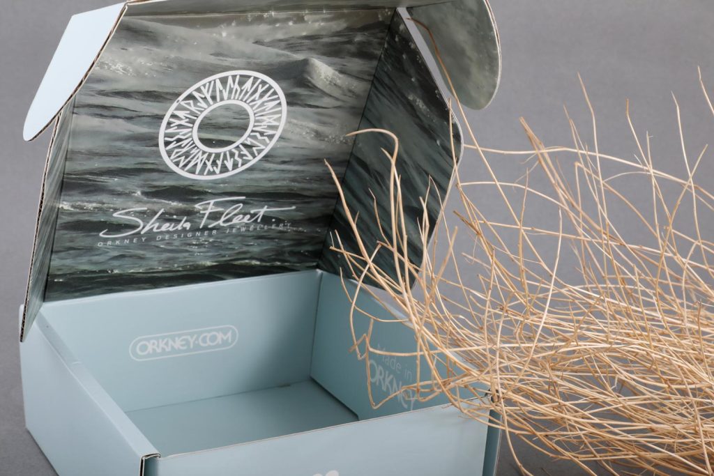
The packaging is a folding carton with a smooth, flat construction made from single-layer paperboard. The exterior is a light blue color, while the interior features a striking design with swirling gray and white patterns. The edges are clean and precise, indicating a well-constructed box. The box is designed to open from the top, with flaps that tuck in securely. There are no visible signs of wear or damage, suggesting it is in excellent condition.

The packaging consists of a brown kraft paper bag with a flat bottom and a resealable top. The bag features a rectangular shape with a smooth surface and clean edges. The front displays a circular logo and product information in a black font, while the back has additional text and details about the coffee. The bag is designed to stand upright, showcasing the product inside.

The packaging is a folding carton made of smooth, single-layer paperboard. It features a light blue exterior with a matte finish and a printed design on the inside flap showing a wave pattern. The edges are clean and precise, indicating high-quality construction. The box has a rectangular shape with a tuck-in closure at the top. The overall appearance is lightweight and suitable for retail display.
About the Brand
Sheila Fleet Jewellery specializes in high-end, handcrafted jewelry rooted in Scottish heritage, offering rings, necklaces, earrings, and more through a direct-to-consumer model. The brand is recognized for its meticulous craftsmanship and the use of responsibly sourced materials, underscored by bespoke packaging that reinforces its luxury positioning.
Operating from their Orkney workshop with a team of skilled artisans, Sheila Fleet Jewellery integrates traditional techniques with modern design elements. Their packaging ecosystem leverages premium rigid boxes, custom folding cartons, and branded inserts, optimizing both visual impact and protection for delicate products. The company also prioritizes customer engagement through personalized touches, such as handwritten cards and gift-ready presentation, aligning packaging with the brand's narrative of authenticity and craftsmanship.
Key Differentiator: Distinctive, locally inspired packaging solutions that mirror the brand’s artisanal ethos and commitment to both luxury and sustainability.
Design System
Visual Style
A refined visual approach featuring clean sans-serif typography, a cool-toned color palette dominated by soft blues, whites, and marble-like patterns, and a matte finish to reinforce a sense of understated luxury.
Brand Identity
Consistent use of the Sheila Fleet logo and company name in gold or contrasting tones, supported by decorative ribbons and occasional Celtic or wave motifs. Iconography is minimal, focusing on clarity and reinforcing the brand’s Scottish identity.
Packaging Design
Material choices include thick-walled chipboard for rigid boxes, plush interior linings, and high-quality, single-layer paperboard for folding cartons. Structural design prioritizes secure closures (magnetic or tuck-in), precise edges, and protection for delicate jewelry.
User Experience
The design system supports an emotional, memorable unboxing journey through layered presentation, personalized cards, and tactile materials. Packaging enhances the brand narrative, reassures product safety during transit, and enables gifting with minimal additional wrapping.
Company Metrics
Business insights for Sheila Fleet Jewellery based on available data
Market Positioning
Brand Values & Focus
Key Competitors
Target Market: Affluent consumers seeking premium, handcrafted jewelry with a focus on Scottish heritage, personalized service, and luxury presentation. The brand appeals to both domestic and international buyers interested in unique, sustainably packaged gifts and commemorative items.
Packaging Assessment
Overall Grade
Visual appeal and presentation quality
Packaging durability and protection
Eco-friendliness and recyclable materials
Cost efficiency and value for money
Packaging assessment for Sheila Fleet Jewellery based on industry standards and best practices
Frequently Asked Questions
What types of packaging does Sheila Fleet Jewellery use for its products?
Sheila Fleet Jewellery primarily utilizes rigid gift boxes with plush interiors for high-value items, complemented by custom folding cartons and branded inserts. These solutions are designed to maximize protection for delicate jewelry while delivering a refined unboxing experience.
How does Sheila Fleet Jewellery address sustainability in its packaging?
The brand incorporates recyclable paperboard materials in its carton boxes and promotes reusability and recyclability. Their packaging choices reflect an ongoing effort to balance luxury presentation with environmental responsibility.
What role does packaging play in Sheila Fleet Jewellery’s brand strategy?
Packaging functions as a key touchpoint in reinforcing the brand's identity, combining premium materials, consistent visual design, and personalized elements to enhance the customer journey and emotional connection to the product.
Discover other Gifts & Special Events companies
Explore more companies in the gifts & special events industry and their packaging strategies
Get Digital
Gifts & Special Events
Get Digital is a niche e-commerce retailer specializing in unique gadgets, nerd-themed apparel, and merchandise for fans and enthusiasts. They offer a wide range of products tailored to the interests of nerds and geeks.
Bunnies By The Bay Inc.
Gifts & Special Events
Bunnies By The Bay is a company that specializes in creating high-quality, personalized baby gifts and plush toys designed to bring joy and comfort to children.
Tillander
Gifts & Special Events
Tillander is a luxury jewelry brand specializing in high-end diamond rings and fine jewelry. They offer a curated selection of unique, handcrafted pieces designed to celebrate significant moments.