My Hair Doctor packaging
My Hair Doctor delivers specialized haircare solutions with a focus on quality, science, and natural ingredients. Their packaging leverages retail-grade carton boxes and tubes, designed to enhance brand visibility and safeguard product integrity throughout the supply chain.
Packaging Portfolio
My Hair Doctor utilizes a packaging portfolio centered on folding carton boxes, cosmetic tubes, and retail cartons with inner glass jars. Carton boxes are constructed from single-layer paperboard for a balance of rigidity and print clarity, supporting high-quality graphics and branding. Tubes offer controlled dispensing and protection for liquid and cream formulations. Packaging formats are chosen for their compatibility with retail display, logistics efficiency, and alignment with sustainability goals, while incorporating vibrant graphics and award seals for enhanced shelf impact.

The packaging is a flat, rectangular box made from smooth, single-layer paperboard. It features clean, precise edges and folds, with a predominantly white exterior. The front of the box displays a large logo in pink and red, along with product information in a clear, modern font. The overall design is minimalistic, with a glossy finish that enhances the visual appeal. The box has a tuck flap closure at the top, allowing for easy opening and closing.
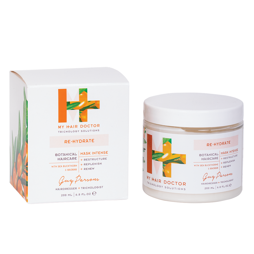
The packaging consists of a folding carton that houses a jar. The carton is made of smooth, flat paperboard with clean edges and folds. It features a white exterior with vibrant graphics, including green and orange botanical illustrations. The jar inside is made of clear glass with a white lid, showcasing the product inside. The overall design is modern and appealing, aimed at retail display.

The packaging consists of a folding carton made from single-layer paperboard. It features a smooth, flat construction with clean edges and folds. The box is predominantly white with colorful graphics and branding elements. The front displays the product name and brand logo prominently, while the sides may include additional product information and marketing text.

The packaging consists of two tubes, each with a cylindrical shape and a smooth surface. The tubes are predominantly white with a soft matte finish, featuring a pink background that enhances the overall aesthetic. The tops of the tubes are sealed with a flip-top cap, allowing for easy dispensing of the product. The design is sleek and modern, appealing to a beauty-conscious audience.
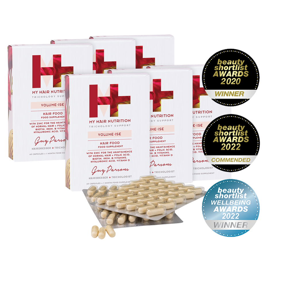
The packaging consists of a series of folding cartons, each featuring a smooth, flat construction without visible fluted layers. The boxes are predominantly white with colorful graphics and branding elements. The edges are clean and precise, indicative of a well-constructed folding carton. The front of each box displays the product name and branding prominently, with additional award seals affixed to the side.
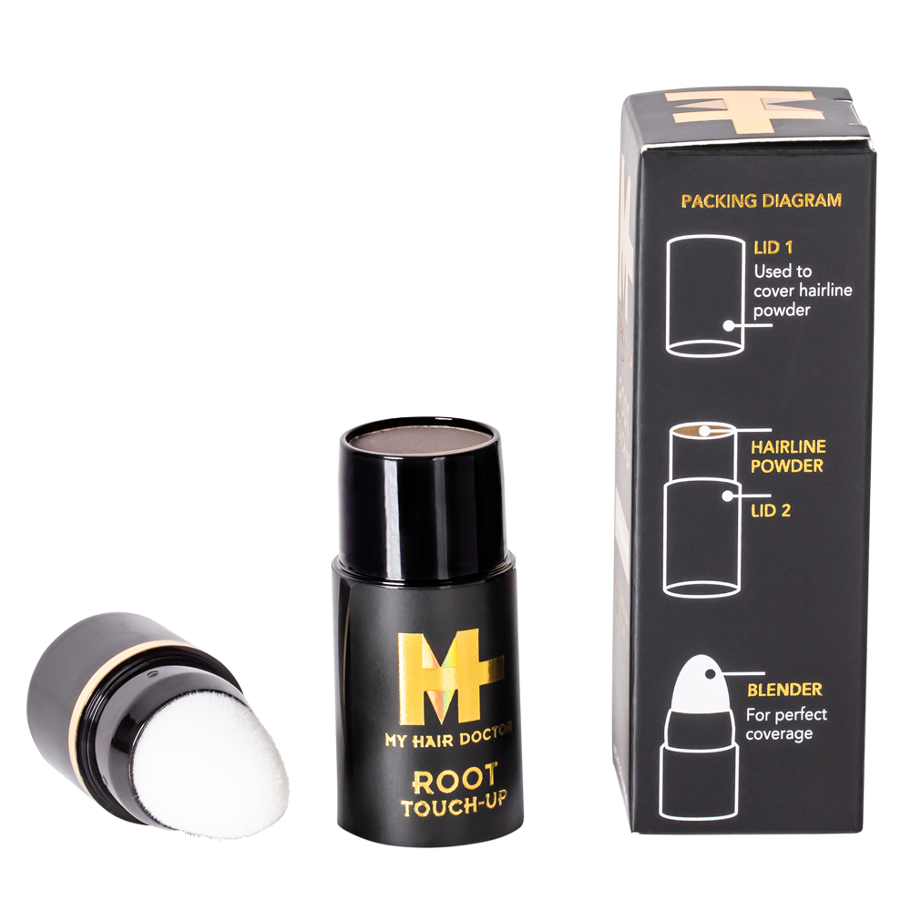
The packaging consists of a folding carton that houses a cylindrical container. The carton is primarily black with gold accents and features a clear, printed packing diagram on one side. The edges are clean and precise, indicating a well-constructed fold. The container itself is cylindrical, made of a sturdy material, and has a smooth finish. The top of the container has a removable lid with a puff applicator.
About the Brand
My Hair Doctor operates in the beauty and fitness industry, offering a diverse range of haircare products tailored to various hair types and scalp needs. The company's packaging strategy emphasizes high-impact branding, functional protection, and shelf appeal, supporting both D2C e-commerce and retail distribution.
Packaging selection at My Hair Doctor centers around folding cartons, cosmetic tubes, and retail-ready containers, each chosen for their ability to communicate product attributes and maintain quality during transit. Consistent use of branded elements and modern visual design ensures strong shelf presence and consumer recognition. The company integrates sustainability considerations in packaging, with a focus on recyclable materials and efficient structures.
Key Differentiator: The brand’s unique value lies in its blend of trichologist-formulated, botanically-driven haircare and a cohesive, scientifically-informed packaging system that aligns with premium market expectations.
Design System
Visual Style
Modern sans-serif typography, a predominantly white background accented with brand colors such as pink, red, and gold, and clean, minimalist layouts. The aesthetic focuses on clarity and premium positioning.
Brand Identity
Prominent use of the 'MY HAIR DOCTOR' logo and sub-brand graphics, consistent iconography, and the use of award seals. Visual consistency is maintained across product lines through uniform color palettes and structured layouts.
Packaging Design
Preference for recyclable paperboard cartons, cosmetic tubes with matte finishes, and glass jars for select products. Structural designs emphasize clean edges, secure closures, and retail display readiness, balancing protection and sustainability.
User Experience
Packaging supports a positive customer journey through easy-open mechanisms, clear labeling, and visually appealing unboxing moments. The design system reinforces product efficacy and brand trust, supporting D2C engagement and repeat purchases.
Company Metrics
Business insights for My Hair Doctor based on available data
Market Positioning
Brand Values & Focus
Key Competitors
Target Market: Eco-conscious and quality-driven consumers seeking science-backed haircare solutions in the premium beauty segment, primarily in the UK and broader European markets.
Packaging Assessment
Overall Grade
Visual appeal and presentation quality
Packaging durability and protection
Eco-friendliness and recyclable materials
Cost efficiency and value for money
Packaging assessment for My Hair Doctor based on industry standards and best practices
Frequently Asked Questions
What types of packaging materials does My Hair Doctor use?
The brand predominantly uses folding carton boxes, cosmetic tubes, and glass jars with paperboard outers. These materials support both product protection and brand communication.
How does My Hair Doctor approach sustainability in packaging?
My Hair Doctor incorporates recyclable paperboard and glass components, and uses minimalistic structural designs to reduce material waste. However, the use of mixed materials in some formats may impact overall recyclability.
Is the packaging design consistent across the product range?
Yes, the packaging employs a unified visual language with consistent use of logos, color schemes, and modern typography, reinforcing brand recognition and premium positioning.
Does the packaging support e-commerce logistics?
The structural integrity of folding cartons and protective inner containers is designed to mitigate damage during shipping, supporting the brand’s D2C model.
Discover other Beauty & Fitness companies
Explore more companies in the beauty & fitness industry and their packaging strategies
Pure Altitude
Beauty & Fitness
Pure Altitude specializes in high-quality beauty and skincare products that leverage the expertise of spa treatments to enhance daily routines. The brand offers a diverse range of products tailored for both facial and body care.
Cultiv Cosmetique
Beauty & Fitness
Cultiv Cosmetique is a French skincare brand that provides organic and eco-friendly beauty products inspired by nature. They focus on effective skincare solutions for various skin concerns.
Owari
Beauty & Fitness
Owari specializes in 100% natural beauty and fitness products, designed to enhance health and wellness. The company proudly offers its products made in France, emphasizing quick delivery and customer support.