Moleskine packaging
Moleskine is a Milan-based leader in premium stationery, specializing in notebooks, planners, and writing tools for creative professionals and enthusiasts. Their packaging strategy emphasizes minimalist, brand-aligned presentation using both retail cartons and rigid boxes to balance product protection with an elevated unboxing experience.
Packaging Portfolio
Moleskine’s packaging portfolio is dominated by high-grade single-layer paperboard retail cartons and rigid chipboard boxes for limited editions. The cartons utilize matte and kraft finishes, with consistent branding bands and product-specific color accents to differentiate SKUs. Rigid boxes, often reserved for collaborations or special releases, feature internal compartments and soft linings, enhancing both product protection and perceived luxury. All packaging formats prioritize precise construction, clean folding, and minimalist graphic treatments to maintain brand integrity and shelf appeal.

The packaging is a flat, rectangular folding carton made of single-layer paperboard. It features a smooth, kraft-colored exterior with a clean, precise edge. The front displays a label with a bright green accent, indicating the product type and brand. The carton is lightweight and has a matte finish, contributing to a minimalistic design aesthetic.

The packaging is a high-quality rigid box with a thick chipboard construction. The exterior is matte black, giving it a premium appearance. The box features a hinged lid that opens to reveal an interior compartment with a printed design and a separate section for the product. The interior is lined with a soft material, enhancing the luxurious feel. The box includes a decorative card with illustrations and text, adding to its aesthetic appeal.

The packaging consists of a smooth, flat construction made from single-layer paperboard. It features a clean, precise fold with a glossy finish. The box is predominantly black with a white band around it, which includes product information and branding. The overall shape is rectangular, designed to hold a watercolor album. The packaging is lightweight and has a professional appearance, suitable for retail display.
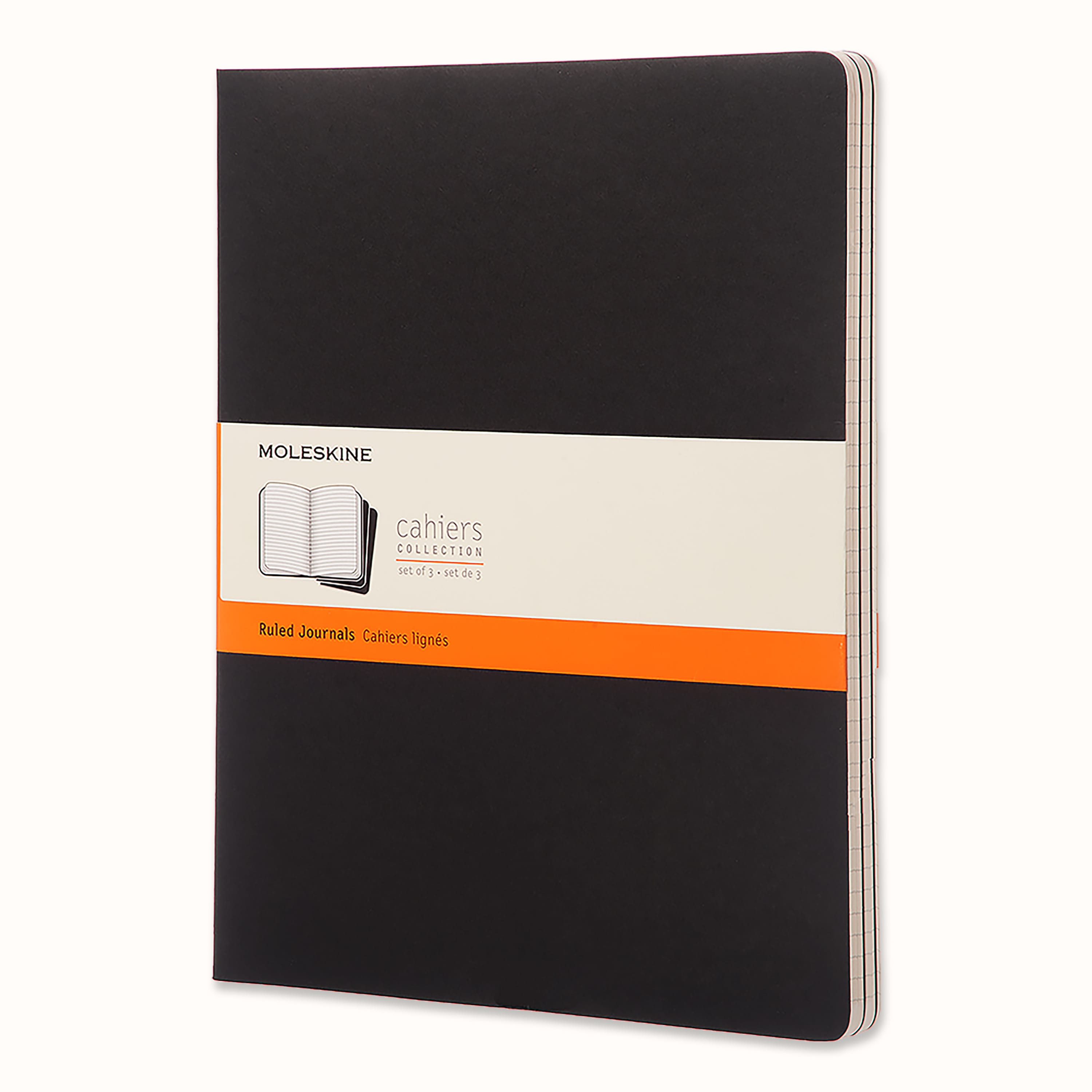
The packaging is a flat, smooth, single-layer paperboard carton that houses a set of ruled journals. It features clean, precise edges and folds, with a predominantly black exterior and an orange band that wraps around the center. The band includes product information in white text, contrasting with the black background.
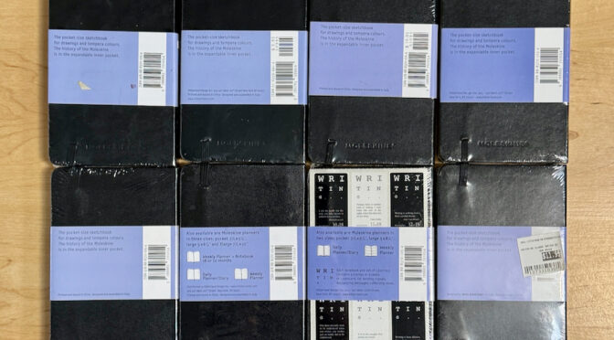
The packaging consists of multiple flat, rectangular boxes stacked together, each with a smooth, flat construction. The boxes are made from a single layer of paperboard, featuring clean edges and folds. They are predominantly black with a matte finish, and the back of each box has a light purple label with product information. The boxes are designed for retail display and are lightweight in appearance.

The packaging consists of a flat, smooth paperboard carton that houses a sketchbook. It features a clean, precise construction with a light weight appearance. The carton is predominantly black with a blue band around the center that displays the brand name and product information. The edges are neatly folded, and the overall finish appears matte with a slight texture. Accompanying the sketchbook is a folded informational sheet and a small card, both printed on lighter paper.
About the Brand
Moleskine is recognized for its high-quality stationery products and iconic design language, serving a global market of creatives, professionals, and students. The company’s packaging consistently reflects a minimalist aesthetic, prioritizing brand consistency, functionality, and customer perception. Durable paperboard and rigid boxes are core to their approach, providing both structural integrity and visual appeal.
Founded in Milan, Moleskine leverages its cultural heritage through premium product presentation and frequent limited-edition collaborations. The brand’s packaging mirrors its core values by employing understated, elegant materials and layouts that reinforce premium positioning. Customizable elements and digital integrations further distinguish Moleskine’s packaging from industry norms.
Key Differentiator: Moleskine’s unique value lies in its cohesive integration of minimalist design, durable packaging materials, and brand-centric presentation, which together elevate both perceived value and the overall customer experience.
Design System
Visual Style
Typography centers on sans-serif, clean typefaces with minimalistic hierarchy. Color palette is primarily black, white, and kraft tones, accented by bold bands in orange, blue, or green for product differentiation. The overall aesthetic is understated and modern.
Brand Identity
Branding relies on consistent logo placement, clear product labeling, and restrained iconography. Logos are prominently displayed on packaging bands and cartons, while visual consistency is maintained through uniform layout and color usage across product lines.
Packaging Design
Material choices prioritize single-layer paperboard for standard products and rigid chipboard for premium editions. Structural design emphasizes durability, flat construction, and efficient folding, supporting both shipping protection and retail display.
User Experience
Packaging is engineered to support a seamless customer journey, from clear product identification at retail to an emotionally resonant unboxing experience. Minimalist aesthetics and tactile finishes reinforce the brand’s creative ethos and premium positioning.
Company Metrics
Business insights for Moleskine based on available data
Market Positioning
Brand Values & Focus
Key Competitors
Target Market: Global consumers in the creative, professional, and student segments seeking high-quality, design-forward stationery products.
Packaging Assessment
Overall Grade
Visual appeal and presentation quality
Packaging durability and protection
Eco-friendliness and recyclable materials
Cost efficiency and value for money
Packaging assessment for Moleskine based on industry standards and best practices
Frequently Asked Questions
What types of packaging does Moleskine primarily use?
Moleskine utilizes a combination of single-layer paperboard retail cartons and high-quality rigid boxes, with packaging design focused on minimalist branding, structural protection, and premium presentation.
How does Moleskine’s packaging support its brand identity?
The packaging employs consistent color schemes, logo placement, and typographic elements that reinforce Moleskine’s minimalist and sophisticated brand positioning, contributing to a cohesive customer journey.
Is sustainability considered in Moleskine packaging?
Moleskine incorporates recyclable materials and paperboard in its packaging, although the use of rigid boxes for limited editions may have a higher environmental impact compared to standard retail cartons.
Discover other Books & Literature companies
Explore more companies in the books & literature industry and their packaging strategies
Lemon Dragon Co.
Books & Literature
Lemon Dragon Co. is a brand focused on inspiring creativity and imagination through a range of products including books and apparel. They are currently preparing to launch a new chapter in their business.
Verlag Dräger Druck
Books & Literature
Verlag Dräger Druck specializes in publishing a variety of literary works, including art books, non-fiction, and poetry. The company is dedicated to showcasing authors and themes that resonate with cultural and historical significance.
Shakespeare and Company, Paris
Books & Literature
Shakespeare and Company is an iconic independent bookstore in Paris, known for its vast collection of literature, both new and rare. Established in 1951, it serves as a cultural hub for readers and writers alike.