Lemon Dragon Co. packaging
Lemon Dragon Co. operates in the Books & Literature space, blending creative storytelling with apparel. Their packaging utilizes vibrant, brand-cohesive carton and rigid boxes to deliver a visually engaging unboxing experience, aligning closely with their imaginative ethos.
Packaging Portfolio
Lemon Dragon Co. employs a mix of single-layer paperboard folding cartons and rigid chipboard boxes for both individual and multi-product sets. The packaging is characterized by clean edges, glossy or matte finishes, and vibrant, illustrated graphics that reinforce the brand's narrative focus. Structural formats include retail cartons for books and apparel, rigid boxes with die-cut windows for gift sets, and integration of secondary elements such as fabric wraps. The emphasis on visual cohesion and tactile quality supports both e-commerce and in-store display requirements, while maintaining moderate sustainability via recyclable base materials.
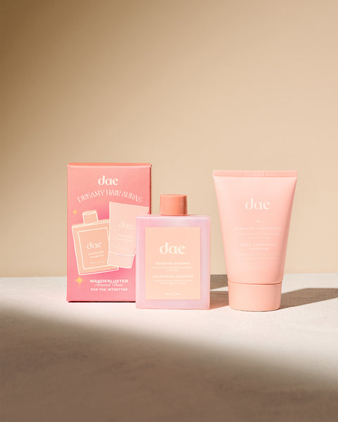
The packaging consists of a folding carton for the product on the left and a squeeze tube for the product on the right. The carton is rectangular with smooth, flat surfaces, featuring a colorful design with a predominantly pink background and white text. The tube has a similar color scheme, with a matte finish and a rounded cap. Both items are designed for retail display, showcasing the product effectively.
The packaging consists of a folding carton that is primarily pink with illustrations of citrus fruits. It features a smooth, flat construction without any visible fluted layers, indicating it is made from single-layer paperboard. The edges are clean and precise, with a glossy finish that enhances the vibrant colors. The front displays product names and branding elements prominently, while the sides may contain additional information about the products included.

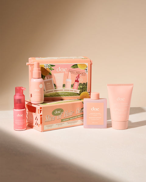
The packaging consists of a colorful retail carton featuring a vibrant design with images of fruit and floral elements. The carton has a smooth, flat construction without visible fluted layers, indicating it is made from single-layer paperboard. The edges are clean and precise, and the overall appearance is lightweight yet sturdy, suitable for retail display. The front showcases the product trio prominently, with a glossy finish enhancing the visual appeal.
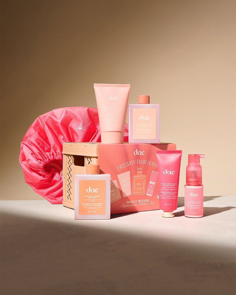
The packaging consists of a retail carton that is predominantly pink with a matte finish. The carton has a smooth, flat construction without any visible fluted layers, indicating it is made from single-layer paperboard. The edges are clean and precise, and the carton features a printed design with various product images and text. The overall shape is rectangular, and it appears to be designed to hold multiple beauty products. Additionally, there is a fabric hair wrap in a vibrant pink color, which is separate from the carton but included in the overall packaging display.

The packaging consists of a rigid box designed to hold multiple hair care products. It features a sturdy construction with thick chipboard walls, providing a premium feel. The box has a window cut-out in a heart shape, allowing visibility of the products inside. The exterior is adorned with a gradient color scheme transitioning from pastel pink to a soft yellow, giving it a vibrant yet elegant appearance. The box includes a printed design with the brand name 'dae' prominently displayed.
About the Brand
Lemon Dragon Co. is a direct-to-consumer brand focused on products that inspire creativity, including books and apparel. The company employs visually distinctive packaging that reinforces its narrative-driven identity through color, illustration, and material choices.
Currently in a pre-launch phase, Lemon Dragon Co. is leveraging anticipation-building strategies and strong branding to engage a community of art and literature enthusiasts. Their packaging approach demonstrates careful attention to both presentation and product protection, utilizing folding carton and rigid box formats with high-impact visual designs.
Key Differentiator: The integration of creative, illustrated packaging with storytelling and fashion elements uniquely positions Lemon Dragon Co. at the intersection of literature and lifestyle branding.
Design System
Visual Style
A playful, contemporary aesthetic featuring pastel and vibrant pinks, accented by citrus and floral illustrations. Typography leans toward serif and modern sans-serif fonts, with high-contrast white or dark text for readability against color-rich backgrounds.
Brand Identity
Consistent usage of the 'dae' or 'daedreams' brand name in prominent positions, with supporting iconography related to dreams, fruit, and creativity. Visual consistency is achieved through a unified color palette and recurring graphic styles across packaging formats.
Packaging Design
Material choices include smooth, single-layer paperboard for folding cartons and thick chipboard for rigid boxes, favoring flat, clean surfaces for print clarity. Structural design prioritizes both shelf appeal and product protection, with occasional die-cut windows or internal dividers for multi-item sets.
User Experience
The design system enhances the customer journey by creating a sense of wonder and anticipation during unboxing, leveraging tactile finishes and visual storytelling to reinforce brand values and strengthen emotional connection.
Company Metrics
Business insights for Lemon Dragon Co. based on available data
Market Positioning
Brand Values & Focus
Key Competitors
Target Market: Creative individuals, readers, and apparel enthusiasts seeking unique, artistic products with strong narrative and design elements.
Packaging Assessment
Overall Grade
Visual appeal and presentation quality
Packaging durability and protection
Eco-friendliness and recyclable materials
Cost efficiency and value for money
Packaging assessment for Lemon Dragon Co. based on industry standards and best practices
Frequently Asked Questions
What types of packaging does Lemon Dragon Co. use?
Lemon Dragon Co. primarily uses single-layer paperboard folding cartons and rigid boxes, both featuring custom illustrations, glossy or matte finishes, and cohesive brand graphics.
How does Lemon Dragon Co. balance aesthetics and logistics in packaging?
Their packaging emphasizes visual storytelling and brand alignment while maintaining structural integrity for retail and e-commerce distribution, particularly through the use of sturdy rigid boxes for multi-product sets.
Does Lemon Dragon Co. prioritize sustainability in its packaging?
While current packaging utilizes recyclable paperboard and chipboard materials, further details on sustainable sourcing or reduced environmental impact are not highlighted in existing practices.
Discover other Books & Literature companies
Explore more companies in the books & literature industry and their packaging strategies
Shakespeare and Company, Paris
Books & Literature
Shakespeare and Company is an iconic independent bookstore in Paris, known for its vast collection of literature, both new and rare. Established in 1951, it serves as a cultural hub for readers and writers alike.
Moleskine
Books & Literature
Moleskine is a renowned brand that specializes in high-quality notebooks, planners, and writing tools, catering to creative professionals and enthusiasts alike.
Amalthea Verlag
Books & Literature
Amalthea Verlag is a publishing house based in Vienna, Austria, specializing in historical literature and narratives that connect past events to contemporary issues. The company publishes a variety of books, including biographies, historical accounts, and cultural studies.