Miele USA packaging
Miele USA specializes in premium home and kitchen appliances, with packaging strategies that reflect their brand’s emphasis on quality and design consistency. Their approach leverages custom carton boxes engineered for both retail presentation and product protection.
Packaging Portfolio
Miele USA’s packaging portfolio is dominated by custom-designed folding carton boxes constructed from single-layer paperboard, typically featuring clean white exteriors with minimalistic graphics and precise structural folds. Product visibility is enhanced through die-cut windows, while matte and glossy finishes are selectively used to reinforce premium positioning. The packaging consistently incorporates clear branding, product names, and instructional text, supporting both retail display and effective logistics. Material selection prioritizes recyclability, aligning with industry sustainability trends.
The packaging is a white folding carton with a smooth, flat construction. It features a clean design with precise edges and folds. The box has a circular cut-out on the front, allowing visibility of the product inside. The top flap is slightly larger, providing a secure closure. The overall appearance is lightweight and designed for retail display.

The packaging consists of a smooth, flat construction made from single-layer paperboard. It features clean, precise edges and folds, with a predominantly white background and colorful graphics. The front displays a prominent green logo and product information, while the sides have additional details and branding elements. The box is designed for retail display, with a lightweight appearance and a glossy finish.
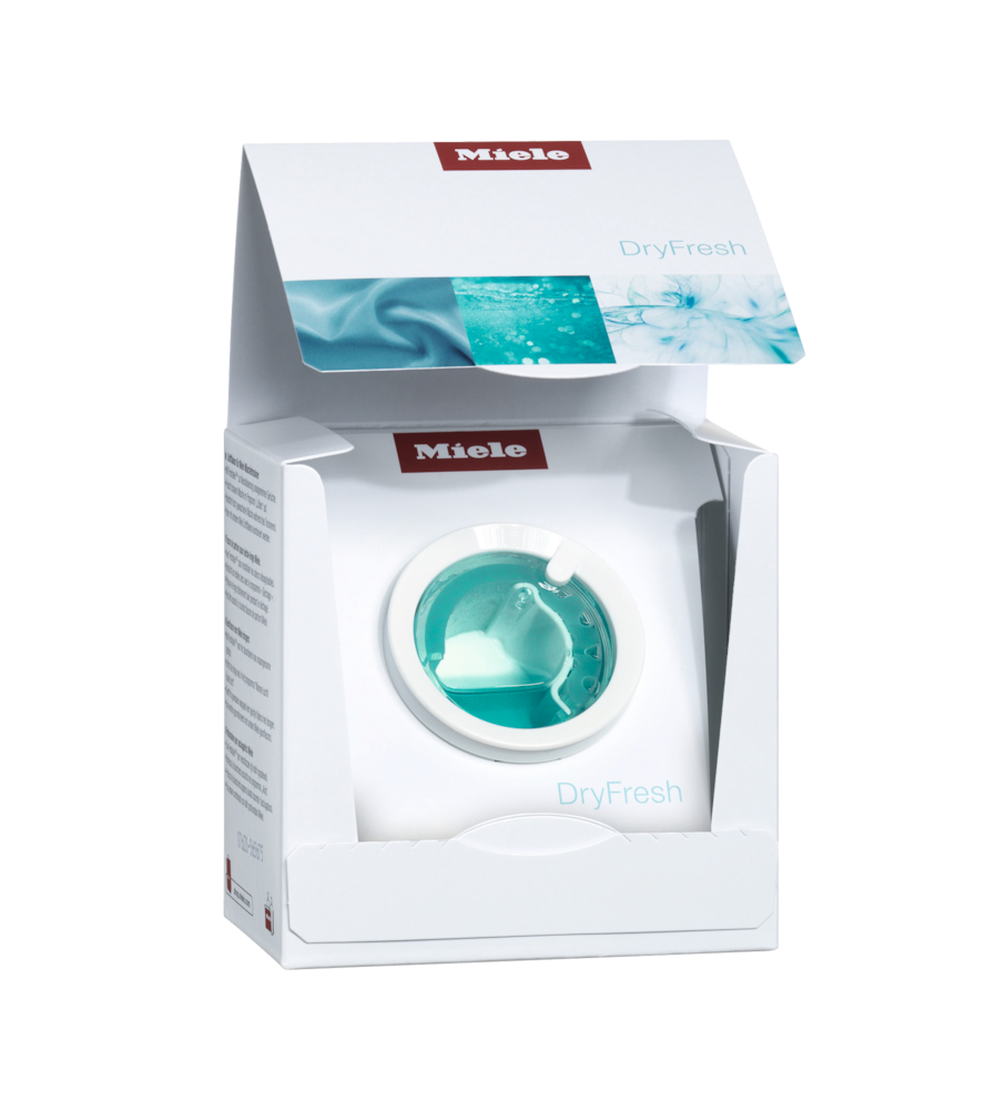
The packaging is a folding carton made of smooth, white paperboard. It features a clean, flat construction with precise edges and folds. The box has a top flap that opens to reveal the product inside, with a cut-out window showcasing the DryFresh product. The exterior has a glossy finish with vibrant colors and graphics.

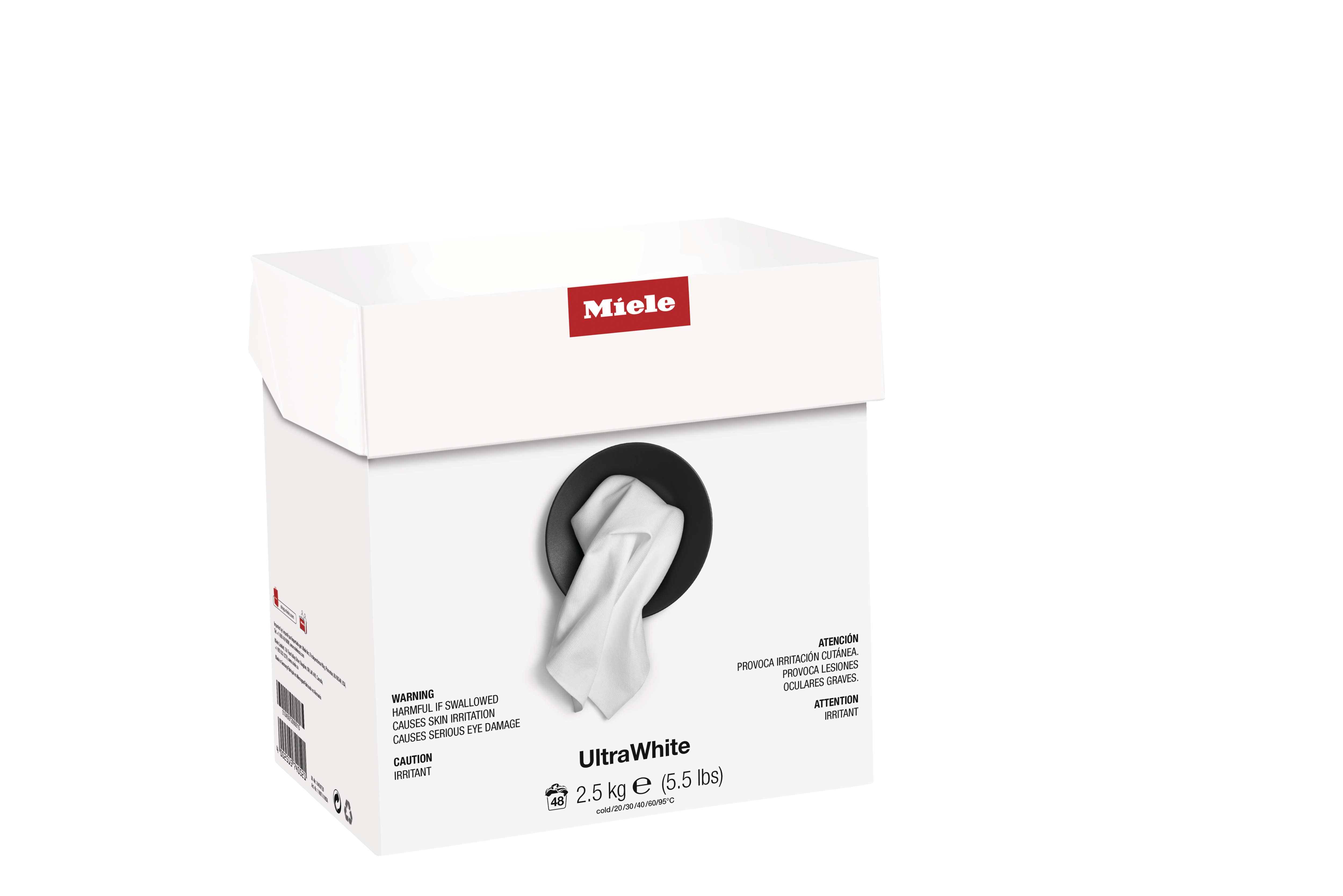
The packaging is a square-shaped retail carton made of smooth, single-layer paperboard. It features clean, precise edges and folds, with a predominantly white exterior and colorful graphics. The front displays a prominent logo and product name, while the sides include additional information and icons. The overall appearance is lightweight and designed for retail display.
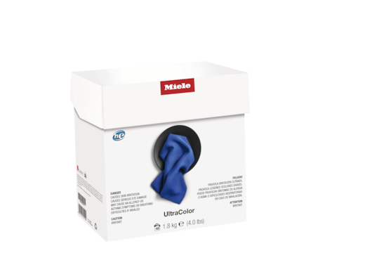
The packaging is a flat, smooth, single-layer paperboard carton with a clean, white exterior. The top flap is slightly raised, indicating it is a tuck-top design. The front features a circular cut-out window displaying a blue cloth inside, suggesting the product is a cleaning cloth. The edges are sharp and precise, with no visible fluting, characteristic of carton boxes. The exterior has a matte finish with a slight sheen where the logo is printed.
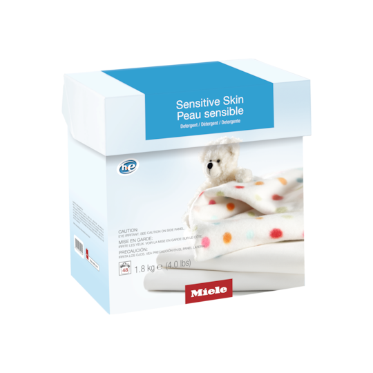
The packaging is a folding carton made from a single layer of paperboard. It features a smooth, flat construction with clean edges and folds. The box is predominantly white with a light blue top flap. The front displays a colorful image of a teddy bear on a soft blanket, along with polka dots, which adds a playful touch. The product name 'Sensitive Skin' is prominently displayed, along with the weight in both metric and imperial units.
About the Brand
Miele USA operates in the high-end home appliance sector, offering a portfolio that spans kitchen and cleaning solutions. The company’s packaging is tailored to reinforce its reputation for precision and reliability, consistently utilizing branded folding cartons for a cohesive shelf presence.
Their packaging strategy focuses on structured paperboard cartons with minimalist design and clear branding, aiming to deliver a visually appealing yet protective solution. Miele USA’s packaging choices balance the need for retail display, logistics safety, and brand consistency, aligning with consumer expectations for premium unboxing experiences. The company also integrates sustainable materials and clear product information into its packaging formats.
Key Differentiator: Miele USA distinguishes itself through a unified visual identity across all packaging, leveraging premium materials and precise structural design to align with its luxury brand positioning.
Design System
Visual Style
Typography is typically sans-serif, supporting clarity and a modern aesthetic. The color palette is dominated by white, red, and blue, reflecting the brand’s established visual identity. Overall design is minimalist, with emphasis on negative space and sharp, clean lines.
Brand Identity
The Miele logo is displayed prominently on the front and top of packaging, accompanied by consistent iconography and product titles. Visual consistency is maintained through repeated use of signature colors and disciplined logo placement.
Packaging Design
Material choices focus on smooth, single-layer paperboard for lightweight durability. Structural design philosophy emphasizes precise folding, secure closures (tuck-top or flap), and die-cut windows for product visibility. Designs are optimized for both retail display and protection in transit.
User Experience
The packaging design supports the customer journey by delivering a premium unboxing experience, clear product information, and immediate brand recognition. Features like product windows and tactile finishes enhance emotional engagement and perceived value.
Company Metrics
Business insights for Miele USA based on available data
Market Positioning
Brand Values & Focus
Key Competitors
Target Market: Affluent households and design-conscious consumers seeking premium kitchen and cleaning appliances in the United States.
Packaging Assessment
Overall Grade
Visual appeal and presentation quality
Packaging durability and protection
Eco-friendliness and recyclable materials
Cost efficiency and value for money
Packaging assessment for Miele USA based on industry standards and best practices
Frequently Asked Questions
How does Miele USA ensure packaging consistency across its product range?
Miele USA standardizes packaging formats using custom carton boxes with consistent branding elements, color schemes, and structural features, supporting both brand recognition and logistics efficiency.
What sustainability initiatives are reflected in Miele USA's packaging?
The company utilizes recyclable paperboard materials and minimalistic designs to reduce environmental impact while maintaining protective standards.
How does Miele USA’s packaging enhance the customer experience?
Packaging is designed with clean lines, subtle branding, and product visibility features such as cut-out windows, all aimed at delivering a premium unboxing experience aligned with the brand’s luxury positioning.
Discover other Home & Garden companies
Explore more companies in the home & garden industry and their packaging strategies
La Bougie Herbivore
Home & Garden
La Bougie Herbivore specializes in artisanal candles crafted in France, offering a unique range of fragrances that evoke emotions and nature.
Top Buxus
Home & Garden
Top Buxus specializes in providing premium care products for boxwood plants, ensuring their optimal growth and protection against pests.
Rockler Companies, Inc.
Home & Garden
Rockler is a leading retailer specializing in woodworking tools, supplies, and hardware, catering to both hobbyists and professionals in the woodworking community.