Michel et Augustin USA packaging
Michel et Augustin USA specializes in premium French-inspired baked goods, focusing on cookies and snacks distributed via a direct-to-consumer model. Their packaging strategy leverages playful, brand-centric designs and a mix of carton and flexible packaging formats to reinforce product quality and drive consumer engagement.
Packaging Portfolio
Michel et Augustin USA employs a dual approach, utilizing both single-layer folding carton boxes and flexible stand-up pouches as the primary packaging formats. Carton boxes are constructed from high-quality paperboard, optimized for retail display and visual differentiation through vibrant color schemes and playful illustrations. Flexible pouches feature resealable zippers and laminate finishes, providing convenience and product freshness while supporting multi-pack and variety bundle SKUs. Material selection emphasizes presentation and branding, with moderate attention to recyclability and sustainability.

The packaging consists of a multi-pack of flexible pouches, each containing individually wrapped cookie squares. The pouches are brightly colored with a predominantly green and pink design, featuring cartoon characters and product images. The top of the pouches has a resealable zipper, and the sides are smooth with a slight sheen, indicating a laminate finish.

The packaging consists of colorful folding cartons with smooth, flat construction. Each carton features clean edges and precise folds, indicative of single-layer paperboard. The cartons are brightly colored, with distinct graphics and branding elements prominently displayed on the front. The overall shape is rectangular, designed for retail display, and they are arranged in a way that showcases multiple flavors of the product.

The packaging consists of several colorful folding cartons arranged in a display format. Each carton features a smooth, flat construction without visible fluted layers, indicating they are made from single-layer paperboard. The cartons are predominantly bright colors, including green, pink, and orange, with clear, precise edges and folds. The design includes playful graphics and text that highlight the product offerings, such as 'Cookie Squares' and flavor descriptions. The overall appearance is clean and appealing, suitable for retail display.

The packaging consists of colorful folding cartons made from single-layer paperboard. Each box features a smooth, flat construction with clean edges and folds. The cartons are predominantly orange and pink with vibrant graphics depicting cartoon characters and product images. The boxes are designed to stand upright with a cut-out display section at the front. They are lightweight and have a glossy finish, enhancing their visual appeal.

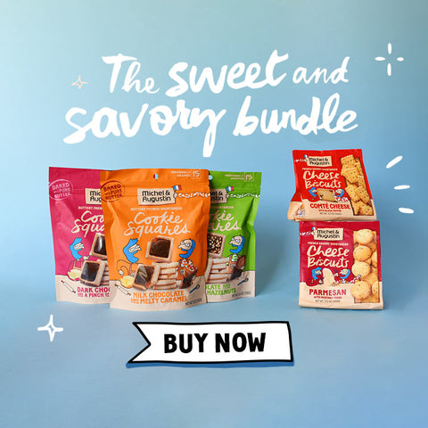
The packaging consists of three individual pouches bundled together, each featuring a vibrant orange color scheme. The front of each pouch displays a playful illustration of cartoon characters alongside images of the cookie squares. The pouches have a smooth, matte finish with a resealable top. The graphics are colorful and eye-catching, with clear product information and branding.
The image features several stand-up pouches arranged in a visually appealing manner. Each pouch has a resealable top and a clear window displaying the product inside. The pouches are brightly colored, with distinct designs for each flavor. The overall shape is rectangular with a flat base, allowing them to stand upright. The background is a soft gradient, enhancing the visual appeal of the packaging.
About the Brand
Michel et Augustin USA is a Brooklyn-based food and beverage company, established in 2004, bringing authentic French pastry experiences to the U.S. market. The brand emphasizes simplicity and quality in its baked goods, targeting a demographic seeking artisanal snacks with a playful twist. Packaging plays a critical role in conveying the company's French heritage and product authenticity.
Through a direct-to-consumer e-commerce model, Michel et Augustin USA employs highly visual, custom-designed packaging that aligns with its 'troublemakers of taste' brand identity. The integration of vibrant colors, cartoonish illustrations, and high-quality materials not only enhances shelf appeal but also contributes to a memorable unboxing experience. The company’s small but focused team ensures that supply chain, quality, and sustainability standards are maintained across all packaging touchpoints.
Key Differentiator: Michel et Augustin USA distinguishes itself through its cohesive, playful packaging design rooted in French culture, combined with premium ingredient transparency and a strong emphasis on customer experience.
Design System
Visual Style
Typography leans toward bold, rounded sans-serif fonts paired with handwritten script accents. The color palette is dominated by high-saturation hues—orange, pink, green, and blue—supporting a playful and energetic brand experience. Overall aesthetic is whimsical, with cartoon characters and dynamic layouts.
Brand Identity
Logo is consistently placed on all packaging fronts, typically paired with product names and flavor descriptors. Iconography includes cartoon illustrations of characters and food items, reinforcing approachability and fun. Visual consistency is maintained through uniform color schemes, illustration styles, and strategic logo placement.
Packaging Design
Material choices favor single-layer paperboard for cartons and multilayer laminate films for pouches, balancing print quality with durability. Structural design prioritizes shelf impact (upright cartons, stand-up pouches) and convenience (resealable closures, clear product windows).
User Experience
Packaging design enhances customer journey by offering an engaging unboxing experience, clear product information, and easy-to-use resealable features. The visual narrative and tactile elements reinforce brand engagement and support repeat purchasing behaviors.
Company Metrics
Business insights for Michel et Augustin USA based on available data
Market Positioning
Brand Values & Focus
Key Competitors
Target Market: Health-conscious and adventurous consumers in the United States seeking premium, French-inspired baked snacks sold primarily through direct-to-consumer online channels.
Packaging Assessment
Overall Grade
Visual appeal and presentation quality
Packaging durability and protection
Eco-friendliness and recyclable materials
Cost efficiency and value for money
Packaging assessment for Michel et Augustin USA based on industry standards and best practices
Frequently Asked Questions
What types of packaging formats does Michel et Augustin USA utilize?
Michel et Augustin USA primarily uses folding carton boxes for retail display and flexible stand-up pouches for snack products, optimizing both shelf presence and convenience.
How does packaging support Michel et Augustin USA’s brand identity?
The packaging features bold, colorful graphics, playful illustrations, and consistent logo placement, all of which communicate the brand’s French heritage and fun, adventurous spirit.
What sustainability considerations are present in their packaging?
The company utilizes single-layer paperboard for cartons and laminated flexible pouches; while some materials are recyclable, full details on post-consumer content and eco-certifications are not disclosed, indicating sustainability is a moderate focus.
Discover other Food & Drink companies
Explore more companies in the food & drink industry and their packaging strategies
ruf lebensmittelwerk kg
Food & Drink
RUF Lebensmittelwerk KG is a German food production company specializing in a variety of baking mixes and drink products. Founded in 1920, the company is known for its high-quality ingredients and innovative food solutions.
Thés de la Pagode
Food & Drink
Thés de la Pagode is a French company specializing in organic teas and infusions, focusing on health and well-being. Established in 1987, they prioritize sustainable practices and high-quality ingredients sourced through fair trade.
Terres de Café
Food & Drink
Terres de Café is a specialty coffee retailer based in Paris, France, known for its commitment to sustainability and high-quality coffee sourcing.