Maniko Nails packaging
Maniko Nails specializes in direct-to-consumer nail care solutions, focusing on UV gel nail strips and accessories. Their packaging utilizes minimalist, retail-ready carton boxes that emphasize brand consistency and shelf appeal, while supporting logistics and sustainability requirements.
Packaging Portfolio
Maniko Nails utilizes custom-designed, single-layer paperboard folding cartons with glossy finishes for its flagship gel nail strips and associated products. The packaging consistently features die-cut windows that display contents for immediate consumer verification, balancing aesthetic appeal with retail practicality. Structural integrity is maintained through precise folds and high-quality materials, while the minimalist graphics and color schemes reinforce brand identity. The portfolio is optimized for both e-commerce shipping and in-store presentation, demonstrating an effective intersection of protective function, marketing, and brand communication.

The packaging is a flat, rectangular carton designed to hold UV gel strips. It features a smooth, white paperboard construction with clean edges and precise folds. The front displays a large, stylized image of the product, showcasing the gel strips in a visually appealing manner. The background is predominantly white with a subtle sheen, giving it a polished look. The overall design is minimalistic yet elegant, emphasizing the product's quality.
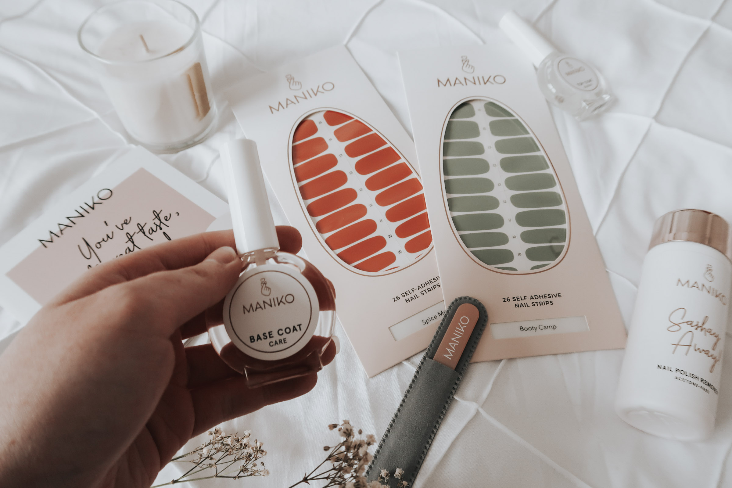
The packaging consists of flat, smooth, single-layer paperboard boxes that are designed to hold self-adhesive nail strips. The boxes feature clean edges and precise folds, indicative of a folding carton construction. The exterior has a glossy finish, enhancing visual appeal. The boxes are predominantly white with colorful graphics, showcasing the nail strip designs prominently.

The packaging consists of a flat, smooth, single-layer paperboard carton designed to hold self-adhesive nail strips. It features a clean, precise shape with rounded edges, and a glossy finish that enhances its visual appeal. The front displays a clear window cutout shaped like an egg, showcasing the nail strips inside. The background is predominantly white, with vibrant colors of the nail strips visible through the window. The design includes a subtle texture that adds depth without being overly complex.
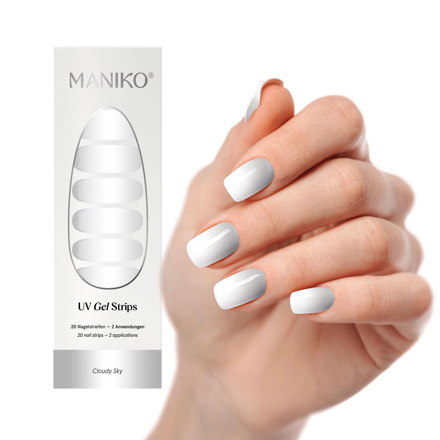
The packaging is a flat, rectangular folding carton made of smooth, single-layer paperboard. It features a clean, white exterior with a glossy finish. The front displays an elongated oval cut-out that showcases the product inside, which consists of UV gel strips. The edges are cleanly folded, and the overall construction appears lightweight yet sturdy, suitable for retail display. The back of the carton likely contains product information and instructions, although this is not visible in the image.

The packaging consists of several retail cartons, primarily white with a smooth finish. Each carton features clean, precise edges and folds, indicative of a single-layer paperboard construction. The cartons are designed to hold nail products, with a sleek and modern aesthetic. The front of the cartons displays product information and branding elements prominently, while the sides are likely plain or contain minimal text.

The packaging consists of several flat, smooth, single-layer paperboard cartons designed for retail display. Each carton has a clean, precise construction with no visible fluted layers, indicating they are made from thinner paperboard. The cartons are primarily white with pastel-colored accents and feature a glossy finish. They are designed to hold nail products, with cut-out windows showcasing the contents inside. The edges are neatly folded, and the overall appearance is lightweight yet sturdy enough for retail use.
About the Brand
Maniko Nails is a Berlin-based beauty brand delivering innovative manicure and pedicure solutions, primarily through high-quality UV gel nail strips. The company operates a D2C model, targeting customers seeking professional results at home. Packaging is central to their user experience, reflecting a clean, modern aesthetic and practical retail presentation.
The brand's packaging approach is characterized by lightweight, single-layer paperboard cartons with glossy finishes and precision-cut windows that display the product. Maniko Nails balances visual appeal with logistical efficiency, aiming for high shelf impact in both e-commerce and brick-and-mortar retail channels. Their packaging aligns with their vegan, cruelty-free positioning and provides a tactile unboxing experience that reinforces brand values.
Key Differentiator: Maniko Nails distinguishes itself with a consistent minimalist packaging system that blends strong shelf presence, brand clarity, and eco-conscious materials, supporting both retail and D2C channels.
Design System
Visual Style
The visual design employs minimalist typography—typically sans-serif fonts—paired with a predominantly white, pastel, and neutral color palette accented by subtle brand colors. The aesthetic is clean and contemporary, aligning with modern beauty sector trends.
Brand Identity
Branding is centered on the prominent MANIKO logo, clear product naming, and consistent use of color and iconography across all packaging. Visual consistency is achieved through standard placement of logos, product windows, and typography, ensuring recognizability across channels.
Packaging Design
Material selection favors recyclable paperboard for folding carton construction, prioritizing lightweight efficiency and visual clarity. Structural design philosophy emphasizes flat, sturdy cartons with die-cut windows, supporting both product protection and retail display requirements.
User Experience
Maniko’s packaging is engineered for ease of access, intuitive product presentation, and an engaging unboxing moment. The design supports the customer journey from first touchpoint to product application, reinforcing trust and satisfaction at each interaction.
Company Metrics
Business insights for Maniko Nails based on available data
Market Positioning
Brand Values & Focus
Key Competitors
Target Market: Primarily targets beauty-conscious consumers in Germany and Europe seeking convenient, salon-quality nail care at home, with a secondary focus on retail shoppers in drugstores and specialty beauty outlets.
Packaging Assessment
Overall Grade
Visual appeal and presentation quality
Packaging durability and protection
Eco-friendliness and recyclable materials
Cost efficiency and value for money
Packaging assessment for Maniko Nails based on industry standards and best practices
Frequently Asked Questions
What packaging materials does Maniko Nails use?
Maniko Nails primarily uses single-layer paperboard folding cartons with a glossy finish for its nail strips and accessory sets. The cartons incorporate die-cut windows for product visibility and are optimized for both e-commerce and retail shelf display.
How does Maniko Nails address sustainability in packaging?
The company utilizes recyclable paperboard materials and avoids excessive secondary packaging. Their commitment to vegan, cruelty-free products extends to packaging choices, although further information on material sourcing and post-consumer recycled content is not specified.
How does Maniko Nails' packaging impact the customer unboxing experience?
The packaging is designed for visual appeal and intuitive access, offering a clean, modern unboxing experience that highlights the product through window cut-outs and clear branding.
Is Maniko Nails' packaging cost-efficient?
By using lightweight paperboard and streamlined structures, Maniko Nails achieves a balance between presentation quality and cost efficiency, suitable for scaling in both online and retail distribution.
Discover other Beauty & Fitness companies
Explore more companies in the beauty & fitness industry and their packaging strategies
Cultiv Cosmetique
Beauty & Fitness
Cultiv Cosmetique is a French skincare brand that provides organic and eco-friendly beauty products inspired by nature. They focus on effective skincare solutions for various skin concerns.
Orris Paris
Beauty & Fitness
Orris Paris specializes in creating artisanal skincare products that combine potent botanical ingredients with modern cleansing rituals. The company emphasizes natural, holistic practices in its formulations.
Pure Altitude
Beauty & Fitness
Pure Altitude specializes in high-quality beauty and skincare products that leverage the expertise of spa treatments to enhance daily routines. The brand offers a diverse range of products tailored for both facial and body care.