luup coffee packaging
LUUP Coffee specializes in lupine-based coffee products, emphasizing organic ingredients and sustainability. Their packaging strategy leverages modern, resealable formats with strong visual branding to enhance product differentiation and reinforce eco-friendly values.
Packaging Portfolio
LUUP Coffee employs a mix of resealable, flexible stand-up pouches and rigid carton boxes for their coffee products. The primary materials include recyclable paperboard and multi-layer flexible films, providing both product protection and shelf appeal. Packaging structures are designed for upright display and feature resealable closures to maintain freshness. Visual branding elements are consistently applied across all formats, with a focus on matte finishes, bold iconography, and minimalistic color schemes to reinforce a modern, eco-friendly image.

The packaging is a stand-up pouch made of flexible material, primarily featuring a yellow exterior with a glossy finish. The front displays a large smiling face graphic, with the brand name 'LUUP' prominently featured in bold, dark letters. Below the brand name, the product type 'Blend' is noted, along with 'LUPINE & ROBUSTA'. The pouch has a resealable top, typical for coffee packaging, and is surrounded by coffee beans and chocolate pieces, enhancing its product context.
The packaging consists of three bags of coffee, each with a flat, smooth construction. The bags are made from a single-layer paperboard material, featuring a clean and precise design with no visible fluted layers. The bags have a matte finish with glossy accents, showcasing a modern aesthetic. Each bag has a resealable top and a flat bottom for standing upright. The overall shape is rectangular, with rounded corners and a tapered top for easy opening.
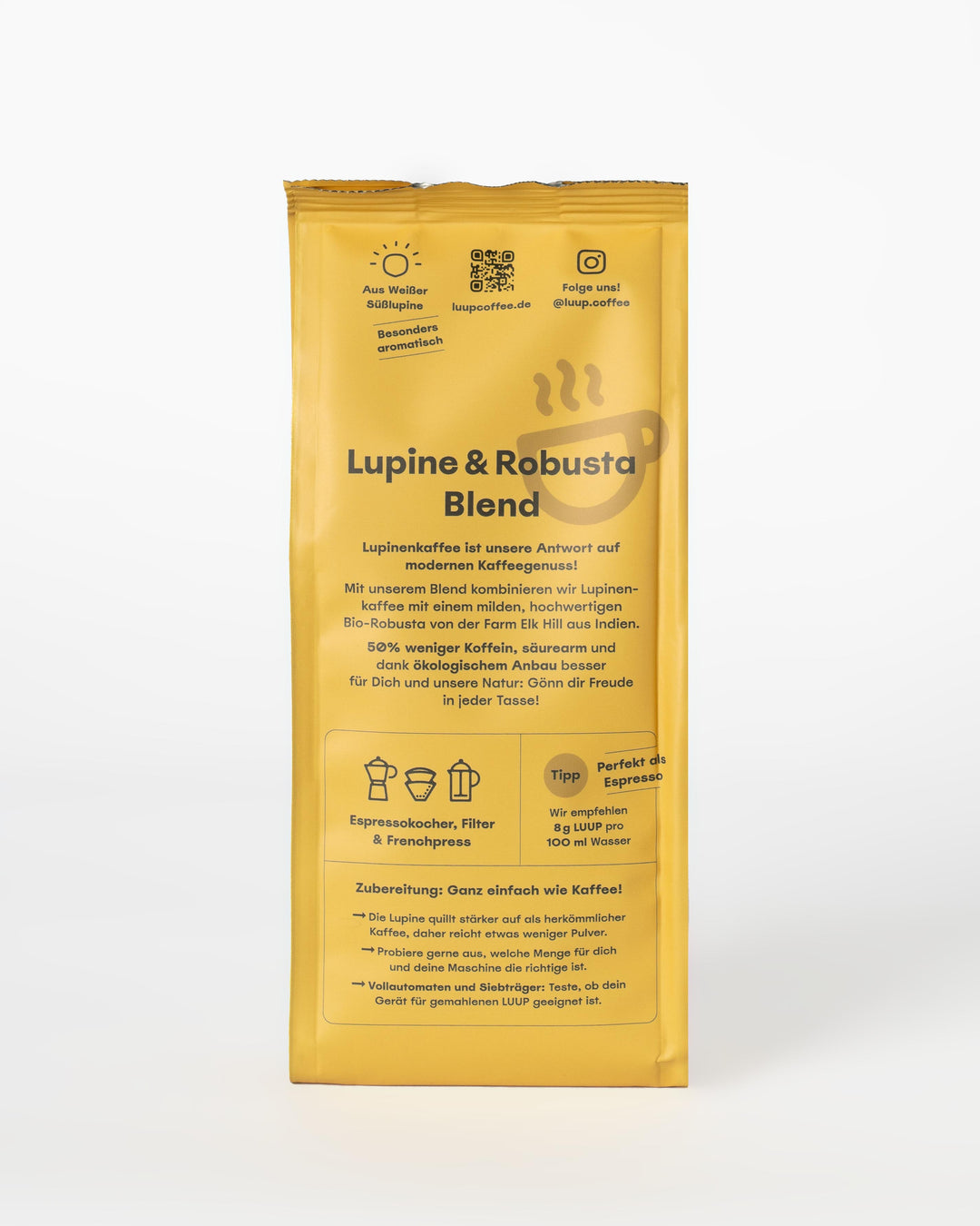
The packaging is a stand-up pouch made of flexible material, likely a composite of plastic and aluminum for barrier protection. It features a smooth surface with a matte finish, predominantly yellow in color. The front displays a large logo and product name in bold, contrasting colors, with additional text providing product information. The bag has a sealed top with a tear notch for easy opening and may include a resealable feature.

The packaging is a flat, stand-up pouch made from a flexible material, likely a combination of plastic and foil. It features a smooth surface with a matte finish. The front of the pouch has a large, smiling face graphic in a light yellow color, with the brand name 'LUUP' prominently displayed in green. Below the brand name, the product description 'LUPINEN KAFFEE' is printed in a smaller font. The overall design is minimalistic and modern, with a bright yellow background that contrasts with the white of the pouch.

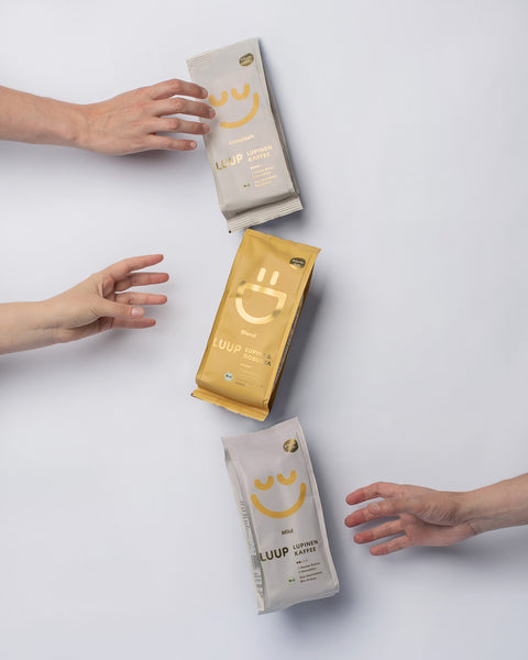
The packaging consists of multiple pouches arranged in a grid pattern. Each pouch features a smooth, flat construction typical of flexible packaging. The pouches are primarily yellow with a large, smiling face graphic and the brand name 'LUUP' prominently displayed. The overall design is clean and modern, with a matte finish that gives a premium feel. The pouches are sealed at the top and have a resealable feature, likely a zipper or similar closure.
About the Brand
LUUP Coffee, founded in 2020 in Düsseldorf, Germany, operates in the alternative coffee segment, offering caffeine-free, lupine-based beverages. The brand prioritizes regional sourcing and organic certification, positioning itself within a health-conscious, sustainability-oriented consumer market.
With a small but focused team, LUUP Coffee has built a loyal customer base by providing a unique product that addresses both wellness trends and environmental concerns. Their packaging reflects a commitment to quality and modern design, utilizing resealable, stand-up pouches and carton boxes constructed from recyclable materials.
Key Differentiator: LUUP Coffee differentiates itself through the exclusive use of 100% German lupines, strong organic credentials, and a packaging approach that balances sustainability with distinctive, approachable design.
Design System
Visual Style
Typography relies on bold, sans-serif fonts for clarity and modern appeal, paired with a high-contrast color palette dominated by bright yellows, greens, and neutrals. The aesthetic is minimalistic, leveraging white space and simple geometric shapes to enhance legibility and impact.
Brand Identity
The LUUP logo, featuring a stylized smiling face, is used prominently on all packaging. Iconography is playful yet clean, supporting a consistent, approachable brand image. Visual consistency is maintained through repeated use of signature colors and straightforward graphic elements.
Packaging Design
Material selection emphasizes recyclability and freshness retention, with flexible pouches using composite materials for barrier properties and carton boxes constructed from sturdy, responsibly sourced paperboard. Structural design prioritizes stand-up formats and resealable features for convenience and product protection.
User Experience
Design choices support an intuitive customer journey, from easy-to-open resealable pouches to visually distinctive graphics that aid rapid brand recognition. The combination of tactile finishes and clear labeling enhances both the unboxing experience and ongoing product use, reinforcing brand trust and loyalty.
Company Metrics
Business insights for luup coffee based on available data
Market Positioning
Brand Values & Focus
Key Competitors
Target Market: Health-conscious consumers seeking organic, caffeine-free coffee alternatives with a preference for sustainable, regionally sourced products. The primary market is German-speaking Europe, with a focus on direct-to-consumer e-commerce.
Packaging Assessment
Overall Grade
Visual appeal and presentation quality
Packaging durability and protection
Eco-friendliness and recyclable materials
Cost efficiency and value for money
Packaging assessment for luup coffee based on industry standards and best practices
Frequently Asked Questions
What types of packaging does LUUP Coffee use for its products?
LUUP Coffee utilizes a mix of flexible stand-up pouches and carton boxes, focusing on resealability, product freshness, and visual impact. Materials are predominantly recyclable and chosen to support both product protection and sustainability goals.
How does LUUP Coffee's packaging support its sustainability claims?
The brand uses recyclable paperboard and flexible packaging materials, minimizing environmental impact and aligning with its organic, regionally sourced product philosophy.
Is LUUP Coffee’s packaging optimized for e-commerce logistics?
Yes, the packaging formats—primarily stand-up pouches and sturdy cartons—are designed to withstand shipping stress, preserving product integrity and presentation through the delivery process.
Discover other Food & Drink companies
Explore more companies in the food & drink industry and their packaging strategies
ruf lebensmittelwerk kg
Food & Drink
RUF Lebensmittelwerk KG is a German food production company specializing in a variety of baking mixes and drink products. Founded in 1920, the company is known for its high-quality ingredients and innovative food solutions.
kerex - terre exotique
Food & Drink
Kerex - Terre Exotique specializes in the international trade of gourmet food and drink products, offering a unique selection of spices and culinary ingredients.
Teegschwendner GmbH
Food & Drink
Teegschwendner GmbH is a specialty tea company based in Germany, offering a wide selection of high-quality teas and tea-related accessories. They focus on providing unique tea experiences through carefully sourced and curated products.