lilly drogerie packaging
Lilly Drogerie is a leading Serbian retailer in the beauty and fitness sector, offering a diverse range of personal care products. The company utilizes a structured packaging strategy that emphasizes brand consistency, retail appeal, and product protection across both consumer and private label lines.
Packaging Portfolio
Lilly Drogerie's packaging portfolio is anchored in the use of single-layer paperboard retail cartons and robust corrugated shipping boxes. Retail packaging displays a high degree of brand integration, with consistent logo placement, clean typography, and color-coded accents for category differentiation. Corrugated materials are employed for bulk transport and in-store logistics, providing necessary durability while maintaining brand presence. Pharmaceutical and personal care lines utilize visually informative, tamper-evident cartons, reflecting a focus on compliance and consumer trust.
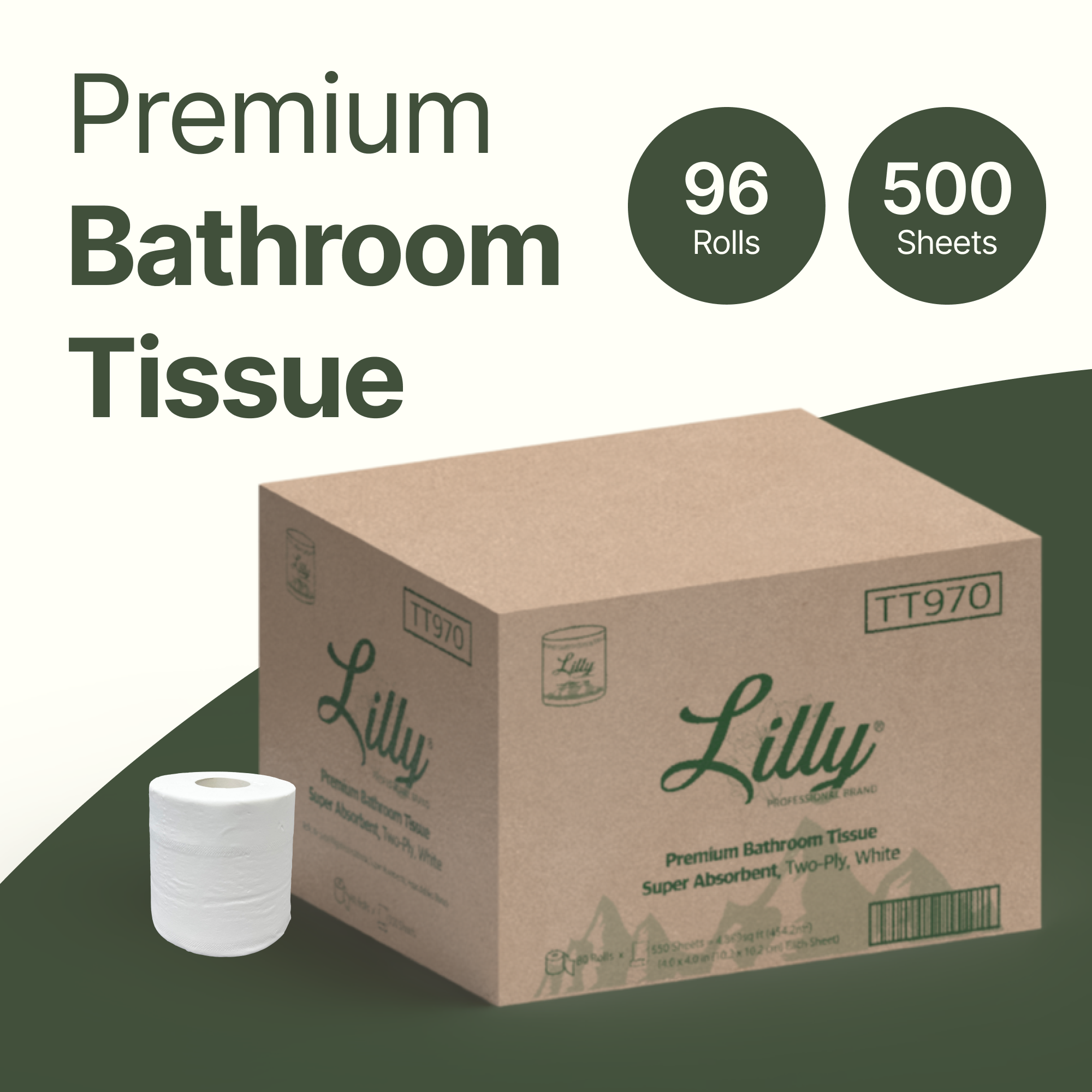
The packaging is a folding carton box designed for retail display. It has a smooth, flat construction with clean edges and folds. The exterior is predominantly white with green accents, featuring a large printed logo and product information. The box appears to be lightweight and is likely made from a single layer of paperboard.
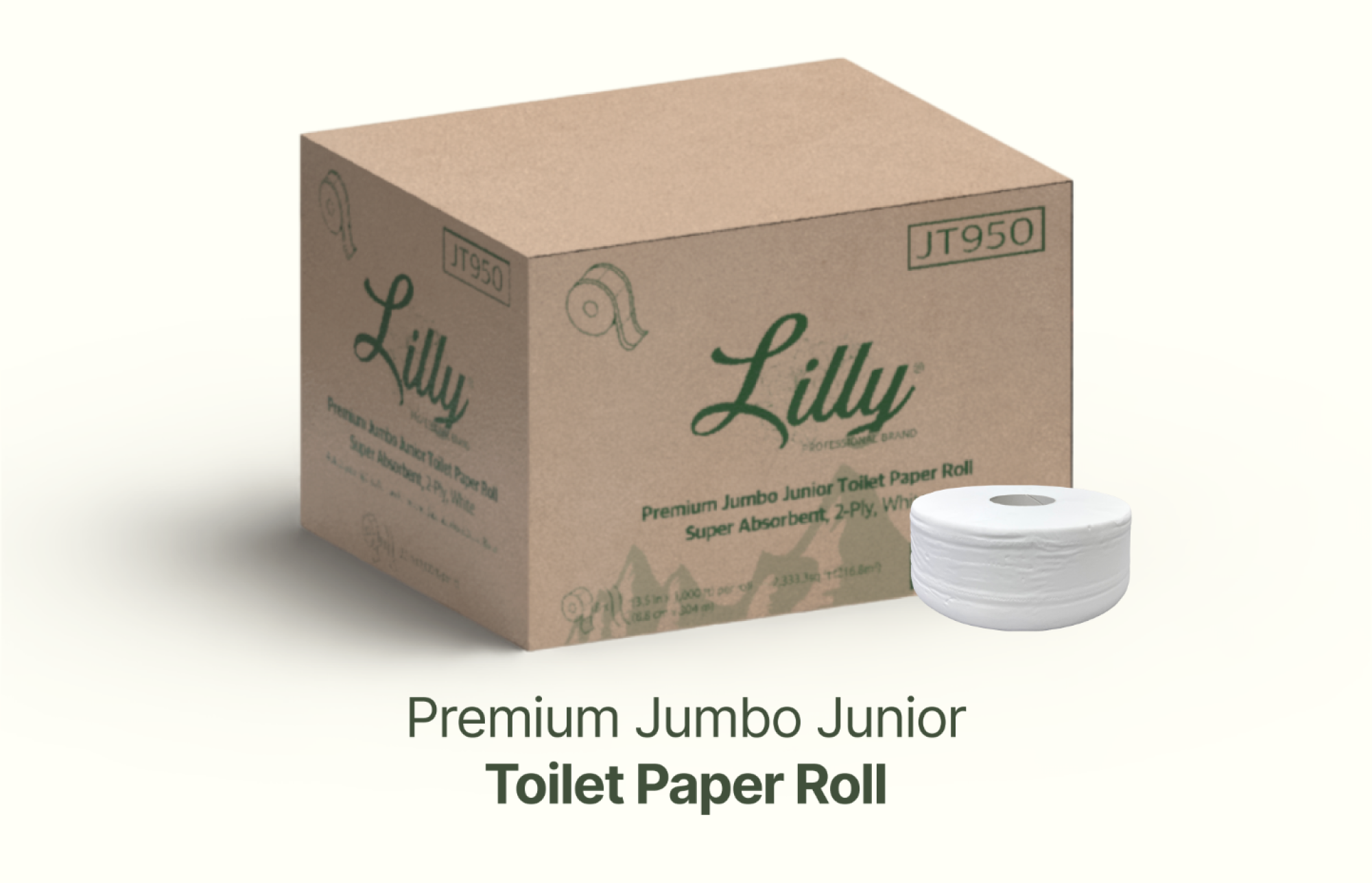
The packaging is a brown corrugated box with visible fluted layers when viewed from the side. The box has a sturdy construction suitable for shipping, with a rectangular shape and dimensions that accommodate a toilet paper roll. The exterior is printed with branding and product information, including the brand name 'Lilly' prominently displayed. The edges are clean, and the box appears to be in good condition with no visible signs of wear or damage.

The packaging consists of three identical folding cartons, each containing a vial of medication. The cartons are made of smooth, single-layer paperboard with clean edges and precise folds. The front of each carton features a white background with colorful graphics and text. The design includes a prominent logo and product name, making it visually appealing and informative. The sides and back of the cartons contain additional product information and instructions.

The packaging consists of two folding cartons, each containing a single-dose pen for injection. The boxes are made of smooth, flat paperboard with clean edges and folds. The exterior features a glossy finish with vibrant colors and printed graphics. Each box has a primary color scheme: one is predominantly white with a yellow accent, while the other has a white base with a purple accent. The front of each box displays the product name 'trulicity' prominently, along with dosage information and usage instructions. The sides of the boxes include additional product details and regulatory information.

The packaging consists of a flat, smooth, single-layer paperboard construction. It features clean, precise edges and folds, typical of retail packaging. The box is predominantly white with maroon accents, indicating a professional appearance suitable for pharmaceutical products. The front displays product information clearly, with a transparent window section showing the contents. The box is lightweight and appears to be designed for easy retail display.
About the Brand
Lilly Drogerie operates a broad retail network in Serbia, specializing in beauty, wellness, and personal care products. Their packaging strategy relies on a mix of carton and corrugated boxes, prioritizing consistent branding, effective logistics, and shelf impact. The company’s approach is characterized by the deployment of standardized retail cartons with clear brand identifiers and robust shipping containers for logistics.
Their packaging portfolio demonstrates high visual consistency, with each box displaying the Lilly logo, product information, and a clean, professional aesthetic. Primary packaging formats focus on single-layer paperboard cartons for retail display, while secondary packaging employs sturdy corrugated materials for transportation and bulk goods. The use of color-coded accents, precise folding, and high-quality printing underscores a deliberate effort to balance brand recognition and operational efficiency.
Key Differentiator: Lilly Drogerie distinguishes itself through the integration of strong branding elements across all packaging types, ensuring high visibility and uniformity from shelf to shipment.
Design System
Visual Style
Typography is clean and sans-serif, supporting readability and modern appeal; the color palette emphasizes white backdrops with vibrant accent colors (maroon, green, yellow, purple) for product differentiation. Overall aesthetic is professional, minimalist, and function-driven.
Brand Identity
Logo is prominently displayed on all packaging formats. Iconography is minimal, relying on product images and dosage or usage information. Visual consistency is achieved through uniform color schemes and typographic standards across products.
Packaging Design
Material selection favors recyclable paperboard for retail units and corrugated cardboard for shipping, prioritizing cost-efficiency and environmental considerations. Structural designs are straightforward, focusing on ease of stacking, retail display, and transportation safety.
User Experience
Packaging is designed for clarity and accessibility, guiding customers through product identification and usage instructions. The approach supports a consistent, trustworthy brand journey from shelf to home, though emotional engagement is moderate compared to premium or luxury segments.
Company Metrics
Business insights for lilly drogerie based on available data
Market Positioning
Brand Values & Focus
Key Competitors
Target Market: Mass-market consumers seeking beauty, personal care, and wellness products in Serbia, with a focus on both retail and e-commerce channels.
Packaging Assessment
Overall Grade
Visual appeal and presentation quality
Packaging durability and protection
Eco-friendliness and recyclable materials
Cost efficiency and value for money
Packaging assessment for lilly drogerie based on industry standards and best practices
Frequently Asked Questions
What packaging materials does Lilly Drogerie primarily use?
Lilly Drogerie predominantly uses single-layer paperboard cartons for retail products and corrugated cardboard for shipping and logistics, balancing shelf presence with transport durability.
How does Lilly Drogerie's packaging support its brand identity?
Packaging consistently features the Lilly logo, clean typography, and color schemes that are in line with the brand’s visual identity, reinforcing recognition and trust at the point of sale.
Is sustainability a priority in Lilly Drogerie's packaging choices?
While recyclable paperboard and corrugated materials are utilized, there is moderate emphasis on sustainability, with further opportunity for increased use of eco-friendly or recycled inputs.
How does the packaging impact the customer unboxing experience?
The unboxing experience is structured and visually consistent, providing clear product information and a professional impression, though emotional impact is moderate compared to highly specialized luxury brands.
Discover other Beauty & Fitness companies
Explore more companies in the beauty & fitness industry and their packaging strategies
Big Moustache
Beauty & Fitness
Big Moustache specializes in shaving and grooming products tailored for men, providing a hassle-free subscription service for razor blades and skincare essentials.
Orris Paris
Beauty & Fitness
Orris Paris specializes in creating artisanal skincare products that combine potent botanical ingredients with modern cleansing rituals. The company emphasizes natural, holistic practices in its formulations.
Owari
Beauty & Fitness
Owari specializes in 100% natural beauty and fitness products, designed to enhance health and wellness. The company proudly offers its products made in France, emphasizing quick delivery and customer support.