lashface&co packaging
lashface&co specializes in lash and brow enhancement products, offering a curated range for both consumers and beauty professionals. Their packaging strategy leverages minimalist, retail-ready carton boxes with strong branding, designed to optimize shelf presence and user experience.
Packaging Portfolio
lashface&co employs a unified packaging approach centered on single-layer paperboard cartons with a glossy finish, optimized for retail and e-commerce channels. The packaging consistently uses a light blue color palette with gold or white accents and employs modular numbering for product differentiation. Structural elements include tuck-top closures and occasional transparent inserts for product visibility. This configuration supports lightweight shipping, effective shelf display, and brand reinforcement, while allowing for efficient assembly and scalability in small-batch production.

The packaging consists of three individual boxes, each with a smooth, flat construction made from single-layer paperboard. The boxes are predominantly a light blue color with a glossy finish, featuring clean edges and precise folds. Each box is labeled with a number (N°1, N°2, N°3) and the brand name 'LASHFACE&CO. SWEDEN' prominently displayed. The design is minimalistic yet elegant, suitable for cosmetic products.

The packaging consists of two retail cartons, each featuring a smooth, flat construction without fluted layers. The boxes are primarily a vibrant blue color with a glossy finish, showcasing a modern and clean design. Each box has precise edges and folds, typical of folding cartons used for retail items. The front of the boxes displays the product number and brand name prominently, with a minimalist aesthetic.

The packaging consists of three individual boxes labeled as 'N°1', 'N°2', and 'N°3', each with a smooth, flat construction indicative of single-layer paperboard. The boxes are predominantly light blue with white text, featuring a clean and modern design. Each box has precise edges and folds, typical of retail packaging. The overall appearance is lightweight and suitable for cosmetic products.
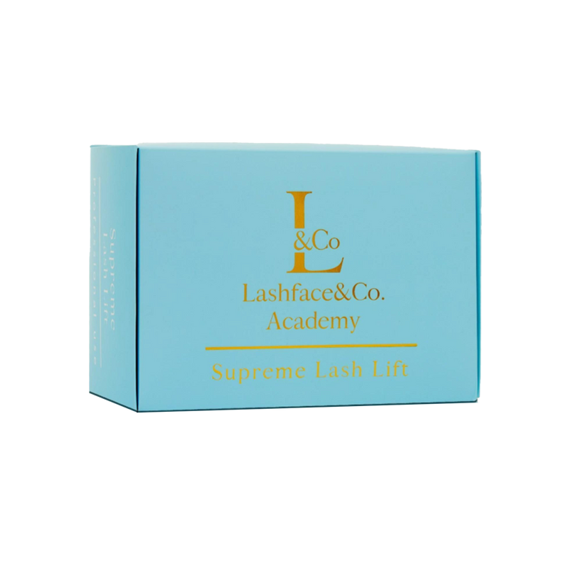
The packaging is a folding carton made from a single layer of paperboard, featuring a smooth, flat construction. The box is predominantly light blue with gold foil lettering, giving it a premium appearance. The edges are clean and precise, with no visible fluted layers. The box is designed to open from the top, with tuck tabs for closure. The overall shape is rectangular, suitable for retail display.

The packaging consists of three flat, rectangular boxes labeled as 'N°1', 'N°2', and 'N°3', each featuring a smooth, flat construction without fluted layers. The boxes are made from a single layer of paperboard, exhibiting a clean and precise edge. Each box has a glossy finish with a light blue background and white text. The boxes are designed to hold individual products, with a clear plastic organizer that has compartments for the items. The organizer is transparent, allowing visibility of the contents, and has a circular label on the front with the brand logo. The overall form is compact and rectangular, suitable for retail display.

The packaging consists of several retail cartons, each featuring a smooth, flat construction without visible fluted layers. The cartons are predominantly colored in a light blue with white accents. Each box has clean, precise edges and folds, indicative of a single-layer paperboard construction. The boxes are designed to hold individual sachets, suggesting a lightweight appearance suitable for retail display. The overall form is rectangular, optimized for shelf placement.
About the Brand
lashface&co is a Swedish beauty company focused on lash and brow care, serving both direct consumers and beauty professionals through high-quality cosmetic solutions. Their packaging portfolio relies on visually consistent, single-layer paperboard cartons that prioritize brand clarity and shelf appeal.
Operating from Gothenburg, lashface&co has developed a packaging ecosystem centered on lightweight, retail cartons with a clean, modern aesthetic. The consistent use of light blue tones, clear product numbering, and prominent brand marks delivers a cohesive identity across their product lines. Packaging formats are optimized for both retail display and e-commerce fulfillment, supporting the brand's omni-channel strategy.
Key Differentiator: The brand’s disciplined use of minimalistic, number-coded cartons with high visual consistency sets them apart in a crowded beauty segment, reinforcing both professional appeal and user trust.
Design System
Visual Style
Clean, modern typography with sans-serif fonts; primary color palette of light blue, white, and gold accents; minimalist layout with strong focus on whitespace and legibility.
Brand Identity
Prominent use of the LASHFACE&CO. logo and consistent placement of the 'SWEDEN' mark; iconography limited to product numbering (N°1, N°2, N°3); highly unified visual language across all packaging elements.
Packaging Design
Single-layer paperboard cartons with glossy finish, prioritizing lightweight construction and ease of assembly. Modular design supports product bundling and retail display, while maintaining clear branding and product identification.
User Experience
Design emphasizes clarity, ease of unboxing, and immediate product recognition. The visually consistent approach supports a seamless customer journey from online purchase through product use, reinforcing trust and brand recall.
Company Metrics
Business insights for lashface&co based on available data
Market Positioning
Brand Values & Focus
Key Competitors
Target Market: B2C beauty consumers and professional beauty practitioners seeking specialized lash and brow care solutions, primarily in Europe.
Packaging Assessment
Overall Grade
Visual appeal and presentation quality
Packaging durability and protection
Eco-friendliness and recyclable materials
Cost efficiency and value for money
Packaging assessment for lashface&co based on industry standards and best practices
Frequently Asked Questions
What types of packaging does lashface&co use for its products?
lashface&co utilizes single-layer paperboard cartons with glossy finishes, employing a modular design system featuring product numbers, consistent brand colors, and prominent logos. These retail cartons are optimized for shelf presence and e-commerce logistics.
How sustainable are lashface&co's packaging materials?
The packaging primarily uses recyclable paperboard materials, minimizing environmental impact. However, there is limited evidence of advanced sustainability practices such as compostable materials or reduced plastic usage.
What is the impact of lashface&co’s packaging on the unboxing experience?
The packaging’s clean lines, cohesive color palette, and clear brand elements contribute to a premium unboxing experience, enhancing perceived product quality and supporting brand differentiation.
Discover other Beauty & Fitness companies
Explore more companies in the beauty & fitness industry and their packaging strategies
Pure Altitude
Beauty & Fitness
Pure Altitude specializes in high-quality beauty and skincare products that leverage the expertise of spa treatments to enhance daily routines. The brand offers a diverse range of products tailored for both facial and body care.
Cultiv Cosmetique
Beauty & Fitness
Cultiv Cosmetique is a French skincare brand that provides organic and eco-friendly beauty products inspired by nature. They focus on effective skincare solutions for various skin concerns.
Owari
Beauty & Fitness
Owari specializes in 100% natural beauty and fitness products, designed to enhance health and wellness. The company proudly offers its products made in France, emphasizing quick delivery and customer support.