Kristallrummet packaging
Kristallrummet is a Swedish e-commerce retailer specializing in authentic crystals, gemstones, and spiritual gift items. Their packaging strategy leverages premium rigid and carton box structures with strong brand integration, focusing on both product protection and a memorable unboxing experience.
Packaging Portfolio
Kristallrummet’s packaging portfolio is anchored by rigid chipboard boxes and single-layer paperboard cartons, both featuring structural integrity for product protection and a premium tactile finish. The application of kraft and matte exteriors, combined with internal cotton-like fillers, enhances product safety for delicate gemstones and jewelry. Brand identity is consistently reinforced through printed logos, crystal-themed graphics, and color-coded labels, while closure mechanisms like snug-fitting lids and tuck tabs add both security and ease of use. The overall system reflects a balance between gift-ready presentation and logistical robustness.

The packaging is a small, square folding carton made of single-layer paperboard. It features a smooth, flat construction with clean edges and precise folds. The exterior is a light brown color, likely printed with a matte finish. The box is opened from the top, with a tuck tab closure. Inside, it contains a white cotton-like filler, which holds the items securely. The overall shape is compact and designed for retail display, suggesting a lightweight appearance suitable for small items.
The packaging consists of a sturdy, square-shaped box made from thick chipboard. The exterior is covered in a smooth, kraft-colored paper, giving it a natural and premium appearance. The box features a clean, precise construction with sharp edges and corners. Inside, the box is lined with white cotton or a similar soft material, providing a protective cushion for the contents. The lid of the box is adorned with a simple yet elegant design, likely featuring a logo or graphic that aligns with the brand's aesthetic.

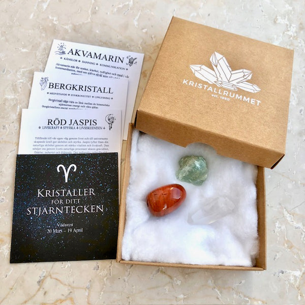
The packaging is a square box with a sturdy construction, made from thick chipboard. The exterior is a kraft brown color, giving it a natural and premium appearance. The box features a clean, smooth surface with no visible fluted layers, indicating it is not corrugated. The top of the box is adorned with a white logo of 'KRISTALLRUMMET' and a graphic of crystal shapes, which adds a touch of elegance. The edges are sharp and well-defined, suggesting precise manufacturing. The box has a simple, fold-over lid that fits snugly, indicating a secure closure without additional fasteners.

The packaging is a rigid box with a sturdy construction, featuring a thick chipboard material. The exterior is a matte gold color with a smooth finish, giving it a premium appearance. The box is square-shaped and opens from the top, revealing a soft white interior that holds the contents securely. The lid fits snugly onto the base, ensuring durability and protection for the items inside.

The packaging is a rectangular box made of a single-layer paperboard, featuring a smooth, flat construction without any visible fluted layers. The box is wrapped in a kraft paper finish, giving it a natural, rustic appearance. It is tied with a twine string, which adds a handmade touch. The box has a pink circular label affixed to one side, displaying the brand name and logo prominently.
About the Brand
Kristallrummet delivers a curated selection of crystals, gemstones, and holistic wellness products, distributing primarily through its online platform. The company’s packaging approach prioritizes sturdy, visually appealing rigid boxes and carton boxes, each featuring prominent branding and natural material finishes.
Packaging components are selected to reinforce brand values of authenticity and quality, with a consistent use of kraft and matte finishes, precise structural forms, and protective internal fillers. The integration of logos and crystal motifs across packaging ensures brand recall, while the emphasis on minimal yet premium presentation aligns with the expectations of their niche, gift-oriented market.
Key Differentiator: Kristallrummet stands out for its cohesive, brand-centric packaging solutions that balance aesthetic appeal, product safety, and a tactile, eco-conscious unboxing experience tailored to high-value, giftable items.
Design System
Visual Style
Utilizes clean, modern sans-serif typography, a natural color palette dominated by kraft brown, matte gold, and soft pink accents, and minimalist layouts that highlight both product and brand elements.
Brand Identity
Consistent logo application, typically featuring 'KRISTALLRUMMET' with an established date, crystal iconography, and clear visual hierarchy. Brand visuals are applied across all packaging types for immediate recognition.
Packaging Design
Preference for rigid chipboard and single-layer paperboard for strength and sustainability; matte and kraft finishes support a natural, premium brand image. Interior fillers like cotton bolster both protection and visual appeal.
User Experience
Packaging is designed to evoke an emotional response and reinforce perceived product value, with intuitive opening mechanisms and carefully chosen internal layouts supporting both gifting and safe transit. Consistency in branding and material quality enhances customer trust and repeat purchase likelihood.
Company Metrics
Business insights for Kristallrummet based on available data
Market Positioning
Brand Values & Focus
Key Competitors
Target Market: Consumers in Sweden and the broader Nordic region seeking authentic crystals, gemstones, and spiritual gift items, with an emphasis on those valuing holistic wellness and premium presentation.
Packaging Assessment
Overall Grade
Visual appeal and presentation quality
Packaging durability and protection
Eco-friendliness and recyclable materials
Cost efficiency and value for money
Packaging assessment for Kristallrummet based on industry standards and best practices
Frequently Asked Questions
What packaging materials does Kristallrummet primarily use?
Kristallrummet primarily utilizes rigid chipboard boxes and single-layer carton boxes, often finished in kraft or matte paper and complemented by cotton fillers for protection.
How does the packaging support the brand identity?
Packaging features the Kristallrummet logo, year of establishment, and crystal-themed graphics, ensuring high brand visibility and consistency across formats.
Is Kristallrummet’s packaging eco-friendly?
The use of recyclable paper-based materials and minimalist design indicates a moderate to high level of sustainability, but further data on sourcing and end-of-life practices would clarify overall impact.
Discover other Gifts & Special Events companies
Explore more companies in the gifts & special events industry and their packaging strategies
Sheila Fleet Jewellery
Gifts & Special Events
Sheila Fleet Jewellery specializes in handcrafted silver, gold, and platinum jewelry inspired by the beauty of Orkney, Scotland.
Bunnies By The Bay Inc.
Gifts & Special Events
Bunnies By The Bay is a company that specializes in creating high-quality, personalized baby gifts and plush toys designed to bring joy and comfort to children.
Luftballon GmbH
Gifts & Special Events
Luftballon GmbH specializes in providing a wide range of balloons and balloon printing services for business clients, schools, and public institutions. They promote environmentally friendly products made from 100% natural latex.