Killer Ink Tattoo packaging
Killer Ink Tattoo supplies professional tattoo artists and studios with a broad range of equipment, inks, and hygiene products, primarily via a robust e-commerce platform. Their packaging strategy leverages branded corrugated shipping boxes and retail cartons, balancing durability, brand visibility, and cost efficiency.
Packaging Portfolio
Killer Ink Tattoo’s packaging portfolio features branded corrugated boxes—predominantly kraft with bold logo print—for secure shipment of tattoo inks, machines, and hygiene supplies. Retail-oriented folding cartons employ high-contrast black and red color schemes with matte and glossy finishes, optimized for both shelf presence and product protection. The consistent use of recyclable materials in shipping formats indicates a moderate commitment to sustainability, while retail cartons prioritize visual impact and ease of handling. This dual-approach supports both logistics efficiency and consumer-facing presentation.
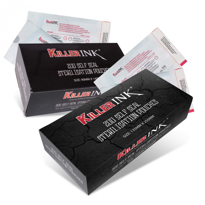
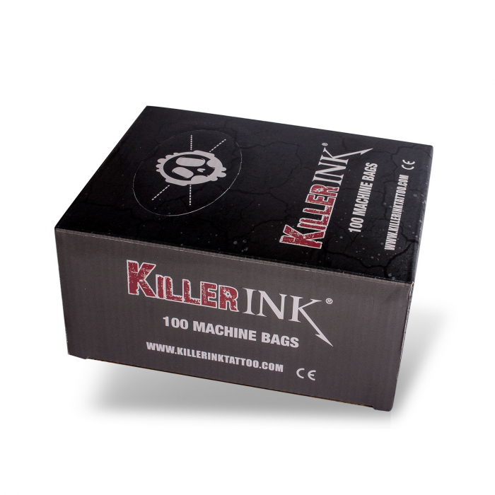
The packaging consists of a smooth, flat construction made from single-layer paperboard. The box has clean, precise edges and folds, indicative of a folding carton design. The exterior features a predominantly black color with a textured appearance, resembling a stone or cracked surface, which adds a rugged aesthetic. The front displays bold red and white typography for the brand name 'Killer INK', along with product information in smaller text. The overall design is striking and eye-catching, suitable for retail display.
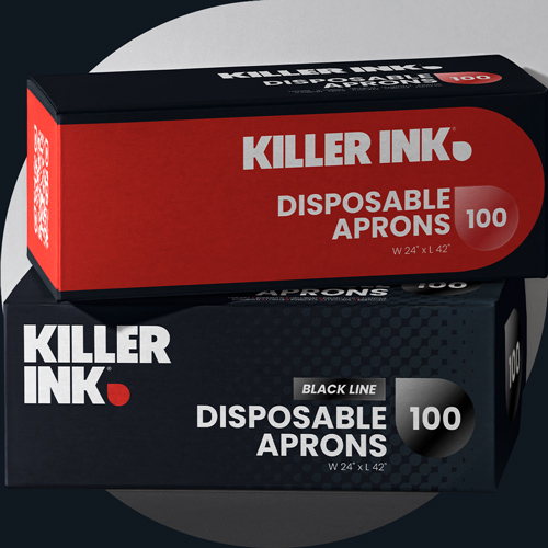
The packaging consists of two rectangular folding cartons stacked on top of each other. Each carton has a smooth, flat construction without any visible fluted layers, indicating they are made from single-layer paperboard. The cartons are predominantly black and red, featuring bold white text. The design includes a clean, modern aesthetic with precise edges and folds, typical of retail packaging. The top carton has a glossy finish, while the bottom one appears matte.
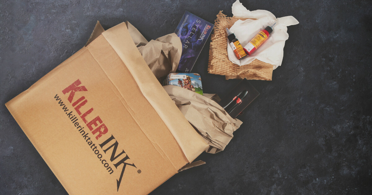
The packaging is a corrugated box with a brown kraft exterior. It features visible fluted edges when viewed from the side, indicating its sturdy construction. The box is partially open, revealing crumpled paper and various items inside. The exterior has a printed logo in bold red letters, 'KILLERINK', along with the website URL, www.killerinktattoo.co.uk, printed in black. The box shows signs of handling with slight crushing at the edges.
The packaging is a brown kraft corrugated box with visible fluted edges when viewed from the side. The box appears to be partially open, revealing various items inside, including bottles and a product box. The exterior has a simple design with the brand name 'KILLER INK' prominently displayed in bold red letters on the front. The box shows signs of handling, with some crumpling and wear evident on the edges.
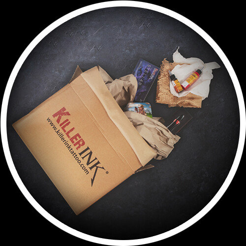
The packaging is a sturdy corrugated box with a visible fluted inner layer, characterized by its brown kraft exterior with printed graphics. The box has a rectangular shape with clean edges and is designed for shipping. It features a top flap that folds down to close securely. The surface has a matte finish with a textured appearance, and the box shows no significant signs of wear or damage.
About the Brand
Killer Ink Tattoo is a UK-based e-commerce provider specializing in tattoo supplies, offering a diverse product portfolio tailored for professionals and apprentices in the tattoo industry. Their packaging approach integrates custom-branded corrugated boxes and folding cartons, supporting both shipping protection and retail display requirements.
The company employs a mix of sturdy corrugated shipping boxes for logistics and visually distinctive folding cartons for retail and hygiene products. Branding is consistently applied with bold logos, color schemes, and product information, reinforcing recognition across the supply chain. The integration of eco-friendly kraft materials and a focus on presentation quality reflects sector-specific demands for both safety and aesthetics.
Key Differentiator: Killer Ink Tattoo’s distinctive edge lies in its combination of robust logistics packaging and high-impact retail cartons, with a consistent, bold brand presence tailored to the tattoo industry’s aesthetics.
Design System
Visual Style
Typography is bold, sans-serif, and high-contrast; primary colors are black, red, and white, creating an assertive and modern aesthetic aligned with tattoo industry trends. Visual hierarchy is reinforced through striking graphics and large brand marks.
Brand Identity
Logo usage is consistent and dominant on all packaging formats, supported by clear typographic hierarchy and minimalistic iconography. Visual consistency is maintained across shipping and retail solutions, ensuring immediate brand recognition.
Packaging Design
Material choices focus on corrugated kraft for shipping durability and single-layer paperboard for retail presentation. Structural design emphasizes protective features for transit and clean edges with precise folds for in-store display, balancing cost and function.
User Experience
Packaging is designed to streamline the customer journey from shipment protection to compelling unboxing. Clear branding and information architecture enhance both first impressions and product usability, while consistent design elements support trust and repeat engagement.
Company Metrics
Business insights for Killer Ink Tattoo based on available data
Market Positioning
Brand Values & Focus
Key Competitors
Target Market: Professional tattoo artists, apprentices, and studio operators in the UK and Europe seeking reliable and branded tattoo supplies with efficient logistics.
Packaging Assessment
Overall Grade
Visual appeal and presentation quality
Packaging durability and protection
Eco-friendliness and recyclable materials
Cost efficiency and value for money
Packaging assessment for Killer Ink Tattoo based on industry standards and best practices
Frequently Asked Questions
What types of packaging does Killer Ink Tattoo use for shipping and retail?
Killer Ink Tattoo utilizes corrugated kraft boxes with branded print for shipping and transit protection, alongside custom folding carton boxes for retail products, hygiene supplies, and studio essentials. Both formats emphasize durability and consistent brand identity.
How does Killer Ink Tattoo address sustainability in its packaging?
The company incorporates recyclable kraft materials in its corrugated shipping boxes and maintains a focus on material efficiency. However, further details on advanced sustainability initiatives, such as biodegradable inks or reduced plastic content, are not explicitly provided.
What is the primary focus of Killer Ink Tattoo’s packaging design?
Their design focuses on balancing product protection, efficient logistics, and strong brand recognition, ensuring safe delivery and a visually coherent unboxing experience for both professionals and retail customers.
Discover other Beauty & Fitness companies
Explore more companies in the beauty & fitness industry and their packaging strategies
Orris Paris
Beauty & Fitness
Orris Paris specializes in creating artisanal skincare products that combine potent botanical ingredients with modern cleansing rituals. The company emphasizes natural, holistic practices in its formulations.
Institut Karité Paris
Beauty & Fitness
Institut Karité Paris specializes in luxury beauty products made with natural Shea Butter, offering a wide range of skincare and body care solutions. The brand combines Parisian heritage with a commitment to quality and creativity in its offerings.
Pure Altitude
Beauty & Fitness
Pure Altitude specializes in high-quality beauty and skincare products that leverage the expertise of spa treatments to enhance daily routines. The brand offers a diverse range of products tailored for both facial and body care.