Kalia Nature packaging
Kalia Nature specializes in hair care solutions for textured hair, leveraging natural ingredients and a direct-to-consumer business model. Their packaging strategy emphasizes brand visibility, sustainability, and a premium unboxing experience tailored to the beauty sector.
Packaging Portfolio
Kalia Nature employs a diverse range of packaging formats, including rigid glass and plastic jars for creams and masks, folding paperboard cartons for retail display, and transparent zippered pouches for travel kits. Packaging structures emphasize both durability and aesthetic shelf impact, with vibrant, brand-consistent designs across all SKUs. The use of recyclable paperboard and reusable jars reflects a moderate-to-high sustainability focus, while flexible pouches enhance portability and merchandising flexibility. This multi-material, multi-format approach is aligned with the demands of the beauty and personal care sector.
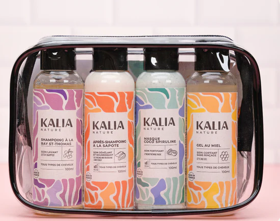
The packaging is a transparent, zippered pouch containing four bottles of hair care products. The pouch is made of a flexible plastic material, allowing visibility of the contents. Each bottle is labeled with a distinct design featuring colorful patterns and the brand name prominently displayed. The pouch has a smooth surface and is rectangular in shape, designed for travel convenience.

The packaging is a transparent zippered pouch containing hair care products. The front features a colorful design with abstract purple and pink swirls on a white background. The product name 'Trousse Cheveux Ondulés' is prominently displayed in bold black font, along with the description of the contents in smaller text. The back of the pouch is clear, allowing visibility of the products inside. The zipper closure is black, and the overall shape is rectangular.

The packaging is a cylindrical jar with a thick, sturdy chipboard base and a plastic lid. The jar is predominantly white with a matte finish, featuring a decorative design in warm colors that resembles organic shapes. The lid is black and smooth, providing a contrast to the jar's body. The overall appearance is sleek and modern, suitable for cosmetic products.

The packaging consists of two cylindrical jars and one square box, all featuring a clean, modern design. The jars are made of clear glass with white lids, showcasing the product inside. The square box is made of smooth, flat paperboard with precise edges and folds. The overall appearance is bright and colorful, with a combination of pastel colors and bold graphics.
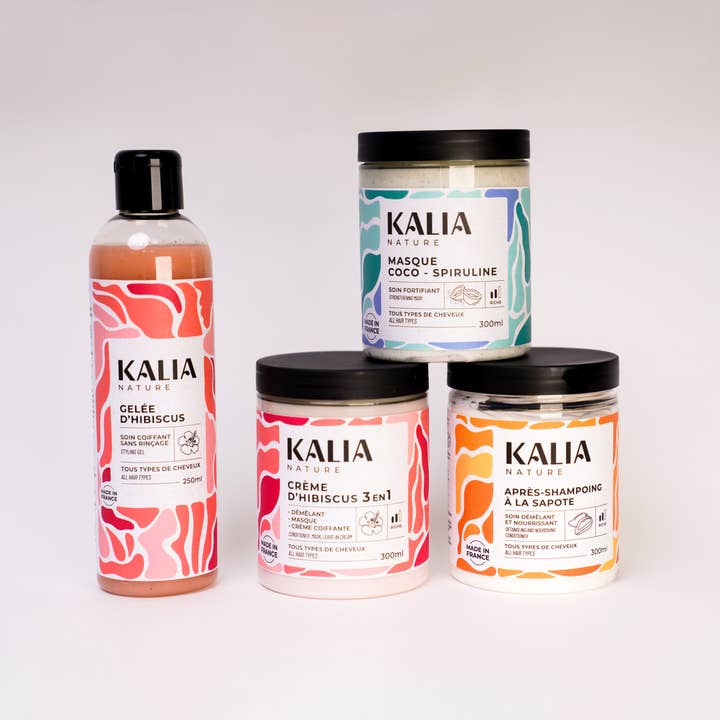
The packaging consists of a set of rigid jars and a bottle. The jars are cylindrical with thick walls, providing a sturdy and premium feel. Each jar has a smooth surface finish, likely with a matte or glossy coating, and features colorful graphics. The bottle is also cylindrical, made of a similar rigid material, with a clear or semi-transparent appearance. The overall design is modern and appealing, with vibrant colors and artistic patterns.
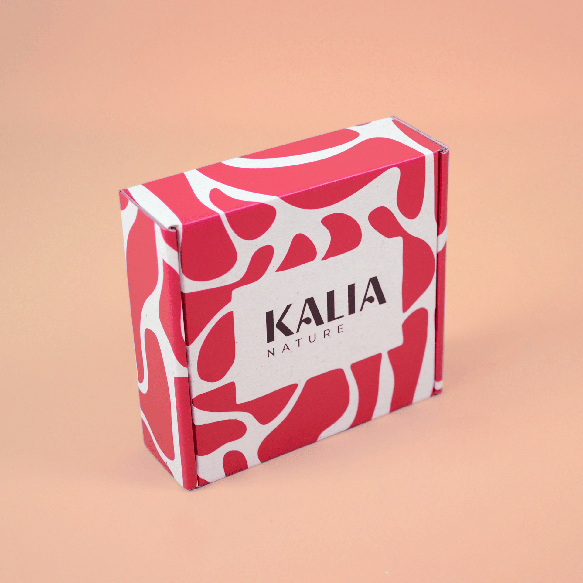
The packaging is a small, square folding carton with a smooth, flat construction. It features a vibrant pink and white abstract design that covers the entire exterior. The edges are clean and precise, indicating a well-constructed fold. The front displays the brand name 'KALIA' prominently in a bold, modern font, with 'NATURE' underneath in a smaller size. The overall appearance is lightweight and designed for retail display.
About the Brand
Kalia Nature is a French beauty company focused on formulating and delivering hair care products for textured hair, including creams, masks, and conditioners. Their direct-to-consumer business model is supported by a strong digital presence and a commitment to sustainable, brand-aligned packaging solutions.
Operating since 2011, Kalia Nature combines Caribbean-inspired botanicals with modern cosmetic science, addressing the unique needs of curly, wavy, and coily hair types. Their packaging portfolio includes rigid jars, retail cartons, and transparent pouches, all designed for both shelf appeal and logistical efficiency. The company's packaging consistently integrates brand identity, leveraging vibrant visuals and high-quality materials to reinforce customer perception of product quality and natural focus.
Key Differentiator: Kalia Nature's unique differentiation lies in its fusion of natural ingredient sourcing, targeted hair care solutions, and a packaging system that mirrors its eco-conscious, culturally inspired brand ethos.
Design System
Visual Style
The visual style is characterized by clean sans-serif typography, a pastel-driven color palette with vibrant accent hues (pinks, purples, and warm tones), and modern, abstract graphic motifs that evoke natural and Caribbean influences.
Brand Identity
Logo usage is prominent on all primary and secondary packaging, reinforced by consistent iconography and clear product naming. Visual consistency is achieved through unified color schemes, layout standards, and recurring design elements, supporting strong shelf recognition.
Packaging Design
Material choices prioritize a mix of recyclable paperboard for cartons, durable glass or plastic for jars, and flexible plastics for travel pouches. Structural design focuses on ease of use, product protection, and maximizing brand exposure at point-of-sale and during unboxing.
User Experience
The packaging design supports the customer journey by offering tactile quality, intuitive opening mechanisms, and clearly legible product information, enhancing perceived value and reinforcing the brand's commitment to natural, effective beauty solutions.
Company Metrics
Business insights for Kalia Nature based on available data
Market Positioning
Brand Values & Focus
Key Competitors
Target Market: Eco-conscious beauty consumers in France and Europe seeking specialized hair care for textured hair, with a strong appeal to individuals valuing natural ingredients and premium presentation.
Packaging Assessment
Overall Grade
Visual appeal and presentation quality
Packaging durability and protection
Eco-friendliness and recyclable materials
Cost efficiency and value for money
Packaging assessment for Kalia Nature based on industry standards and best practices
Frequently Asked Questions
What types of packaging materials does Kalia Nature use?
Kalia Nature utilizes a mix of rigid glass and plastic jars, paperboard cartons, and flexible plastic pouches. The selection is informed by product needs, shelf visibility, and sustainability objectives.
How sustainable is Kalia Nature's packaging?
Packaging choices reflect a commitment to eco-friendly practices, favoring recyclable materials and minimizing excess waste, though the use of some plastics indicates room for further improvement.
Does Kalia Nature prioritize the unboxing experience for customers?
Yes, their packaging design emphasizes visual appeal, tactile quality, and cohesive branding, enhancing the emotional impact of the unboxing process.
Discover other Beauty & Fitness companies
Explore more companies in the beauty & fitness industry and their packaging strategies
Orris Paris
Beauty & Fitness
Orris Paris specializes in creating artisanal skincare products that combine potent botanical ingredients with modern cleansing rituals. The company emphasizes natural, holistic practices in its formulations.
Pure Altitude
Beauty & Fitness
Pure Altitude specializes in high-quality beauty and skincare products that leverage the expertise of spa treatments to enhance daily routines. The brand offers a diverse range of products tailored for both facial and body care.
Owari
Beauty & Fitness
Owari specializes in 100% natural beauty and fitness products, designed to enhance health and wellness. The company proudly offers its products made in France, emphasizing quick delivery and customer support.