Kaffa Roastery packaging
Kaffa Roastery is a Finnish specialty coffee producer focused on premium, ethically sourced coffee. Their packaging strategy leverages flexible, visually distinctive stand-up pouches designed for both product preservation and brand recognition.
Packaging Portfolio
Kaffa Roastery’s packaging portfolio is centered on flexible, stand-up pouches constructed from multi-layer laminate films, designed to optimize barrier properties for aroma and freshness retention. Packaging formats include resealable zip closures and gusseted bottoms for shelf stability and consumer convenience. Visual differentiation is achieved through bold, saturated color palettes and high-contrast typography, supported by clear labeling and integrated certification icons. The choice of flexible materials reflects a balance between logistics efficiency and product protection, while design consistency across SKUs enhances brand cohesion.

The packaging is a stand-up pouch made of a flexible material, likely a multi-layer laminate that includes a barrier to protect the contents. The front features a vibrant blue background with large yellow text stating 'KAFFA ROASTERY', along with a smaller text 'AINA' and a graphic element that suggests coffee-related imagery. The design is modern and appealing, aimed at attracting consumers in a retail environment.
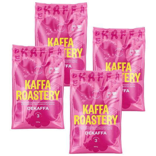
The packaging consists of four pouches of coffee, each featuring a vibrant pink color with bold yellow text. The bags are sealed at the top and have a flat bottom, allowing them to stand upright. The surface is smooth with a glossy finish, and the design includes a large logo and product name prominently displayed. The bags are likely made from a multi-layered flexible material that provides barrier properties to preserve freshness.
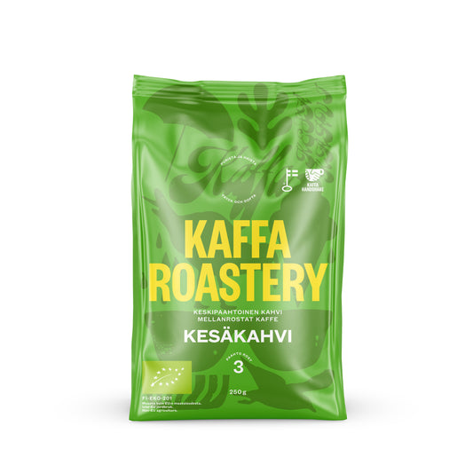
The packaging is a stand-up pouch made from a flexible material, likely a multi-layer film that provides barrier properties for freshness. The front features a vibrant green color with the brand name 'KAFFA ROASTERY' prominently displayed in bold yellow letters. There are additional graphics and icons indicating product information, such as coffee type and certifications. The top of the pouch has a resealable zipper, and the bottom is gusseted to allow it to stand upright.
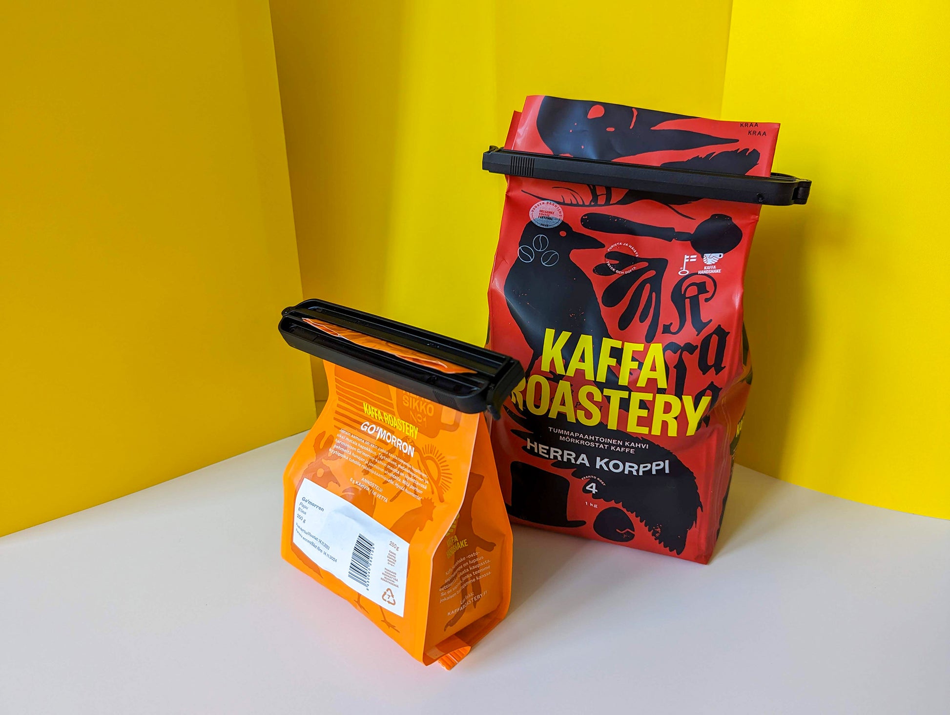
The image shows two stand-up pouches with vibrant colors. The larger pouch is predominantly red with black graphics, featuring the brand name 'KAFFA ROASTERY' in bold yellow letters. The design includes abstract illustrations of coffee-related elements. The smaller pouch is orange with a white label, displaying product information in a clear font. Both pouches have a resealable top closure and a flat bottom, allowing them to stand upright.
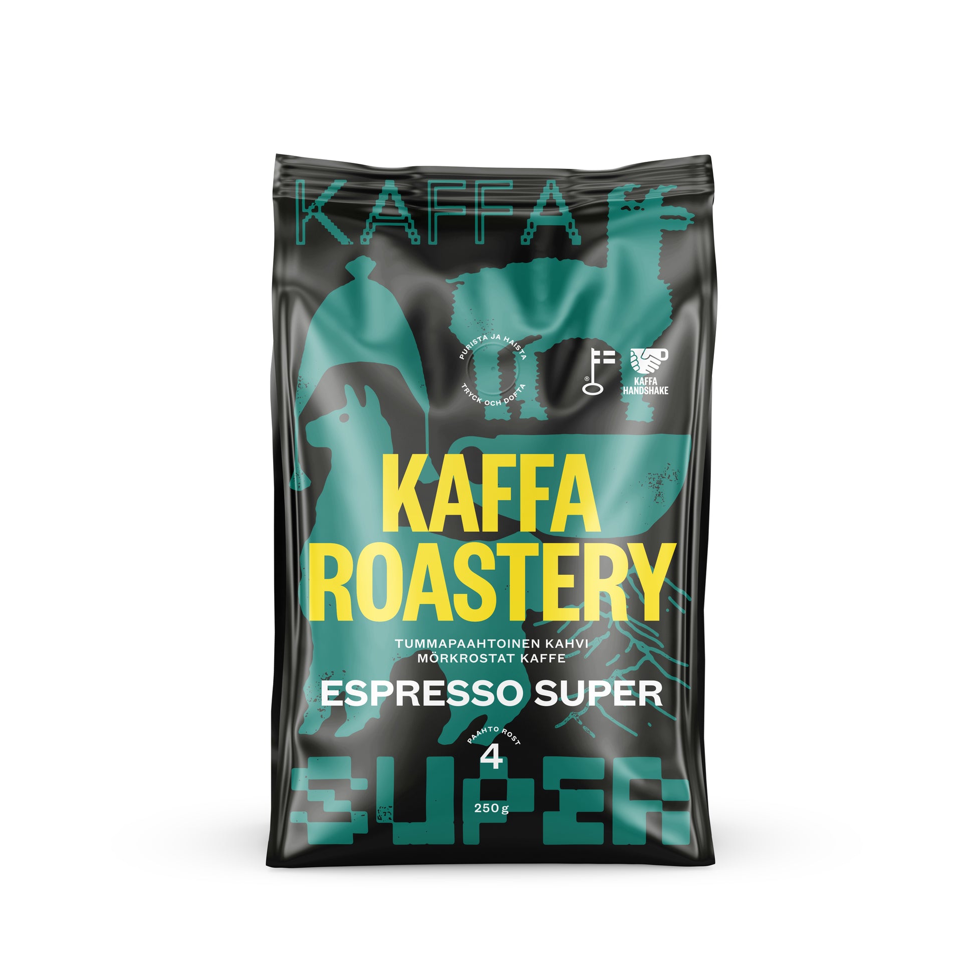
The packaging is a flexible bag designed for coffee, featuring a matte black background with vibrant turquoise and yellow graphics. The front prominently displays the brand name 'KAFFA ROASTERY' in large, bold letters, with the product name 'ESPRESSO SUPER' below it. The design includes abstract shapes and icons related to coffee, enhancing its visual appeal. The bag has a sealed top and a bottom gusset, allowing it to stand upright.
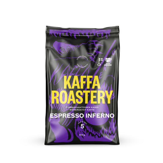
The packaging is a stand-up pouch designed for coffee, featuring a glossy finish with vibrant colors. The front displays a bold design with a mix of purple and black, incorporating abstract graphics that suggest a dynamic and energetic feel. The brand name 'KAFFA ROASTERY' is prominently placed at the top in large, white, uppercase letters, while the product name 'ESPRESSO INFERNO' is displayed below in a contrasting color. The overall design is modern and eye-catching, appealing to coffee enthusiasts.
About the Brand
Kaffa Roastery specializes in high-quality coffee, with a strong emphasis on ethical sourcing and sustainability. The company utilizes modern, branded flexible packaging to maintain product freshness, ensure shelf appeal, and communicate their values to consumers.
Operating on a direct-to-consumer model, Kaffa Roastery targets coffee enthusiasts who value both quality and environmental responsibility. Their packaging approach aligns closely with their brand identity, leveraging high-impact colors and clear typographic elements to differentiate on retail shelves and in e-commerce environments. The use of multi-layer flexible pouches with resealable features reflects a balance between product protection, user convenience, and visual storytelling.
Key Differentiator: Kaffa Roastery’s packaging is characterized by vibrant, brand-consistent designs and a clear focus on sustainability, aimed at fostering loyalty among environmentally conscious consumers.
Design System
Visual Style
The visual system leverages bold, contemporary typography (primarily uppercase sans-serif), a vibrant and varied color palette (including turquoise, yellow, pink, blue, red, and green), and abstract coffee-related graphics. The overall aesthetic is modern, energetic, and tailored to the specialty coffee market.
Brand Identity
Logos and company names are prominently featured on all packaging, often in large, contrasting text. Iconography is used to highlight certifications and product features, ensuring visual consistency and immediate brand recognition across the range.
Packaging Design
Multi-layer flexible materials are selected for high barrier performance and resealability. Structural choices—such as stand-up pouches with gussets—support both product protection and retail display. The design philosophy prioritizes freshness, visual impact, and environmental considerations in material selection.
User Experience
Packaging supports the customer journey by facilitating easy opening, resealing, and storage. The use of vibrant colors and clear labeling enhances the unboxing experience, while sustainability messaging and certification icons reinforce the brand’s values and build trust with environmentally conscious consumers.
Company Metrics
Business insights for Kaffa Roastery based on available data
Market Positioning
Brand Values & Focus
Key Competitors
Target Market: Ethically minded coffee consumers and specialty coffee enthusiasts in Finland and international markets seeking premium coffee with sustainable packaging.
Packaging Assessment
Overall Grade
Visual appeal and presentation quality
Packaging durability and protection
Eco-friendliness and recyclable materials
Cost efficiency and value for money
Packaging assessment for Kaffa Roastery based on industry standards and best practices
Frequently Asked Questions
What types of packaging does Kaffa Roastery use for their coffee products?
Kaffa Roastery primarily utilizes flexible stand-up pouches made from multi-layer laminate materials, offering resealable closures to ensure freshness and enhance consumer convenience.
How does Kaffa Roastery address sustainability in packaging?
The company emphasizes the use of barrier materials that optimize product shelf life, while integrating design elements that highlight sustainability certifications and ethical sourcing, though full recyclability details depend on the specific laminate choices used.
Is the packaging design consistent across product lines?
Yes, Kaffa Roastery maintains a cohesive visual identity across its product portfolio, with bold color schemes, prominent logos, and modern typography that reinforce brand recognition.
Discover other Food & Drink companies
Explore more companies in the food & drink industry and their packaging strategies
Terres de Café
Food & Drink
Terres de Café is a specialty coffee retailer based in Paris, France, known for its commitment to sustainability and high-quality coffee sourcing.
Teegschwendner GmbH
Food & Drink
Teegschwendner GmbH is a specialty tea company based in Germany, offering a wide selection of high-quality teas and tea-related accessories. They focus on providing unique tea experiences through carefully sourced and curated products.
Thés de la Pagode
Food & Drink
Thés de la Pagode is a French company specializing in organic teas and infusions, focusing on health and well-being. Established in 1987, they prioritize sustainable practices and high-quality ingredients sourced through fair trade.