Kaadu packaging
Kaadu is a food and drink company focused on ethically sourced, sustainable snacks. Their packaging approach prioritizes visual transparency, resealability, and brand consistency, supporting both product freshness and consumer trust.
Packaging Portfolio
Kaadu’s packaging portfolio predominantly utilizes flexible, transparent stand-up pouches with zip closures and single-layer paperboard carton boxes. Flexible pouches offer product visibility, resealability, and efficient use of materials, making them suitable for portioned snacks and powders. Carton boxes provide structural integrity for secondary packaging and retail display. The material mix focuses on light weight and recyclability, supporting cost-effective logistics while aligning with sustainability targets. Branding is consistently applied across formats, ensuring clear product identification and reinforcing ethical positioning.

The packaging is a tall, rectangular carton box made of smooth, single-layer paperboard. It features a clean and precise construction with sharp edges and folds. The box is predominantly white with colorful graphics and text printed on the front and sides. The top of the box has a flap that is folded down, indicating a tuck closure. The front displays a playful design with a character made from the toy pieces inside, along with the product name and piece count.

The packaging is a transparent stand-up pouch made from a flexible material that allows it to maintain an upright position. The front of the pouch showcases the product through a clear window, while the back is opaque. The top features a zip closure for resealability. The pouch is filled with a brown powder, likely the jaggery powder, and has a matte finish overall.

The packaging appears to be a retail carton made from a single layer of paperboard. It has a smooth, flat construction with clean edges and folds. The carton is primarily white with colorful graphics and text on the front, indicating its function and brand. The overall design is simple yet effective for retail display.
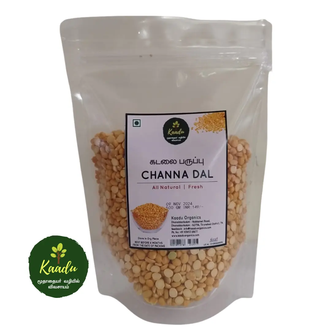
The packaging is a transparent stand-up pouch made of a flexible material that allows it to maintain an upright position. The front of the pouch showcases the contents, which are yellow channa dal, clearly visible through the clear plastic. The top of the pouch features a resealable zipper closure, allowing for easy access and storage. The design includes a green circular logo at the bottom left, indicating the brand name 'Kaadu' along with the product name 'Channa Dal' in bold text. The overall appearance is clean and modern, with a focus on the natural aspect of the product.
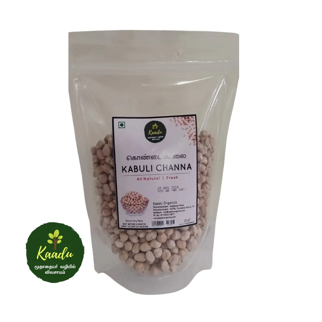
The packaging is a transparent stand-up pouch made of a flexible material that allows it to maintain an upright position. The pouch has a smooth surface with a clear window showcasing the contents inside. The top of the pouch features a resealable zipper closure, providing convenience for storage. The overall shape is rectangular with rounded corners, and the sides are slightly curved to enhance stability when standing.
About the Brand
Kaadu specializes in sustainably produced snacks, targeting health-conscious consumers who value ethical sourcing and environmental responsibility. The brand uses flexible stand-up pouches and carton boxes, emphasizing visibility of the product and protective features.
Operating on a direct-to-consumer model, Kaadu aligns its packaging with its core values of transparency and sustainability. The use of transparent, resealable flexible pouches and retail-ready carton boxes demonstrates an integrated approach to convenience, freshness, and efficient logistics. The relatively small scale of the company allows for nimble adjustments in packaging to meet evolving sustainability targets, though current information suggests a balance between recyclability and cost considerations.
Key Differentiator: Kaadu’s distinctive commitment to 'radikal-fair' production extends to its packaging strategy, combining clear product presentation with resealable, consumer-friendly formats that reinforce both ethical sourcing and brand transparency.
Design System
Visual Style
Kaadu employs clean sans-serif typography and a palette of earthy, natural tones (greens, browns, and whites) to reinforce organic and sustainable cues. Layouts are minimalist, prioritizing clarity and product transparency.
Brand Identity
The brand features a circular logo and consistent use of the 'Kaadu' name, ensuring immediate recognition. Product names and taglines are clearly presented, and iconography is minimal to maintain a focus on ingredient purity and ethical values.
Packaging Design
Material choices emphasize flexible plastics with transparent windows for primary packaging and recyclable paperboard for secondary packaging. The structural design philosophy prioritizes resealability, ease of handling, and shelf stability while maintaining a low material footprint.
User Experience
Packaging supports a straightforward, trustworthy customer journey by enabling quick product identification, easy opening and reclosing, and a visually transparent unboxing experience that aligns with the brand’s fair and open ethos.
Company Metrics
Business insights for Kaadu based on available data
Market Positioning
Brand Values & Focus
Key Competitors
Target Market: Health-conscious and environmentally aware consumers seeking ethically produced snacks, primarily in Switzerland and adjacent European markets.
Packaging Assessment
Overall Grade
Visual appeal and presentation quality
Packaging durability and protection
Eco-friendliness and recyclable materials
Cost efficiency and value for money
Packaging assessment for Kaadu based on industry standards and best practices
Frequently Asked Questions
What types of packaging does Kaadu use for its snacks?
Kaadu employs transparent, resealable stand-up pouches and paperboard carton boxes. These formats enhance product visibility, freshness, and retail display while supporting logistics efficiency.
How does Kaadu address sustainability in its packaging?
Kaadu prioritizes recyclable materials and minimalistic designs, with an emphasis on reducing environmental impact through material selection and resealable features that support product longevity.
Is the unboxing experience a focus for Kaadu?
Kaadu’s packaging design focuses on clean, natural aesthetics and functional convenience, offering a straightforward unboxing experience that highlights product freshness and brand transparency.
Discover other Food & Drink companies
Explore more companies in the food & drink industry and their packaging strategies
kerex - terre exotique
Food & Drink
Kerex - Terre Exotique specializes in the international trade of gourmet food and drink products, offering a unique selection of spices and culinary ingredients.
ruf lebensmittelwerk kg
Food & Drink
RUF Lebensmittelwerk KG is a German food production company specializing in a variety of baking mixes and drink products. Founded in 1920, the company is known for its high-quality ingredients and innovative food solutions.
Teegschwendner GmbH
Food & Drink
Teegschwendner GmbH is a specialty tea company based in Germany, offering a wide selection of high-quality teas and tea-related accessories. They focus on providing unique tea experiences through carefully sourced and curated products.