Julie Sandlau packaging
Julie Sandlau is a Danish jewelry brand recognized for its sculptural designs and refined aesthetics. Their packaging strategy emphasizes premium rigid boxes and elegant carton formats aligned with the brand’s focus on quality, protection, and elevated unboxing experiences.
Packaging Portfolio
Julie Sandlau’s packaging portfolio centers around rigid set-up boxes constructed from thick chipboard and lined with soft, plush materials for product protection. The use of light, neutral color palettes and minimalist branding supports a luxury positioning, while compact carton boxes are utilized for secondary or retail display packaging. Structural designs prioritize clean edges, secure closures, and tactile finishes, enhancing both product safety and visual impact. Overall, the portfolio demonstrates a disciplined approach to material selection and presentation, with a focus on premium user experience.

The packaging consists of a thick, sturdy chipboard box with a premium appearance. The box is covered in a soft, textured paper, likely with a matte finish, and features a clean, precise fold. Inside, there is a soft cleaning cloth made of fabric, which is cut in a zigzag pattern along the edges. The box has a light color, possibly pale pink, with the brand name 'JULIE SANDLAU' prominently displayed in a stylish font. The overall design is elegant and minimalistic, suitable for jewelry packaging.

The packaging consists of multiple rigid boxes, all featuring a premium construction with thick walls. The boxes have a luxurious appearance, covered in a textured light beige or cream-colored material. The boxes are square with clean, precise edges and folds, indicating high-quality craftsmanship. The interior of the boxes is lined with a soft, plush material, likely in a darker shade, to protect the contents. The exterior has a subtle sheen, enhancing the premium feel.
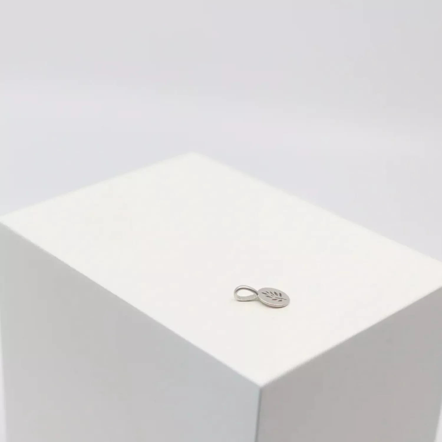
The packaging is a sturdy, thick-walled box with a smooth, white exterior. It has a clean and minimalist design, featuring a simple metallic charm on the top, which adds a touch of elegance. The box appears to have a seamless construction with sharp, precise edges and corners, indicative of high-quality manufacturing. There are no visible flaps or tabs, suggesting it may have a lift-off lid or a magnetic closure.
_(12)_(13)_(14)_(15)_(16)_(17).png?v=119201954)
The packaging is a square, rigid box with a thick, sturdy construction. It features a smooth, flat surface with a light beige color and a subtle sheen. The box has a lid that fits snugly over the base, showcasing a clean and elegant design. The edges are well-defined, and the corners are sharp, indicating high-quality craftsmanship. The interior is likely lined with a soft material, enhancing the premium feel.

The packaging consists of a smooth, flat construction with clean edges and folds. The box is predominantly a light color, likely white or a soft pastel, featuring a glossy finish. The top of the box has a printed logo and product information in a stylish font, indicating it is designed for retail display. The box is compact and square in shape, suitable for holding a small product, possibly jewelry-related. There are no visible fluted layers, confirming it as a carton box.
About the Brand
Julie Sandlau specializes in contemporary jewelry, offering pieces characterized by high craftsmanship and personal storytelling. The brand operates direct-to-consumer, serving a style-conscious audience with a strong international presence.
Operating from Denmark, Julie Sandlau leverages its brand narrative and design ethos to differentiate in a competitive jewelry market. The company invests in packaging that not only protects delicate items but also reinforces luxury branding through meticulous material selection and minimalist design. Packaging is tailored to complement the unboxing ritual, utilizing premium rigid boxes, soft linings, and consistent visual branding.
Key Differentiator: Julie Sandlau’s unique value lies in the integration of personal storytelling with high-end, design-consistent packaging, resulting in a cohesive and emotionally resonant customer experience.
Design System
Visual Style
Typography is elegant and sans-serif, set against a neutral palette of beiges, creams, and soft pastels. The overall aesthetic is minimalist, with subtle sheen and texture to reinforce premium cues.
Brand Identity
Logo application is restrained yet prominent, typically centered and foil-stamped or printed in metallic or muted tones. Iconography is minimal, ensuring visual consistency and strong brand recognition across all packaging formats.
Packaging Design
Materials include rigid chipboard for primary packaging and high-quality cartons for secondary packaging. Structural design principles focus on durability, sharp geometry, seamless closures, and a tactile, soft-touch experience.
User Experience
Packaging is designed to guide the customer through a deliberate unboxing sequence, emphasizing anticipation and emotional engagement. Interior linings and included accessories, such as cleaning cloths, reinforce a sense of care and exclusivity, supporting the brand’s narrative-driven approach.
Company Metrics
Business insights for Julie Sandlau based on available data
Market Positioning
Brand Values & Focus
Key Competitors
Target Market: Fashion-forward consumers and jewelry enthusiasts seeking premium, design-led accessories that reflect personal identity and style.
Packaging Assessment
Overall Grade
Visual appeal and presentation quality
Packaging durability and protection
Eco-friendliness and recyclable materials
Cost efficiency and value for money
Packaging assessment for Julie Sandlau based on industry standards and best practices
Frequently Asked Questions
What types of packaging does Julie Sandlau use for their jewelry?
Julie Sandlau primarily utilizes rigid boxes with soft linings and high-quality carton boxes, focusing on protective structures and luxury presentation. Their packaging often features minimalist branding and is designed for both retail display and direct shipping.
How does Julie Sandlau ensure product safety during shipping?
The company employs thick-walled rigid boxes and snug-fitting lids to minimize product movement and damage. Interior linings and sturdy materials enhance durability and secure jewelry during transit.
Is Julie Sandlau’s packaging environmentally sustainable?
Julie Sandlau’s packaging incorporates premium paper-based materials, which are potentially recyclable. However, the emphasis on luxury rigid boxes may limit full recyclability or the use of post-consumer content, resulting in moderate sustainability performance relative to best-in-class eco-packaging.
Discover other Apparel companies
Explore more companies in the apparel industry and their packaging strategies
SUICOKE JAPAN
Apparel
SUICOKE specializes in high-quality footwear and apparel, focusing on unique designs and comfort. The brand is recognized for its innovative sandals and commitment to quality craftsmanship.
Alexander Shorokhoff
Apparel
Alexander Shorokhoff is a luxury watch manufacturer that specializes in creating unique and artistic timepieces. Their products blend traditional craftsmanship with modern designs, appealing to discerning customers worldwide.
ALTI
Apparel
ALTI specializes in unique, handcrafted silver jewelry designed by skilled artisans in Sweden. The company offers a range of customizable options and promotes a tranquil lifestyle through its jewelry collections.