JOOP! packaging
JOOP! is a German-based fashion brand specializing in contemporary apparel and accessories, with a focus on sophisticated design and premium presentation. Their packaging strategy leverages high-quality materials and structured formats to reinforce brand image and ensure secure, visually appealing delivery.
Packaging Portfolio
JOOP!'s packaging solutions primarily utilize rigid chipboard boxes and single-layer folding carton formats, optimizing for both retail presentation and e-commerce shipment. High-gloss and matte finishes are standard, with custom inserts frequently used to secure products such as fragrance bottles and accessories. Visual branding is consistently applied through bold typography and signature color schemes, while structural integrity and material thickness are prioritized for product protection. Packaging choices reflect a balance between luxury appeal, durability, and sustainability.
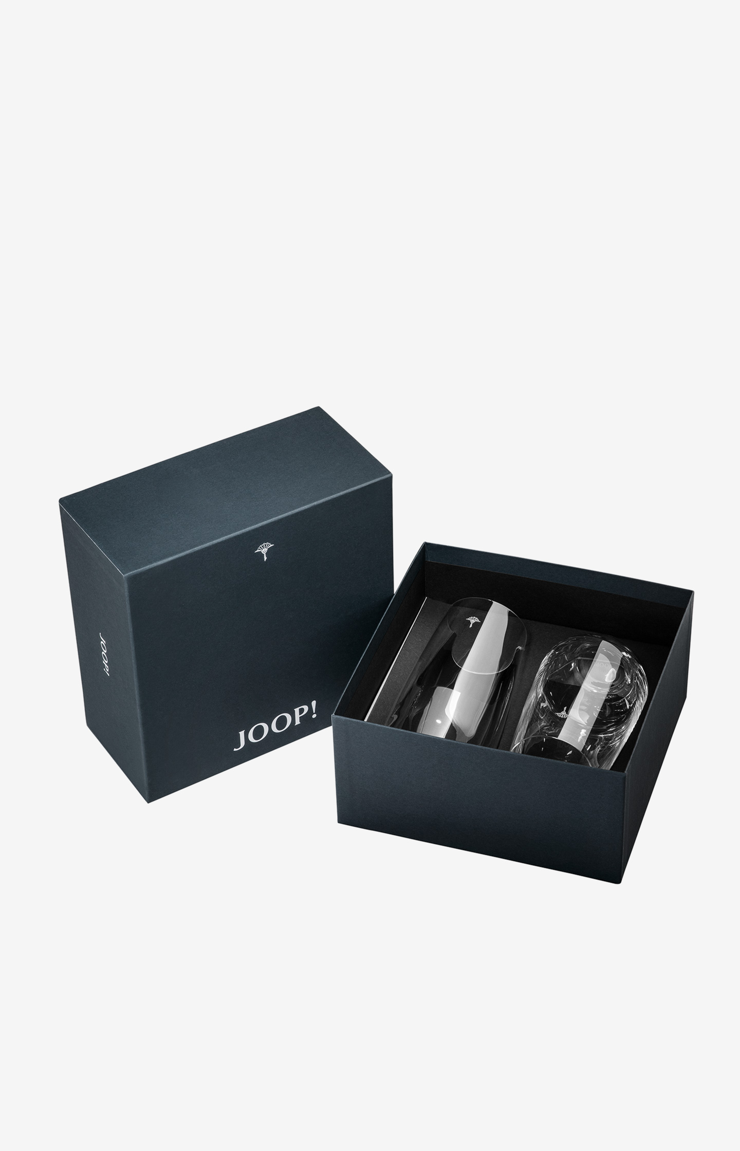
The packaging is a sturdy, thick-walled box with a premium appearance. It features a dark navy blue exterior with a matte finish, giving it a luxurious feel. The box is open at the top, revealing two products inside, each secured with a transparent plastic cover. The interior is likely designed to hold the products securely, possibly with custom inserts. The edges are clean and well-defined, indicating high-quality construction.
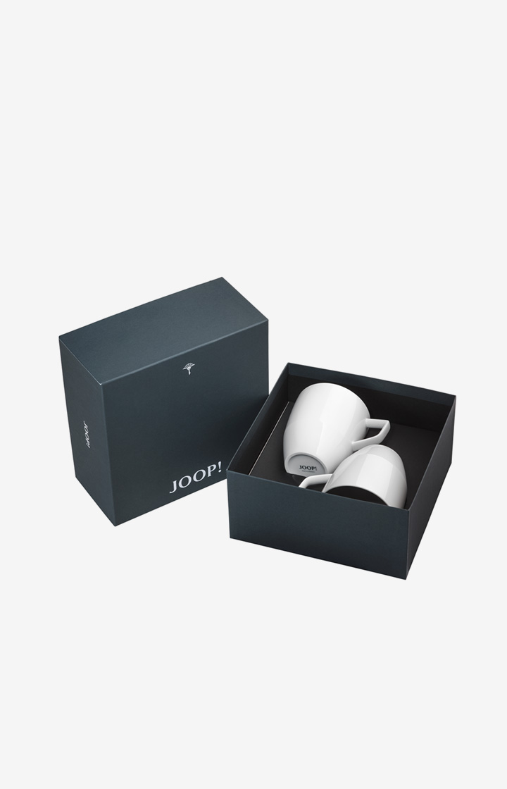
The packaging is a square rigid box with a sturdy construction, featuring a matte dark blue exterior. The box has a clean, smooth surface with no visible fluted layers, indicating it is made from thick chipboard. The interior is a contrasting lighter shade, possibly a soft-touch finish, providing a premium feel. The box is designed to hold two white mugs securely, with a snug fit that prevents movement. The edges are sharp and well-defined, showcasing high-quality craftsmanship.
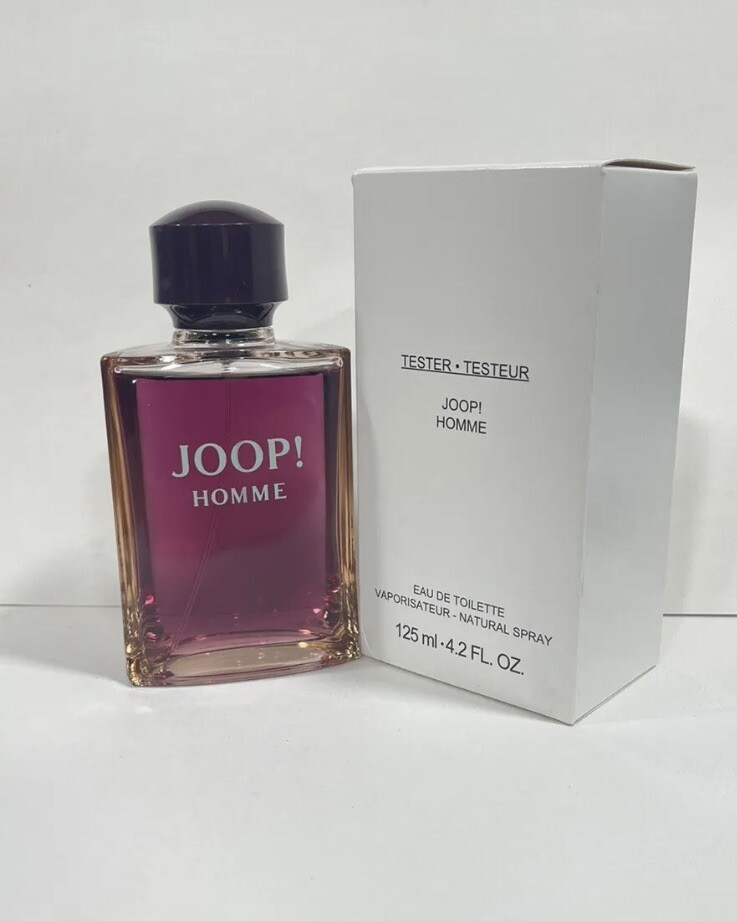
The packaging is a retail carton box designed for a fragrance product. It features a smooth, flat construction without any visible fluted layers, indicating it is made from single-layer paperboard. The box is predominantly white with a glossy finish, giving it a clean and modern appearance. The front displays the brand name 'JOOP!' prominently, along with the product name 'HOMME' in a bold font. The overall design is minimalistic, with a focus on the brand identity.

The packaging features a sturdy construction with thick chipboard walls, providing a premium feel. The exterior is adorned with a glossy finish that enhances the visual appeal. The box is designed to hold a perfume bottle and a shower gel, with a clear display of the products through the transparent window. The overall shape is rectangular, with clean edges and precise folds, indicative of high-quality manufacturing.

The packaging is a folding carton box designed for retail display. It features a smooth, flat construction without any visible fluted layers, indicating it is made from single-layer paperboard. The box has a glossy finish, with clean edges and precise folds. The front showcases a gradient color scheme transitioning from dark to light, with the brand name 'JOOP!' prominently displayed in a bold, modern font. The back and sides contain product information and branding elements, maintaining a consistent design throughout.

The packaging consists of a smooth, flat construction made of single-layer paperboard. The box is predominantly white with a glossy finish, featuring clean, precise edges and folds. The front displays the brand name 'JOOP!' in bold black letters, with 'HOMME' beneath it in a slightly smaller font. The overall design is minimalistic and elegant, typical for fragrance packaging, conveying a sense of luxury.
About the Brand
JOOP! operates in the premium apparel segment, delivering modern clothing and accessories to a diverse customer base. The brand emphasizes a strong visual identity and integrates sustainable elements into both product and packaging design.
With a direct-to-consumer e-commerce model, JOOP! prioritizes packaging that balances luxury aesthetics with logistical functionality. Their packaging portfolio includes both rigid and folding carton boxes, often utilizing gloss or matte finishes, and consistently incorporates prominent branding. This attention to packaging detail supports the brand’s positioning in the competitive European fashion market.
Key Differentiator: JOOP! stands out for its cohesive integration of brand storytelling and sophisticated packaging design, combining luxury presentation with sustainability initiatives.
Design System
Visual Style
JOOP! employs a modern, minimalist design language featuring bold sans-serif typography, a predominantly dark blue and white color palette, and high-contrast finishes. The overall aesthetic emphasizes clarity, elegance, and sophistication.
Brand Identity
The JOOP! logo is prominently displayed on all packaging surfaces, with strict adherence to proportional scaling and placement. Iconography is minimal, ensuring the brand mark and product names remain the visual focal points. Design consistency is maintained across all packaging lines.
Packaging Design
Material selection prioritizes rigid chipboard for premium sets and single-layer paperboard for folding cartons, often with gloss or matte coatings. Structural designs are clean and geometric, engineered for both shelf presence and shipping durability. Inserts and partitions are used where necessary to secure delicate items.
User Experience
Packaging is designed to deliver a premium unboxing experience, supporting the brand's upscale positioning. The tactile and visual qualities of materials, along with secure fit and easy access, contribute to a positive customer journey and reinforce brand value at the point of interaction.
Company Metrics
Business insights for JOOP! based on available data
Market Positioning
Brand Values & Focus
Key Competitors
Target Market: Fashion-conscious consumers in Europe and globally seeking premium, modern apparel and accessories with an emphasis on quality and brand experience.
Packaging Assessment
Overall Grade
Visual appeal and presentation quality
Packaging durability and protection
Eco-friendliness and recyclable materials
Cost efficiency and value for money
Packaging assessment for JOOP! based on industry standards and best practices
Frequently Asked Questions
What types of packaging does JOOP! use for its apparel and accessories?
JOOP! utilizes a mix of rigid boxes and folding carton formats, with an emphasis on premium materials and finishes that deliver a luxury unboxing experience while providing strong product protection.
How does JOOP! address sustainability in its packaging?
JOOP! incorporates eco-friendly materials where feasible and maintains a focus on recyclable paperboard and chipboard substrates, with some product lines highlighting sustainable packaging choices.
What impact does JOOP!'s packaging have on the customer experience?
Packaging plays a key role in reinforcing the brand's luxury positioning, with high attention to detail, clean design, and premium finishes contributing to a positive and memorable customer journey.
Discover other Apparel companies
Explore more companies in the apparel industry and their packaging strategies
Alexander Shorokhoff
Apparel
Alexander Shorokhoff is a luxury watch manufacturer that specializes in creating unique and artistic timepieces. Their products blend traditional craftsmanship with modern designs, appealing to discerning customers worldwide.
ALTI
Apparel
ALTI specializes in unique, handcrafted silver jewelry designed by skilled artisans in Sweden. The company offers a range of customizable options and promotes a tranquil lifestyle through its jewelry collections.
SUICOKE JAPAN
Apparel
SUICOKE specializes in high-quality footwear and apparel, focusing on unique designs and comfort. The brand is recognized for its innovative sandals and commitment to quality craftsmanship.