Jho packaging
Jho is a French direct-to-consumer brand specializing in organic menstrual and intimate care products, prioritizing sustainability and transparency. Their packaging strategy leverages biodegradable carton boxes with modern, branded designs to reinforce eco-conscious values and product safety.
Packaging Portfolio
Jho’s packaging portfolio is anchored in single-layer paperboard folding cartons, optimized for both retail and direct-to-consumer distribution. The structured, flat-pack designs leverage precise folds and clean edges to ensure product integrity and presentation. Color palettes incorporate whites, pastels, and vibrant accents, while surface finishes range from matte to glossy for tactile and visual distinction. Printed graphics emphasize clarity and brand identity, and all packaging solutions are designed to be lightweight, fully recyclable, and suitable for sensitive product categories.

The packaging consists of two retail cartons that are smooth and flat, made from single-layer paperboard. They feature clean edges and folds, with a light orange color and a matte finish. The cartons are designed for retail display, likely containing cotton products, as indicated by the text on the packaging. Each carton has a simple, modern design with rounded corners.

The packaging is a folding carton with a smooth, flat construction. It features a predominantly white exterior adorned with a playful heart pattern in red. The edges are clean and precise, indicating a well-constructed box suitable for retail display. The box is designed to hold multiple products, including a box of tampons and a tube of lubricant, both branded with 'Jho'. The interior is visible, showcasing the products neatly arranged within.

The packaging consists of multiple retail cartons made from single-layer paperboard. Each carton features a smooth, flat surface with clean edges and folds. The predominant color is orange, with green and white accents. The design includes rounded shapes and a playful layout, typical for consumer-friendly products. The cartons are lightweight and appear to be designed for easy shelf display.

The packaging consists of several small, flat boxes made from single-layer paperboard. Each box has a smooth, flat construction with clean edges and precise folds. The boxes are brightly colored, featuring a combination of red, yellow, and white hues, with a glossy finish. They are designed for retail display and are lightweight in appearance. The boxes are stacked next to a tipped-over cup, suggesting a playful arrangement.

The packaging is a folding carton made of smooth, flat paperboard. It features a clean, precise construction with sharp edges and folds. The box has a light pastel color scheme with a combination of purple, yellow, and white, creating a modern and appealing aesthetic. The front displays the brand name 'Jho,' prominently, along with product information in both French and English. The overall design is minimalistic yet vibrant, aimed at attracting consumer attention.
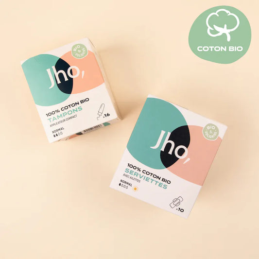
The packaging consists of two retail cartons, each made of smooth, single-layer paperboard. The boxes have clean, precise edges and folds, with a predominantly white background featuring colorful geometric shapes in soft pastel tones. The design includes a circular logo and product information prominently displayed on the front. The boxes are lightweight in appearance and designed for retail display.
About the Brand
Jho operates in the beauty and fitness sector with a focus on organic, biodegradable feminine hygiene solutions. The company’s packaging approach centers on single-layer paperboard cartons engineered for both retail appeal and environmental responsibility. Clear branding and ingredient transparency are integral to their packaging strategy.
Founded in 2018, Jho targets eco-conscious consumers seeking safe, sustainable menstrual and intimate care products. Their packaging reflects this ethos through high-visibility branding, consistent color palettes, and recyclable materials designed to minimize environmental impact. Structural choices emphasize product protection and retail display suitability.
Key Differentiator: Jho’s distinctive value lies in its commitment to biodegradable, organic packaging materials, combined with strong visual branding and ingredient transparency throughout the entire consumer journey.
Design System
Visual Style
Typography is clean and modern, with sans-serif fonts for clarity. The color palette emphasizes whites, soft pastels, and vibrant accent tones such as red, yellow, orange, and green, reinforced by playful heart and geometric patterns. The aesthetic is approachable, modern, and consumer-friendly.
Brand Identity
Brand logos are prominently featured on all packaging, with consistent iconography and clear product naming. Visual elements such as heart motifs and eco-friendly badges reinforce brand recognition and values. All design elements adhere to a cohesive visual language across product lines.
Packaging Design
Material selection prioritizes FSC-certified, biodegradable paperboard with minimal lamination. Structural philosophy emphasizes flat, lightweight cartons with precise folds and efficient use of space for product protection and shelf appeal.
User Experience
Packaging is designed for easy handling, clear information display, and an emotionally positive unboxing experience. The approach supports Jho’s brand promise of comfort, safety, and environmental stewardship, guiding the consumer seamlessly from purchase to product use.
Company Metrics
Business insights for Jho based on available data
Market Positioning
Brand Values & Focus
Key Competitors
Target Market: Eco-conscious French consumers seeking organic, safe, and socially responsible menstrual and intimate care products via direct-to-consumer channels.
Packaging Assessment
Overall Grade
Visual appeal and presentation quality
Packaging durability and protection
Eco-friendliness and recyclable materials
Cost efficiency and value for money
Packaging assessment for Jho based on industry standards and best practices
Frequently Asked Questions
What types of packaging materials does Jho use for its products?
Jho primarily utilizes single-layer paperboard carton boxes for product packaging. These materials are chosen for their biodegradability and recyclability, aligning with the brand's sustainability objectives.
How does Jho ensure the sustainability of its packaging?
Jho’s packaging strategy prioritizes the use of organic, FSC-certified paperboard, minimal plastic components, and easily recyclable structures. The visual design also communicates eco-friendly messaging to reinforce the brand’s environmental commitments.
What is the impact of Jho’s packaging on the customer unboxing experience?
The unboxing experience is designed to be visually appealing, emotionally positive, and consistent with Jho’s brand identity. Clean graphics, cohesive color schemes, and clear product information contribute to an elevated and reassuring customer experience.
Discover other Beauty & Fitness companies
Explore more companies in the beauty & fitness industry and their packaging strategies
Big Moustache
Beauty & Fitness
Big Moustache specializes in shaving and grooming products tailored for men, providing a hassle-free subscription service for razor blades and skincare essentials.
Cultiv Cosmetique
Beauty & Fitness
Cultiv Cosmetique is a French skincare brand that provides organic and eco-friendly beauty products inspired by nature. They focus on effective skincare solutions for various skin concerns.
Institut Karité Paris
Beauty & Fitness
Institut Karité Paris specializes in luxury beauty products made with natural Shea Butter, offering a wide range of skincare and body care solutions. The brand combines Parisian heritage with a commitment to quality and creativity in its offerings.