IsoVibe packaging
IsoVibe specializes in clear whey protein supplements, prioritizing taste, quality, and convenience for health-conscious consumers. Their packaging strategy leverages vibrant, branded designs across flexible pouches, rigid containers, and retail cartons to enhance shelf appeal and support a premium, direct-to-consumer experience.
Packaging Portfolio
IsoVibe’s packaging portfolio integrates flexible resealable pouches, rigid chipboard canisters, and branded retail cartons, each selected for product-specific requirements such as moisture protection, resealability, and shelf presence. Materials are predominantly glossy-finished plastics and paperboard, providing strong graphics reproduction for flavor differentiation. Structural choices, such as zipper closures and screw-top lids, are optimized for user convenience and product preservation. The consistent application of vivid color palettes and clear labeling supports both regulatory compliance and consumer engagement.
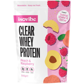
The packaging is a resealable pouch made of flexible material. It features a glossy finish with vibrant colors and graphics. The front displays a large, bold product name 'CLEAR WHEY PROTEIN' in black font, with the flavor 'Peach & Raspberry' in a smaller font below. The background includes illustrations of fruits like peaches, raspberries, and other colorful elements, creating an appealing visual. The top has a resealable zipper, and the overall shape is rectangular with a slightly tapered bottom.

The packaging consists of several cylindrical containers made of smooth, flat paperboard, each featuring a colorful label. The containers are white with vibrant graphics showcasing different flavors of protein powder. The labels include images of fruits and bold text indicating the product name and flavor. The containers are placed on a pink pedestal, enhancing their visual appeal. The overall arrangement is clean and organized, with no visible wear or damage.

The packaging consists of a smooth, flat construction with a vibrant color scheme. The box features a clean, precise design with a glossy finish, prominently displaying the product name 'CLEAR WHEY PROTEIN' in bold, clear fonts. The overall shape is rectangular, typical for retail packaging, and it appears to be designed for shelf display. The box is adorned with images of tropical fruits, enhancing its appeal.

The packaging is a cylindrical container made of thick, sturdy chipboard with a premium finish. It features a smooth, matte surface with vibrant colors. The lid is a screw-on type, providing a secure closure. The container is primarily white with pink and yellow graphics, showcasing the product name and nutritional information. The overall design is modern and appealing, aimed at a fitness-oriented audience.

The packaging is a resealable pouch made from a flexible material, featuring a vibrant design with a combination of red and pink colors. The front displays a large, bold product name 'CLEAR WHEY PROTEIN' in black font, accompanied by the flavor 'Cherry & Apple' in smaller text. The design includes illustrations of cherries and apples, enhancing the visual appeal. The top of the pouch has a resealable zipper closure, and the overall shape is rectangular with a flat bottom for stability.
About the Brand
IsoVibe operates within the health and nutrition industry, offering a diverse portfolio of clear whey protein products aimed at fitness enthusiasts and consumers seeking functional, low-sugar protein solutions. Packaging is central to their branding strategy, with a strong emphasis on visual differentiation and product clarity.
The company’s product lineup includes multiple flavors of clear whey protein, supported by branded shaker bottles and merchandising kits. IsoVibe’s packaging choices—ranging from resealable flexible pouches to rigid carton and chipboard containers—are designed to ensure product freshness, ease of use, and visual cohesion. Digital-first distribution necessitates packaging that balances protective integrity with strong shelf and unboxing appeal.
Key Differentiator: IsoVibe distinguishes itself through vibrant, flavor-forward packaging and a clear focus on user convenience, aligning package structure with the functional benefits of clear whey protein.
Design System
Visual Style
IsoVibe's design system leverages bold, sans-serif typography, high-contrast color palettes featuring white backgrounds with vibrant accent colors (pinks, yellows, reds), and photographic or illustrated fruit elements to communicate flavor cues. The aesthetic is modern, youthful, and energetic, targeting a fitness-oriented demographic.
Brand Identity
The ISOVIBE logo is prominently displayed on all packaging formats, supported by large, readable product names and distinct flavor descriptors. Graphic elements are used consistently for quick shelf recognition, with iconography limited to essential product or nutrition cues to maintain clarity.
Packaging Design
Material selection prioritizes food-safe flexible plastics for pouches and sturdy chipboard for rigid containers. The structural design emphasizes resealability, protection from moisture, and ease of handling. Visual hierarchy is established through bold typography and color blocking, facilitating easy product navigation.
User Experience
Packaging is engineered for both in-home and on-the-go consumption, with resealable features to maintain freshness and compact structures for portability. The design supports a seamless unboxing experience, reinforcing brand values at each customer touchpoint and encouraging repeat engagement through visual appeal and functional convenience.
Company Metrics
Business insights for IsoVibe based on available data
Market Positioning
Brand Values & Focus
Key Competitors
Target Market: Fitness enthusiasts, health-conscious consumers, and individuals seeking convenient, low-sugar protein supplements within the UK and broader e-commerce markets.
Packaging Assessment
Overall Grade
Visual appeal and presentation quality
Packaging durability and protection
Eco-friendliness and recyclable materials
Cost efficiency and value for money
Packaging assessment for IsoVibe based on industry standards and best practices
Frequently Asked Questions
What types of packaging formats does IsoVibe use?
IsoVibe employs a mix of flexible resealable pouches, rigid chipboard containers, and retail carton boxes, all featuring bold branding and flavor-specific graphics.
How does IsoVibe’s packaging support its direct-to-consumer business model?
The packaging is designed for both e-commerce shipping durability and shelf appeal, with resealable features for product freshness and consistent brand presentation to reinforce customer loyalty.
Is IsoVibe packaging environmentally friendly?
While some packaging materials may be recyclable, the use of flexible plastics and glossy finishes suggests a moderate approach to sustainability, with further opportunities for adopting higher-recycled content or compostable options.
Discover other Health companies
Explore more companies in the health industry and their packaging strategies
Lily & Loaf
Health
Lily & Loaf specializes in high-quality health and nutrition products, offering a range of supplements and vitamins aimed at supporting an active lifestyle. The company focuses on providing natural solutions for health and beauty.
EVO Nutrition
Health
EVO Nutrition specializes in premium health supplements, providing a wide range of vitamins and nutritional products to support well-being.
Bio-Synergy
Health
Bio-Synergy is a UK-based company specializing in health and fitness products, including nutritional supplements and DNA testing kits. Their mission is to support individuals in achieving their health and fitness goals through innovative products and personalized insights.