Isostar packaging
Isostar is a leading sports nutrition brand focused on hydration, protein, and energy products tailored for athletes and fitness enthusiasts. Their packaging strategy emphasizes functional, branded solutions that combine striking visual appeal with performance-driven design for retail and e-commerce distribution.
Packaging Portfolio
Isostar’s packaging portfolio includes folding carton boxes for retail shelf presence, flexible laminated pouches for energy gels and snacks, rigid composite containers for powdered supplements, and corrugated boxes for shipping. These structures are selected for their protective properties, branding surface area, and consumer usability. The use of vibrant graphics, high-contrast brand colors, and prominent product information supports both in-store differentiation and online merchandising. Resealable features and ergonomic formats enhance convenience, while material selections balance cost, protection, and partial recyclability.

The packaging is a corrugated box with a visible fluted inner layer, characterized by its sturdy construction suitable for shipping. The box is primarily black with a white interior, and it holds multiple energy gel pouches organized neatly inside. The box features a flap closure on top and is designed to be opened easily. The exterior has a matte finish, while the interior is smooth and clean.
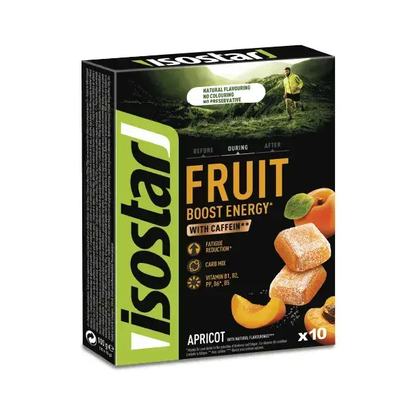
The packaging is a folding carton box made from single-layer paperboard. It features a smooth, flat construction without any visible fluted layers, indicative of a carton box. The exterior is predominantly black with vibrant colors used for the branding and product information. The edges are clean and precise, with no visible wear or damage. The box has a glossy finish, enhancing the visual appeal.

The packaging is a sturdy, cylindrical container with a wide mouth, designed for easy access to the powdered contents. It features a black plastic lid that screws on securely. The body of the container is predominantly orange with black accents, showcasing vibrant graphics and product information. The front displays the product name 'HYDRATE & PERFORM' prominently, along with an image of an orange slice. The overall design is sleek and modern, appealing to active consumers.

The packaging consists of flexible pouches with a smooth, flat construction. Each pouch features a vibrant color scheme with a glossy finish. The front displays a large logo of 'Isostar' prominently, along with product information and flavor descriptions. The pouches have a resealable top, allowing for easy access and storage. The overall design is sleek and modern, appealing to a sports-oriented audience.

The image features a collection of packaging items, including a rectangular carton box for 'Fruit Boost Energy' with a vibrant design showcasing strawberries, a cylindrical container for 'Whey Protein' with a matte black finish, and other assorted boxes and pouches. The cartons have clean edges and folds, with colorful graphics and product information prominently displayed. The overall appearance is modern and appealing, aimed at active consumers.
About the Brand
Isostar delivers a comprehensive suite of sports nutrition products, with packaging engineered for both consumer convenience and robust brand presentation. Their portfolio spans carton boxes, flexible pouches, rigid containers, and corrugated shipping boxes—each selected for optimal product protection and market impact.
The packaging approach integrates multi-material formats to address the diverse needs of hydration, protein, and snack products. Rigid and corrugated structures safeguard contents during transit, while retail cartons and flexible pouches prioritize shelf visibility and user-friendly access. Consistent use of bold colors, clear labeling, and brand-centric graphics is evident across all packaging types, supporting a cohesive brand experience in both physical and digital channels.
Key Differentiator: Isostar’s packaging strategy uniquely balances performance-driven product protection with visually impactful branding, leveraging a multi-format approach tailored for active and health-conscious consumers.
Design System
Visual Style
Bold sans-serif typography, a high-contrast palette dominated by black, yellow, and orange, and dynamic, sporty graphics characterize the aesthetic. The overall style is energetic and modern, aimed at visually engaging athletic consumers.
Brand Identity
Consistent application of the Isostar logo, strong use of brand colors, and recurring iconography related to sports and nutrition. Product names and key nutritional claims are prominently positioned for quick recognition.
Packaging Design
Material choices prioritize function—rigid plastics or composites for powders, laminated flexible materials for pouches, and sturdy carton or corrugated board for boxes. Structural design focuses on product protection, resealability, and display efficiency.
User Experience
Design elements are tailored for intuitive navigation—clear labeling, resealable closures, and ergonomic formats support ease of use, while cohesive branding reinforces trust and product recognition throughout the customer journey.
Company Metrics
Business insights for Isostar based on available data
Market Positioning
Brand Values & Focus
Key Competitors
Target Market: Active individuals and athletes seeking scientifically formulated hydration, energy, and recovery nutrition solutions in France and broader European markets.
Packaging Assessment
Overall Grade
Visual appeal and presentation quality
Packaging durability and protection
Eco-friendliness and recyclable materials
Cost efficiency and value for money
Packaging assessment for Isostar based on industry standards and best practices
Frequently Asked Questions
How does Isostar ensure its packaging supports product safety during shipping?
Isostar employs corrugated and rigid box structures for primary protection, combined with secure closures and organized internal layouts to minimize movement and reduce damage risk during logistics.
What types of packaging materials does Isostar primarily use?
The brand utilizes carton board for retail packaging, flexible laminated pouches for energy and snack products, and rigid plastic or composite containers for powders and supplements.
How does Isostar’s packaging reflect its brand values?
Isostar’s packaging showcases bold brand colors, prominent logos, and active lifestyle imagery, directly aligning visual design with its focus on performance, quality, and athlete engagement.
Discover other Beauty & Fitness companies
Explore more companies in the beauty & fitness industry and their packaging strategies
Institut Karité Paris
Beauty & Fitness
Institut Karité Paris specializes in luxury beauty products made with natural Shea Butter, offering a wide range of skincare and body care solutions. The brand combines Parisian heritage with a commitment to quality and creativity in its offerings.
Pure Altitude
Beauty & Fitness
Pure Altitude specializes in high-quality beauty and skincare products that leverage the expertise of spa treatments to enhance daily routines. The brand offers a diverse range of products tailored for both facial and body care.
Owari
Beauty & Fitness
Owari specializes in 100% natural beauty and fitness products, designed to enhance health and wellness. The company proudly offers its products made in France, emphasizing quick delivery and customer support.