HorseFlex packaging
HorseFlex delivers specialized nutritional supplements for horses, employing rigid plastic packaging with clear branding and product differentiation. Their packaging strategy emphasizes product integrity, retail presentation, and consistent visual identity tailored for the equine health market.
Packaging Portfolio
HorseFlex utilizes rigid, injection-molded plastic containers and jars with screw-on or snap-fit lids, suited for bulk powders and pellets. The packaging system favors opaque, food-grade plastics to ensure product protection from light and moisture, while supporting resealability and prolonged storage. Labels are full-color, featuring strong brand identity, product information, and color coding for range differentiation. The format enables efficient logistics handling and retail presentation, yet relies heavily on conventional plastics with limited recyclability enhancements.
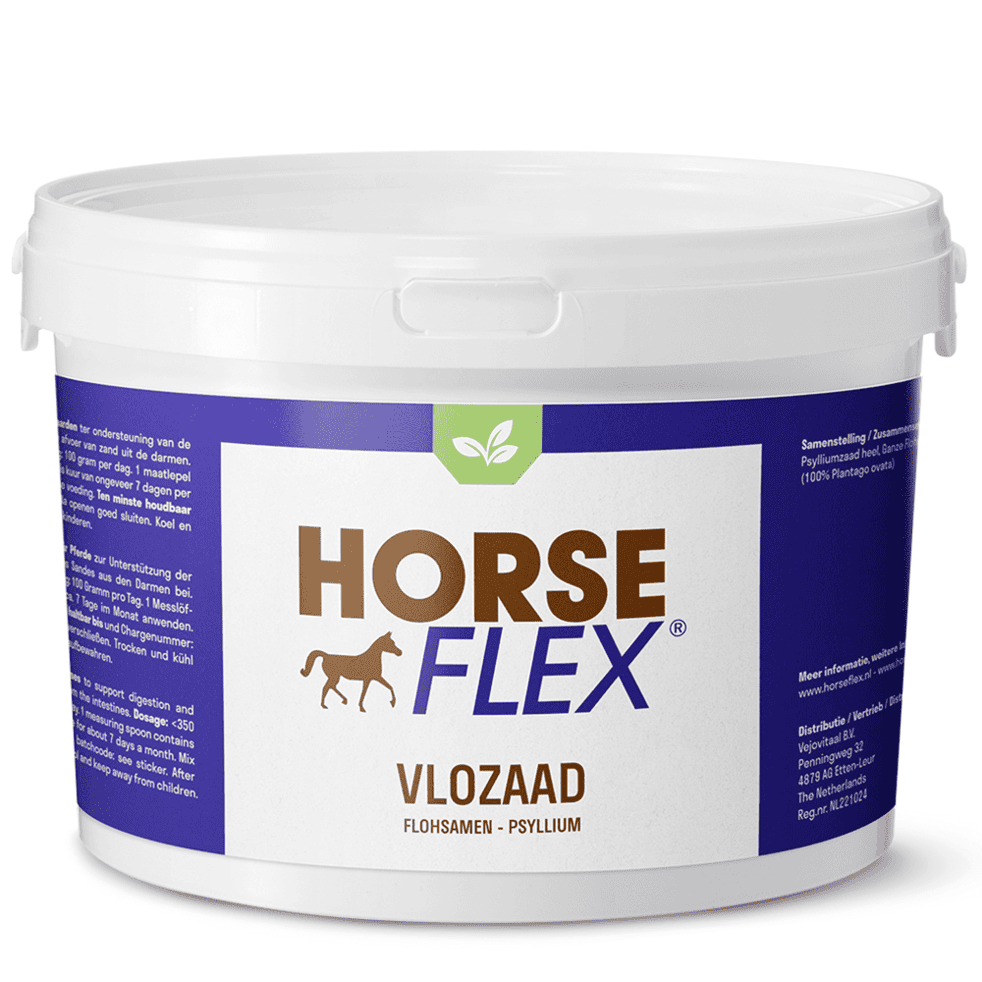
The packaging is a round, opaque plastic container with a white lid. The body of the container is predominantly purple with a white label featuring the brand name and product information. The label includes a graphic of a horse and green leaf elements, indicating a focus on natural ingredients. The container has a smooth surface with no visible flutes or layers, characteristic of plastic packaging.
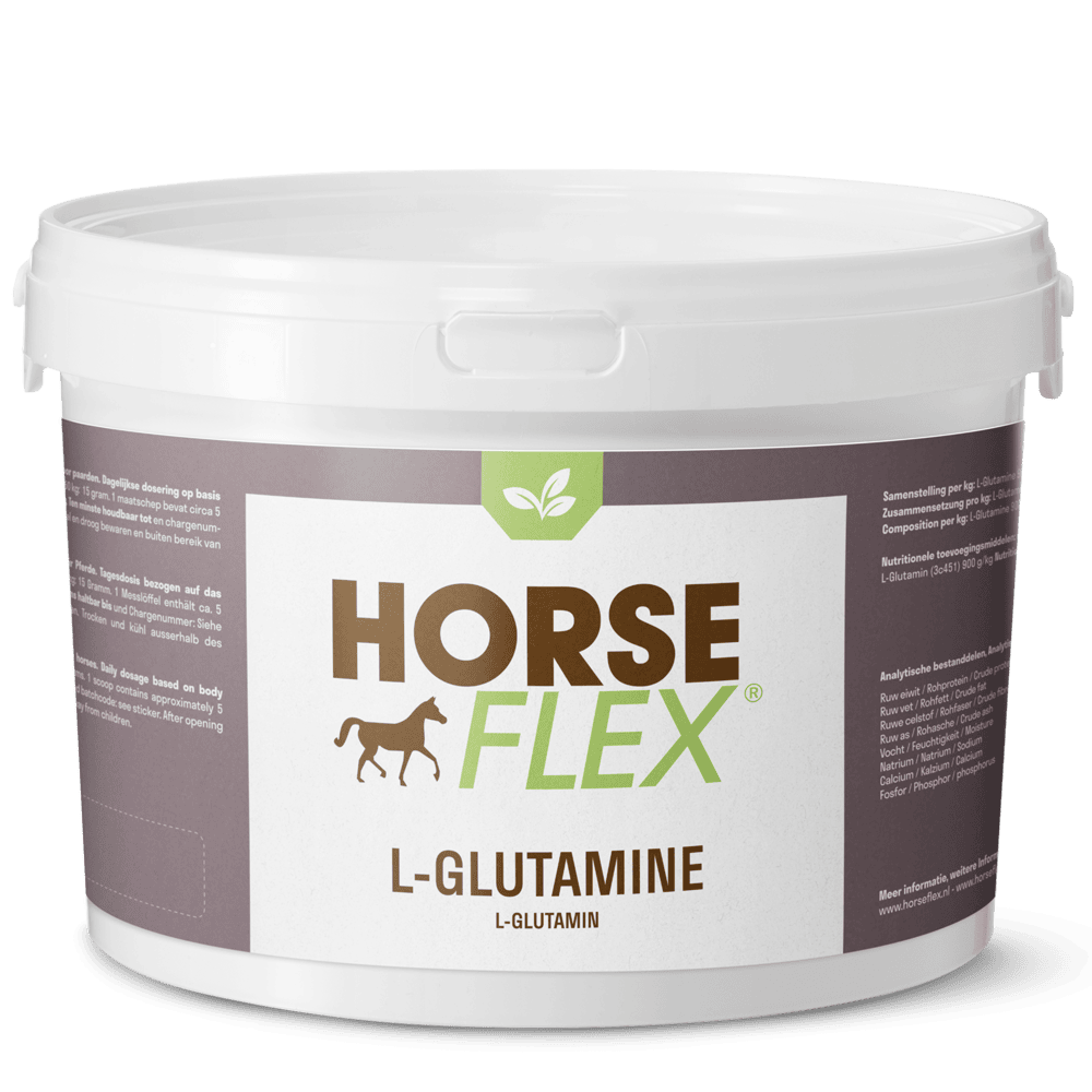
The packaging is a round, white plastic container with a smooth surface and a secure lid. The container is cylindrical in shape and has a glossy finish. The lid is flat and fits tightly to ensure product freshness. The front of the container features a large, colorful label with the brand name 'HORSE FLEX' prominently displayed in bold letters, along with a graphic of a horse. The label includes additional product information and a green leaf logo, suggesting a natural product.
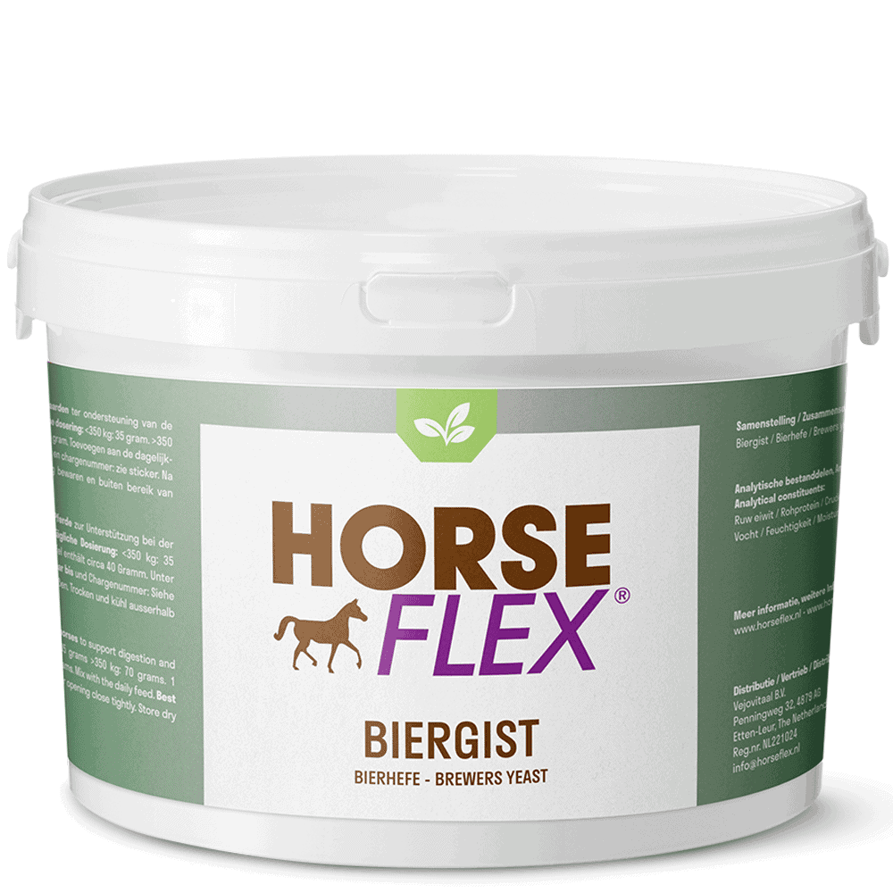
The packaging is a round plastic container with a white screw-on lid. The container has a smooth surface with a matte finish, primarily in a neutral color palette. The front features a prominent label with the brand name 'HORSE FLEX' in bold letters, accompanied by a silhouette of a horse. The label includes product information and nutritional details, printed in a clear, legible font. The overall design is clean and professional, emphasizing the product's purpose.
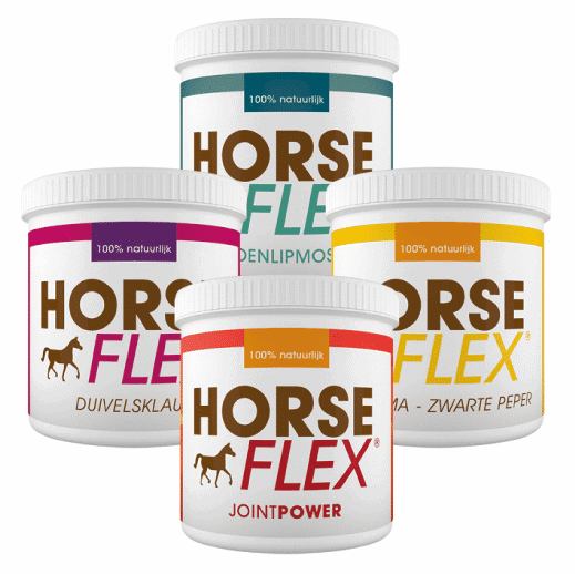
The packaging consists of four plastic jars, each with a round shape and a screw-on lid. The jars are predominantly white with colored labels that feature the brand name 'HORSE FLEX' prominently displayed. The labels include various colors and designs, indicating different product types. Each jar has a clear, smooth surface with no visible fluted layers, indicating they are not corrugated or carton boxes. The jars appear to be designed for retail display, showcasing the product inside.
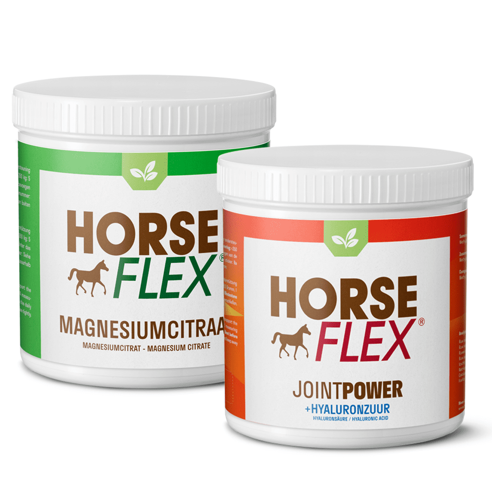
The packaging consists of two cylindrical containers with screw-on lids. Each container has a smooth, glossy surface with a predominantly white base color. The labels feature bold, colorful graphics with a combination of green, red, and brown elements. The front of each container prominently displays the brand name 'HORSE FLEX' in large, capitalized letters, along with product-specific information. The containers are designed for easy handling and storage, with a clean and modern aesthetic.

The packaging is a round, rigid plastic container with a wide mouth and a screw-on lid. The container is predominantly white with a yellow band around the middle. The front features a large, bold logo that reads 'HORSE FLEX' in black letters, accompanied by a silhouette of a horse. The back contains detailed product information and instructions in a smaller font. The surface is smooth with a matte finish, and the container appears sturdy and durable.
About the Brand
HorseFlex operates within the equine health segment, offering a diverse range of nutritional and wellness products for horses. Their packaging relies on durable plastic containers and jars, each labeled with product-specific and brand-centric graphics to ensure both clear identification and shelf impact.
The brand’s packaging design prioritizes product safety and ease of use, utilizing round, opaque plastic containers with secure lids to protect supplement quality. Visual consistency is maintained through uniform use of labels, color coding, and logo placement, supporting both functional requirements and brand recognition in a competitive B2C environment.
Key Differentiator: HorseFlex distinguishes itself through highly consistent branding, robust container formats tailored for bulk supplements, and a visual system that clearly communicates product purpose and quality within the horse supplement industry.
Design System
Visual Style
Typography features bold, sans-serif fonts for high legibility; color palette includes white, purple, green, and accent colors for product differentiation; overall style is clinical yet approachable, with clean layouts and animal-centric imagery.
Brand Identity
Consistent logo placement at the top or center of labels, use of horse and leaf iconography, and unified visual structure across product lines for immediate brand recognition.
Packaging Design
Material choices center on injection-molded, food-grade plastics; structural design prioritizes durability, resealability, and bulk storage. Design philosophy emphasizes practical utility for equestrian use, with minimal superfluous elements.
User Experience
Packaging is designed for ease of handling, clear identification, and straightforward unboxing. Visual consistency and functional container formats support trust and repeat purchase behavior, reinforcing the brand’s authority in equine health.
Company Metrics
Business insights for HorseFlex based on available data
Market Positioning
Brand Values & Focus
Key Competitors
Target Market: Equestrian consumers and horse owners seeking reliable, high-quality nutritional supplements for animal health and performance.
Packaging Assessment
Overall Grade
Visual appeal and presentation quality
Packaging durability and protection
Eco-friendliness and recyclable materials
Cost efficiency and value for money
Packaging assessment for HorseFlex based on industry standards and best practices
Frequently Asked Questions
What packaging materials does HorseFlex use for its products?
HorseFlex primarily utilizes rigid plastic containers and jars with screw-on or snap-fit lids, designed for product protection and resealability.
How does HorseFlex ensure product safety during shipping?
The packaging structure incorporates durable, impact-resistant plastics and secure closures, minimizing risk of spillage or contamination during transit.
What sustainability measures are present in HorseFlex packaging?
While the brand uses recyclable plastic containers, there is limited evidence of advanced sustainability initiatives such as biodegradable materials or refill systems.
How does HorseFlex use packaging to enhance customer experience?
Packaging features clear branding, color-coded labels for product differentiation, and practical container shapes for easy storage and usage by equine owners.
Discover other Pets & Animals companies
Explore more companies in the pets & animals industry and their packaging strategies
Natural Trail
Pets & Animals
Natural Trail produces high-quality dry and wet food for dogs and cats, focusing on their natural dietary needs. The company is committed to providing pet owners with nutritious and delicious meal options made from carefully selected ingredients.
Zooper
Pets & Animals
Zooper is a retail company specializing in pet supplies and products, offering a wide range of items for both dogs and cats. Their online platform provides convenience for pet owners looking for quality goods at competitive prices.
Vegdog
Pets & Animals
Vegdog specializes in providing vegan and gluten-free dog food, developed in collaboration with veterinarians to ensure optimal nutrition for dogs with food sensitivities and allergies.