Holyrood Distillery packaging
Holyrood Distillery is an Edinburgh-based spirits producer specializing in single malt whisky and gin, leveraging modern techniques and heritage-driven branding. Their packaging strategy utilizes premium materials and visually distinctive formats to reinforce brand identity and elevate the consumer experience.
Packaging Portfolio
Holyrood Distillery’s packaging portfolio incorporates custom-molded glass bottles with matte finishes and distinctive structural forms, supporting both whisky and gin product lines. The use of rigid luxury boxes and premium folding cartons ensures product protection, strong shelf presence, and suitability for gifting. Materials selected include high-clarity glass, textured papers, and metallic foil accents, while labeling employs bold typography and consistent brand iconography. These choices collectively reinforce a premium positioning and facilitate both retail and direct-to-consumer sales strategies.

The image features three bottles of whiskey from Holyrood Distillery, each with a distinct label design. The bottles are glass, showcasing the amber liquid inside. Each label has a unique color scheme and design, indicating different varieties of whiskey. The labels include the brand name 'HOLYROOD DISTILLERY' prominently displayed, along with additional graphics and information about each whiskey type.
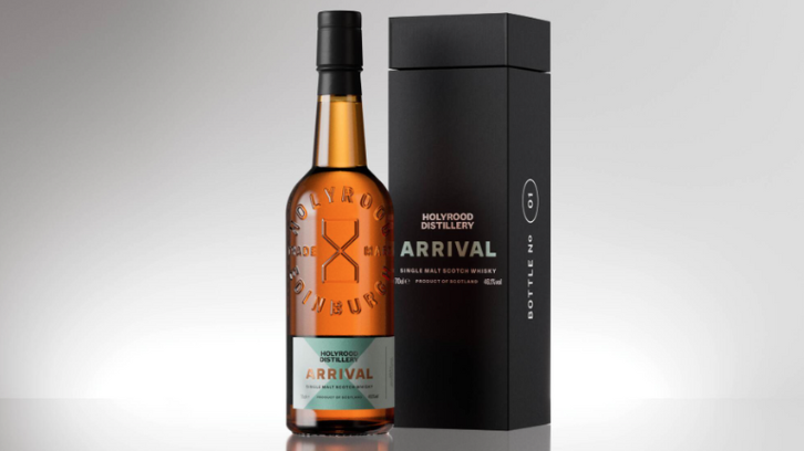
The packaging consists of a tall, rectangular box with a premium appearance. The exterior is matte black with a smooth finish, featuring a minimalist design. The front displays the brand name 'HOLYROOD DISTILLERY' prominently, along with the product name 'ARRIVAL' in a contrasting color. The box has a clean, modern aesthetic with no visible wear or damage, indicating it is in excellent condition. The top of the box is slightly wider than the base, creating a tapered effect.

The packaging is a glass bottle with a distinctive shape, featuring a matte green finish. The bottle has a rounded body and a narrow neck, topped with a cork closure. The label is prominently displayed on the front, featuring the product name 'HEIGHT OF ARROWS' in bold white letters, along with a stylized 'H' logo. The background is a natural landscape, suggesting a connection to the distillery's origins.

The packaging consists of a frosted green glass bottle with a distinctive shape, featuring a wide base and a narrow neck. The bottle is designed for holding gin and has a minimalist aesthetic. The surface is smooth with a matte finish, giving it a premium feel. The label is prominently displayed on the front, featuring the product name 'HEIGHT OF ARROWS' in bold white letters, along with the brand name 'HOLYWOOD DISTILLERY' in smaller text. The cap is a standard screw-on type, colored in red, which contrasts with the green bottle.

The packaging consists of a smooth, flat construction typical of folding cartons. The surface is primarily a dark green color with metallic gold accents, featuring clear, precise edges and folds. The carton displays product information prominently, including the brand name 'HOLYROOD DISTILLERY' in bold typography. The overall design is clean and modern, with a matte finish that enhances the premium feel of the product.
About the Brand
Holyrood Distillery operates at the intersection of tradition and innovation in the spirits industry, offering a range of single malt whiskies and gins. The company's packaging approach is characterized by the use of custom glass bottles, rigid luxury boxes, and high-impact labeling, with a focus on both shelf presence and consumer engagement.
Founded in 2019, Holyrood Distillery has rapidly established itself as a prominent player in the Edinburgh spirits market. The brand leverages its unique position as the only single malt whisky producer in the city, integrating local heritage elements into both product and packaging. Their packaging portfolio reflects a commitment to premiumization and differentiation, incorporating matte finishes, metallic accents, and modern typographic treatments to align with their brand narrative.
Key Differentiator: Holyrood Distillery distinguishes itself through the combination of city-exclusive single malt production, immersive customer experiences, and packaging that visually articulates both heritage and modernity.
Design System
Visual Style
The brand employs bold, sans-serif typography and a modern color palette dominated by deep greens, blacks, metallic golds, and whites. The overall aesthetic is minimalist yet impactful, with matte and frosted finishes for a contemporary, premium effect.
Brand Identity
Logo and product names are consistently placed for high visibility, with the 'H' icon and 'Holyrood Distillery' lockup anchoring most packaging. Iconography is restrained, focusing on clean lines and geometric forms to communicate modernity and heritage.
Packaging Design
Material choices prioritize glass for primary containers and rigid board for outer packaging, emphasizing durability and a tactile, high-value feel. Structural design is tailored for both product safety and consumer presentation, with attention to closure types (cork, screw cap) and box engineering.
User Experience
Packaging is designed to deliver a strong first impression and a premium unboxing moment, supporting the customer journey from purchase through gifting and display. The visual and structural elements reinforce brand authenticity and encourage repeat purchase by enhancing perceived value.
Company Metrics
Business insights for Holyrood Distillery based on available data
Market Positioning
Brand Values & Focus
Key Competitors
Target Market: Premium spirits consumers, whisky and gin enthusiasts, and experiential buyers seeking quality and distinctive branding in the UK and international markets.
Packaging Assessment
Overall Grade
Visual appeal and presentation quality
Packaging durability and protection
Eco-friendliness and recyclable materials
Cost efficiency and value for money
Packaging assessment for Holyrood Distillery based on industry standards and best practices
Frequently Asked Questions
What types of packaging formats does Holyrood Distillery utilize?
Holyrood Distillery employs a mix of custom glass bottles, rigid luxury boxes, and folding carton packaging. Their solutions are tailored for both retail and gifting scenarios, emphasizing structural integrity and premium aesthetics.
How does Holyrood Distillery address sustainability in its packaging?
While the primary focus is on premium presentation, Holyrood Distillery demonstrates moderate sustainability by using glass bottles and recyclable carton materials. However, the reliance on multi-material luxury packaging may present challenges for end-of-life recyclability.
What role does packaging play in Holyrood Distillery’s brand strategy?
Packaging is integral to Holyrood Distillery’s brand strategy, serving as a visual and tactile extension of their commitment to quality, innovation, and local Edinburgh heritage. It enhances shelf appeal and supports a memorable unboxing and gifting experience.
Discover other Food & Drink companies
Explore more companies in the food & drink industry and their packaging strategies
ruf lebensmittelwerk kg
Food & Drink
RUF Lebensmittelwerk KG is a German food production company specializing in a variety of baking mixes and drink products. Founded in 1920, the company is known for its high-quality ingredients and innovative food solutions.
Thés de la Pagode
Food & Drink
Thés de la Pagode is a French company specializing in organic teas and infusions, focusing on health and well-being. Established in 1987, they prioritize sustainable practices and high-quality ingredients sourced through fair trade.
Terres de Café
Food & Drink
Terres de Café is a specialty coffee retailer based in Paris, France, known for its commitment to sustainability and high-quality coffee sourcing.