holy packaging
holy is a Berlin-based direct-to-consumer beverage company specializing in sugar-free energy drinks, iced teas, and hydration powders. Their packaging approach leverages vibrant visual branding through custom carton boxes and flexible pouches designed for high shelf impact and strong product differentiation.
Packaging Portfolio
holy's packaging portfolio consists primarily of single-layer paperboard folding cartons for retail display and shipment, paired with flexible stand-up pouches for portioned servings. The cartons are engineered for high visual impact, featuring clean folds and vivid, brand-consistent graphic treatments. Flexible sachets within the cartons provide product protection and convenience. This modular approach enables efficient fulfillment, enhanced shelf presence, and a robust unboxing experience, while the material selection balances cost, durability, and moderate recyclability.

The packaging consists of a folding carton box that is smooth and flat, made from a single layer of paperboard. The box features a vibrant design with a blue background and colorful graphics depicting cherries and the product name 'HOLY'. The edges are clean and precise, indicating a well-constructed fold. The box is lightweight in appearance and is likely used for retail purposes, showcasing the product attractively.

The image features multiple colorful flexible pouches, each with a distinct design. The pouches are made from a thin, flexible material that allows for easy handling and storage. Each pouch has a resealable top, ensuring product freshness. The designs are vibrant, with bold colors and graphics that depict various flavors or ingredients. The overall shape is rectangular with a slight taper at the top, typical for stand-up pouches.

The packaging consists of a brightly colored folding carton box with a smooth, flat construction. The box features a vibrant yellow background with bold graphics, including the word 'HOLY' prominently displayed in a large, stylized font. The edges are clean and precise, indicative of a well-constructed carton. There are additional smaller boxes and stickers surrounding the main carton, showcasing a playful design aesthetic.

The outer packaging is a folding carton with a colorful design featuring a mix of purple and orange patterns. The box has a smooth, flat construction without fluted layers, indicating it is made from single-layer paperboard. The front displays vibrant graphics of a character holding a drink, with the product name 'HOLY' prominently featured. The box has clean, precise edges and folds, typical of retail packaging. The inner sachets are visible, suggesting a secondary packaging element.
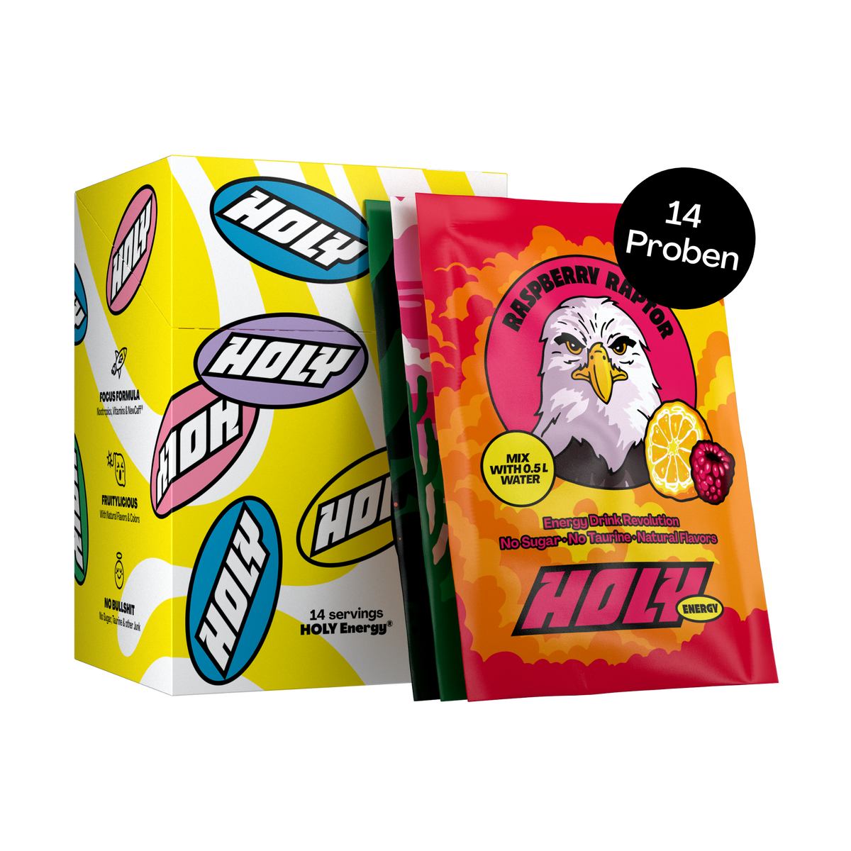
The outer packaging is a folding carton made of smooth, flat paperboard with a colorful design. It features a bright yellow background with various oval shapes containing the word 'HOLY' in bold lettering. The carton has clean edges and folds, indicative of a retail packaging style. Inside, there are individual sachets of energy powder, each with a vibrant design featuring an eagle and the flavor 'Raspberry Raptor'. The sachets are sealed and display product information prominently.

The packaging consists of a flat, smooth, single-layer paperboard carton that houses individual sachets of a hydration drink. The carton features vibrant colors and playful graphics, prominently displaying the product name 'HOLY' along with illustrations of passionfruit and a character holding a bat. The edges are clean and precise, indicative of a folding carton design. The sachets inside are likely made from a flexible material, but the outer carton is clearly paperboard.
About the Brand
holy delivers a portfolio of health-oriented soft drinks, utilizing sugar-free formulations and natural flavors to appeal to health-conscious consumers. The brand's packaging strategy centers on retail-ready carton boxes and flexible pouches, engineered for a visually engaging customer experience and logistical efficiency.
Operating in the competitive food & drink sector, holy has scaled quickly through an e-commerce-first model, achieving a strong reputation for product quality and brand satisfaction. Their packaging is characterized by playful, bold graphics, consistent branding elements, and modular structures that facilitate both retail display and direct shipment. This committed approach to design and usability reinforces product integrity while enhancing consumer perception at every touchpoint.
Key Differentiator: holy's unique packaging employs a high-visibility, colorful aesthetic combined with modular, retail-focused formats that support both brand recognition and efficient D2C distribution.
Design System
Visual Style
Typography is bold, sans-serif, and highly legible, paired with a saturated, multi-hue color palette dominated by yellows, blues, and purples. The overall aesthetic is playful, energetic, and youth-oriented.
Brand Identity
The logo 'HOLY' is always displayed prominently in large, stylized type. Packaging maintains consistent use of vibrant iconography, custom illustrations, and flavor-color associations for instant recognition across SKUs.
Packaging Design
Material choices prioritize single-layer paperboard for outer cartons and flexible plastic or composite pouches for inner product containment. Structural design emphasizes modularity, stackability, and clean edge finishes to support retail and e-commerce channels.
User Experience
Design elements guide the consumer journey from online purchase to physical unboxing, with visual cues and tactile quality engineered to reinforce brand values and generate positive emotional response. Custom starter packs and trial formats encourage exploration and repeat engagement.
Company Metrics
Business insights for holy based on available data
Market Positioning
Brand Values & Focus
Key Competitors
Target Market: Health-focused consumers seeking sugar-free beverage alternatives, primarily located in Tier I markets within Europe, with a strong emphasis on online D2C purchasing behavior.
Packaging Assessment
Overall Grade
Visual appeal and presentation quality
Packaging durability and protection
Eco-friendliness and recyclable materials
Cost efficiency and value for money
Packaging assessment for holy based on industry standards and best practices
Frequently Asked Questions
What packaging formats does holy predominantly use?
holy primarily utilizes folding carton boxes for outer retail packaging and flexible stand-up pouches for individual servings, optimizing for both visual appeal and functional protection.
How does holy address sustainability in its packaging?
The use of paperboard cartons indicates a moderate commitment to recyclability, though the inclusion of flexible pouches may pose challenges for overall sustainability depending on material choices.
What is the focus of holy's packaging design?
The packaging design prioritizes vibrant color schemes, bold typography, and consistent brand iconography, supporting strong shelf presence and an engaging unboxing experience.
Discover other Food & Drink companies
Explore more companies in the food & drink industry and their packaging strategies
ruf lebensmittelwerk kg
Food & Drink
RUF Lebensmittelwerk KG is a German food production company specializing in a variety of baking mixes and drink products. Founded in 1920, the company is known for its high-quality ingredients and innovative food solutions.
Thés de la Pagode
Food & Drink
Thés de la Pagode is a French company specializing in organic teas and infusions, focusing on health and well-being. Established in 1987, they prioritize sustainable practices and high-quality ingredients sourced through fair trade.
Terres de Café
Food & Drink
Terres de Café is a specialty coffee retailer based in Paris, France, known for its commitment to sustainability and high-quality coffee sourcing.