hola coffee roasters packaging
Hola Coffee Roasters, based in Madrid, specializes in high-quality, seasonal coffees and related products. Their packaging utilizes distinctive flexible pouches and kraft paper bags, emphasizing both vibrant visual branding and practical functionality.
Packaging Portfolio
Hola Coffee Roasters employs a portfolio centered on flexible stand-up pouches—primarily composite plastics with matte or glossy finishes—and kraft paper coffee bags. Packaging formats include resealable zippers for extended freshness and upright structures for efficient shelf presentation. Clear labeling, distinct color panels for variety differentiation, and integrated QR codes enhance traceability and consumer engagement. The use of both barrier-protected materials and recyclable kraft paper demonstrates a balance between product integrity and moderate sustainability.

The packaging is a flat, kraft paper bag with a rounded bottom and a smooth surface. It features a prominent circular label on the front, which includes the brand name 'hola' and the product name 'QUE CHIMBA'. The label has a dark green background with white text, giving it a clean and modern appearance. The edges of the bag are neatly folded and sealed, indicating a well-constructed package. The bag is designed to hold coffee beans, as evidenced by the presence of coffee beans scattered on the surface beneath it.

The packaging is a stand-up pouch made from a flexible material, featuring a vibrant yellow exterior. The pouch has a smooth, flat construction without any visible fluted layers, indicating it is not corrugated or rigid. The top of the pouch has a resealable zipper closure, allowing for easy access and storage. The front displays a label with product information, including the origin 'GUATEMALA Nueva Montaña' and a QR code, while the back has additional details about the coffee. The overall shape is rectangular, tapering slightly towards the bottom, which allows it to stand upright.

The packaging is a stand-up pouch made from a flexible material, featuring a bright yellow color with a glossy finish. The front displays a maroon label containing product information, including the name 'SAN ISIDRO Blend' and a list of ingredients. The top of the pouch has a resealable zipper closure, allowing for easy access and storage. A playful sticker with a cartoon coffee cup and the word 'HOT!' adds a fun element to the design.
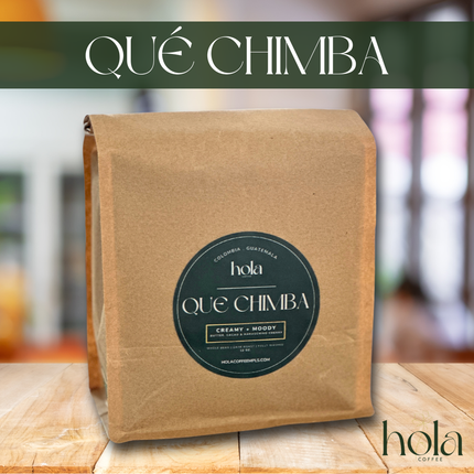
The packaging is a flat, stand-up pouch made of kraft paper with a smooth surface. It features a rounded bottom and is designed to hold coffee. The front displays a circular label with the brand name 'hola' and product name 'QUÉ CHIMBA', along with descriptive text. The top of the bag is folded over, and there are no visible flaps or tabs for closure.

The packaging consists of stand-up pouches made from a flexible material, likely a composite of plastic and foil for barrier protection. Each pouch features a vibrant yellow exterior with a matte finish and a resealable top. The front displays a large, bold 'Hola coffee.' logo in black, with additional colored panels indicating different coffee varieties. The pouches are designed to stand upright, showcasing the contents effectively.
About the Brand
Hola Coffee Roasters is a specialty coffee company with a strong focus on quality sourcing and community education. Their product range covers seasonal coffees, brewing equipment, and educational workshops, serving both local and online audiences.
The company integrates both retail and e-commerce channels, offering whole bean and ground coffee in meticulously designed stand-up pouches and kraft paper bags. Their packaging emphasizes resealability and product protection while supporting strong brand recognition through consistent color schemes, logo placement, and clear information labeling. Educational initiatives further distinguish their approach by fostering a knowledgeable community around coffee.
Key Differentiator: Hola Coffee Roasters differentiates itself through a blend of high-impact visual packaging, educational programming, and a strong local presence supported by a robust e-commerce platform.
Design System
Visual Style
Typography is modern, sans-serif, and bold, paired with a color palette dominated by bright yellow, maroon, and earthy tones. The overall aesthetic is playful, clean, and visually striking, designed to stand out on retail shelves and digital platforms.
Brand Identity
Consistent use of the 'hola' logo, large product names, and color-coded panels for different coffee varieties. Iconography is minimal but impactful, with occasional playful stickers and QR codes. High visual consistency is maintained across all packaging formats.
Packaging Design
Material choices prioritize flexible packaging for barrier protection, combined with kraft paper for select SKUs to convey sustainability. The structural design emphasizes resealability, upright storage, and efficient product protection during transit.
User Experience
Packaging is optimized for intuitive unboxing, with resealable closures and clear labeling supporting ease of use. Visual cues and QR codes facilitate consumer education and reinforce the brand’s commitment to community and transparency.
Company Metrics
Business insights for hola coffee roasters based on available data
Market Positioning
Brand Values & Focus
Key Competitors
Target Market: Primary target audience includes specialty coffee consumers, home brewers, and coffee enthusiasts in Madrid and broader European urban markets, with additional reach via e-commerce to a global audience.
Packaging Assessment
Overall Grade
Visual appeal and presentation quality
Packaging durability and protection
Eco-friendliness and recyclable materials
Cost efficiency and value for money
Packaging assessment for hola coffee roasters based on industry standards and best practices
Frequently Asked Questions
What types of packaging does Hola Coffee Roasters use for their coffee products?
Hola Coffee Roasters primarily uses flexible stand-up pouches and kraft paper bags with resealable features. These materials offer both product protection and effective shelf presentation, while the visual design supports brand recognition.
How does Hola Coffee Roasters address sustainability in their packaging?
The brand utilizes some recyclable kraft materials and flexible packaging, but a significant portion relies on composite plastics and foils for barrier protection. This provides durability but limits recyclability, resulting in moderate sustainability performance.
What is the overall aesthetic of Hola Coffee Roasters’ packaging?
The packaging features bold colors, clear typography, and playful iconography, creating a modern and approachable brand experience that is consistent across all product lines.
Discover other Food & Drink companies
Explore more companies in the food & drink industry and their packaging strategies
Teegschwendner GmbH
Food & Drink
Teegschwendner GmbH is a specialty tea company based in Germany, offering a wide selection of high-quality teas and tea-related accessories. They focus on providing unique tea experiences through carefully sourced and curated products.
Thés de la Pagode
Food & Drink
Thés de la Pagode is a French company specializing in organic teas and infusions, focusing on health and well-being. Established in 1987, they prioritize sustainable practices and high-quality ingredients sourced through fair trade.
Terres de Café
Food & Drink
Terres de Café is a specialty coffee retailer based in Paris, France, known for its commitment to sustainability and high-quality coffee sourcing.