HLTH Magazine packaging
HLTH Magazine operates as a direct-to-consumer health and wellness platform, offering supplements and nutrition products for both humans and pets. Their packaging strategy incorporates a mix of modern flexible pouches, rigid containers, and retail cartons, all designed for functionality, product security, and brand alignment.
Packaging Portfolio
HLTH Magazine’s packaging solutions demonstrate a strategic blend of flexible stand-up pouches, rigid cylindrical supplement containers, and retail folding cartons. The use of resealable zippers, matte and glossy finishes, and transparent windows enhances both product protection and consumer usability. Packaging materials favor lightweight plastics and paperboard, optimizing for shipping efficiency and shelf appeal while maintaining sufficient product integrity. However, the current portfolio primarily utilizes conventional substrates, with limited evidence of large-scale adoption of biodegradable or recycled materials.

The packaging consists of two distinct retail cartons, each with a smooth, flat construction. The left carton features a vibrant orange background with a prominent logo and product name, while the right carton has a dark blue background with a tropical leaf design. Both cartons have clean edges and precise folds, typical of folding cartons used for retail. The left carton has a glossy finish, while the right appears to have a matte texture.
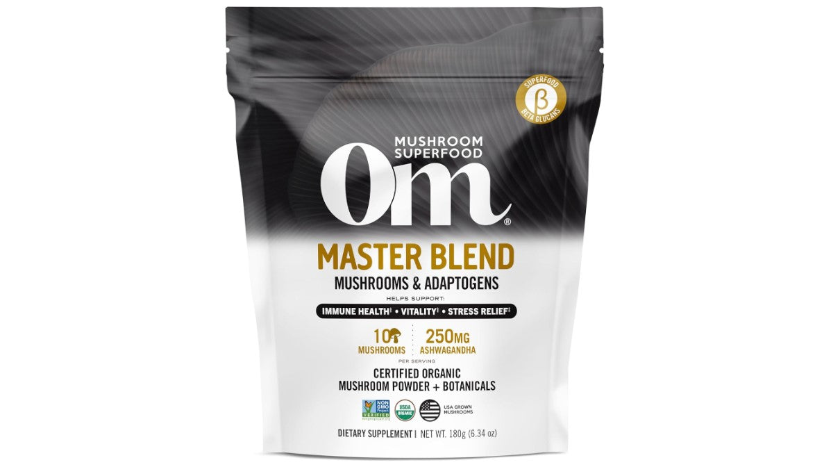
The packaging is a stand-up pouch made from a flexible material, likely a combination of plastic and foil. It features a resealable zipper at the top for convenience. The front displays a large, bold logo with the brand name 'Om' prominently featured. Below the logo, the product name 'MASTER BLEND' is printed in a slightly smaller font. The background has a clean, white finish with colorful accents that highlight the product's benefits, such as 'Immune Health', 'Vitality', and 'Stress Relief'. The overall design is modern and appealing, with a focus on health and wellness.
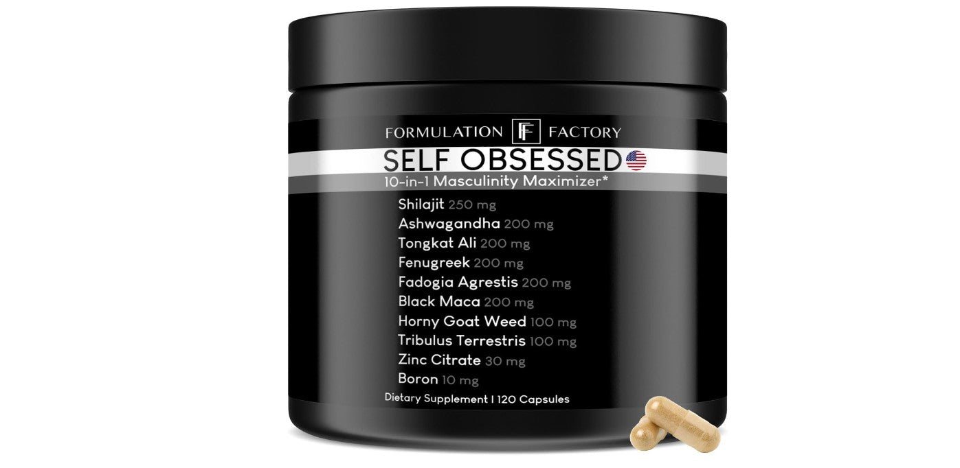
The packaging is a cylindrical container with a wide mouth and a black matte finish. It has a smooth surface with no visible fluted layers, indicating a rigid construction. The lid is fitted tightly, suggesting a secure closure. The overall shape is round and tall, typical for supplement packaging.
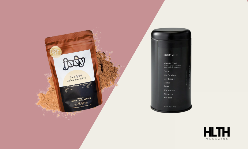
The packaging consists of a stand-up pouch on the left, made from a flexible material that allows it to maintain an upright position. The pouch has a matte finish with a zipper closure at the top. It features a transparent window that displays the product inside, which appears to be a fine powder. The right side shows a cylindrical container with a matte black finish, featuring a screw-on lid. Both packages are designed for easy access and storage.
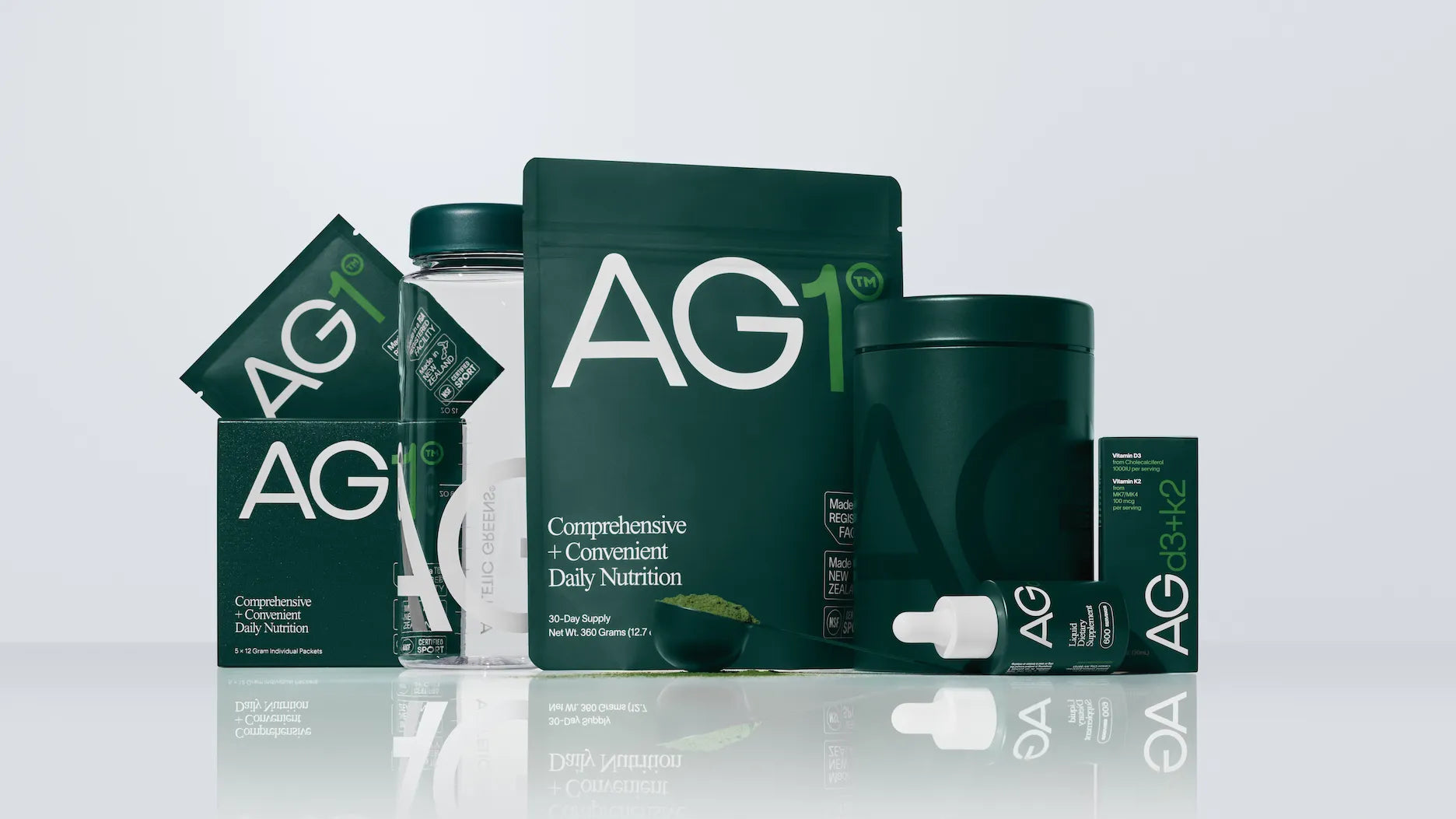
The packaging consists of various items, including a rectangular carton box, a flexible pouch, and a cylindrical container. The carton box has a smooth, flat construction with clean edges and folds, featuring a matte finish. The flexible pouch has a similar matte texture and is designed for easy opening. The cylindrical container has a sturdy appearance with a lid that likely screws on. The overall color scheme is dark green with white and light green accents, creating a cohesive look.
About the Brand
HLTH Magazine specializes in health supplements and wellness products, leveraging a robust e-commerce model with a focus on both product quality and educational content. The company’s packaging solutions are carefully selected to enhance product integrity, consumer trust, and brand recognition within the health sector.
With a portfolio spanning flexible pouches, rigid containers, and folding cartons, HLTH Magazine’s packaging mix is designed for protective performance, visual clarity, and consumer convenience. The brand’s packaging approach prioritizes clear labeling, resealability, and shelf presence, supporting both logistical efficiency and a positive customer experience. While some packaging features strong sustainability characteristics, there is room for further integration of eco-friendly materials and practices.
Key Differentiator: HLTH Magazine’s dual focus on human and pet wellness, paired with in-depth product reviews and educational packaging, differentiates the brand in the competitive health supplement market.
Design System
Visual Style
The visual approach is rooted in modern, minimal design—utilizing sans-serif typography, a health-oriented color palette (whites, greens, blacks, and accent colors), and clean layouts for clarity and premium appeal.
Brand Identity
Branding is consistently applied, with prominent logo placement, clear use of product names, and cohesive iconographic elements. Visual consistency is maintained across packaging types for both human and pet product lines.
Packaging Design
Material selection prioritizes flexible plastics for pouches, rigid board for cartons, and sturdy plastic or composite for cylindrical containers. The design philosophy emphasizes resealability, transparency, and efficient structural layouts to protect contents and support branding.
User Experience
Packaging is structured to support intuitive unboxing, with clear product information, resealable features, and visually engaging graphics that foster trust and a premium brand experience. The design supports both online and in-store customer journeys by maximizing readability and ease of use.
Company Metrics
Business insights for HLTH Magazine based on available data
Market Positioning
Brand Values & Focus
Key Competitors
Target Market: Health-conscious consumers and pet owners seeking expert-reviewed supplements and wellness products through direct-to-consumer e-commerce channels.
Packaging Assessment
Overall Grade
Visual appeal and presentation quality
Packaging durability and protection
Eco-friendliness and recyclable materials
Cost efficiency and value for money
Packaging assessment for HLTH Magazine based on industry standards and best practices
Frequently Asked Questions
What types of packaging formats does HLTH Magazine use for its products?
HLTH Magazine utilizes a variety of packaging formats, including flexible stand-up pouches with resealable closures, rigid cylindrical containers, and retail folding cartons. These formats are selected to balance product protection, shelf appeal, and consumer convenience.
How does HLTH Magazine address packaging sustainability?
The company integrates some recyclable materials and prioritizes efficient packaging structures, but greater adoption of fully recyclable or compostable materials could further improve sustainability performance.
What is the visual design approach in HLTH Magazine's packaging?
Packaging features a modern, minimalist aesthetic with clean typography, brand-forward color palettes, and clear product information, supporting both brand recognition and a premium user experience.
Discover other Health companies
Explore more companies in the health industry and their packaging strategies
Comvita
Health
Comvita is a New Zealand-based company specializing in high-quality Mānuka honey and natural health products. Established in 1974, it aims to connect people with the healing power of nature.
Bio-Synergy
Health
Bio-Synergy is a UK-based company specializing in health and fitness products, including nutritional supplements and DNA testing kits. Their mission is to support individuals in achieving their health and fitness goals through innovative products and personalized insights.
EVO Nutrition
Health
EVO Nutrition specializes in premium health supplements, providing a wide range of vitamins and nutritional products to support well-being.