Herome Cosmetics packaging
Herome Cosmetics is a Dutch nail care brand specializing in direct-to-consumer beauty products with an emphasis on clean, sustainable formulations. Their packaging strategy centers around visually consistent, branded carton boxes designed for retail impact and efficient logistics.
Packaging Portfolio
Herome Cosmetics utilizes single-layer folding carton boxes as their primary packaging format, engineered for both product protection and visual appeal. These cartons feature die-cut windows to showcase contents, glossy and matte finishes for tactile differentiation, and precise folds for structural integrity. The material choice centers on recyclable paperboard, supporting sustainability goals while maintaining adequate rigidity for logistics. Designs are optimized for upright retail display and efficient stacking, balancing branding visibility with practical supply chain considerations.

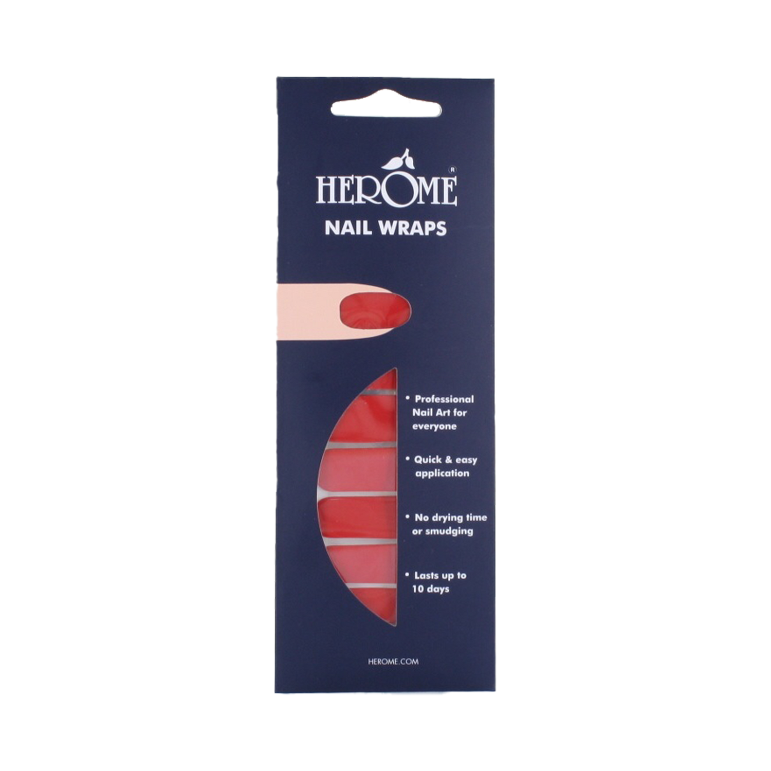
The packaging is a tall, narrow folding carton made of single-layer paperboard. It features a smooth, flat construction with clean edges and precise folds. The exterior is predominantly dark blue with white text and graphics, giving it a modern and appealing look. The front has a die-cut window that allows visibility of the nail wraps inside. The packaging is designed to stand upright, making it suitable for retail display.

The packaging is a tall, narrow folding carton designed for retail display. It features a smooth, flat construction with clean edges and folds. The exterior is predominantly red with white text, showcasing a glossy finish. The front displays the product name 'NAIL HARDENER EXTRA STRONG' in bold white font, alongside the brand name 'HEROME' in a stylized font. The carton has a pointed top, which adds a unique shape to the packaging.

The packaging is a flat, rectangular folding carton designed to hold nail wraps. It features a smooth, single-layer paperboard construction with clean edges and folds. The front displays a vibrant design with a large image of a finger with a nail wrap applied, emphasizing the product's use. The background is a deep blue, contrasting with the bright red of the nail wraps. The overall appearance is sleek and modern, suitable for retail display.

The packaging consists of three distinct folding cartons, each with a smooth, flat construction. The cartons are made of single-layer paperboard, featuring clean edges and precise folds. The first carton is predominantly white with a simple design, the second carton is a darker color with a more elaborate design, and the third carton has a blue and white color scheme with the brand name prominently displayed. Each carton has a rectangular shape and is designed for retail display.

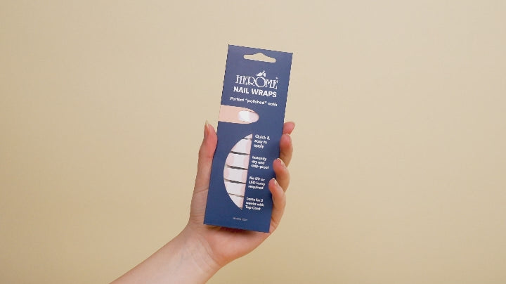
The packaging is a slender, upright carton with a smooth, flat construction. It features a blue background with white text and graphics. The edges are clean and precise, indicative of a folding carton design. The front has a cut-out window that showcases the product inside, and the top is designed with a tuck flap for closure.

The packaging is a flat, rectangular carton designed to hold nail wraps. It features a smooth, single-layer paperboard construction with a glossy finish. The front displays a vibrant blue background with the brand name 'HEROME' prominently at the top in white, bold lettering. Below the brand name, there is a pink oval cut-out that allows visibility of the product inside. The edges are clean and precise, indicating a well-constructed folding carton. The back of the packaging likely contains product information and instructions, although this side is not visible in the image.
About the Brand
Herome Cosmetics delivers a specialized range of nail care solutions, leveraging over 40 years of industry experience. The company’s packaging approach integrates brand visibility with sustainability, using recyclable carton materials and consistent design language.
With a medium-sized workforce and a growing e-commerce presence, Herome targets ethically-minded consumers seeking premium nail care. Their packaging is built for shelf appeal, utilizing folding cartons with custom die-cuts and prominent branding to enhance product differentiation. Seasonal and limited-edition packaging supports agile marketing campaigns and product launches.
Key Differentiator: Herome distinguishes itself through a consistent commitment to sustainability and clean beauty, reflected in both product formulation and packaging choices.
Design System
Visual Style
Modern typography with sans-serif fonts, a blue-dominant color palette complemented by whites and accent reds, and high-contrast layouts ensure immediate brand recognition. Consistent use of bold, clean lines and product imagery enhances shelf impact.
Brand Identity
Logo placement is prioritized on primary display panels, with the 'HEROME' name in a stylized font. Iconography is minimal, focusing on product function and clear labeling. Visual consistency is maintained across all SKUs through uniform color schemes and typographic hierarchy.
Packaging Design
Material selection favors recyclable paperboard with smooth, glossy, or matte finishes. Structural designs include upright folding cartons, rectangular and slender profiles, and strategic die-cuts for product display. Packaging balances retail aesthetics with protective features.
User Experience
Packaging is designed for straightforward unboxing, with easy-open features and product visibility windows. Clear labeling and visually engaging fronts guide the consumer through the purchase and unboxing journey, reinforcing brand values and product benefits at each touchpoint.
Company Metrics
Business insights for Herome Cosmetics based on available data
Market Positioning
Brand Values & Focus
Key Competitors
Target Market: Ethically-driven beauty consumers seeking premium nail care solutions, primarily in EU Tier I markets through direct-to-consumer channels.
Packaging Assessment
Overall Grade
Visual appeal and presentation quality
Packaging durability and protection
Eco-friendliness and recyclable materials
Cost efficiency and value for money
Packaging assessment for Herome Cosmetics based on industry standards and best practices
Frequently Asked Questions
What types of packaging does Herome Cosmetics use?
Herome Cosmetics primarily uses single-layer folding carton boxes for their nail care products, with structural features such as die-cut windows, glossy finishes, and upright retail-oriented designs.
How does Herome address sustainability in packaging?
Herome’s packaging strategy incorporates recyclable paperboard materials and minimizes plastic use, aligning with their broader sustainability ethos and targeting eco-conscious consumers.
Is the packaging designed to enhance the unboxing experience?
Yes, the packaging features vibrant colors, clear branding, and product visibility, which collectively enhance the consumer’s visual and tactile unboxing experience.
Discover other Beauty & Fitness companies
Explore more companies in the beauty & fitness industry and their packaging strategies
Cultiv Cosmetique
Beauty & Fitness
Cultiv Cosmetique is a French skincare brand that provides organic and eco-friendly beauty products inspired by nature. They focus on effective skincare solutions for various skin concerns.
Institut Karité Paris
Beauty & Fitness
Institut Karité Paris specializes in luxury beauty products made with natural Shea Butter, offering a wide range of skincare and body care solutions. The brand combines Parisian heritage with a commitment to quality and creativity in its offerings.
Big Moustache
Beauty & Fitness
Big Moustache specializes in shaving and grooming products tailored for men, providing a hassle-free subscription service for razor blades and skincare essentials.