Hairburst packaging
Hairburst specializes in hair care solutions, with a product range spanning vitamins, supplements, and topical treatments for hair health. Their packaging strategy emphasizes brand consistency and retail appeal, utilizing color-driven designs and robust carton structures tailored for direct-to-consumer shipments and retail display.
Packaging Portfolio
Hairburst employs a packaging portfolio centered on high-quality single-layer paperboard cartons and rigid boxes, optimized for both retail display and direct-to-consumer delivery. The use of pastel colors and precise folding techniques enhances shelf appeal and strengthens brand identity. Structural integrity is prioritized through sturdy materials and clean construction, while design consistency is maintained across product lines to ensure cohesive brand recognition. Visual branding elements such as logos and signature color schemes are integrated across all packaging formats, reinforcing Hairburst’s premium positioning in the beauty sector.
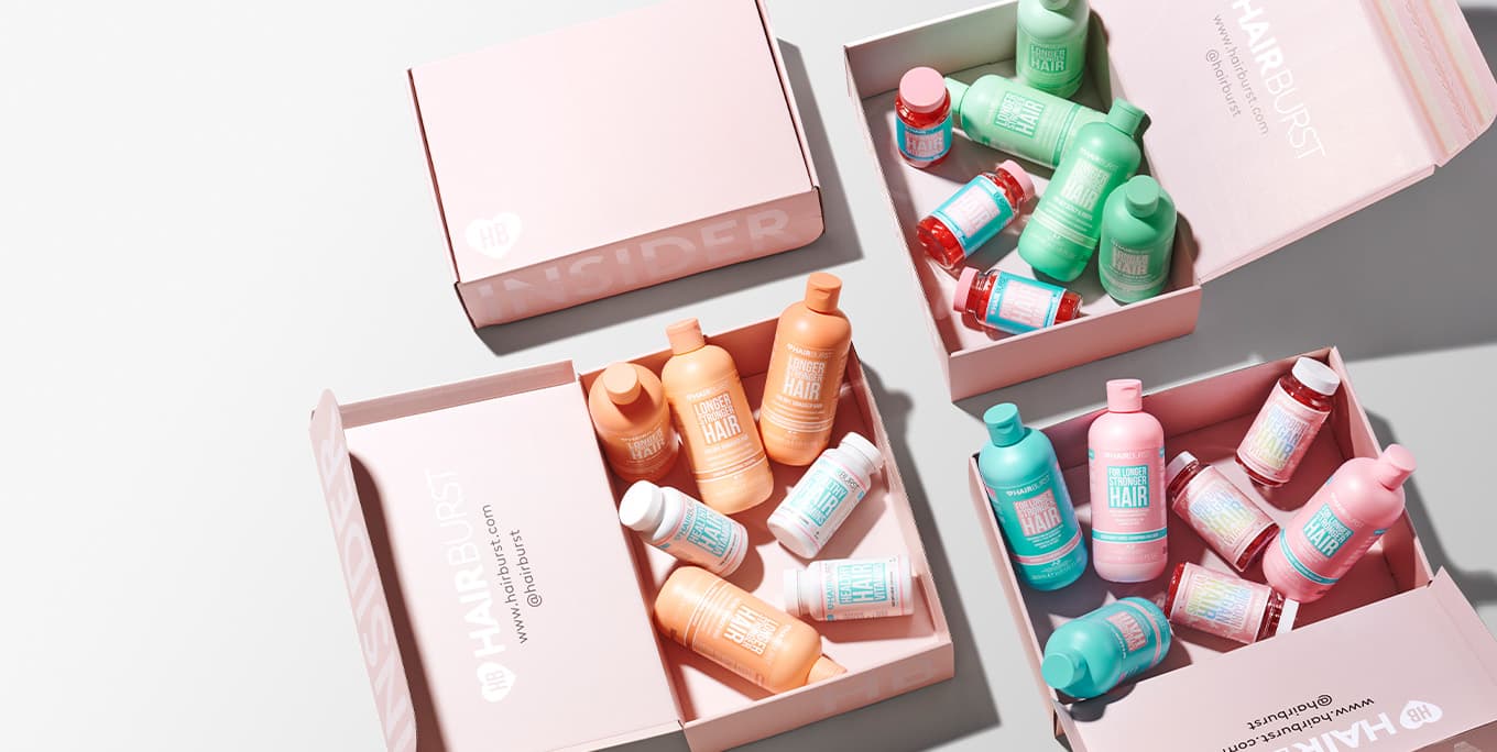
The packaging consists of folding cartons made from smooth, flat paperboard. The boxes are primarily pink with a clean, modern aesthetic, featuring precise edges and folds. The interior is filled with various hair care products, including bottles and capsules, arranged neatly. The packaging is designed for retail display, showcasing the products effectively.

The packaging is a retail carton with a smooth, flat construction made of single-layer paperboard. It features a bright pink and blue color scheme with clear graphics and text. The edges are clean and precise, indicating a well-constructed folding carton. The front displays the product name 'CHEWABLE HAIR VITAMINS' prominently, along with additional product benefits listed in a bullet format. The overall design is appealing and aligns with cosmetic packaging aesthetics.

The packaging consists of several retail cartons for hair care products, including shampoo and conditioner bottles, as well as chewable hair vitamins. Each carton has a smooth, flat construction without fluted layers, indicative of single-layer paperboard. The cartons are primarily colored in pastel shades, featuring a light blue and pink color scheme. The front of each carton displays bold, clear text indicating the product name, with additional details about the benefits of the products. The edges and folds of the cartons are clean and precise, suggesting a well-manufactured product. The overall appearance is light and inviting, suitable for retail display.
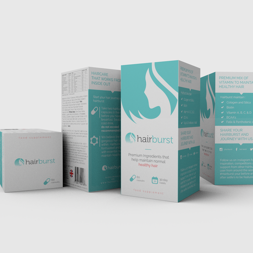
The packaging consists of a series of folded cartons made from smooth, single-layer paperboard. Each carton has a clean, flat construction with precise edges and folds. The overall design features a light blue and white color scheme, with a matte finish that gives it a contemporary look. The cartons are printed with various graphics, including a logo and product information, which are prominently displayed on the front and sides.
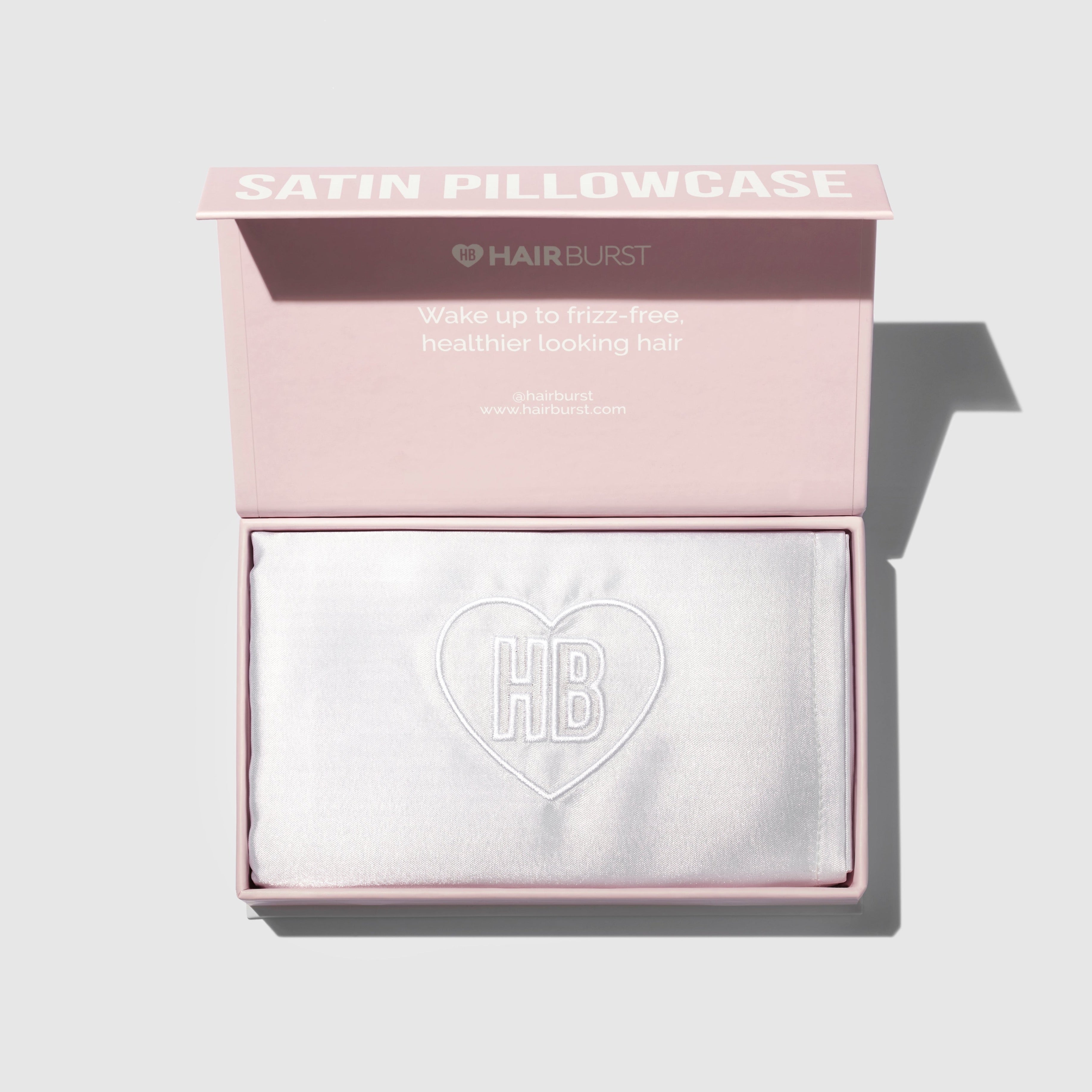
The packaging is a rigid box with a thick, sturdy construction. The exterior is a soft pink color with a glossy finish. The lid features a raised logo and product name in white, embossed lettering. The interior has a smooth, satin-like texture with a white satin pillowcase neatly placed inside, showcasing a heart-shaped logo. The box has clean, precise edges and folds, indicating high-quality craftsmanship.

The packaging consists of a smooth, flat construction made from single-layer paperboard. It features a clean and precise folding design with a light beige exterior and a contrasting pink interior. The edges are sharp and well-defined, indicative of high-quality manufacturing. The box is designed to be lightweight yet sturdy enough for retail use.
About the Brand
Hairburst operates in the beauty and wellness sector, focusing on products designed to address hair thinning and loss through scientifically backed formulations. The brand leverages a direct-to-consumer model, prioritizing research-driven credibility and customer trust in both product efficacy and packaging presentation.
Founded in 2011, Hairburst has maintained a strong position in the competitive hair care market, emphasizing clinical research and visible results as core components of its brand promise. Their packaging choices reflect a commitment to high-quality presentation, with substantial investment in custom cartons and rigid boxes that deliver both shelf impact and secure delivery for e-commerce customers. The use of pastel color palettes and consistent branding elements reinforce recognition and trust, critical in a market segment where consumer confidence is key.
Key Differentiator: Hairburst distinguishes itself through clinically proven product claims, high consistency in packaging aesthetics, and a focus on premium unboxing experiences that reinforce its market positioning as a trusted, science-backed hair wellness brand.
Design System
Visual Style
The visual design utilizes a soft pastel palette dominated by light pinks and blues, coupled with clean sans-serif typography and generous white space for a modern, approachable aesthetic. Packaging finishes include matte and occasional glossy accents to enhance tactile quality.
Brand Identity
Consistent logo placement, clear product naming, and iconography such as heart motifs ensure strong brand recall. All packaging maintains visual coherence through uniform color schemes, font choices, and clear layout hierarchies.
Packaging Design
Material selection favors lightweight, recyclable paperboard for most cartons and thick, rigid boards for luxury items. The structural design emphasizes precise folding, strong edges, and secure closures to balance protection with presentation. Packaging is tailored for both e-commerce and retail requirements.
User Experience
The design system is crafted to deliver a positive unboxing experience, with intuitive opening mechanisms and visually striking interiors. Packaging supports the customer journey from first touchpoint to product access, reinforcing trust and perceived value at every stage.
Company Metrics
Business insights for Hairburst based on available data
Market Positioning
Brand Values & Focus
Key Competitors
Target Market: Health-conscious consumers seeking effective, scientifically supported hair care and supplements, primarily in the UK and broader European D2C e-commerce segments.
Packaging Assessment
Overall Grade
Visual appeal and presentation quality
Packaging durability and protection
Eco-friendliness and recyclable materials
Cost efficiency and value for money
Packaging assessment for Hairburst based on industry standards and best practices
Frequently Asked Questions
What types of packaging does Hairburst use for its products?
Hairburst primarily utilizes single-layer paperboard carton boxes and rigid boxes, designed for both retail presentation and secure e-commerce shipping. Their packaging is characterized by pastel color schemes, clear branding, and precise folding.
How sustainable are Hairburst's packaging materials?
While Hairburst's primary use of paperboard cartons offers some recyclability, there is limited evidence of advanced eco-friendly materials or significant sustainability certifications. The focus remains on presentation and protection rather than cutting-edge sustainability.
How does Hairburst’s packaging support its direct-to-consumer business model?
Their packaging is engineered for efficient shipping and positive unboxing experiences, providing both product protection during transit and strong visual branding upon delivery to consumers.
Discover other Beauty & Fitness companies
Explore more companies in the beauty & fitness industry and their packaging strategies
Orris Paris
Beauty & Fitness
Orris Paris specializes in creating artisanal skincare products that combine potent botanical ingredients with modern cleansing rituals. The company emphasizes natural, holistic practices in its formulations.
Pure Altitude
Beauty & Fitness
Pure Altitude specializes in high-quality beauty and skincare products that leverage the expertise of spa treatments to enhance daily routines. The brand offers a diverse range of products tailored for both facial and body care.
Institut Karité Paris
Beauty & Fitness
Institut Karité Paris specializes in luxury beauty products made with natural Shea Butter, offering a wide range of skincare and body care solutions. The brand combines Parisian heritage with a commitment to quality and creativity in its offerings.