GP Nutrition packaging
GP Nutrition delivers science-backed nutritional supplements with a direct-to-consumer model, utilizing flexible, resealable stand-up pouches as its primary packaging approach. The brand’s packaging emphasizes modern aesthetics, clear branding, and consumer convenience, aligning with premium health and wellness standards.
Packaging Portfolio
GP Nutrition’s packaging portfolio is dominated by flexible, resealable stand-up pouches manufactured with composite materials, including plastic and metallic films. The use of matte and glossy finishes with clear windows provides both premium shelf appeal and product visibility. Structural features such as zipper closures and sealed edges ensure repeated use and product integrity during shipping. The consistent application of clean, modern branding across all pouches reinforces product segmentation and enhances recognizability in the competitive wellness market.

The packaging is a stand-up pouch made of a flexible material, featuring a smooth surface with a metallic gold finish. The front displays a clear window that allows visibility of the contents, which are capsules. The top of the pouch has a resealable zipper closure, providing convenience for repeated use. The edges are sealed, and the overall shape is rectangular with a slight taper towards the bottom, allowing it to stand upright.

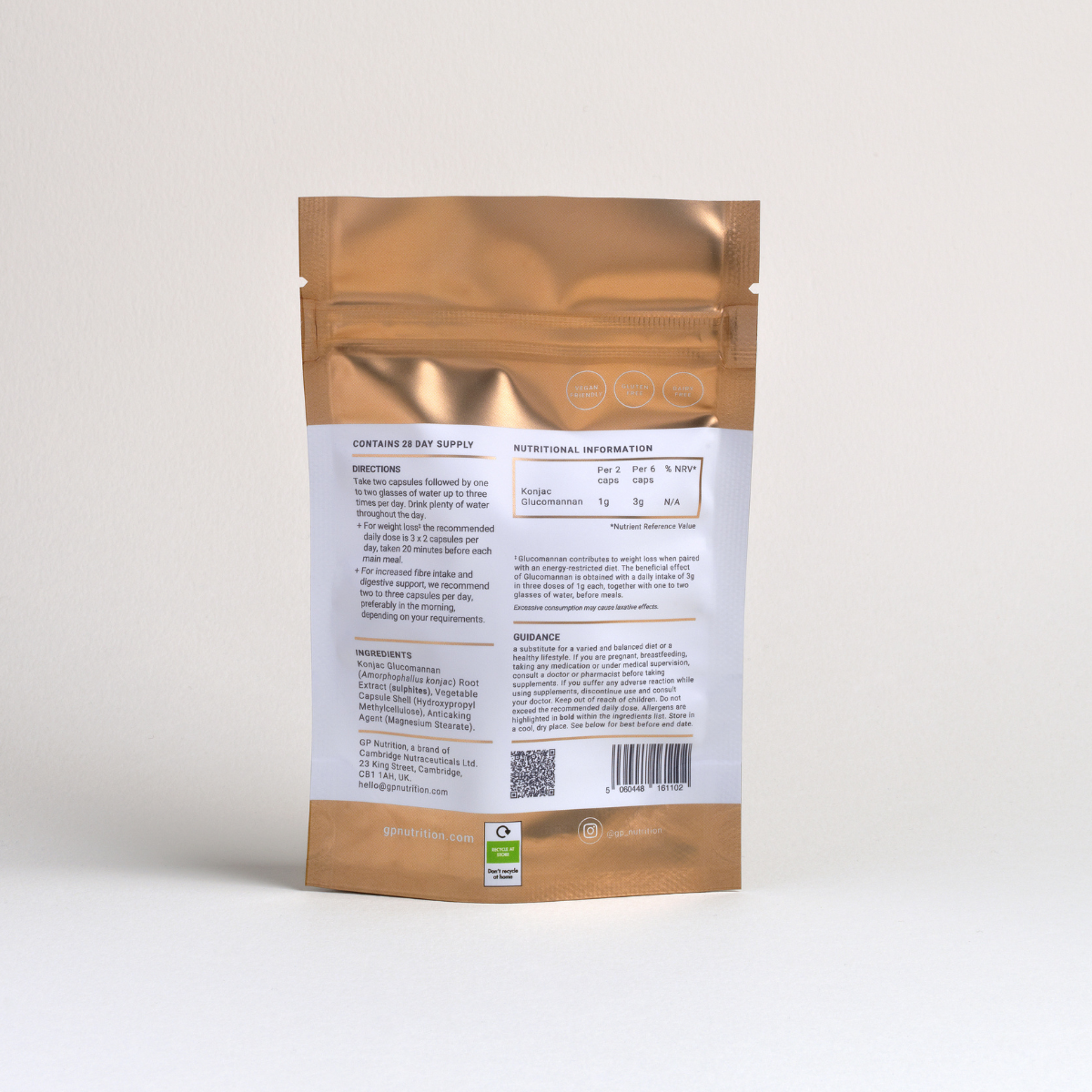
The packaging is a stand-up pouch made from a flexible material that appears to be a composite of plastic and aluminum. It features a glossy finish with a metallic gold color dominating the exterior. The front of the pouch has a white rectangular label that contains product information, including the product name 'Glucomannan' and the word 'FIBRE' in a smaller font. The top of the pouch has a resealable zipper closure, and the overall shape is slightly tapered towards the bottom, allowing it to stand upright. There are no visible flaps or tabs, and the edges are smooth and clean.

The packaging is a stand-up pouch made of a flexible material that allows it to maintain an upright position. The front features a matte gold finish with a clear window at the bottom, allowing visibility of the contents. The back of the pouch is white with printed nutritional information and directions. The edges are sealed, and the top has a re-sealable zipper closure.

The packaging is a stand-up pouch made of a flexible material, featuring a matte finish in a muted blue color. The front displays a large, bold white text reading 'CLEANSE ME' with the brand name 'GP NUTRITION' prominently placed at the bottom. The back of the pouch contains a list of ingredients and nutritional information, printed in a clear, legible font. The edges are sealed, and the top has a resealable zipper closure.

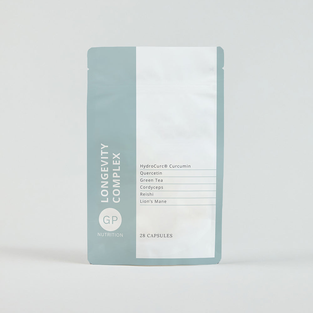
The packaging is a flat, stand-up pouch made from a flexible material. It features a smooth surface with a matte finish. The pouch is primarily white with a light blue accent at the top. The front displays the product name 'LONGEVITY COMPLEX' in bold, modern typography, along with a list of key ingredients in smaller text. The overall design is clean and minimalistic, emphasizing a health-oriented product.
About the Brand
GP Nutrition specializes in high-quality nutritional supplements and wellness products, targeting consumers seeking science-driven solutions for health, beauty, and vitality. The company’s packaging strategy is closely tied to its premium brand positioning and commitment to customer convenience through subscription services.
Operating with a lean team and a strong online presence, GP Nutrition uses flexible stand-up pouches with resealable closures and clear branding across its product range. This approach supports both logistics efficiency and an elevated unboxing experience, while also communicating product transparency and quality through design and material choices.
Key Differentiator: GP Nutrition’s key differentiator lies in its integration of expert-driven formulations and a consistently branded, modern packaging system that reinforces trust and product efficacy for the health and wellness segment.
Design System
Visual Style
Modern minimalist typography, typically sans-serif with bold weight for product names. The color palette features metallic golds, muted blues, and dominant whites for a clean, clinical, yet premium aesthetic. High contrast and negative space are used to enhance readability and shelf impact.
Brand Identity
Consistent use of the GP Nutrition logo, product-specific iconography, and standardized label placement. Visual consistency is maintained through repetition of core colors, design motifs, and clear product descriptors across all SKUs.
Packaging Design
Material choices favor lightweight, flexible pouches, optimizing for efficient shipping and resealability. The structural design philosophy prioritizes consumer convenience (easy open/close, stand-up format) and product protection, with a balance between visual appeal and logistical practicality.
User Experience
The design supports the customer journey through clear labeling, transparent windows for product assurance, and tactile finishes that enhance perceived value. The unboxing experience is elevated by visual uniformity and resealable features, aligning with subscription-based repeat purchase behaviors and fostering brand trust.
Company Metrics
Business insights for GP Nutrition based on available data
Market Positioning
Brand Values & Focus
Key Competitors
Target Market: Health-conscious consumers seeking premium, science-based supplements in the UK and broader European D2C market, with a focus on beauty, wellness, and lifestyle improvements.
Packaging Assessment
Overall Grade
Visual appeal and presentation quality
Packaging durability and protection
Eco-friendliness and recyclable materials
Cost efficiency and value for money
Packaging assessment for GP Nutrition based on industry standards and best practices
Frequently Asked Questions
What types of packaging does GP Nutrition primarily use?
GP Nutrition primarily utilizes flexible, resealable stand-up pouches, often with matte or metallic finishes and clear windows for product visibility. These structures support product freshness and user convenience.
How does GP Nutrition’s packaging support its subscription model?
The use of resealable, durable pouches enables efficient recurring shipments, minimizes waste, and enhances the customer experience for subscribers receiving regular deliveries.
Is GP Nutrition’s packaging environmentally friendly?
The packaging employs lightweight flexible materials, which reduce shipping emissions, but does not explicitly prioritize recycled or compostable materials, resulting in moderate sustainability performance.
Discover other Health companies
Explore more companies in the health industry and their packaging strategies
EVO Nutrition
Health
EVO Nutrition specializes in premium health supplements, providing a wide range of vitamins and nutritional products to support well-being.
Comvita
Health
Comvita is a New Zealand-based company specializing in high-quality Mānuka honey and natural health products. Established in 1974, it aims to connect people with the healing power of nature.
Bio-Synergy
Health
Bio-Synergy is a UK-based company specializing in health and fitness products, including nutritional supplements and DNA testing kits. Their mission is to support individuals in achieving their health and fitness goals through innovative products and personalized insights.