GoGoldenTree packaging
GoGoldenTree is a direct-to-consumer provider of vegan, natural health supplements, focusing on clean formulations and customer trust. Their packaging strategy centers on brand-forward carton boxes and plastic bottles, balancing visual appeal with protective functionality.
Packaging Portfolio
GoGoldenTree’s packaging solutions are characterized by the use of single-layer paperboard folding cartons and clear PET or HDPE bottles. Carton boxes are employed for powders and sachet-based products, providing both structural integrity and high-impact branding real estate. Plastic bottles are chosen for capsules, optimizing visibility and shelf appeal while ensuring moisture protection and tamper resistance. Across formats, the brand employs consistent white and gold color schemes, gloss and matte finishes, and easy-to-read labels, supporting both logistics efficiency and consumer experience.
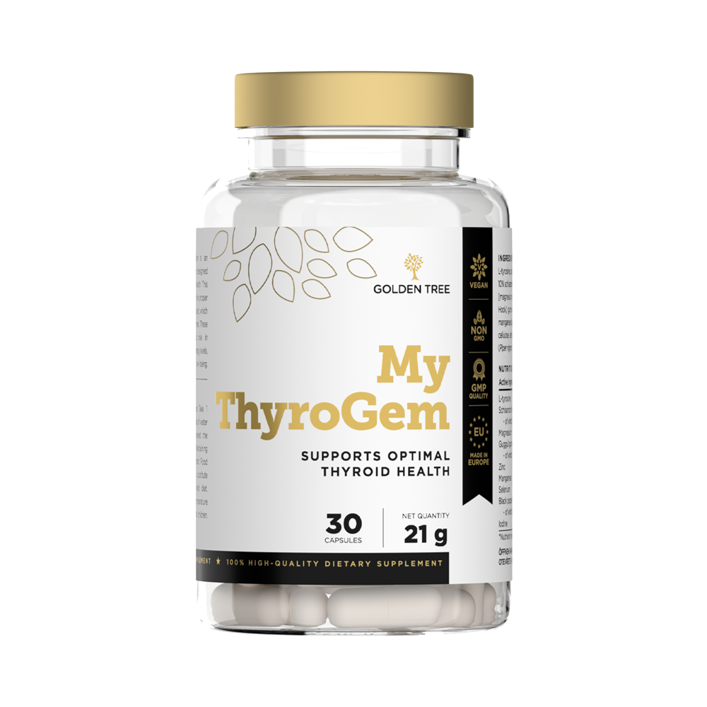
The packaging is a clear plastic bottle with a round shape and a wide mouth. The bottle contains white capsules and has a white and gold label wrapped around its body. The label features a minimalist design with a leaf motif, the brand name 'GOLDEN TREE' prominently displayed at the top, and the product name 'My ThyroGem' in a larger font. The label includes additional product information such as 'Supports Optimal Thyroid Health' and '30 Capsules'. The overall appearance is clean and modern.
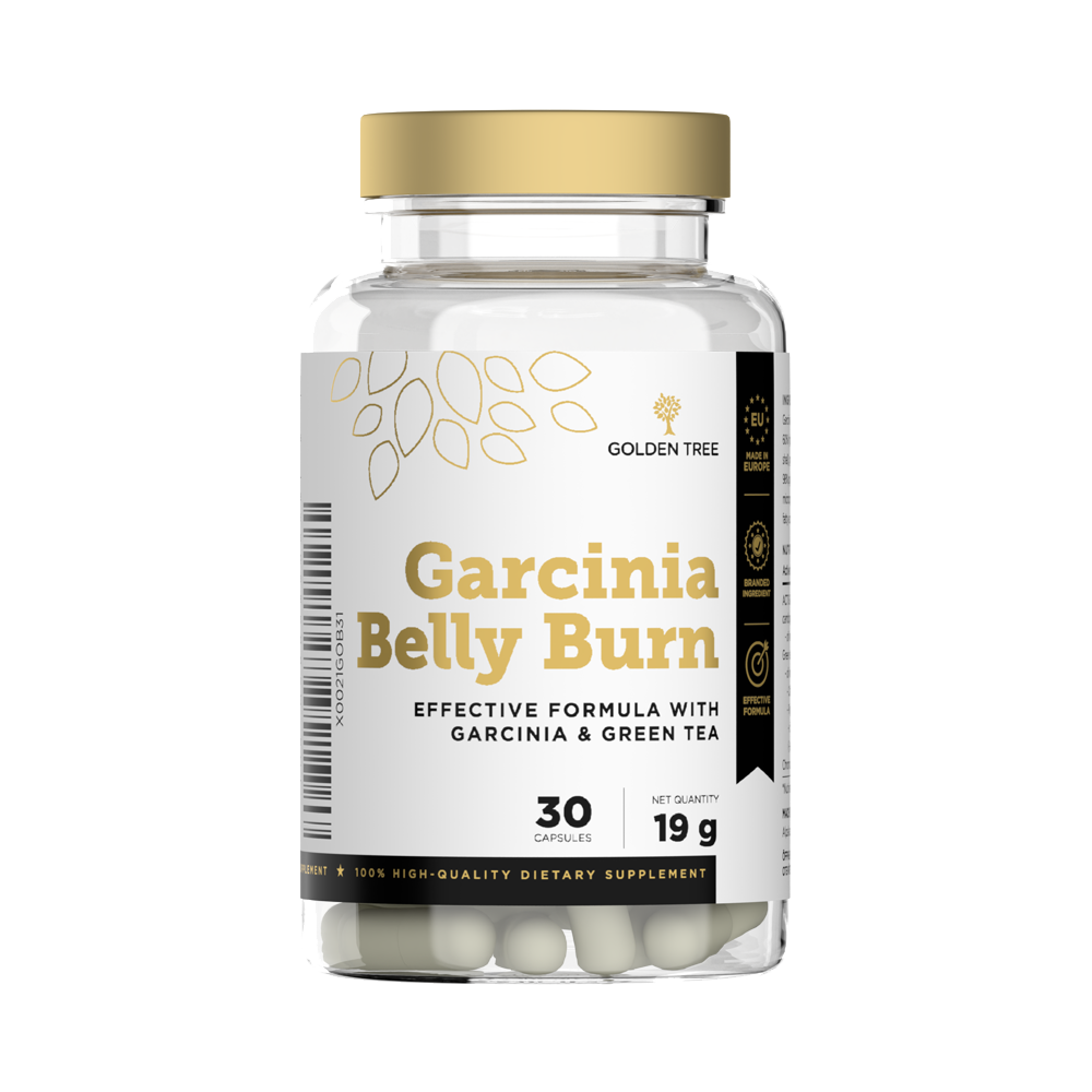
The packaging is a clear plastic bottle with a white cap. The bottle contains capsules and has a label wrapped around it. The label features a gold and white color scheme with the product name prominently displayed. The design includes leaf motifs and text indicating the product's purpose as a dietary supplement.
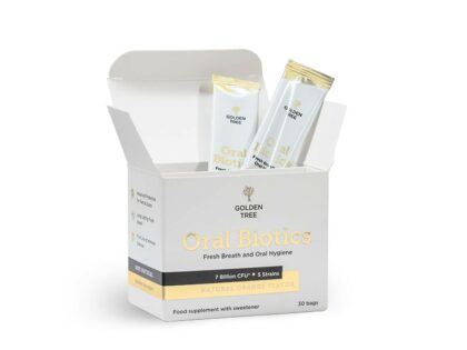
The packaging is a folding carton with a smooth, flat construction. It features a clean, precise design with a white exterior and gold accents. The box opens from the top with a tuck flap closure, providing easy access to the contents inside. The interior holds individual sachets of the product, which are neatly arranged. The overall shape is rectangular, suitable for retail display.
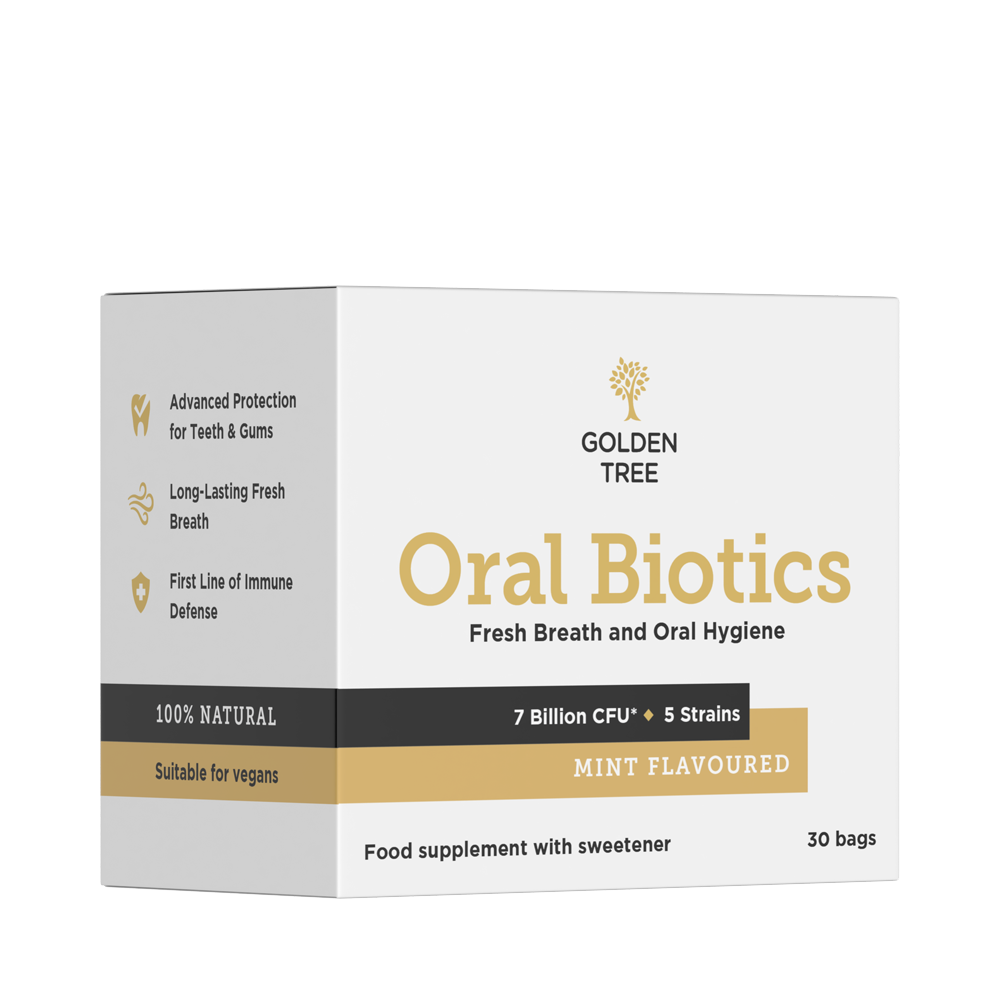
The packaging is a folding carton made from single-layer paperboard. It features a smooth, flat construction with clean edges and precise folds. The box is predominantly white with colorful graphics and text. The front displays the product name 'Oral Biotics' prominently, along with icons indicating benefits. The overall shape is rectangular, designed to stand upright. The box has a glossy finish, enhancing its visual appeal.
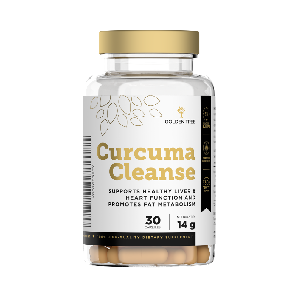
The packaging is a clear plastic bottle with a round shape and a wide mouth. The bottle is filled with capsules that are visible through the transparent material. The label wraps around the bottle, featuring a white background with gold accents. The label includes the product name 'Curcuma Cleanse' prominently displayed in bold lettering, along with supporting text about health benefits. The top of the bottle has a white screw-on cap.
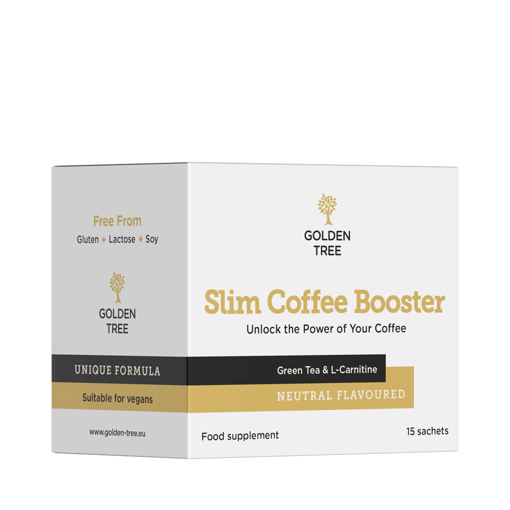
The packaging is a folding carton made from single-layer paperboard. It features a smooth, flat construction with clean edges and precise folds. The box is predominantly white with a matte finish, accented by black and gold graphics. The front displays the product name 'Slim Coffee Booster' prominently, along with a brief description and branding elements. The sides contain additional product information and a website URL. The box has a rectangular shape, suitable for retail display.
About the Brand
GoGoldenTree specializes in the development and distribution of vegan and natural supplements targeting a variety of health and wellness concerns. Their packaging approach leverages branded carton boxes and clear plastic bottles, emphasizing both product protection and clear, consistent brand messaging.
The brand’s product catalog incorporates solutions for detoxification, weight management, and beauty, requiring versatile packaging to accommodate powders, capsules, and sachets. Packaging is carefully designed to reinforce the company’s commitment to quality, using clean aesthetics and consistent iconography to communicate key product attributes. The integration of prominent logos and health claims further supports consumer trust while enabling efficient retail display and logistics.
Key Differentiator: GoGoldenTree differentiates itself through the consistent application of clean, health-centric branding across both primary and secondary packaging, with an emphasis on customer-centric design and transparent communication of health benefits.
Design System
Visual Style
Typography favors clean, sans-serif fonts for clarity and modernity. The color palette is predominantly white, gold, and subtle accent colors, reinforcing a premium, health-focused image. Visual hierarchy is maintained through bold product names and minimalistic graphics.
Brand Identity
Logo usage is prominent on all packaging, accompanied by consistent iconography and health claims. Visual consistency is achieved through repetition of color schemes, structured layouts, and uniform placement of brand elements.
Packaging Design
Material choices prioritize single-layer carton board for boxes and PET/HDPE for bottles, balancing cost, protection, and visual clarity. Structural design emphasizes ease of opening, tamper evidence, and stackable, retail-ready formats.
User Experience
Design choices support an intuitive unboxing process, clear product identification, and trust signals via visible certifications and ingredient claims. The packaging enhances the customer journey by aligning physical presentation with the brand’s digital and marketing communications.
Company Metrics
Business insights for GoGoldenTree based on available data
Market Positioning
Brand Values & Focus
Key Competitors
Target Market: GoGoldenTree targets health-conscious consumers seeking vegan, natural supplements, with a strong presence in online direct-to-consumer channels across the UK and broader European markets.
Packaging Assessment
Overall Grade
Visual appeal and presentation quality
Packaging durability and protection
Eco-friendliness and recyclable materials
Cost efficiency and value for money
Packaging assessment for GoGoldenTree based on industry standards and best practices
Frequently Asked Questions
What types of packaging formats does GoGoldenTree utilize?
GoGoldenTree primarily uses folding carton boxes for powders and sachets, and clear plastic bottles with branded labels for capsules and supplement products. This dual approach allows for efficient protection, retail display, and brand consistency.
How does GoGoldenTree’s packaging support product safety during shipping?
Their packaging solutions, including rigid carton boxes and durable plastic bottles with secure closures, are engineered to minimize damage and preserve product integrity during transit.
What sustainability initiatives are evident in GoGoldenTree’s packaging?
While GoGoldenTree’s focus is on clean materials and minimalistic design, reliance on plastic bottles limits overall sustainability. However, the use of recyclable carton board for secondary packaging improves the environmental profile.
Discover other Health companies
Explore more companies in the health industry and their packaging strategies
Comvita
Health
Comvita is a New Zealand-based company specializing in high-quality Mānuka honey and natural health products. Established in 1974, it aims to connect people with the healing power of nature.
Bio-Synergy
Health
Bio-Synergy is a UK-based company specializing in health and fitness products, including nutritional supplements and DNA testing kits. Their mission is to support individuals in achieving their health and fitness goals through innovative products and personalized insights.
EVO Nutrition
Health
EVO Nutrition specializes in premium health supplements, providing a wide range of vitamins and nutritional products to support well-being.