GliSODin packaging
GliSODin specializes in nutricosmetics and nutraceuticals targeting skin health and wellness, underpinned by clinical research and natural antioxidant formulations. Their packaging approach leverages minimalist carton boxes and supplement bottles, prioritizing clarity, brand consistency, and retail-ready presentation.
Packaging Portfolio
GliSODin deploys a standardized packaging portfolio comprised predominantly of single-layer, paperboard carton boxes for retail shelf presentation and cylindrical plastic bottles for supplement delivery. Cartons exhibit high print quality, matte or glossy finishes, and precise folds, catering to both aesthetic and protective needs. Labeling is optimized for regulatory compliance and consumer information clarity, while the overall form factors are lightweight and designed for efficient storage and shipping. No evidence of complex multi-material structures or secondary protective packaging is observed, reflecting a streamlined, cost-efficient approach suitable for beauty supplement SKUs.
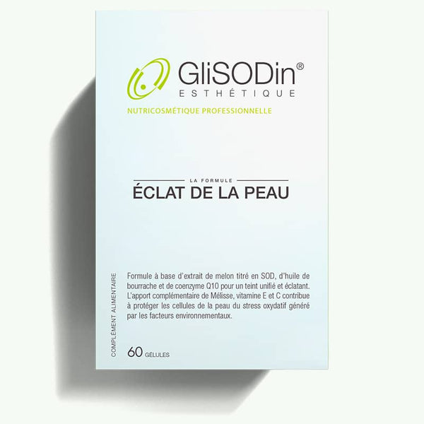
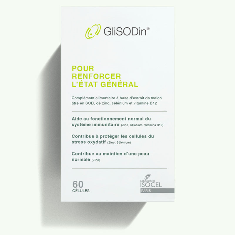
The packaging is a flat, smooth, single-layer paperboard carton with clean edges and folds. It features a light blue color with a glossy finish, displaying a professional appearance. The front side contains a logo and product name, while the sides have additional product information. The construction is precise, with no visible fluted layers, indicating it is made from paperboard. The edges are sharp and well-defined, typical of retail packaging.
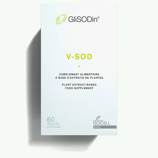
The packaging is a flat, rectangular box made from a single layer of paperboard. It features clean, precise edges and folds, with a smooth surface. The box is predominantly white with green accents, displaying a minimalist design. The front includes the product name 'V-SOD' in a bold, modern font, along with additional text in smaller font sizes. The overall appearance is light and airy, suitable for retail display.
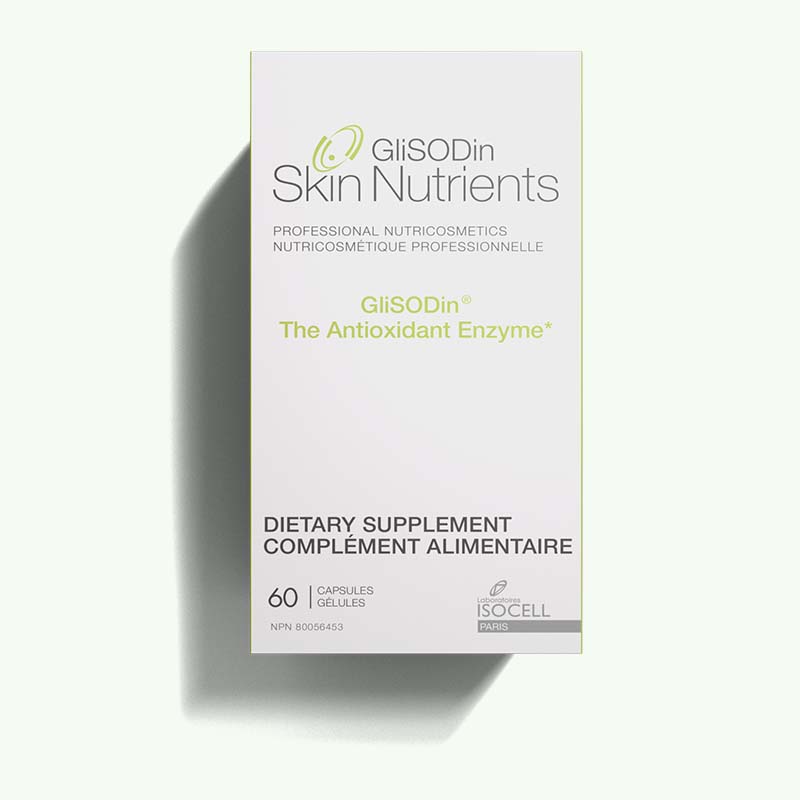
The packaging is a flat, rectangular box made from single-layer paperboard. It features smooth, clean edges and precise folds, indicative of a folding carton. The exterior is predominantly white with green accents, showcasing a modern and clean design. The front displays the product name and key information in a clear, legible font, while the sides contain additional product details. The box has a lightweight appearance, typical of retail packaging, and lacks any visible fluted layers.
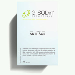
The packaging is a smooth, flat construction made from single-layer paperboard, featuring clean edges and precise folds. It has a light blue background with a glossy finish, giving it a polished appearance. The front displays the product name 'ANTI-ÂGE' prominently, along with the brand name 'GliSOdin' in a larger font. The overall design is minimalistic and professional, consistent with cosmetic or health-related products.
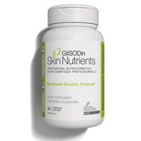
The packaging is a cylindrical bottle with a wide mouth and a screw-on cap. The bottle is primarily white with a glossy finish, featuring a label that wraps around its circumference. The label includes colorful graphics and text, providing product information and branding elements. The overall shape is typical for dietary supplements, designed for easy handling and dispensing.
The packaging is a flat, rectangular box made of smooth, single-layer paperboard. It features clean edges and precise folds, typical of retail packaging. The exterior is predominantly white with vibrant green and yellow text. The box has a matte finish, giving it a sleek appearance. The front displays the product name prominently, along with descriptive text about its benefits. There are no visible fluted layers, indicating it is not corrugated. The box appears to be designed for shelf display, with no signs of wear or damage.
About the Brand
GliSODin delivers science-backed beauty supplements, focusing on oxidative stress reduction and skin vitality through advanced nutricosmetic formulations. The company operates primarily in the B2C segment, distributing directly to consumers via a robust e-commerce platform. Packaging is designed to communicate clinical credibility and product efficacy.
GliSODin's portfolio centers on clinically validated antioxidant supplements, with a business model integrating digital channels and expert collaborations. Packaging solutions are tailored for retail and direct-to-consumer fulfillment, emphasizing clean aesthetics, product information clarity, and protective functionality. Operations are France-based, supporting stringent quality control and consistent branding across all product lines.
Key Differentiator: The brand distinguishes itself through scientifically proven formulations, proprietary French melon-derived ingredients, and a packaging strategy that reinforces premium positioning and trust among health-conscious consumers.
Design System
Visual Style
Typography is clean and sans-serif, supporting legibility and a clinical appearance. The color palette is predominantly white with green and blue accents, creating a fresh, health-oriented aesthetic. Minimalist layout and high-contrast text reinforce a modern, professional image.
Brand Identity
Consistent use of the GliSODin logo, prominent product naming, and structured label hierarchies ensure brand recognizability. Iconography is minimal, focusing on clarity and scientific credibility. Visual consistency is maintained across all SKUs and packaging types.
Packaging Design
Material choices favor single-layer paperboard for cartons and PET or HDPE for supplement bottles, balancing print quality and product protection. Structural design is utilitarian, with emphasis on stackability, efficient shipping, and ease of use for end consumers.
User Experience
Packaging is designed to facilitate straightforward unboxing and immediate access to product information. The clean, uncluttered presentation supports trust and aligns with the brand's clinical ethos, guiding consumers through a seamless purchase-to-usage journey.
Company Metrics
Business insights for GliSODin based on available data
Market Positioning
Brand Values & Focus
Key Competitors
Target Market: Health-conscious consumers seeking premium, clinically validated beauty and wellness supplements, primarily in urban and digital-driven markets.
Packaging Assessment
Overall Grade
Visual appeal and presentation quality
Packaging durability and protection
Eco-friendliness and recyclable materials
Cost efficiency and value for money
Packaging assessment for GliSODin based on industry standards and best practices
Frequently Asked Questions
What types of packaging does GliSODin use for its products?
GliSODin primarily utilizes single-layer paperboard carton boxes for retail display and cylindrical plastic supplement bottles for oral products, focusing on clean design, clear labeling, and shelf durability.
How does GliSODin's packaging reinforce its brand identity?
Packaging features consistent brand elements such as the GliSODin logo, a minimalist color palette, and legible typography, aligning with the brand's focus on clinical efficacy and natural wellness.
Is GliSODin's packaging environmentally sustainable?
While carton boxes are generally recyclable, there is limited evidence of advanced sustainable practices (e.g., use of recycled materials or eco-certifications), suggesting moderate sustainability performance.
Discover other Beauty & Fitness companies
Explore more companies in the beauty & fitness industry and their packaging strategies
Pure Altitude
Beauty & Fitness
Pure Altitude specializes in high-quality beauty and skincare products that leverage the expertise of spa treatments to enhance daily routines. The brand offers a diverse range of products tailored for both facial and body care.
Institut Karité Paris
Beauty & Fitness
Institut Karité Paris specializes in luxury beauty products made with natural Shea Butter, offering a wide range of skincare and body care solutions. The brand combines Parisian heritage with a commitment to quality and creativity in its offerings.
Owari
Beauty & Fitness
Owari specializes in 100% natural beauty and fitness products, designed to enhance health and wellness. The company proudly offers its products made in France, emphasizing quick delivery and customer support.