Florihana packaging
Florihana is a French distillery specializing in organic essential oils and natural beauty products, with a packaging approach centered on sustainability and quality presentation. Their packaging solutions reinforce brand values of purity, safety, and environmental responsibility.
Packaging Portfolio
Florihana's packaging portfolio features a blend of carton boxes, rigid wooden presentation cases, and premium amber glass bottles. The primary packaging leverages recyclable paperboard and glass to maintain product integrity and minimize contamination risk, while secondary packaging—such as smooth folding cartons and wooden boxes—enhances perceived value and supports safe shipping. The use of secure closures, multi-lingual labeling, and minimalist design reinforces the brand's organic positioning and ensures regulatory compliance across international markets. Each format is optimized for both retail display and direct-to-consumer fulfillment, reflecting a balance of durability, sustainability, and brand storytelling.
The packaging is a smooth, flat carton box made of single-layer paperboard. It features a cylindrical shape with a wide mouth and a screw cap. The exterior is predominantly blue with a white label. The label has a clean design with a circular logo at the top, product name in bold text, and additional product information below. The edges are precise, and the overall appearance is lightweight and retail-friendly.
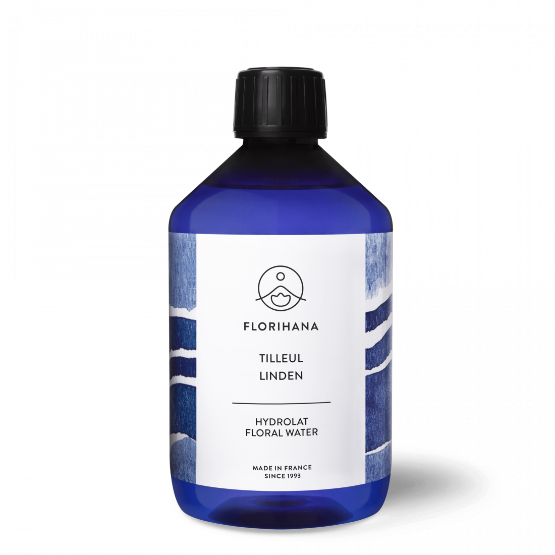
The packaging is a clear blue plastic bottle with a black screw cap. The bottle is cylindrical in shape, with a smooth surface and no visible seams. The label wraps around the body of the bottle, featuring vibrant colors and floral imagery. The label includes text in multiple languages, indicating the product name, type, and brand information. The overall appearance is clean and modern, with a focus on organic and natural elements.
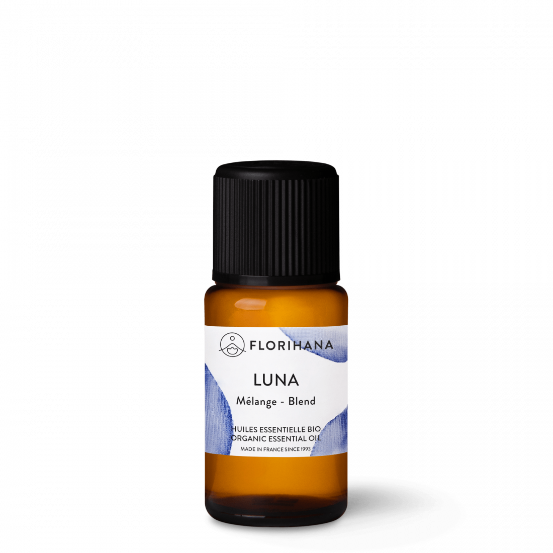
The packaging consists of a small amber glass bottle with a black plastic screw cap. The bottle is cylindrical, with a smooth surface and a label wrapped around its body. The label features a white background with blue watercolor elements, and text indicating the product name 'LUNA' and its description as an 'Organic Essential Oil'. The overall appearance is sleek and modern, suitable for a premium product.
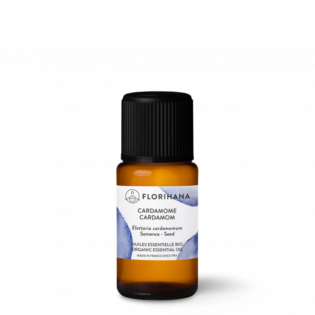
The packaging consists of a small, amber glass bottle with a black plastic dropper cap. The bottle has a cylindrical shape and is designed to hold essential oil. The label on the bottle features a white background with blue watercolor accents, displaying the product name 'Cardamome' and additional information in both English and French. The label is clean and professionally printed, with a matte finish.
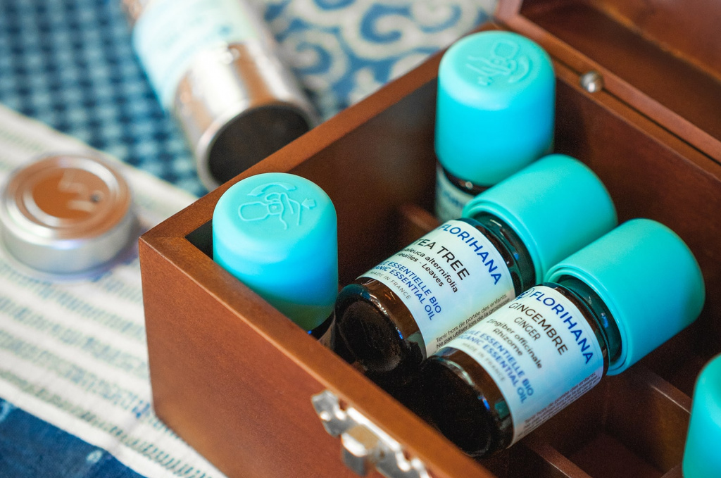
The packaging consists of a wooden box containing several small glass bottles of essential oils. The box has a polished finish and is designed to hold the bottles securely in place. The bottles have a dark glass body with a light blue plastic cap. The labels on the bottles are white with blue text, indicating the type of essential oil inside. The overall appearance is elegant and organized, with the bottles arranged neatly within the box.
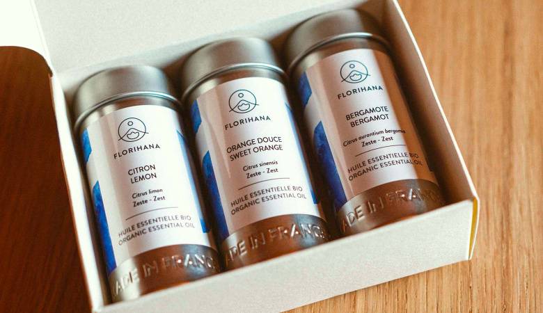
The packaging is a folding carton designed to hold three cylindrical containers of essential oils. It features a smooth, flat construction without any visible fluted layers, indicating it is made from single-layer paperboard. The exterior is predominantly white with a matte finish, providing a clean and elegant appearance. The box has a hinged lid that opens easily, revealing the contents inside. The edges are cleanly folded, and the overall form is rectangular, designed to fit the cylindrical bottles snugly.
About the Brand
Florihana produces 100% organic essential oils, hydrolats, and natural beauty products, emphasizing stringent quality standards and environmental preservation. The company leverages a direct-to-consumer model to deliver botanically sourced wellness solutions.
Packaging at Florihana is designed to reflect the brand's commitment to purity, transparency, and ecological stewardship. The use of recyclable materials, minimalist structures, and clear product labeling underscores an approach rooted in both functionality and aesthetics. Consistent branding across primary and secondary packaging builds consumer trust while supporting logistical efficiency and shelf impact.
Key Differentiator: Florihana's unique combination of strict organic certifications, sustainable sourcing, and educational consumer engagement is reflected in its packaging strategy, which prioritizes environmental responsibility and premium presentation.
Design System
Visual Style
Florihana utilizes clean, sans-serif typography paired with a restrained color palette dominated by white, blue, and natural wood tones. The aesthetic is minimalist, focusing on clarity, elegance, and a sense of botanical purity.
Brand Identity
Consistent use of the Florihana logo and circular emblem ensures strong brand recognition. Iconography is understated, with subtle watercolor elements and clear labeling in both French and English for international accessibility. The overall design language emphasizes trust and authenticity.
Packaging Design
Material selection prioritizes glass and recyclable paperboard, with wooden boxes reserved for premium sets. Structural design is purpose-driven: cylindrical bottles for liquid containment, snug-fit cartons for secure transit, and hinged wooden cases for multi-bottle gifting. Emphasis is placed on minimizing excess material without compromising product safety.
User Experience
Packaging is designed to facilitate an intuitive and rewarding unboxing experience, with easy-to-open closures and organized presentation. Clear labeling, tactile finishes, and premium materials contribute to a positive customer journey, reinforcing the brand’s values of quality and sustainability at each touchpoint.
Company Metrics
Business insights for Florihana based on available data
Market Positioning
Brand Values & Focus
Key Competitors
Target Market: Health-conscious consumers, beauty and wellness enthusiasts, and businesses seeking certified organic ingredients for personal care applications in Europe and international markets.
Packaging Assessment
Overall Grade
Visual appeal and presentation quality
Packaging durability and protection
Eco-friendliness and recyclable materials
Cost efficiency and value for money
Packaging assessment for Florihana based on industry standards and best practices
Frequently Asked Questions
How does Florihana ensure the sustainability of its packaging?
Florihana utilizes recyclable paperboard, glass, and minimally processed materials to reduce environmental impact, aligning packaging with the company's organic and eco-responsible ethos.
What types of packaging formats does Florihana use for its essential oils?
Florihana employs carton boxes, rigid wooden boxes, and amber glass bottles with secure closures, optimizing product protection and brand presentation for both retail and direct-to-consumer channels.
How does packaging design reinforce Florihana’s brand identity?
Consistent use of logo, clean typography, and a natural color palette across all packaging elements ensures strong brand cohesion and immediate product recognition.
Discover other Beauty & Fitness companies
Explore more companies in the beauty & fitness industry and their packaging strategies
Institut Karité Paris
Beauty & Fitness
Institut Karité Paris specializes in luxury beauty products made with natural Shea Butter, offering a wide range of skincare and body care solutions. The brand combines Parisian heritage with a commitment to quality and creativity in its offerings.
Pure Altitude
Beauty & Fitness
Pure Altitude specializes in high-quality beauty and skincare products that leverage the expertise of spa treatments to enhance daily routines. The brand offers a diverse range of products tailored for both facial and body care.
Owari
Beauty & Fitness
Owari specializes in 100% natural beauty and fitness products, designed to enhance health and wellness. The company proudly offers its products made in France, emphasizing quick delivery and customer support.