Flora Danica packaging
Flora Danica specializes in premium silk scarves, leveraging luxury rigid boxes and sophisticated carton formats to deliver a high-end customer experience. Their packaging strategy focuses on material quality, refined aesthetics, and brand narrative integration.
Packaging Portfolio
Flora Danica’s packaging portfolio is dominated by rigid boxes and luxury gift cartons, constructed from thick chipboard and high-grade paperboard. The structural integrity ensures protection for delicate silk products, while matte finishes and muted botanical color schemes reinforce a premium tactile and visual impression. Minimalist branding and precise folding techniques reflect a focus on craftsmanship and exclusivity, with packaging formats tailored for both direct-to-consumer shipping and upscale retail presentation.
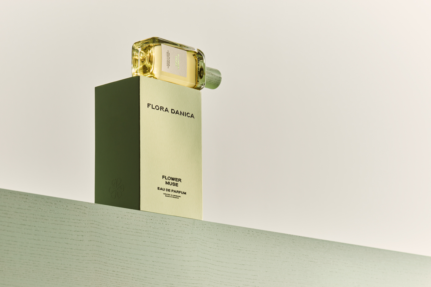
The packaging features a tall, rectangular box with a premium finish, designed to hold a perfume bottle. The box has a sturdy construction with thick walls, giving it a luxurious feel. The surface is smooth and matte, likely coated for a high-quality appearance. The front displays the brand name 'FLORA DANICA' in elegant, understated typography, while the color scheme is a soft, muted green, enhancing the premium aesthetic.
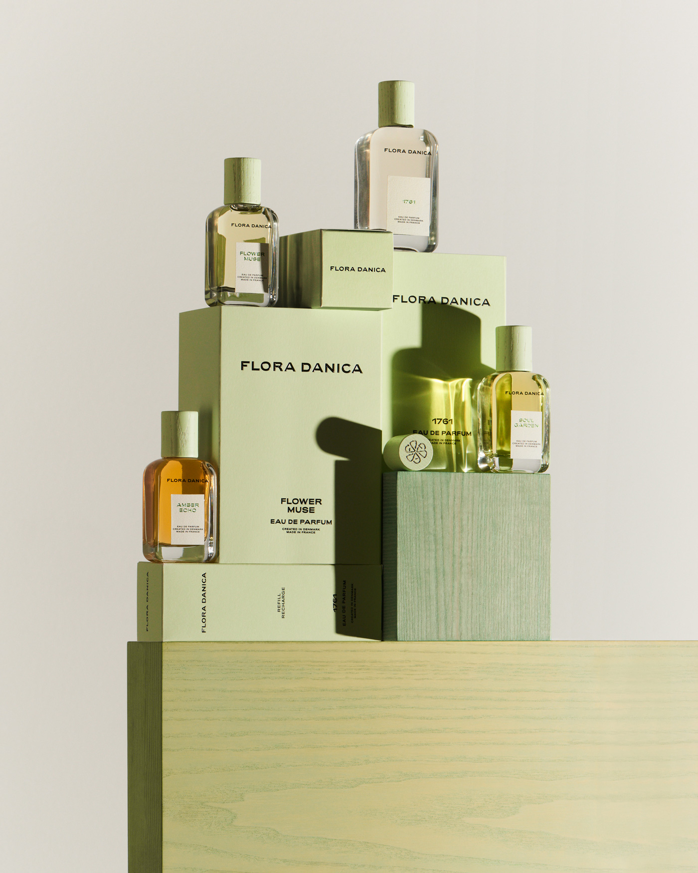
The packaging consists of several rigid boxes and cartons stacked together, primarily in a light green color. The boxes feature clean, precise edges and folds, indicating a high-quality construction. The surface has a matte finish, enhancing the premium feel. The boxes are adorned with minimalistic text and branding elements, maintaining a cohesive design aesthetic.
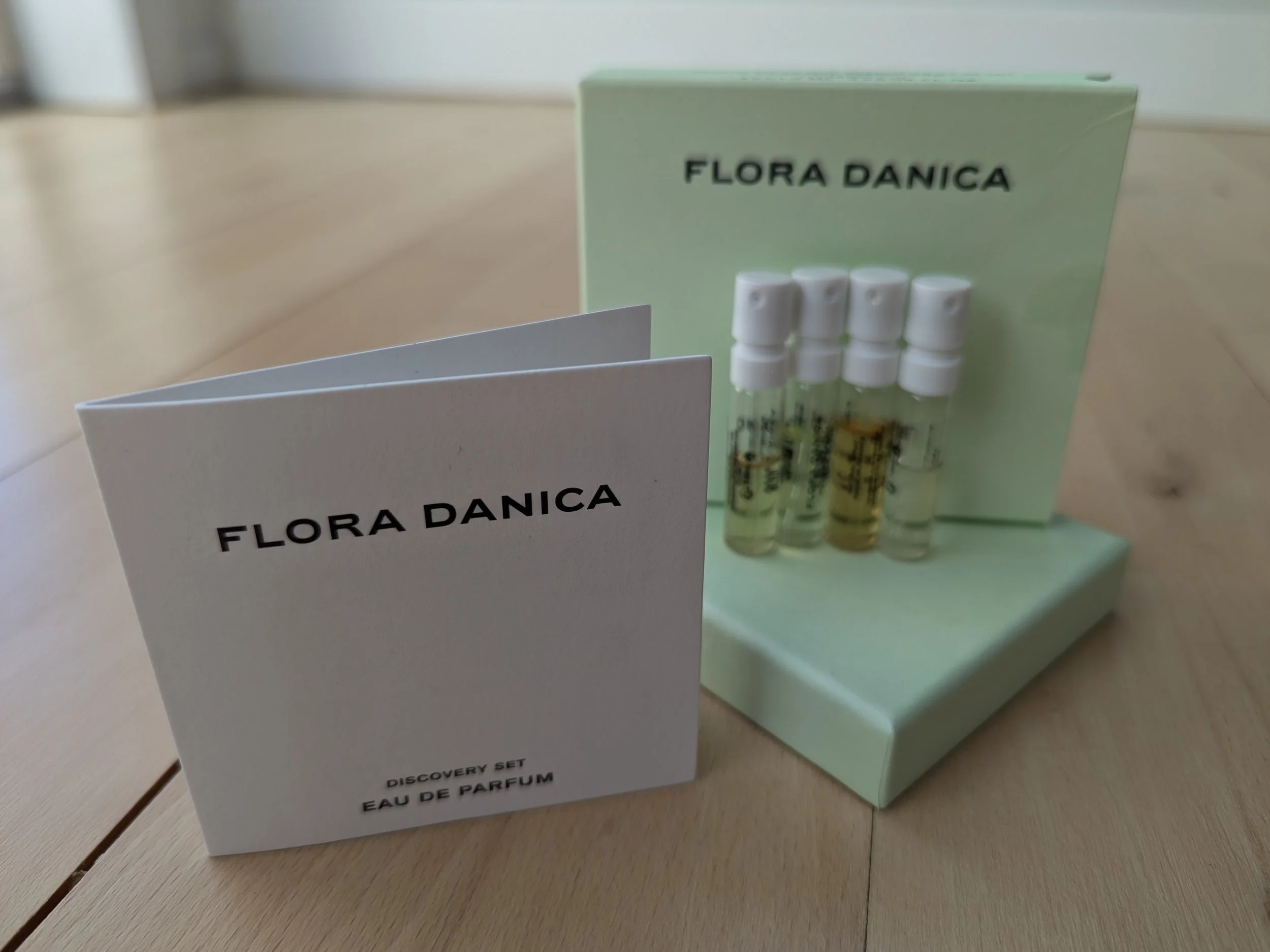
The packaging consists of a rigid box that holds several small vials of perfume. The box is made of thick chipboard with a premium feel, featuring a smooth exterior finish. The color is a soft green, giving it an elegant appearance. The box has a lid that fits snugly over the base, indicating a sturdy construction. The vials inside are clear glass, showcasing the liquid contents, and are neatly arranged within the box. There is also a folded card included, which is white with black text, providing product information.

The packaging is a flat, single-layer paperboard structure with a smooth surface. It features a predominantly blue background with white circular patterns, likely representing the product inside. The edges are clean and precise, indicating a well-constructed folding carton. The front displays product information, including the brand name 'FLORA DANICA' prominently at the top, with additional details such as pack size and storage instructions clearly printed.
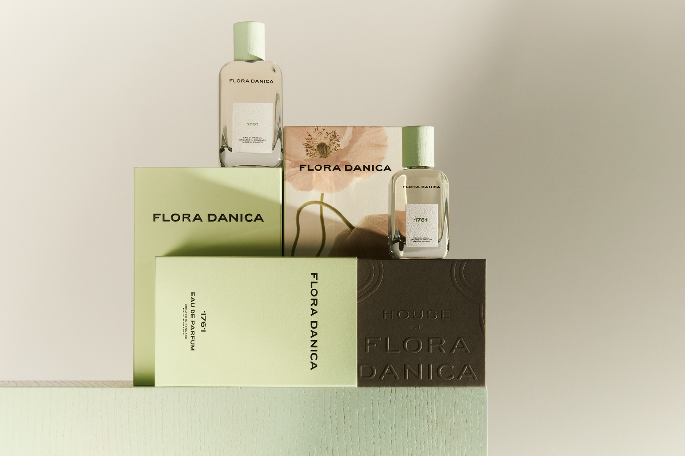
The packaging consists of multiple rigid boxes and cartons, showcasing a premium appearance. The boxes are made of thick chipboard, providing a sturdy and luxurious feel. The surfaces are smooth with a matte finish, featuring clean edges and precise folds. The color palette includes soft green, beige, and brown tones, creating an elegant aesthetic. The boxes display various branding elements prominently.

The box is square with a clean, smooth surface. It features a sturdy construction with thick walls, indicative of premium chipboard material. The exterior is a soft white color with a matte finish, giving it a luxurious appearance. The top of the box is adorned with a gold logo that reads 'ROYAL COPENHAGEN' in an elegant font, along with a crown emblem above the text. The edges are well-defined, and the box has a seamless appearance with no visible flaps or tabs.
About the Brand
Flora Danica operates within the apparel sector, offering silk scarves and fashion accessories with a strong emphasis on Danish heritage and nature-inspired artistry. The company's packaging reflects its premium market positioning, utilizing robust materials and understated branding to reinforce product exclusivity.
The brand’s packaging approach is characterized by the use of rigid boxes and carton solutions that prioritize structural integrity, unboxing impact, and visual coherence with the product’s botanical themes. Attention to detail in material selection and minimalist design elements align with the expectations of discerning, design-conscious consumers. Packaging is central to Flora Danica’s gifting proposition, supporting both personal and retail experiences through tactile and aesthetic cues.
Key Differentiator: Distinctive integration of artistic, botanical motifs and premium material selection sets Flora Danica apart in the luxury accessory market.
Design System
Visual Style
The visual design employs minimalist typography (likely serif or modern sans-serif), a muted natural palette (soft greens, whites, and beiges), and matte finishes. The overall approach is elegant, understated, and inspired by botanical illustration.
Brand Identity
Logo application is restrained, often appearing in gold or white foil; iconography is minimal, favoring clean lines and generous whitespace. Visual consistency is achieved through recurring color schemes and typographic choices across all packaging elements.
Packaging Design
Material selections prioritize rigid chipboard and coated paper, balancing luxury perception with practical product protection. Structural design emphasizes clean edges, snug-fitting lids, and layered unboxing experiences, supporting both gifting and online retail requirements.
User Experience
Packaging is engineered to create an impactful first impression, with unboxing sequences designed for emotional resonance and shareability. The tactile quality, visual harmony, and information hierarchy support a seamless customer journey, reinforcing brand values at each touchpoint.
Company Metrics
Business insights for Flora Danica based on available data
Market Positioning
Brand Values & Focus
Key Competitors
Target Market: Design-conscious consumers seeking luxury fashion accessories with an emphasis on artistry and gifting; predominantly targeting female buyers and premium gift purchasers in Europe and global online markets.
Packaging Assessment
Overall Grade
Visual appeal and presentation quality
Packaging durability and protection
Eco-friendliness and recyclable materials
Cost efficiency and value for money
Packaging assessment for Flora Danica based on industry standards and best practices
Frequently Asked Questions
What types of packaging does Flora Danica use for its products?
Flora Danica primarily utilizes rigid boxes, luxury gift boxes, and high-quality folding cartons. These formats are chosen for their durability, presentation value, and ability to enhance the perceived value of silk scarves and accessories.
How does Flora Danica's packaging support its brand positioning?
Packaging is designed to reflect the brand’s premium, artistic identity through minimalist layouts, muted color palettes, and precise structural construction. This supports the narrative of exclusivity and craftsmanship central to Flora Danica’s market positioning.
Is sustainability considered in Flora Danica’s packaging choices?
While recyclable chipboard and paper-based materials are frequently used, the focus on luxury rigid boxes suggests a moderate approach to sustainability, balancing eco-friendliness with structural and aesthetic requirements.
Discover other Apparel companies
Explore more companies in the apparel industry and their packaging strategies
Menswear Online
Apparel
Menswear Online is a UK-based e-commerce retailer specializing in stylish men's clothing and accessories. The company offers a wide selection of premium brands, including Armani Exchange and Lacoste.
Compressport International
Apparel
Compressport International specializes in high-end compression garments and sports accessories designed for athletes. Founded in 2008 and based in Geneva, Switzerland, the company caters to the needs of trail runners, triathletes, and other fitness enthusiasts.
ALTI
Apparel
ALTI specializes in unique, handcrafted silver jewelry designed by skilled artisans in Sweden. The company offers a range of customizable options and promotes a tranquil lifestyle through its jewelry collections.