Fleeky packaging
Fleeky specializes in beauty products aimed at enhancing natural features, with a focus on user-friendly application and modern design. Their packaging strategy utilizes premium materials and visually cohesive branding to deliver a consistent and appealing unboxing experience across their product range.
Packaging Portfolio
Fleeky's packaging portfolio demonstrates a strong reliance on rigid chipboard boxes for premium kits, folding carton boxes for standard retail products, and flexible laminated pouches for single-use items like gel masks. Their selection of matte and glossy finishes, pastel and neutral color palettes, and bold typography ensures high shelf impact and a premium look. Structural decisions prioritize both product protection and ease of unboxing, while branding remains central across all formats. The consistent use of recyclable paperboard and streamlined shapes supports sustainability objectives without compromising presentation.

The packaging is a flat, flexible pouch designed to hold a gel mask. It features a smooth surface with a matte finish, predominantly white in color. The front displays the brand name 'fleeky' in bold, black font at the top, accompanied by a small illustration of a character and product description below. The edges are sealed, and the overall shape is rectangular with rounded corners.

The packaging is a flat, rectangular box with smooth, flat construction. It features clean, precise edges and folds, indicative of a folding carton. The exterior has a gradient color scheme transitioning from white to a soft pastel hue, giving it a modern and appealing look. The front displays the brand name 'fleeky' in a bold, elegant font, centered prominently. The overall appearance is lightweight and designed for retail display.

The packaging consists of a smooth, flat construction with clean edges and folds. The primary box is a light yellow color with the word 'fleeky' prominently displayed in a bold font. The box has a glossy finish, enhancing its retail appeal. There are additional items in the image, including cylindrical containers and a roller, all featuring similar branding elements.

The packaging consists of a smooth, flat, yellow carton box with a clean and precise construction. The box features a lid that folds down over the sides, with a sturdy base. The surface is matte with a slight sheen, indicating a quality finish. The front of the box prominently displays the brand name 'fleeky' in a bold, stylish font, accompanied by a small graphic of a crown or similar icon. The overall design is minimalistic yet elegant, suitable for retail display.
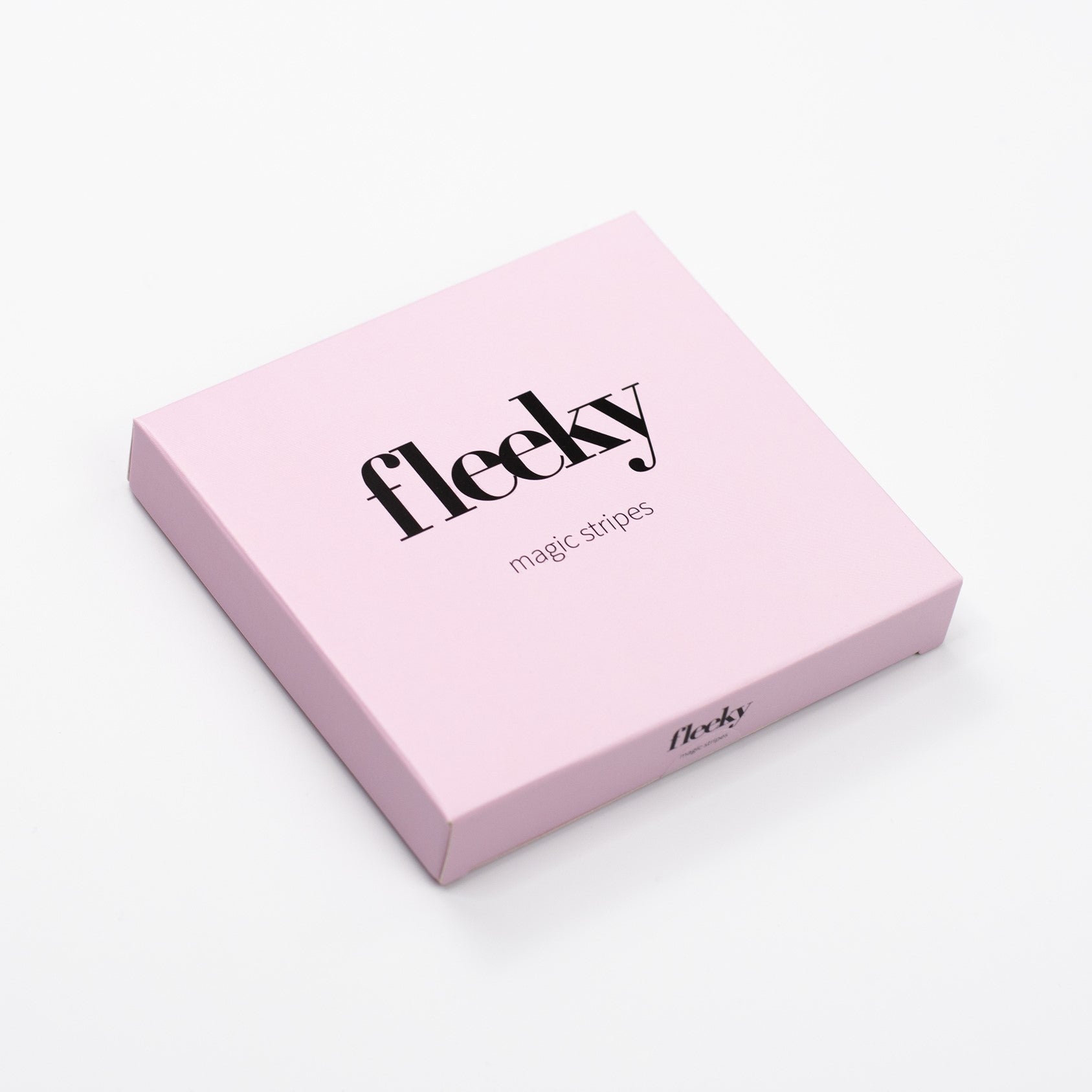
The packaging is a square-shaped rigid box with a premium appearance. It features a thick, sturdy construction, indicative of chipboard material. The exterior is a soft pink color with a matte finish, giving it a luxurious feel. The edges are clean and precisely folded, enhancing its high-quality look. The top surface is adorned with bold black typography that reads 'fleeky' prominently, along with the text 'magic stripes' in a smaller font beneath it. There are no visible flaps or tabs, as the box is designed to open from the top.
About the Brand
Fleeky operates in the beauty and cosmetics sector, providing a range of products for brows, lashes, and lips. Their packaging approach incorporates sturdy rigid boxes, retail-ready folding cartons, and flexible pouches, each tailored for product protection and shelf appeal.
The company leverages a direct-to-consumer business model, enabling rapid feedback loops and adaptability in both product and packaging development. Fleeky's packaging consistently reflects its minimalist, modern branding, with attention to structural integrity and visual presentation. The brand’s emphasis on sustainability is evident through material choices and design, aligning with evolving consumer expectations for eco-friendly beauty solutions.
Key Differentiator: Fleeky's integration of premium packaging structures with a minimalist, aesthetically consistent brand identity, combined with a growing focus on sustainability, sets it apart in the competitive beauty and fitness market.
Design System
Visual Style
Fleeky’s design system employs minimalist typography, primarily bold sans-serif fonts, paired with a pastel-leaning color palette dominated by soft pinks, yellows, and white gradients. The overall aesthetic is clean, modern, and approachable, with restrained use of graphic elements.
Brand Identity
Branding is centered around prominent logo placement, consistent font usage, and cohesive color application across all packaging. Iconography, such as small crown graphics, is used sparingly to reinforce product differentiation while maintaining visual unity.
Packaging Design
Material choices include premium rigid chipboard for gift boxes, high-quality folding cartons for retail, and flexible multilayer pouches for gel products. The structural focus is on durability, retail display suitability, and minimalistic form factors to reduce material waste.
User Experience
The design supports an elevated customer journey by delivering a visually striking unboxing moment, intuitive product access, and clear labeling. Packaging is engineered to balance aesthetics with functional protection, reinforcing Fleeky’s brand promise of effortless beauty.
Company Metrics
Business insights for Fleeky based on available data
Market Positioning
Brand Values & Focus
Key Competitors
Target Market: Fleeky targets a digitally engaged, style-conscious audience seeking accessible beauty solutions, with a core demographic of young adults and beauty enthusiasts in urban markets.
Packaging Assessment
Overall Grade
Visual appeal and presentation quality
Packaging durability and protection
Eco-friendliness and recyclable materials
Cost efficiency and value for money
Packaging assessment for Fleeky based on industry standards and best practices
Frequently Asked Questions
What types of packaging does Fleeky use for its beauty products?
Fleeky employs a mix of rigid boxes for premium kits, folding carton boxes for retail products, and flexible pouches for gel masks, ensuring appropriate protection and a consistent brand experience across its product lines.
How does Fleeky address sustainability in its packaging?
Fleeky emphasizes the use of recyclable materials and streamlined designs, reflecting a commitment to reducing environmental impact while maintaining product integrity and visual appeal.
What is the focus of Fleeky's packaging design philosophy?
The brand prioritizes minimalist aesthetics, clean typography, and cohesive color palettes to reinforce its modern identity and appeal to a younger, design-conscious demographic.
Discover other Beauty & Fitness companies
Explore more companies in the beauty & fitness industry and their packaging strategies
Institut Karité Paris
Beauty & Fitness
Institut Karité Paris specializes in luxury beauty products made with natural Shea Butter, offering a wide range of skincare and body care solutions. The brand combines Parisian heritage with a commitment to quality and creativity in its offerings.
Owari
Beauty & Fitness
Owari specializes in 100% natural beauty and fitness products, designed to enhance health and wellness. The company proudly offers its products made in France, emphasizing quick delivery and customer support.
Big Moustache
Beauty & Fitness
Big Moustache specializes in shaving and grooming products tailored for men, providing a hassle-free subscription service for razor blades and skincare essentials.