Fertility Family packaging
Fertility Family is a UK-based provider of fertility supplements and reproductive health products, utilizing carefully branded carton packaging optimized for retail and direct-to-consumer channels. Their packaging strategy emphasizes clean visual presentation and consistent brand messaging tailored to the health sector.
Packaging Portfolio
Fertility Family employs retail-oriented, single-layer folding carton boxes constructed from paperboard, chosen for their lightweight properties and visual clarity. The packaging is characterized by precise edges, clean folds, and a predominantly white base complemented by vibrant accent colors—purples, pinks, and greens—to differentiate product lines. Structural design is optimized for shelf display and direct shipping, providing adequate protection without over-packaging. Material selection supports moderate sustainability, with primary recyclability but limited evidence of advanced eco-design features.

The packaging is a tall, rectangular folding carton made of smooth, single-layer paperboard. It features a clean and precise construction with sharp edges and folds. The exterior is predominantly white with green accents, showcasing a modern design. The front displays the product name 'impryl' prominently, along with a tagline 'co-create with confidence'. The overall appearance is lightweight and retail-friendly, suitable for display on shelves.
The packaging is a rectangular folding carton made of smooth, single-layer paperboard. It features a clean, flat construction with precise edges and folds, typical of retail packaging. The exterior is predominantly white with a glossy finish, complemented by purple and white wave patterns. The design is visually appealing and aligns with health and wellness branding.
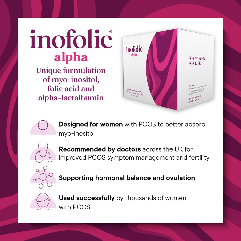
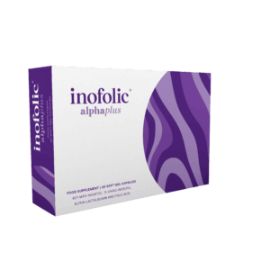
The packaging is a folding carton made from single-layer paperboard. It features a smooth, flat construction with clean edges and precise folds. The box is predominantly white with vibrant purple and pink graphics that create an eye-catching design. The front displays the product name 'inofolic alpha' prominently, along with a brief description of its benefits. The overall shape is rectangular, typical for retail packaging.
The packaging is a folding carton with a smooth, flat construction and clean edges. It features a predominantly white exterior with vibrant purple and pink design elements. The front displays the product name 'inofolic alpha' prominently, with a modern font. The sides have a wavy pattern in pink that adds visual interest. The carton is lightweight and appears to be designed for retail display, likely for food supplements.

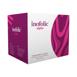
The packaging is a folding carton made of smooth, single-layer paperboard. It features clean, precise edges and folds, indicative of a retail packaging style. The exterior is predominantly white with vibrant pink and purple graphics, including a wave design that adds visual interest. The top flap is neatly sealed, and the sides show no visible fluting, confirming it is not corrugated. The overall structure is lightweight and designed for retail display.

The packaging is a flat, rectangular carton box made of single-layer paperboard. It features a smooth, flat construction without any visible fluted layers, indicating it is not corrugated. The exterior is predominantly white with green accents, giving it a clean and modern appearance. The edges are precise, and the folds are well-defined, typical of retail packaging. The front displays product information and branding elements prominently, while the sides may include additional details or instructions.
About the Brand
Fertility Family specializes in fertility supplements, serving individuals and couples seeking reproductive health support. Their packaging approach leverages lightweight, retail-oriented carton boxes designed to protect supplements while reinforcing brand trust and product integrity.
Operating with a D2C model, Fertility Family maintains tight control over packaging quality and presentation. The packaging features modern design elements, with a focus on medical credibility and consumer reassurance. This approach is aligned with industry standards for dietary supplements, ensuring compliance and shelf appeal.
Key Differentiator: Fertility Family distinguishes itself by integrating doctor-recommended branding and targeted product messaging into every aspect of its packaging, enhancing both consumer trust and product differentiation within a competitive health market.
Design System
Visual Style
Modern sans-serif typography, a predominantly white color palette with accent colors (purple, pink, green), and a minimalist yet approachable aesthetic tailored for the health and wellness sector.
Brand Identity
Consistent use of product and brand logos, clear hierarchy in product naming, and standardized iconography reflecting medical trust and efficacy across all packaging. Visual consistency is maintained through repeated color motifs and layout structures.
Packaging Design
Utilization of lightweight, non-corrugated paperboard folding cartons with smooth finishes. Structural choices favor ease of assembly, retail readiness, and cost-effective production, while graphics emphasize legibility and product differentiation.
User Experience
The design approach prioritizes clarity, reassuring messaging, and straightforward unboxing, supporting customer confidence and facilitating a seamless transition from digital purchase to physical product receipt. The packaging reinforces brand values at each touchpoint in the customer journey.
Company Metrics
Business insights for Fertility Family based on available data
Market Positioning
Brand Values & Focus
Key Competitors
Target Market: Individuals and couples in the UK seeking reproductive health solutions, including those trying to conceive, experiencing fertility challenges, or undergoing IVF treatments.
Packaging Assessment
Overall Grade
Visual appeal and presentation quality
Packaging durability and protection
Eco-friendliness and recyclable materials
Cost efficiency and value for money
Packaging assessment for Fertility Family based on industry standards and best practices
Frequently Asked Questions
What packaging materials does Fertility Family use for its supplements?
Fertility Family primarily utilizes single-layer paperboard folding carton boxes for its retail packaging, focusing on lightweight structures that balance shelf appeal and product protection.
How does the packaging support the brand's credibility?
The packaging reinforces credibility through modern, clean design, prominent product and brand naming, and consistent use of health-related iconography and color schemes associated with trust and wellness.
Is Fertility Family's packaging sustainable?
The use of paperboard suggests a moderate level of sustainability, with recyclable materials being a key component. However, there is limited evidence of advanced eco-friendly features such as compostable inks or minimalistic design to further reduce environmental impact.
Discover other Health companies
Explore more companies in the health industry and their packaging strategies
Smart Protein
Health
Smart Protein is dedicated to transforming nutrition by providing a range of health and wellness products focused on protein supplements and vitamins.
Lily & Loaf
Health
Lily & Loaf specializes in high-quality health and nutrition products, offering a range of supplements and vitamins aimed at supporting an active lifestyle. The company focuses on providing natural solutions for health and beauty.
EVO Nutrition
Health
EVO Nutrition specializes in premium health supplements, providing a wide range of vitamins and nutritional products to support well-being.