Father Carpenter packaging
Father Carpenter is a Berlin-based specialty coffee roaster and coffee bar known for its focus on ethically sourced, high-quality beans. Their packaging approach centers on premium, flexible stand-up pouches and sleek carton boxes, reflecting a commitment to freshness, modern design, and brand consistency.
Packaging Portfolio
Father Carpenter’s packaging portfolio primarily features matte-finish flexible stand-up pouches with resealable closures, optimized for coffee freshness and protection. These pouches are complemented by folding carton boxes for retail and gift offerings, constructed from lightweight paperboard. The structural focus is on durability, product visibility, and ease of use, while the minimalist visual design leverages custom color schemes, clean sans-serif typography, and subtle iconography to reinforce brand recognition. Overall, the packaging solutions balance premium presentation with operational efficiency and moderate sustainability considerations.

The packaging is a folding carton box with a smooth, flat construction. It features a predominantly light blue background with a simple, clean design. The box has a rectangular shape with precise edges and folds, indicative of a single-layer paperboard construction. The front displays the brand name 'Father Carpenter' prominently in a bold, white font, along with product information and graphics that suggest a connection to coffee or tea. The top flap is folded down, and there are no visible signs of wear or damage.

The packaging consists of two stand-up pouches made from a flexible material, featuring a matte green exterior with a circular logo and product name prominently displayed. The bags have a sealed top and a flat bottom, allowing them to stand upright. The design includes a white circular label with the brand name 'FATHER CARPENTER' and product details in a clean, modern font.

The packaging is a stand-up pouch with a matte finish, featuring a rounded logo in the center. The overall shape is rectangular with a flat bottom, allowing it to stand upright. The color is a deep green, giving it a premium look. The top of the pouch has a resealable closure, which is common for coffee bags to maintain freshness.

The packaging is a stand-up pouch made from a flexible material, featuring a matte finish with a dark green background. The front displays the brand name 'Father Carpenter' prominently in white, along with the product name 'Daanisa' in a smaller font. There are decorative elements such as a coffee cup icon and floral designs in white, adding visual interest. The overall design is clean and modern, with a focus on the brand identity.
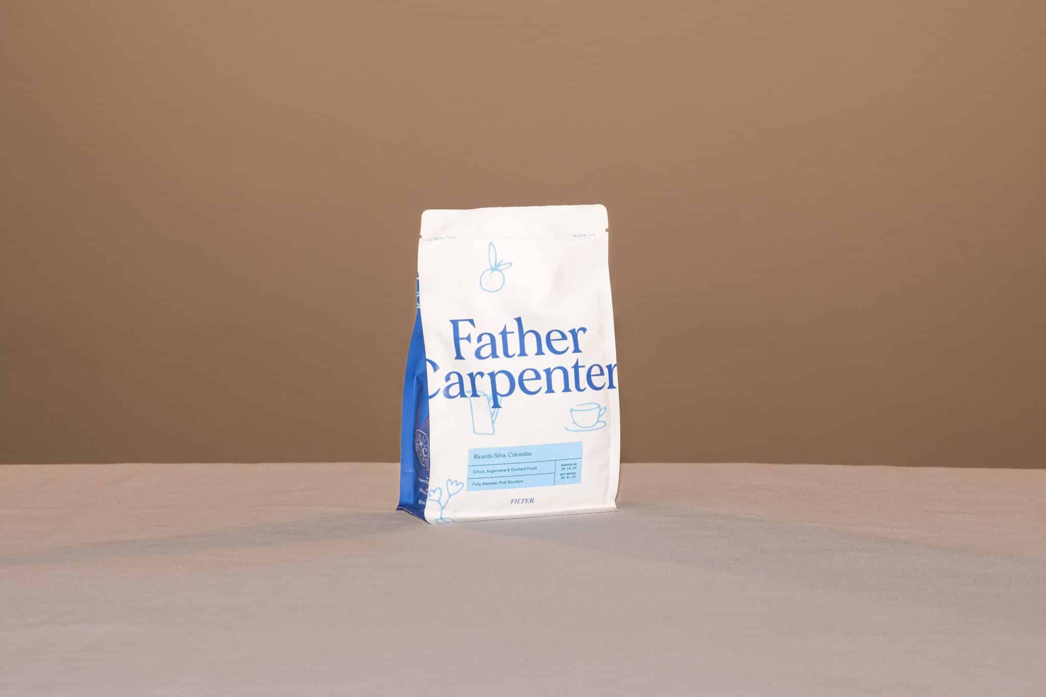
The packaging is a stand-up pouch made of flexible material, featuring a white background with blue accents. The front displays the brand name 'Father Carpenter' prominently in a bold, modern font. The design includes simple line drawings of a cup and a spoon, contributing to a clean aesthetic. The top of the pouch has a resealable zipper, and the bottom is gusseted, allowing it to stand upright. The overall shape is rectangular with a slight taper towards the top.
About the Brand
Father Carpenter operates as a direct-to-consumer coffee roastery and bar, specializing in small-batch, artisanal coffee. Their packaging strategy leverages flexible pouches and folding cartons to maintain product integrity and communicate a premium brand image.
With a consistent roasting and shipping schedule, Father Carpenter prioritizes freshness and product protection through sealed, resealable stand-up pouches and structurally robust cartons. The visual language of their packaging—clean typography, minimalist graphics, and curated color palettes—aligns with contemporary specialty coffee market trends, reinforcing the brand's artisanal and ethical positioning.
Key Differentiator: Distinctive minimalist packaging, strong alignment with ethical sourcing, and a focus on maintaining freshness through high-quality materials set Father Carpenter apart in the specialty coffee segment.
Design System
Visual Style
Modern minimalist; clean sans-serif typography, muted and tonal color palettes (greens, blues, whites), and restrained graphic elements for a sophisticated, contemporary look.
Brand Identity
Prominent use of the Father Carpenter wordmark and circular logo, consistent iconography (coffee cups, floral motifs), and uniform placement of branding elements across all packaging surfaces for strong visual cohesion.
Packaging Design
Emphasis on flexible, resealable pouches and sturdy folding cartons, favoring materials that preserve freshness and withstand handling. The design philosophy prioritizes clarity, simplicity, and premium tactile finishes.
User Experience
Packaging is designed for intuitive use—resealable closures for convenience, clear labeling for product identification, and a visually appealing unboxing sequence that reinforces the brand’s artisanal and quality-focused values.
Company Metrics
Business insights for Father Carpenter based on available data
Market Positioning
Brand Values & Focus
Key Competitors
Target Market: Coffee enthusiasts and quality-conscious consumers in urban markets, particularly those seeking ethically sourced and freshly roasted specialty coffee.
Packaging Assessment
Overall Grade
Visual appeal and presentation quality
Packaging durability and protection
Eco-friendliness and recyclable materials
Cost efficiency and value for money
Packaging assessment for Father Carpenter based on industry standards and best practices
Frequently Asked Questions
What types of packaging formats does Father Carpenter use?
Father Carpenter employs flexible stand-up pouches for coffee, featuring resealable closures, and folding carton boxes for select products. Both formats emphasize product freshness, durability, and aesthetic appeal.
How does Father Carpenter's packaging address sustainability?
While the company’s packaging utilizes recyclable materials and minimalistic design to reduce waste, specific details on compostability or renewable sourcing are limited, indicating room for further sustainability advancements.
How does packaging support the Father Carpenter brand experience?
Packaging reinforces the brand’s premium positioning through minimalist visual design, clear brand identity elements, and user-friendly structural features, contributing to a cohesive and memorable unboxing experience.
Discover other Food & Drink companies
Explore more companies in the food & drink industry and their packaging strategies
Thés de la Pagode
Food & Drink
Thés de la Pagode is a French company specializing in organic teas and infusions, focusing on health and well-being. Established in 1987, they prioritize sustainable practices and high-quality ingredients sourced through fair trade.
ruf lebensmittelwerk kg
Food & Drink
RUF Lebensmittelwerk KG is a German food production company specializing in a variety of baking mixes and drink products. Founded in 1920, the company is known for its high-quality ingredients and innovative food solutions.
Terres de Café
Food & Drink
Terres de Café is a specialty coffee retailer based in Paris, France, known for its commitment to sustainability and high-quality coffee sourcing.