Erdbeerwoche packaging
Erdbeerwoche is a health-focused platform specializing in sustainable menstrual hygiene products and educational resources. Their packaging approach emphasizes eco-friendly materials and functional design, aligning with their commitment to sustainability and consumer empowerment.
Packaging Portfolio
Erdbeerwoche’s packaging portfolio comprises recyclable paperboard folding cartons for retail menstruation products, complemented by branded fabric zipper pouches for accessories. The folding cartons typically feature clean structural lines, tuck closures, and gloss or matte finishes, balancing shelf impact with functionality. Packaging designs leverage eco-labels, organic certifications, and sustainability messaging. While visual branding is consistent across product lines, co-branded packaging from partner suppliers (e.g., Natracare, Organyc) is also present, ensuring alignment with sustainability priorities.
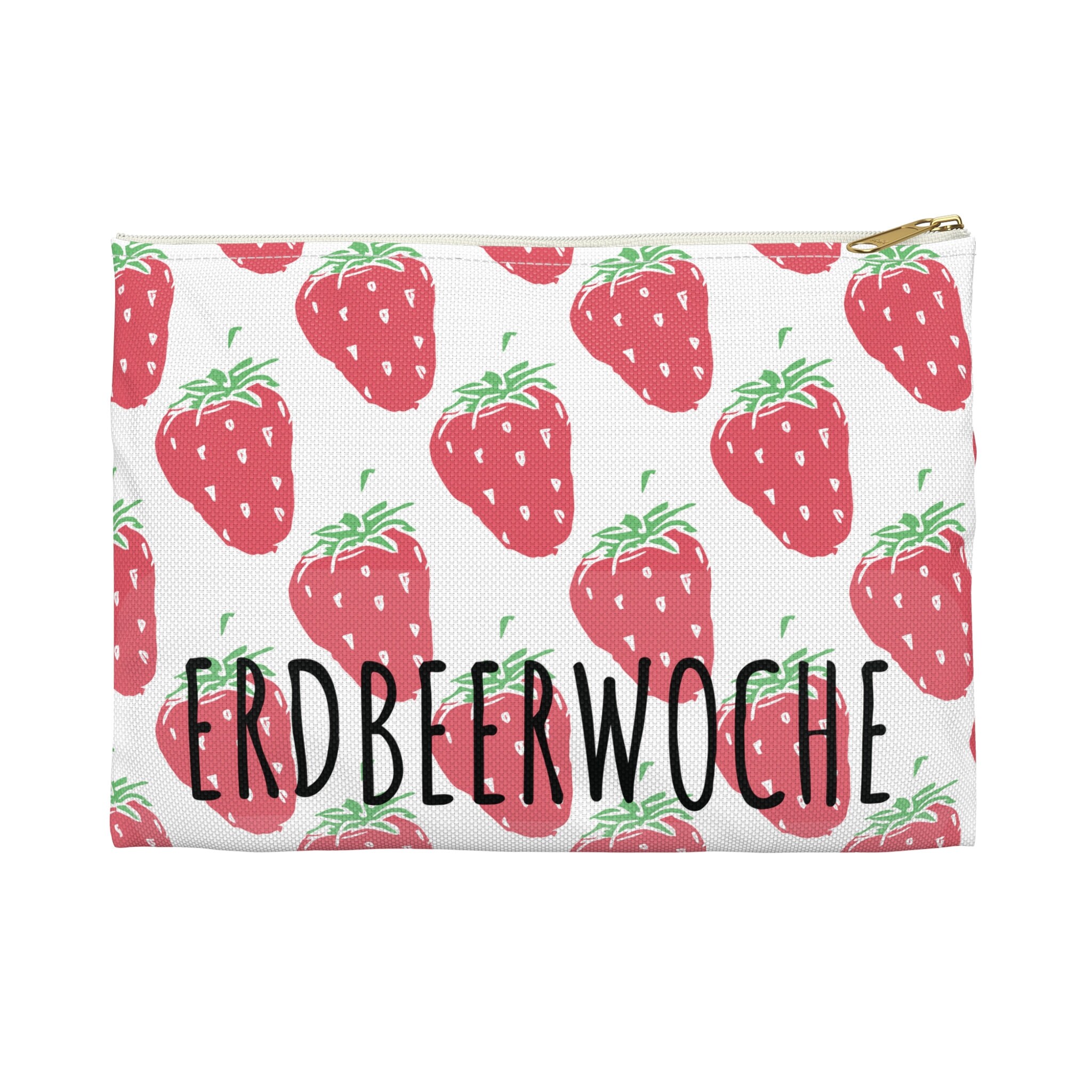
The packaging is a flat zipper pouch featuring a repeated strawberry pattern on a white background. The pouch has a gold zipper at the top, providing a secure closure. The design is vibrant and playful, with the brand name 'ERDBEERWOCHE' prominently displayed in a bold, black font across the center.

The packaging is a flat, rectangular folding carton made from a single layer of paperboard. It features smooth edges and a clean, precise fold structure. The exterior is predominantly white with colorful graphics and text. The front displays the product name prominently, along with a logo and descriptive text about the product's features. The sides contain additional product information and usage instructions. The box has a glossy finish that enhances the visual appeal.

The packaging consists of a flat, smooth, single-layer paperboard box with clean edges and folds. The box is predominantly white with green and brown accents, featuring a glossy finish. The front displays a logo and product name, along with images of the product inside. The sides have additional product information and features. The box has a tuck tab closure at the top and is designed for retail display.
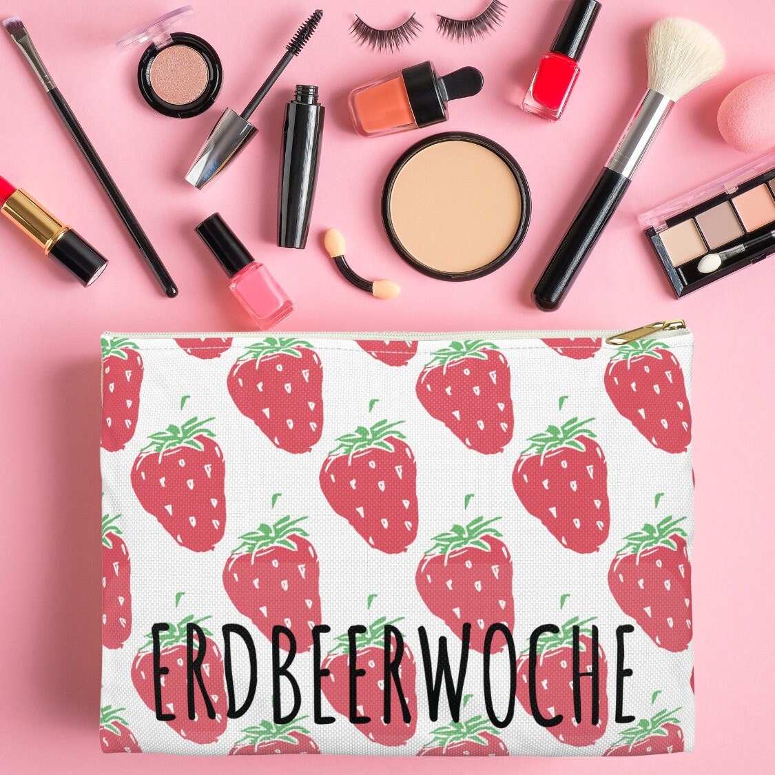
The packaging is a cosmetic pouch featuring a white fabric exterior adorned with a repeated strawberry pattern. The pouch has a zip closure at the top and is flat, allowing it to stand on its own. The interior is likely lined to hold cosmetics securely. The design is playful and colorful, appealing to a younger demographic.
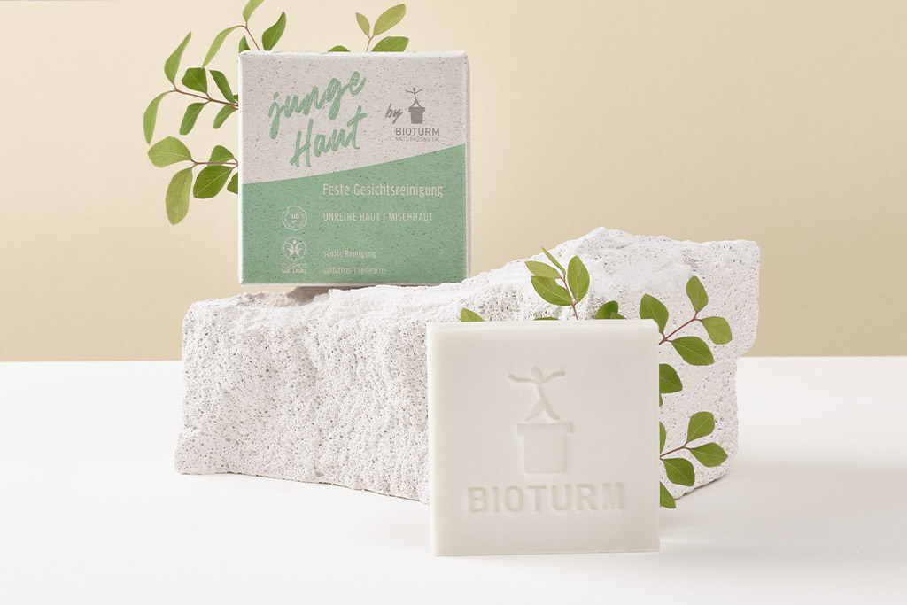
The packaging is a folding carton made of smooth, white paperboard with a clean, flat construction. It features a precise folding pattern with sharp edges and corners. The front displays a green and white color scheme with a modern design, including the brand name 'BIOTURM' prominently featured. The carton has a matte finish, giving it a premium look. The back of the carton likely contains product information and instructions, though not visible in the image.
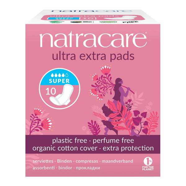
The packaging is a folding carton made of smooth, flat paperboard. It features a predominantly pink color scheme with illustrations of flowers and figures. The edges are clean and precise, with a glossy finish that enhances the visual appeal. The box has a rectangular shape, typical for retail packaging, and is designed to stand upright on shelves. The top flap is folded down, indicating a tuck closure.
About the Brand
Erdbeerwoche delivers sustainable menstrual hygiene solutions and educational content, targeting individuals seeking eco-conscious alternatives. The brand’s packaging strategy leverages recyclable materials and clear, informative graphics to reinforce both product protection and environmental responsibility.
With a business model rooted in education and consumer advocacy, Erdbeerwoche’s packaging portfolio combines retail folding cartons for feminine hygiene products with branded cosmetic and zipper pouches. Their packaging consistently features sustainability messaging, organic material indicators, and user-centric design elements. Following the closure of their e-commerce shop, the brand has maintained educational outreach as a primary focus.
Key Differentiator: Erdbeerwoche distinguishes itself by fusing educational leadership in menstrual health with a rigorously sustainable packaging approach, integrating eco-labels and transparent communication directly onto packaging.
Design System
Visual Style
Typography emphasizes bold sans-serif fonts for legibility; the color palette prioritizes whites, pinks, greens, and earth tones, conveying a clean and approachable aesthetic. Illustrative graphics, organic patterns, and playful motifs (e.g., strawberries) are integrated to enhance relatability.
Brand Identity
Brand name and logo are prominently displayed on both primary and secondary packaging, with consistent use of color and iconography. Visual consistency is maintained through uniform placement of brand elements and sustainability badges.
Packaging Design
Material selection centers on recyclable paperboard and organic cotton, avoiding plastics where possible. Structural design favors folding cartons with straightforward closures and minimal excess material, highlighting sustainability and functional protection.
User Experience
Packaging design supports the end-user by providing clear product information, intuitive opening mechanisms, and an approachable, stigma-free presentation. The visual and tactile experience aims to de-stigmatize menstruation and empower informed product use.
Company Metrics
Business insights for Erdbeerwoche based on available data
Market Positioning
Brand Values & Focus
Key Competitors
Target Market: Eco-conscious consumers seeking sustainable menstrual hygiene solutions and educational resources, primarily in DACH (Germany, Austria, Switzerland) and broader European markets.
Packaging Assessment
Overall Grade
Visual appeal and presentation quality
Packaging durability and protection
Eco-friendliness and recyclable materials
Cost efficiency and value for money
Packaging assessment for Erdbeerwoche based on industry standards and best practices
Frequently Asked Questions
What types of packaging materials does Erdbeerwoche use?
Erdbeerwoche primarily utilizes recyclable paperboard for folding cartons and fabric for branded pouches, emphasizing materials with lower environmental impact.
How does Erdbeerwoche’s packaging support its sustainability goals?
Packaging choices prioritize recyclable substrates, organic certifications, and minimal plastic usage, reflecting the brand's commitment to reducing environmental footprint.
Is custom packaging used for all Erdbeerwoche products?
Branded custom packaging is used for select products and accessories, while some stock packaging is co-branded or sourced from third-party sustainable suppliers.
Discover other Health companies
Explore more companies in the health industry and their packaging strategies
Doctor Seaweed
Health
Doctor Seaweed specializes in natural, plant-based nutritional supplements derived from seaweed, aimed at promoting overall wellness.
EVO Nutrition
Health
EVO Nutrition specializes in premium health supplements, providing a wide range of vitamins and nutritional products to support well-being.
Bio-Synergy
Health
Bio-Synergy is a UK-based company specializing in health and fitness products, including nutritional supplements and DNA testing kits. Their mission is to support individuals in achieving their health and fitness goals through innovative products and personalized insights.