eq love packaging
eq love is a France-based wellness and beauty brand specializing in organic, eco-conscious products for health-focused consumers. Their packaging strategy emphasizes sustainable materials, modern design, and visual coherence, delivering a consistent brand experience across the cosmetics and personal care segments.
Packaging Portfolio
eq love utilizes a portfolio of single-layer paperboard cartons and recyclable plastic tubes for its beauty and wellness products. The folding cartons feature precise construction, clean edges, and either matte or glossy finishes, optimized for shelf presence and product protection. Structural formats include rectangular retail cartons and cylindrical tubes, supporting both direct-to-consumer shipping and in-store display. Branding is applied consistently using modern graphics, earthy tones, and minimalistic layouts, reinforcing the company’s eco-friendly and wellness-focused proposition.

The packaging consists of three distinct tubes and bottles, all made from smooth, flat paperboard. The bottles are dark-colored with a glossy finish, while the tube has a matte appearance. Each item features clean edges and precise folds, indicative of a folding carton structure. The overall design is sleek and modern, suitable for retail display.

The packaging is a squeezable tube made of flexible plastic, designed for dispensing a gel product. The tube has a cylindrical shape with a rounded cap at the top. The surface is smooth and features a matte finish, predominantly in white with a grey and brown color scheme. The front displays product information, including the product name and description, in a modern font. There are no visible flaps or tabs, as it is a tube that is simply squeezed to dispense the product. The overall design is sleek and minimalistic, aligning with contemporary cosmetic packaging trends.

The packaging consists of a small, rectangular carton that houses cosmetic products. The carton features smooth, flat construction without any visible fluted layers, indicating it is made of single-layer paperboard. The exterior is primarily white with colorful graphics and text. The edges are clean and precise, with folds that are well-defined. The carton has a glossy finish, enhancing its visual appeal. The products inside include a sunscreen, a massage oil, and a moisturizing lotion, all displayed prominently on the front.

The packaging consists of three distinct personal care products: a stick sunscreen, a shampoo bottle, and a soothing cream tube. The stick sunscreen is cylindrical with a twist-up mechanism, while the shampoo is in a tall, slender bottle with a flip-top cap. The soothing cream is in a squeeze tube. All products feature clean lines and a modern aesthetic, indicative of a premium brand. The colors are predominantly white with accents of black and a hint of color on the labels.
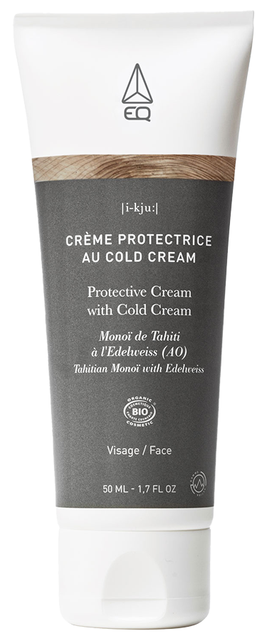
The packaging is a cylindrical tube made of flexible plastic, designed for dispensing a cream product. The tube features a smooth surface with a matte finish, predominantly in a gray color with white and black accents. The top of the tube has a flip-top cap for easy dispensing. The overall design is sleek and modern, appealing to a cosmetic audience.
About the Brand
eq love operates at the intersection of beauty, wellness, and sustainability, providing organic-certified products through a direct-to-consumer model. The company leverages custom packaging solutions to reinforce its environmental commitments and maintain product integrity.
With a compact team and a targeted product line, eq love's packaging choices are deliberately aligned with their eco-friendly mission. Predominantly utilizing single-layer paperboard cartons and recyclable plastic tubes, the brand ensures both protection and premium shelf appeal. Visual consistency, material selection, and minimalist graphics underline their focus on natural, sustainable living.
Key Differentiator: eq love distinguishes itself with an integrated approach to sustainability—extending from organic product formulation to thoughtfully selected packaging materials that minimize environmental impact.
Design System
Visual Style
Typography is modern, sans-serif, and clean, paired with a color palette dominated by whites, earthy browns, greens, and subtle gold accents. The overall aesthetic is minimalist and nature-inspired, projecting authenticity and purity.
Brand Identity
The EQ logo is prominently and consistently displayed on all packaging, often accompanied by the tagline 'live, love, care.' Iconography is minimal, with emphasis on product names and clear, legible descriptions. Visual consistency is achieved through standardized color usage and layout structures.
Packaging Design
Material choices prioritize single-layer, recyclable paperboard for cartons and flexible, recyclable plastic for tubes. Structural design is functional yet refined, with a focus on ease of use, product protection, and environmental responsibility. Packaging avoids excess material and uses finishes that balance visual appeal with practicality.
User Experience
The packaging design supports a positive customer journey by providing clear product information, easy-open formats, and a cohesive unboxing experience. Visual and tactile elements reflect the brand’s commitment to wellness and sustainability, fostering trust and engagement at every consumer touchpoint.
Company Metrics
Business insights for eq love based on available data
Market Positioning
Brand Values & Focus
Key Competitors
Target Market: Health-conscious and environmentally aware consumers seeking premium, organic beauty and wellness products in France and international e-commerce markets.
Packaging Assessment
Overall Grade
Visual appeal and presentation quality
Packaging durability and protection
Eco-friendliness and recyclable materials
Cost efficiency and value for money
Packaging assessment for eq love based on industry standards and best practices
Frequently Asked Questions
How does eq love ensure the sustainability of its packaging?
eq love prioritizes recyclable and eco-conscious materials such as single-layer paperboard and minimal plastic usage. Packaging is designed for recyclability and reduced environmental footprint, supporting the brand's overall sustainability objectives.
What types of packaging formats are commonly used by eq love?
The brand predominantly uses folding cartons for retail and e-commerce, along with flexible tubes for creams and gels. These formats are chosen for their protective qualities and compatibility with sustainable materials.
How does eq love's packaging design enhance the unboxing experience?
Packaging features clean lines, earthy color schemes, and high-quality finishes, creating a visually appealing and emotionally engaging unboxing experience that aligns with the brand's wellness positioning.
Discover other Beauty & Fitness companies
Explore more companies in the beauty & fitness industry and their packaging strategies
Cultiv Cosmetique
Beauty & Fitness
Cultiv Cosmetique is a French skincare brand that provides organic and eco-friendly beauty products inspired by nature. They focus on effective skincare solutions for various skin concerns.
Institut Karité Paris
Beauty & Fitness
Institut Karité Paris specializes in luxury beauty products made with natural Shea Butter, offering a wide range of skincare and body care solutions. The brand combines Parisian heritage with a commitment to quality and creativity in its offerings.
Pure Altitude
Beauty & Fitness
Pure Altitude specializes in high-quality beauty and skincare products that leverage the expertise of spa treatments to enhance daily routines. The brand offers a diverse range of products tailored for both facial and body care.