de teint packaging
de teint is an online beauty retailer offering a wide assortment of cosmetics, skincare, and grooming products. Their packaging approach leverages industry-standard carton and rigid box formats, focusing on brand visibility and premium presentation for both established and niche beauty brands.
Packaging Portfolio
de teint’s packaging portfolio is characterized by a predominant use of single-layer paperboard folding cartons and rigid chipboard boxes, tailored for cosmetics, skincare, and fragrance products. The packaging integrates high-impact visual finishes, including glossy and matte laminates, metallic accents, and advanced printing techniques to enhance shelf presence and brand recall. Structural formats are optimized for both retail display and e-commerce logistics, with secure closures and snug product fits minimizing in-transit movement. Packaging consistently features prominent branding elements, supporting both luxury and mainstream positioning within the beauty sector.

The packaging consists of a series of sleek, black folding cartons designed for cosmetic products. Each carton features a smooth, flat construction with clean edges and precise folds. The surface is matte with a slight sheen, indicating a high-quality finish. The boxes are adorned with vibrant, colorful graphics and text, including product names and descriptions, which are printed in various fonts and sizes. The overall design is modern and stylish, appealing to a beauty-conscious audience.

The packaging is a flat, rectangular box made from single-layer paperboard. The exterior features a smooth, metallic gold finish with a glossy appearance. The edges are clean and precise, indicating a well-constructed folding carton. The front displays the product name 'DIOR PRESTIGE' prominently, along with additional product details in a smaller font. The overall design is elegant and luxurious, consistent with high-end cosmetics packaging.
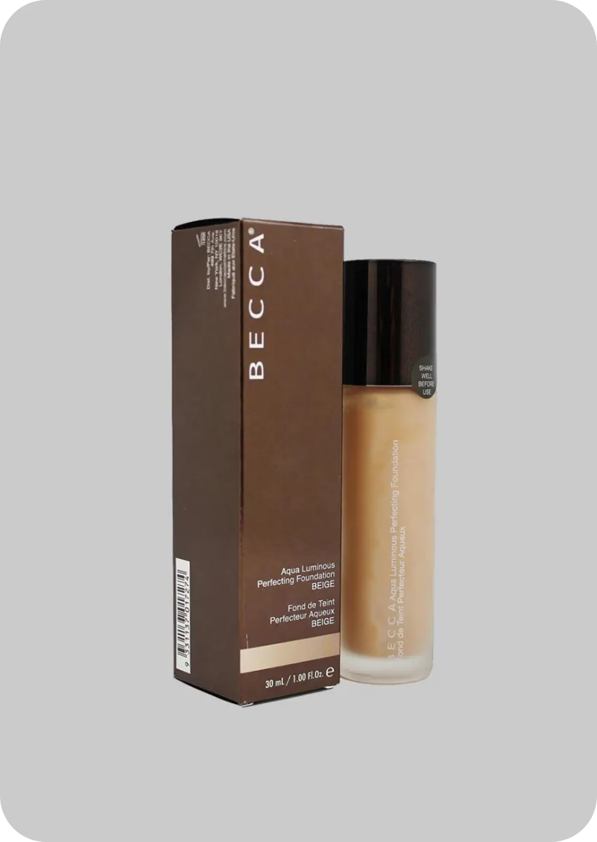
The packaging consists of a tall, rectangular carton that houses a glass bottle. The carton is made from a single layer of paperboard, featuring a smooth surface with clean edges and precise folds. The exterior is predominantly brown with a glossy finish, showcasing product information and branding elements. The front displays the brand name 'BECCA' prominently, along with product details in a lighter font. The sides contain additional information and barcodes. The top flap is designed to tuck securely into place, ensuring the contents are protected.
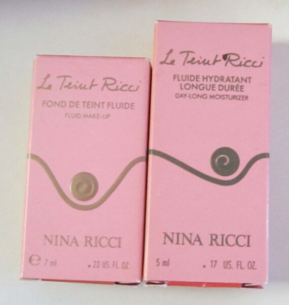
The packaging consists of two small, rectangular boxes made of smooth, single-layer paperboard. The boxes have clean, precise edges and folds, with a predominantly pink color scheme. Each box features a glossy finish that enhances the visual appeal. The front of the boxes displays the product names and brand logo prominently, with a stylized swirl graphic element. The boxes are designed for retail display, likely containing cosmetics or skincare products.
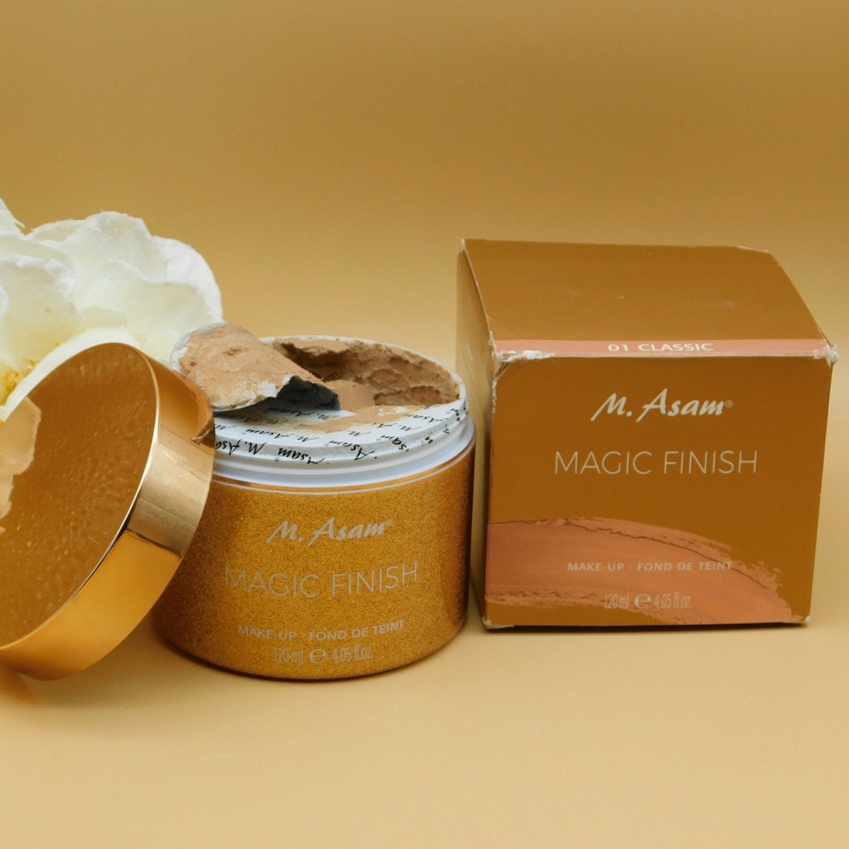
The packaging consists of a rigid box and a cosmetic jar. The jar is made of thick glass with a metallic gold lid, showcasing a luxurious appearance. The box is made of sturdy chipboard with a smooth finish, featuring clean edges and folds. The box is primarily gold with a matte texture, while the jar has a glossy finish. The box has a printed label with product information, including the brand name and product details.
About the Brand
de teint curates a comprehensive selection of beauty and personal care products, distributing high-end, niche, and mainstream brands through a B2C e-commerce platform. The company’s packaging strategy centers on retail-ready carton and rigid box solutions that reinforce brand messaging and product differentiation.
The packaging portfolio encompasses single-layer paperboard cartons and rigid chipboard boxes, supporting a premium unboxing experience and consistent shelf appeal. Cartons feature high-quality printing, glossy and matte finishes, and clear branding elements for products from brands such as BECCA, Dior, and Huda Beauty. Packaging design reflects an alignment with luxury industry standards while accommodating a broad product range.
Key Differentiator: de teint distinguishes itself through a vast product selection and the consistent application of visually compelling, brand-integrated packaging, ensuring both protection and elevated consumer perception.
Design System
Visual Style
The visual design employs modern, sans-serif typography paired with elegant serif accents for luxury brands. Color palettes range from muted metallics and soft neutrals to vibrant, brand-specific hues, maintaining strong visual cohesion with product lines.
Brand Identity
Branding elements include high-visibility logos, consistent color schemes, and standardized iconography tailored to each represented brand. Packaging maintains visual consistency across product categories through uniform placement of logos and product details.
Packaging Design
Material choices prioritize coated paperboard and rigid chipboard for structural integrity and print quality. The design philosophy emphasizes clear brand differentiation, premium tactile finishes, and compact, efficient forms for both display and shipping.
User Experience
The design approach supports a positive customer journey by delivering a visually appealing, tactile unboxing experience. Consistent branding and high-quality materials reinforce trust and perceived value, while structural integrity ensures products arrive in optimal condition.
Company Metrics
Business insights for de teint based on available data
Market Positioning
Brand Values & Focus
Key Competitors
Target Market: Beauty and personal care consumers seeking a wide selection of branded and niche cosmetics, perfumes, and grooming products, primarily in Germany and broader European markets.
Packaging Assessment
Overall Grade
Visual appeal and presentation quality
Packaging durability and protection
Eco-friendliness and recyclable materials
Cost efficiency and value for money
Packaging assessment for de teint based on industry standards and best practices
Frequently Asked Questions
What types of packaging does de teint primarily use?
de teint primarily utilizes single-layer carton boxes and rigid chipboard boxes, optimized for cosmetic, skincare, and fragrance products. These structures support both visual branding and product protection.
How does de teint’s packaging impact the customer experience?
The packaging provides a premium unboxing experience by featuring high-end finishes, precise construction, and strong brand cues, which enhance the overall perception of product quality and value.
Does de teint emphasize sustainability in its packaging?
While de teint uses recyclable materials such as paperboard, there is limited evidence of advanced sustainability initiatives, resulting in a moderate sustainability performance typical of the sector.
Discover other Beauty & Fitness companies
Explore more companies in the beauty & fitness industry and their packaging strategies
Institut Karité Paris
Beauty & Fitness
Institut Karité Paris specializes in luxury beauty products made with natural Shea Butter, offering a wide range of skincare and body care solutions. The brand combines Parisian heritage with a commitment to quality and creativity in its offerings.
Owari
Beauty & Fitness
Owari specializes in 100% natural beauty and fitness products, designed to enhance health and wellness. The company proudly offers its products made in France, emphasizing quick delivery and customer support.
Big Moustache
Beauty & Fitness
Big Moustache specializes in shaving and grooming products tailored for men, providing a hassle-free subscription service for razor blades and skincare essentials.