curantus naturkosmetik packaging
Curantus naturkosmetik is a Münster-based natural cosmetics company specializing in premium skincare, makeup, and body care. Their packaging approach emphasizes elegant, minimalist carton and rigid box formats that align with high-end beauty industry standards.
Packaging Portfolio
Curantus naturkosmetik employs a range of packaging types including folding carton boxes with matte and glossy finishes, rigid cylindrical luxury boxes, and select plastic containers for specific product formulations. The predominant use of smooth paperboard and chipboard materials supports both retail presentation and shipping efficiency. Packaging structures are typically tall and rectangular or cylindrical, optimizing shelf appeal and efficient stacking. Visual and tactile quality is maintained across formats, with detailed product information and consistent branding integrated directly into the packaging design.

The packaging consists of various retail cartons with a smooth, flat construction, featuring clean edges and precise folds. The boxes are predominantly tall and rectangular, with a variety of colors including teal, yellow, purple, and gray. Each box has a glossy finish, enhancing the visual appeal. The design includes a mountain graphic at the bottom, transitioning into solid colors at the top. The brand name 'huut.' is prominently displayed on each box, accompanied by product descriptions and details.

The packaging is a tall, rectangular folding carton made of smooth, white paperboard. It features a clean and precise construction with sharp edges and folds. The surface has a matte finish, giving it a premium appearance. The front of the carton showcases a large brand name 'ABLOOM' in a stylish font, with the tagline 'SLOW SKINCARE' below it. The background has a subtle, light green abstract design that adds visual interest without overwhelming the text. The sides of the carton are filled with detailed product information, including ingredients and usage instructions, printed in a smaller font. The overall design is elegant and minimalist, appealing to a skincare audience.

The packaging consists of cylindrical rigid boxes made from thick chipboard, each with a decorative exterior. The boxes feature a smooth surface with vibrant printed designs, showcasing various artistic patterns and floral motifs. The tops of the boxes have a circular black label with the brand name 'SABÉ MASSON' prominently displayed. The overall appearance is luxurious and premium, with a high-quality finish that suggests durability and a sophisticated aesthetic.
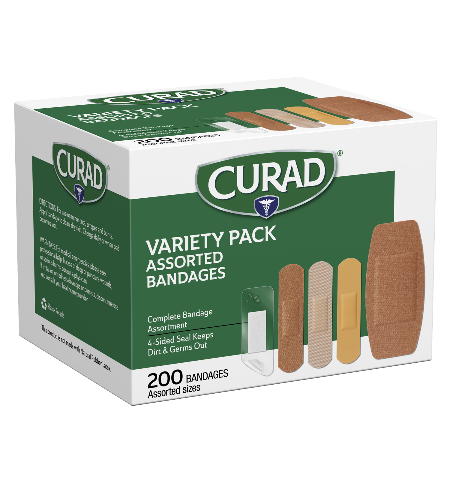
The packaging is a retail carton box with a smooth, flat construction. It features a white paperboard exterior with a glossy finish. The box has clean edges and precise folds, indicative of a folding carton design. The front displays a large green area with the brand name 'CURAD' prominently featured in white letters. There are images of assorted bandages on the side, showcasing the product variety. The box has a rectangular shape, suitable for retail display.

The packaging is a folding carton made of smooth, flat paperboard. It features a rectangular shape with clean, precise edges and folds. The exterior is predominantly white with colorful graphics and product information. The front displays the brand name 'CURAD' prominently, along with images of assorted bandages. The sides contain additional information about the product, including features like 'Antibacterial' and 'Waterproof'. There are no visible fluted layers, indicating a single-layer construction typical of carton boxes.
About the Brand
Curantus naturkosmetik delivers high-tech, natural beauty products directly to consumers, prioritizing ingredient quality and customer satisfaction. The brand operates primarily through an e-commerce model, with a product portfolio spanning skincare, makeup, and body care.
Operating from Germany, Curantus leverages a D2C business model to reach a customer base seeking efficacy and sustainability in cosmetics. Their packaging solutions are carefully selected to reflect both luxury and environmental consciousness, employing rigid and folding cartons with premium finishes to reinforce their market positioning. The combination of rapid delivery, clear branding, and detailed product information on packaging supports their reputation for reliability and quality.
Key Differentiator: Curantus stands out for its integration of premium, minimalist packaging designs with strong brand alignment and a commitment to sustainability, targeting consumers who value both aesthetics and responsible sourcing.
Design System
Visual Style
The visual system features minimalist typography, often sans-serif, paired with a restrained color palette of whites, greens, muted pastels, and natural tones. Abstract graphics and subtle patterns enhance visual interest without detracting from clarity.
Brand Identity
Brand logos and names are consistently prominent, supported by clean iconography and clear labeling. Packaging elements maintain coherence through repeated use of taglines, brand marks, and unified graphic motifs, ensuring strong shelf recognition.
Packaging Design
Material selection prioritizes recyclable paperboard and rigid chipboard for primary and secondary packaging, with emphasis on precise folding, clean edges, and premium tactile finishes. Structural choices favor protective, display-ready forms and a minimalist design philosophy.
User Experience
The packaging design enhances the customer journey by emphasizing an intuitive unboxing sequence, clear product information, and a luxury feel. The approach balances emotional impact with functional clarity, supporting both initial brand perception and ongoing customer trust.
Company Metrics
Business insights for curantus naturkosmetik based on available data
Market Positioning
Brand Values & Focus
Key Competitors
Target Market: Affluent, eco-conscious beauty consumers in Germany and wider Europe, seeking effective, sustainable, and aesthetically pleasing skincare and cosmetics products.
Packaging Assessment
Overall Grade
Visual appeal and presentation quality
Packaging durability and protection
Eco-friendliness and recyclable materials
Cost efficiency and value for money
Packaging assessment for curantus naturkosmetik based on industry standards and best practices
Frequently Asked Questions
What types of packaging does curantus naturkosmetik primarily use?
Curantus primarily utilizes folding carton boxes for retail, rigid luxury boxes for high-value products, and select cylindrical containers, all featuring minimalist branding and premium finishes.
How does curantus ensure packaging sustainability?
The company prioritizes recyclable paperboard materials and minimalist design to reduce environmental impact, though further transparency on sourcing and certifications could strengthen sustainability claims.
What role does packaging play in curantus’s brand strategy?
Packaging is central to Curantus’s brand, serving both as a visual differentiator and a means of communicating quality and product information to reinforce the luxury natural cosmetics positioning.
Discover other Beauty & Fitness companies
Explore more companies in the beauty & fitness industry and their packaging strategies
Orris Paris
Beauty & Fitness
Orris Paris specializes in creating artisanal skincare products that combine potent botanical ingredients with modern cleansing rituals. The company emphasizes natural, holistic practices in its formulations.
Big Moustache
Beauty & Fitness
Big Moustache specializes in shaving and grooming products tailored for men, providing a hassle-free subscription service for razor blades and skincare essentials.
Institut Karité Paris
Beauty & Fitness
Institut Karité Paris specializes in luxury beauty products made with natural Shea Butter, offering a wide range of skincare and body care solutions. The brand combines Parisian heritage with a commitment to quality and creativity in its offerings.