Coutume Café packaging
Coutume Café, based in Paris, specializes in premium coffee, tea, and brewing accessories, emphasizing quality and sustainability throughout their supply chain. Their packaging strategy blends modern visual branding with functional, eco-conscious materials to support both product freshness and brand positioning.
Packaging Portfolio
Coutume Café’s packaging portfolio incorporates folding carton boxes for retail coffee, kraft paper bags for accessories, stand-up pouches with resealable closures for whole bean and ground coffee, and flexible single-serve coffee bags. Material selection emphasizes paperboard and kraft substrates, with a focus on clean-folded edges and lightweight construction for efficient shelf placement and improved logistics. Visual elements consistently feature geometric graphics and minimalist branding, ensuring high shelf visibility while supporting product differentiation and environmental goals.
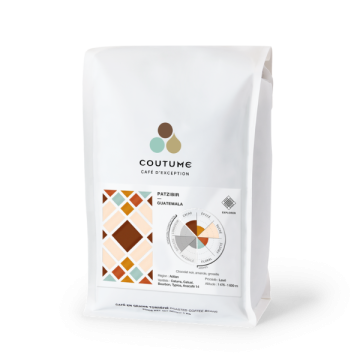
The packaging is a flat, stand-up pouch designed for coffee. It features a smooth, white exterior with a matte finish. The front displays a colorful geometric design with shades of brown, orange, and teal, alongside product information. The bag has a resealable top with a zip closure for freshness. The overall shape is rectangular, tapering slightly towards the bottom.
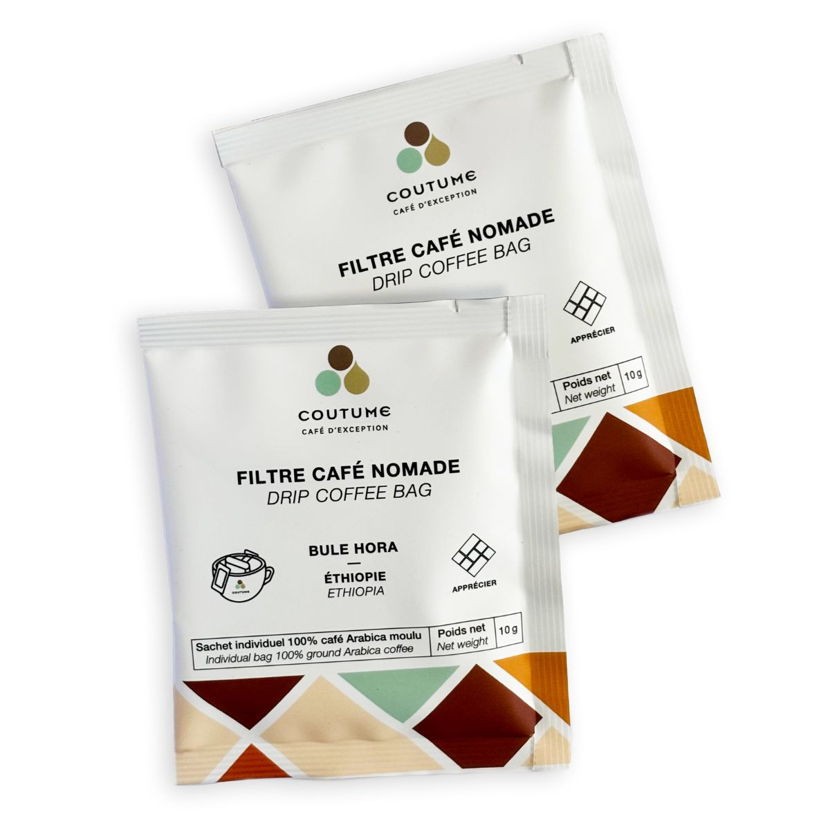
The packaging consists of two individual coffee bags, each featuring a flat, smooth construction. The bags are made from a lightweight, flexible material that is likely a type of plastic or foil, designed to preserve freshness. The surface has a matte finish with a slight sheen, indicating a possible barrier layer for moisture protection. The bags are predominantly white with colorful geometric patterns and text printed on the front, including the product name and origin details.
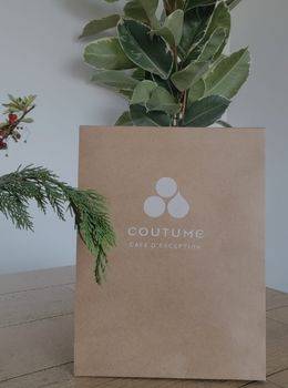
The packaging is a simple, brown kraft paper bag with a flat, rectangular shape. It has a smooth surface without any visible fluted layers, indicating it is made from single-layer paperboard. The bag features a clean, minimalist design with a white logo printed on the front, consisting of three circular shapes arranged vertically above the brand name 'COUTUME' in a modern font. The edges of the bag are neatly folded and glued, providing a sturdy construction suitable for retail use.
The packaging is a folding carton made of smooth, flat paperboard with clean edges and folds. It features a predominantly white exterior with colorful geometric designs at the bottom. The front displays the brand name 'COUTUM' prominently, along with product details and graphics related to the coffee. The carton has a tuck-top closure and is designed for retail display, with a lightweight appearance.
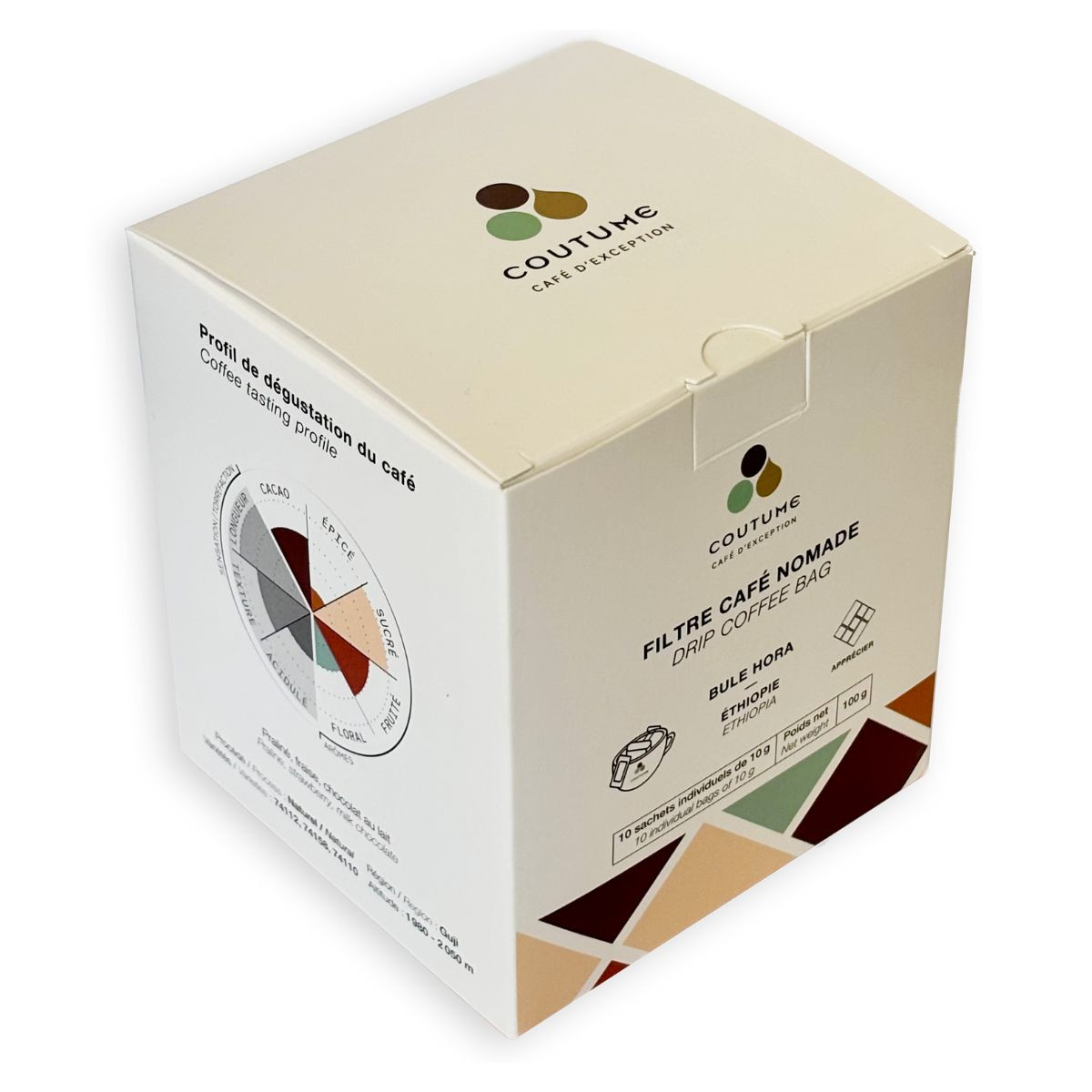
The packaging is a smooth, flat construction with clean edges and folds, made from a single-layer paperboard. It features a white exterior with colorful geometric graphics and text. The box has a square shape with a lid that tucks down securely. The overall appearance is lightweight and designed for retail display.
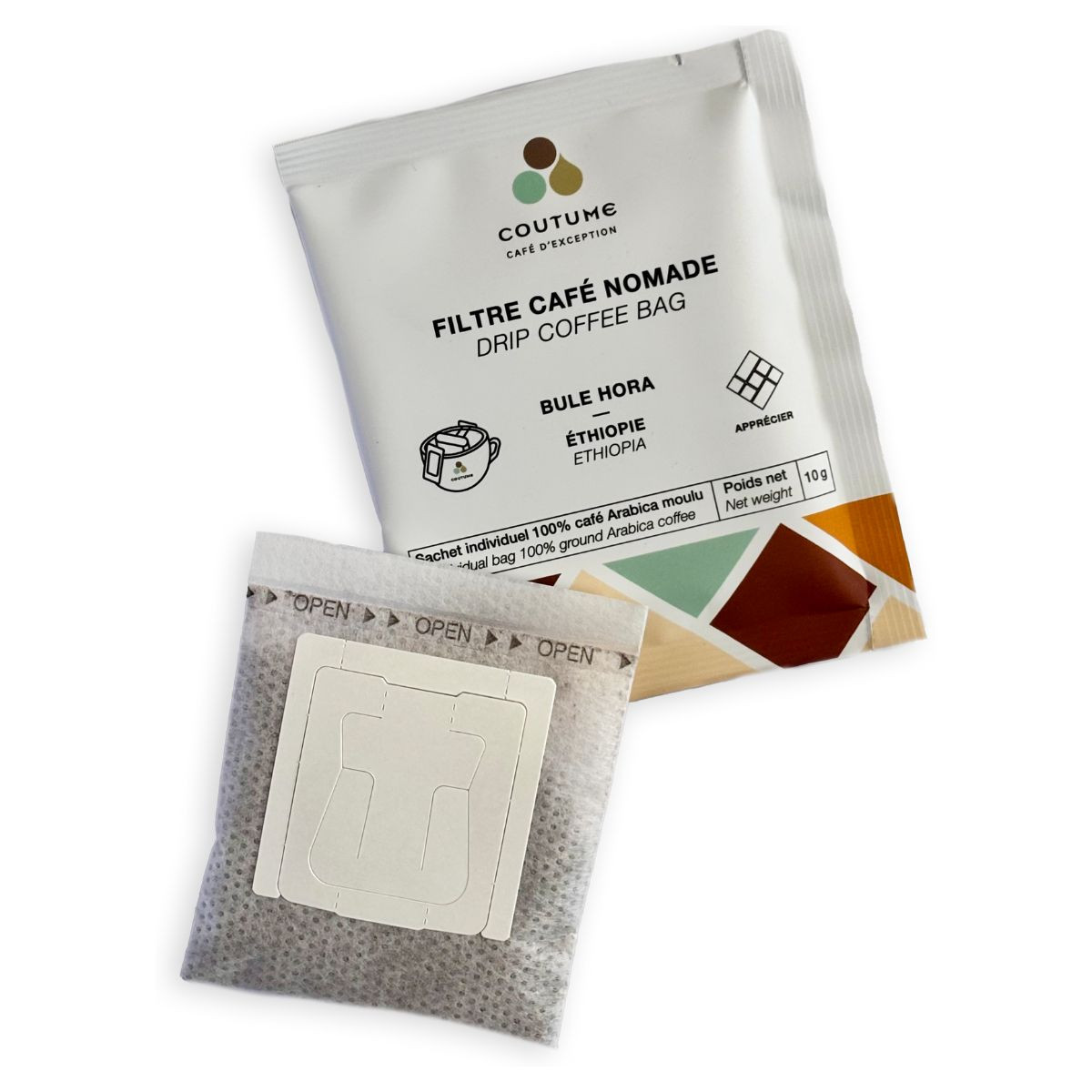
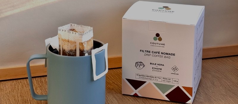
The packaging consists of a small, flat pouch designed for single-use coffee brewing. It features a white exterior with printed text and graphics. The bag is sealed on the sides and has a perforated opening at the top for easy access. The front displays the brand name 'COUTUME' prominently, along with product information and a graphic representation of the coffee brewing process.
About the Brand
Coutume Café operates in the specialty coffee sector, focusing on direct-to-consumer sales of curated coffees, teas, and brewing equipment. The brand is recognized for its commitment to sourcing quality ingredients and delivering a refined customer experience, reflected in both product selection and packaging execution.
Founded in 2010, Coutume Café leverages a diverse product portfolio, including organic and single-origin coffees, alongside educational resources for enthusiasts. The company’s packaging solutions are designed to balance shelf appeal, product protection, and sustainability, catering to a growing segment of environmentally aware consumers in the premium beverage market.
Key Differentiator: A strong focus on sustainability and modern, minimalist packaging design that reinforces brand values while ensuring functional protection for specialty products.
Design System
Visual Style
Typography centers on modern sans-serif fonts, complemented by a restrained color palette of white, brown, and accent geometric hues. The overall aesthetic is minimalist and contemporary, with clean lines and uncluttered layouts.
Brand Identity
Consistent usage of the COUTUME logo and geometric iconography ensures high brand recall. Visual consistency is maintained through uniform placement of brand elements, product details, and origin indicators across all packaging formats.
Packaging Design
Material selection favors recyclable paperboard and kraft paper, with structural designs that balance lightweight construction and product protection. Packaging structures include tuck-top cartons, stand-up pouches with resealable closures, and flat sachets for single servings, reflecting a philosophy of minimalism and sustainability.
User Experience
The design supports the customer journey by providing clear product information, easy-open features, and a visually appealing unboxing process. The approach reinforces the brand’s premium positioning and sustainability values, enhancing overall customer satisfaction and loyalty.
Company Metrics
Business insights for Coutume Café based on available data
Market Positioning
Brand Values & Focus
Key Competitors
Target Market: Environmentally conscious coffee and tea consumers, specialty beverage enthusiasts, and professional baristas seeking premium, ethically sourced products with high-quality presentation.
Packaging Assessment
Overall Grade
Visual appeal and presentation quality
Packaging durability and protection
Eco-friendliness and recyclable materials
Cost efficiency and value for money
Packaging assessment for Coutume Café based on industry standards and best practices
Frequently Asked Questions
What types of packaging does Coutume Café use for its products?
Coutume Café utilizes a combination of carton boxes, kraft paper bags, stand-up pouches, and flexible packaging, each tailored to preserve freshness, facilitate retail display, and support sustainable practices.
How does Coutume Café address sustainability in its packaging?
The company integrates recyclable and eco-friendly materials such as kraft paper and paperboard, and adopts minimalist design principles to minimize excess material use and environmental impact.
What is the visual branding approach in Coutume Café’s packaging?
Their packaging features a consistent use of geometric patterns, a modern sans-serif logo, and a restrained color palette, supporting strong brand recognition and a premium market position.
Discover other Food & Drink companies
Explore more companies in the food & drink industry and their packaging strategies
Teegschwendner GmbH
Food & Drink
Teegschwendner GmbH is a specialty tea company based in Germany, offering a wide selection of high-quality teas and tea-related accessories. They focus on providing unique tea experiences through carefully sourced and curated products.
PrepMyMeal
Food & Drink
PrepMyMeal is a food production company specializing in high-protein meal delivery services. They offer a variety of natural, nutritious meals designed for fitness enthusiasts and those seeking convenience in meal preparation.
Terres de Café
Food & Drink
Terres de Café is a specialty coffee retailer based in Paris, France, known for its commitment to sustainability and high-quality coffee sourcing.