Coral Club packaging
Coral Club delivers health and wellness solutions through a direct-to-consumer model, specializing in nutritional supplements and beauty products. Their packaging strategy leverages high-visibility carton formats with strong visual branding, designed for shelf impact and a cohesive consumer experience.
Packaging Portfolio
Coral Club’s packaging is dominated by single-layer folding carton boxes constructed from paperboard, selected for their lightweight properties and printability. The product portfolio utilizes a modular approach, with varied box sizes and inner pouches to accommodate sets and individual items, particularly for supplements and beauty aids. The color schemes are vibrant, often using two-tone designs for visual segmentation and easy product identification. Structural integrity is achieved through clean folds and precision edges, supporting both retail display and secure shipping. Brand elements, such as logos and product names, are prominently placed to reinforce identity across the entire product line.
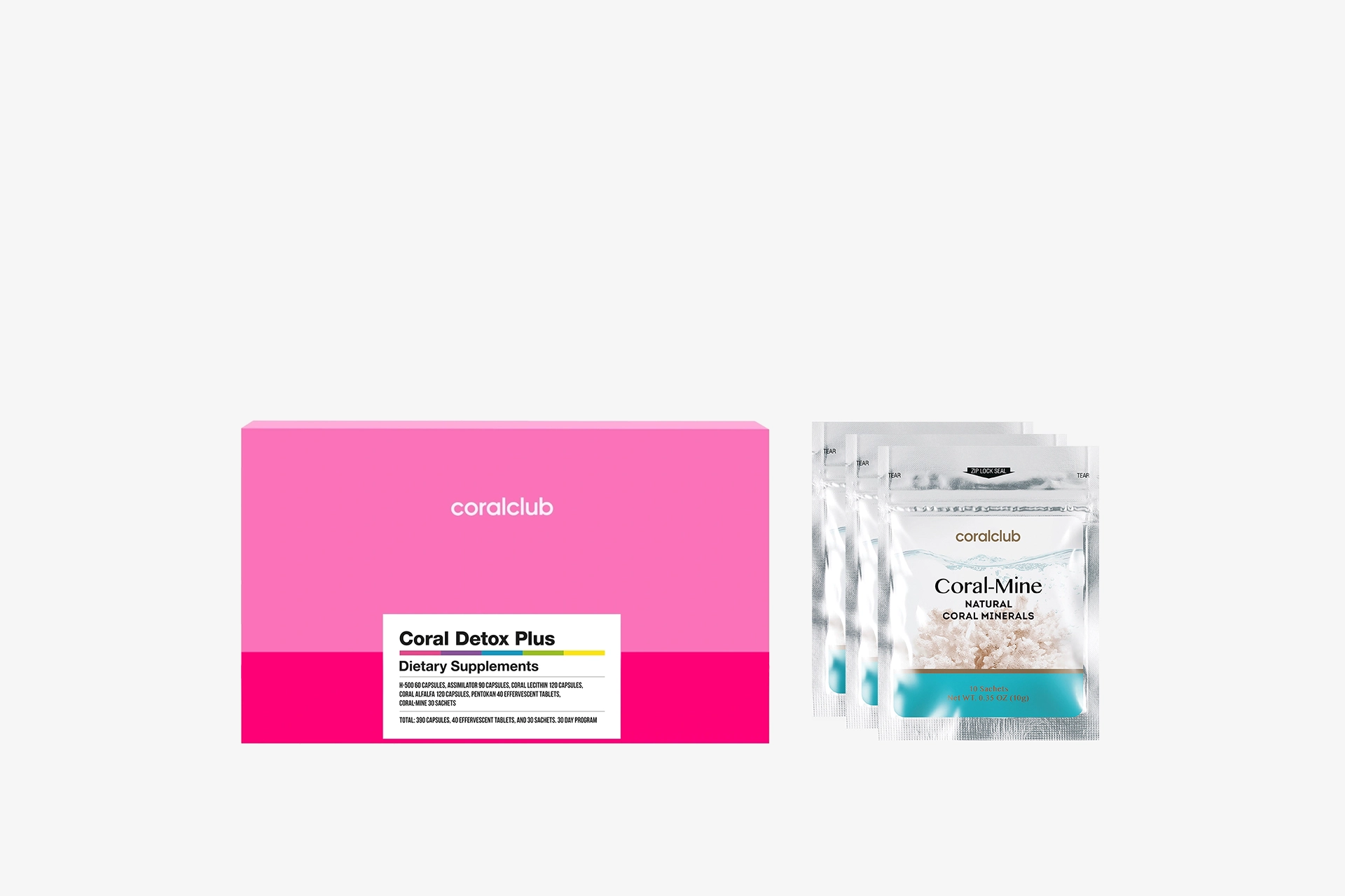
The packaging consists of a rectangular folding carton that is primarily pink with a white label at the bottom. The box has smooth, flat construction without any visible fluted layers, indicating it is made from single-layer paperboard. The edges are clean and precise, and the box has a glossy finish. Inside, there are several smaller pouches that appear to contain dietary supplements, each with a metallic finish and clear branding.
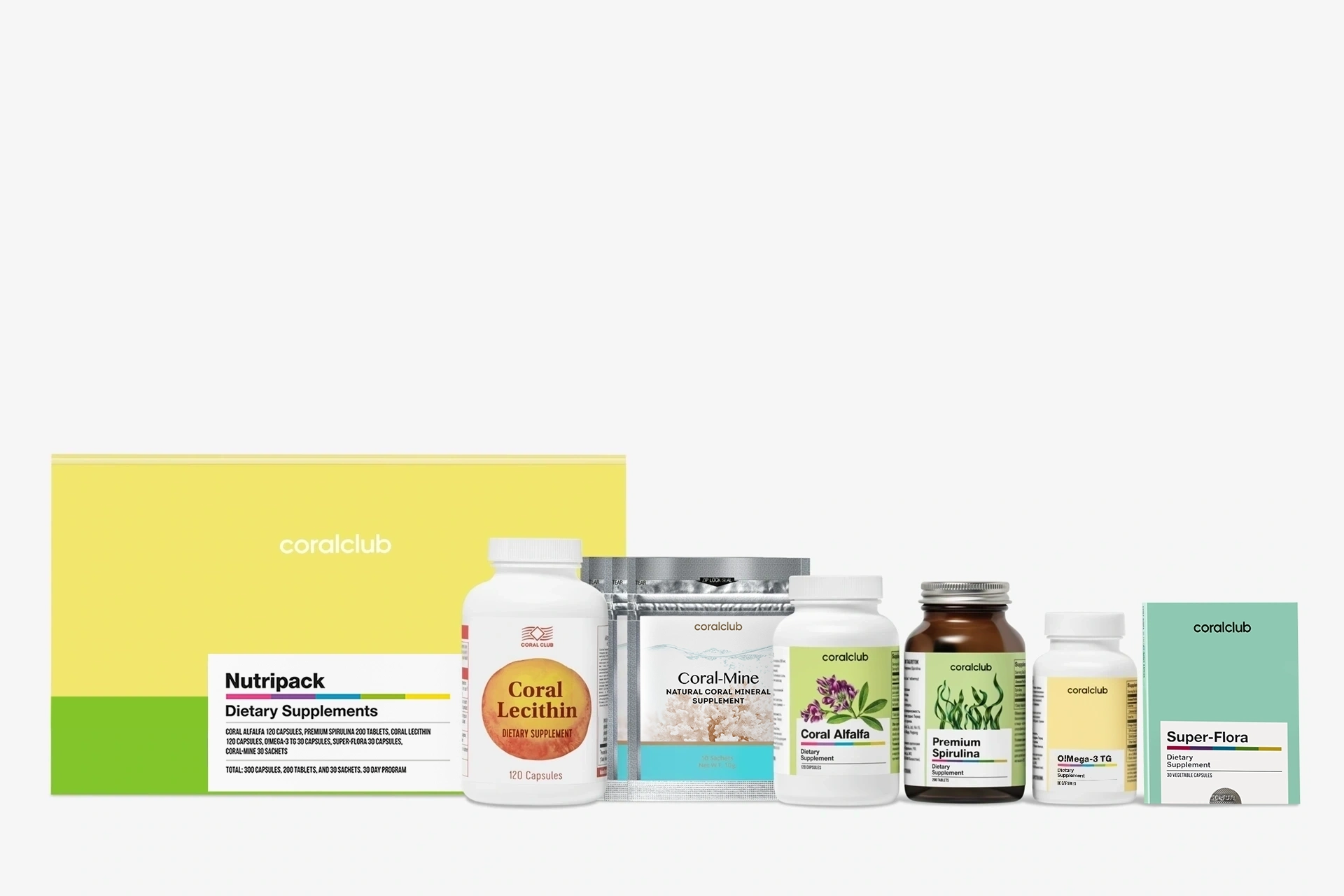
The packaging consists of a flat, smooth construction with a colorful exterior. The box features a predominantly yellow top with a white label area for product information. The edges are clean and precise, indicative of a folding carton. The box is designed to hold dietary supplements, with a clear branding presence.
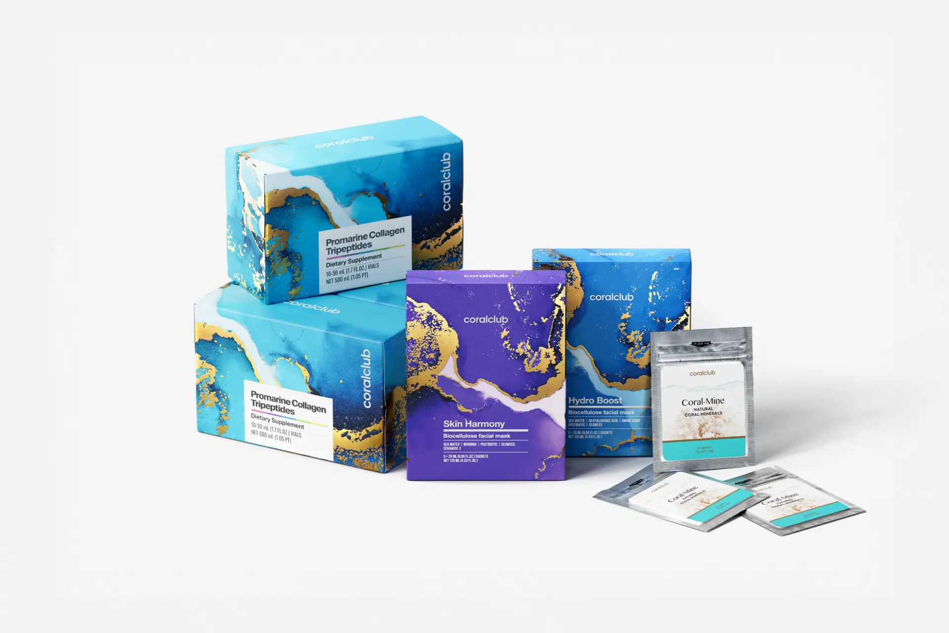
The packaging consists of multiple folding cartons made from single-layer paperboard. The boxes have smooth, flat surfaces with clean edges and folds, featuring vibrant colors and graphics. Each box is designed for retail display, showcasing product information prominently on the front. The overall appearance is lightweight and visually appealing, suitable for cosmetic or health-related products.
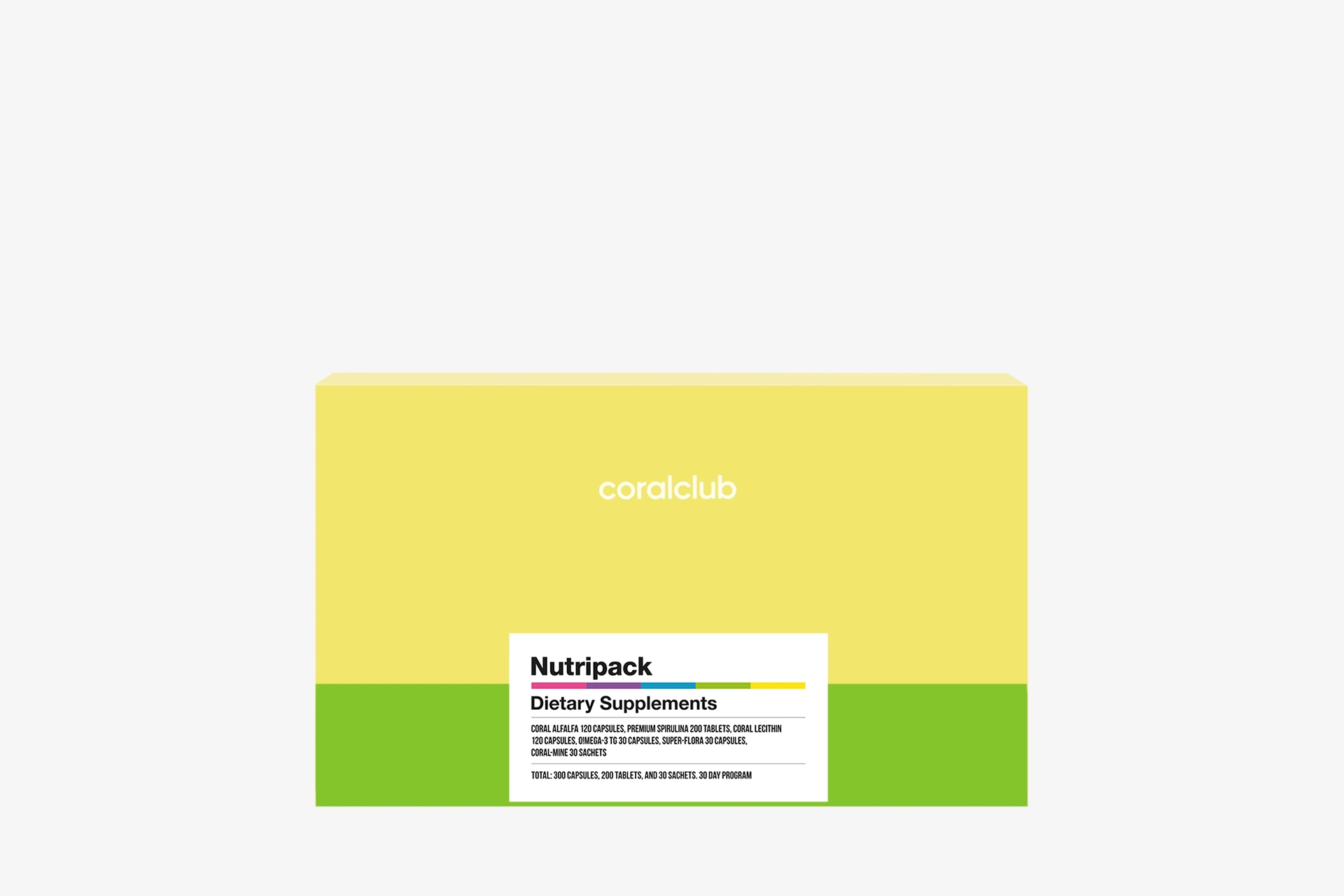
The packaging is a flat, rectangular box made of single-layer paperboard. It features a smooth surface with clean edges and precise folds. The box has a predominantly yellow exterior with a green bottom section, creating a two-tone color scheme. The front displays a product label with black text detailing the product name and description, while the overall design is minimalistic and modern.
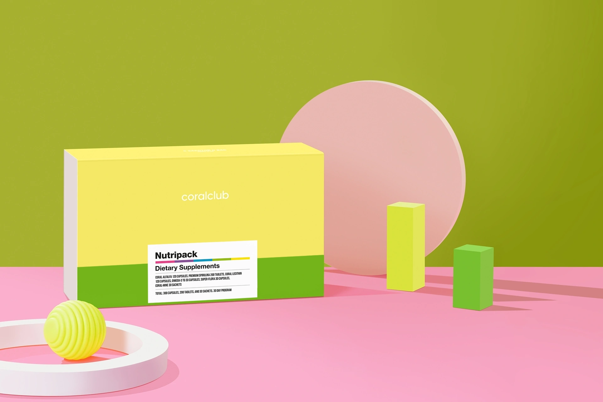
The packaging is a rectangular folding carton with a smooth, flat construction. It features a bright yellow top half and a green bottom half, creating a visually appealing two-tone design. The edges are clean and precise, indicating high-quality paperboard. The front displays product information clearly, with a white label that includes the product name 'Nutripack' and 'Dietary Supplements' in a bold, readable font.
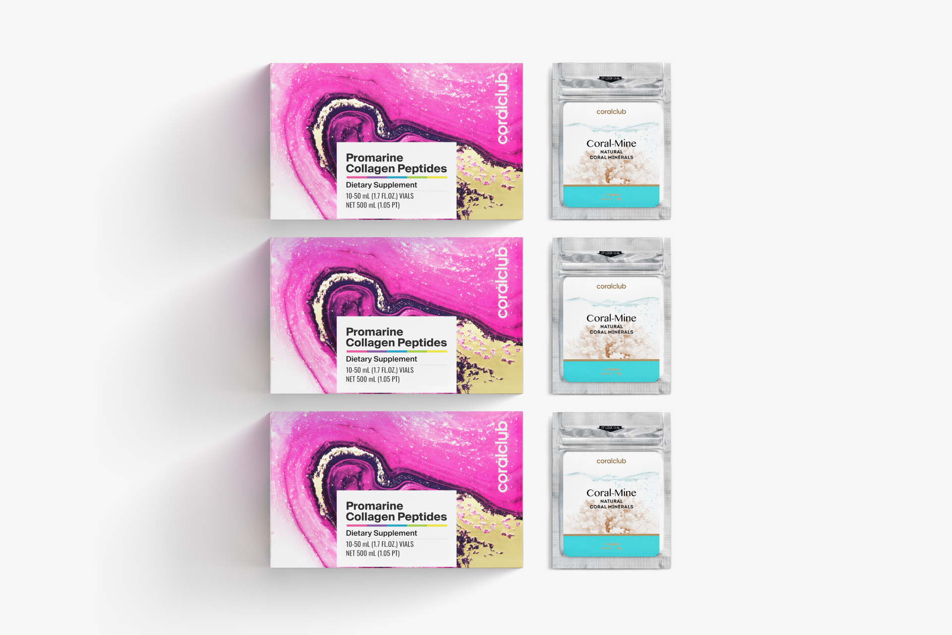
The packaging consists of two types of folding cartons. The larger boxes are designed for Promarine Collagen Peptides, featuring a vibrant pink and white color scheme with a heart design. The boxes are made of smooth, flat paperboard with clean edges and folds, indicative of a single-layer construction. The smaller packets for Coral-Mine have a similar design aesthetic but are more compact, showcasing a blue and white color scheme. Both types have a glossy finish, enhancing their visual appeal.
About the Brand
Coral Club operates in the global health and wellness sector, offering a robust portfolio of supplements, beauty aids, and fitness products. Their packaging relies primarily on single-layer folding carton boxes, optimized for both retail display and e-commerce logistics. Consistent color palettes and bold labeling support strong brand recall and customer engagement.
The company’s approach to packaging focuses on combining visual appeal with functional protection, utilizing vibrant two-tone color schemes and minimalistic layouts. Packaging formats are tailored for both individual and bundled product sets, supporting a direct-to-consumer sales channel with global reach. The use of lightweight, paperboard-based cartons aims to balance shelf presence with logistical efficiency.
Key Differentiator: Coral Club stands out through its cohesive packaging design system that integrates brand-forward visuals, member-focused experiences, and a modular approach suitable for frequent product launches and promotions.
Design System
Visual Style
Typography is bold, sans-serif for product names and key information, supporting clarity and shelf visibility. The color palette features bright, saturated tones—predominantly yellow, pink, green, and blue—used in two-tone or gradient schemes, paired with ample white space for a modern, minimalistic look.
Brand Identity
The Coral Club logo is consistently applied on all packaging, with strategic placement to maximize visibility. Product names are set in prominent, high-contrast fonts. Iconography is minimal, focusing instead on color and layout for differentiation. Visual consistency is maintained across SKUs, reinforcing brand recognition.
Packaging Design
Material selection prioritizes single-layer paperboard for cost-effective print quality and recyclability. Structural designs favor folding cartons with clean edges and glossy finishes, enhancing both tactile and visual appeal. The design philosophy emphasizes modularity, allowing for both individual and bundled packaging formats.
User Experience
Packaging is engineered for intuitive unboxing, with clear labeling and compartmentalization when sets are included. The visual system guides customers through product selection and usage, while the tactile feel and color coding enhance the emotional connection at each touchpoint in the customer journey.
Company Metrics
Business insights for Coral Club based on available data
Market Positioning
Brand Values & Focus
Key Competitors
Target Market: Health-conscious consumers seeking premium nutritional supplements, beauty, and fitness solutions, with a focus on direct-to-consumer convenience and global shipping.
Packaging Assessment
Overall Grade
Visual appeal and presentation quality
Packaging durability and protection
Eco-friendliness and recyclable materials
Cost efficiency and value for money
Packaging assessment for Coral Club based on industry standards and best practices
Frequently Asked Questions
What types of packaging materials does Coral Club use?
Coral Club primarily uses single-layer folding carton boxes constructed from high-quality paperboard, supporting both product protection and visual branding.
How does Coral Club's packaging support its direct-to-consumer model?
Packaging is designed for efficient shipment and retail presentation, with clear product information, robust branding, and lightweight materials to optimize fulfillment and customer unboxing.
Is Coral Club's packaging recyclable or eco-friendly?
Most packaging uses recyclable paperboard materials, though there is limited evidence of advanced sustainable practices or eco-certifications at this time.
Discover other Beauty & Fitness companies
Explore more companies in the beauty & fitness industry and their packaging strategies
Institut Karité Paris
Beauty & Fitness
Institut Karité Paris specializes in luxury beauty products made with natural Shea Butter, offering a wide range of skincare and body care solutions. The brand combines Parisian heritage with a commitment to quality and creativity in its offerings.
Big Moustache
Beauty & Fitness
Big Moustache specializes in shaving and grooming products tailored for men, providing a hassle-free subscription service for razor blades and skincare essentials.
Orris Paris
Beauty & Fitness
Orris Paris specializes in creating artisanal skincare products that combine potent botanical ingredients with modern cleansing rituals. The company emphasizes natural, holistic practices in its formulations.