Compagnie des Sens packaging
Compagnie des Sens is a French natural health company specializing in herbal extracts, essential oils, and dietary supplements, with a focus on organic ingredients. Their packaging strategy emphasizes eco-friendly materials, clear branding, and a retail-ready presentation to align with their holistic product positioning.
Packaging Portfolio
Compagnie des Sens utilizes a portfolio dominated by kraft paperboard folding cartons for retail display and corrugated boxes for shipping, both featuring custom-printed branding and botanical illustrations. Packaging formats accommodate small bottles and sensitive goods, often integrating protective tissue paper and printed sleeves for enhanced presentation. Material selection prioritizes recyclability and visual alignment with organic positioning, while design consistency extends across all product lines, supporting both shelf impact and e-commerce logistics.

The packaging is a folding carton box made from a single layer of paperboard. It features a smooth, flat construction with clean edges and folds. The exterior is a light brown color, typical of kraft paper, and it is designed to hold multiple small bottles of essential oils. The box is partially open, revealing a green tissue paper lining that adds a decorative touch. The overall shape is rectangular, suitable for retail display.
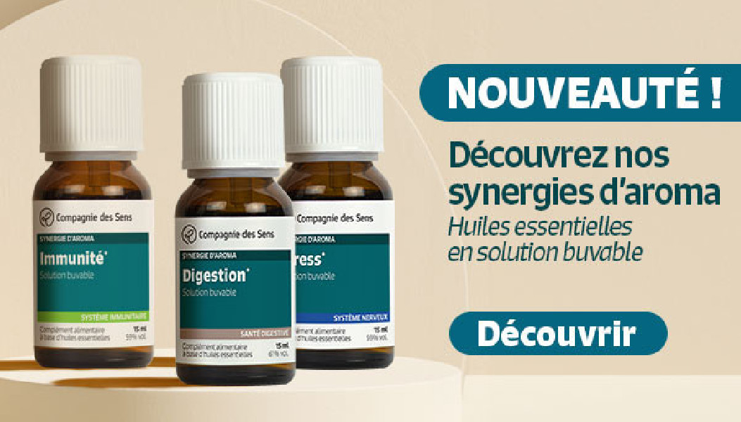
The packaging consists of small, cylindrical bottles with a dark brown color, each labeled with distinct product information. The labels feature a combination of white and colored text, with clear branding elements from www.compagnie-des-sens.fr. The bottles are displayed in a way that highlights their contents, suggesting a retail presentation. The overall arrangement is clean and organized, with a light background enhancing the visibility of the products.
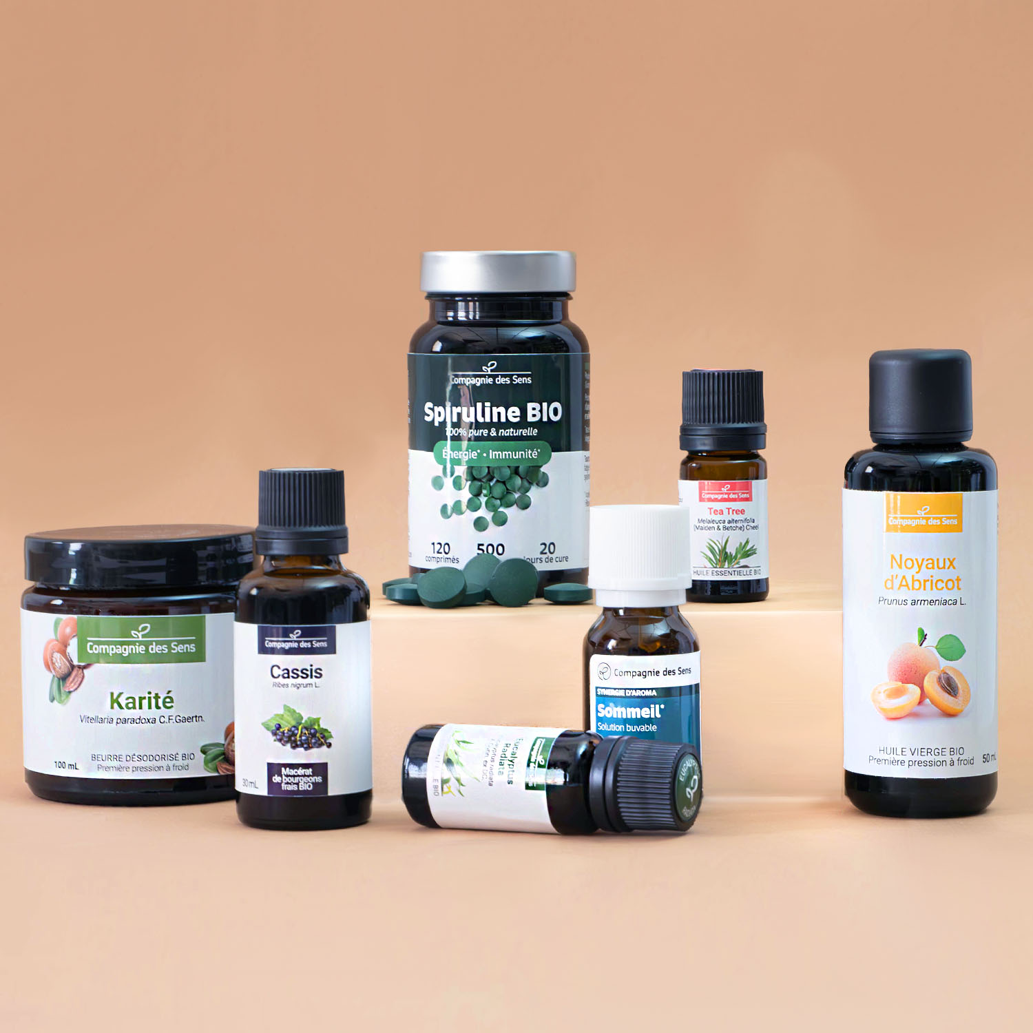
The packaging consists of various small containers and bottles, primarily made of glass and plastic. The bottles have smooth surfaces with clean edges and are designed for retail display. They feature labels with colorful graphics and text, indicating the product type and brand. The overall arrangement suggests a retail presentation, showcasing different essential oils and natural products.
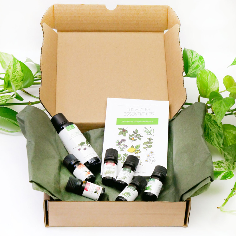
The packaging is a corrugated box with a brown kraft exterior. It features a sturdy construction with visible fluted edges when viewed from the side. The box is partially opened, revealing several essential oil bottles and a folded informational booklet inside. The interior is lined with green tissue paper, providing cushioning for the contents. The box has clean, precise edges and is designed for shipping purposes.
The packaging consists of a flat, smooth, single-layer paperboard box that is primarily brown in color. The box has clean edges and folds, indicative of a folding carton design. It features a printed sleeve that wraps around the box, displaying botanical illustrations and product information in a clean, modern font. The overall appearance is light and retail-oriented, suitable for displaying essential oils. The box shows no signs of wear or damage.
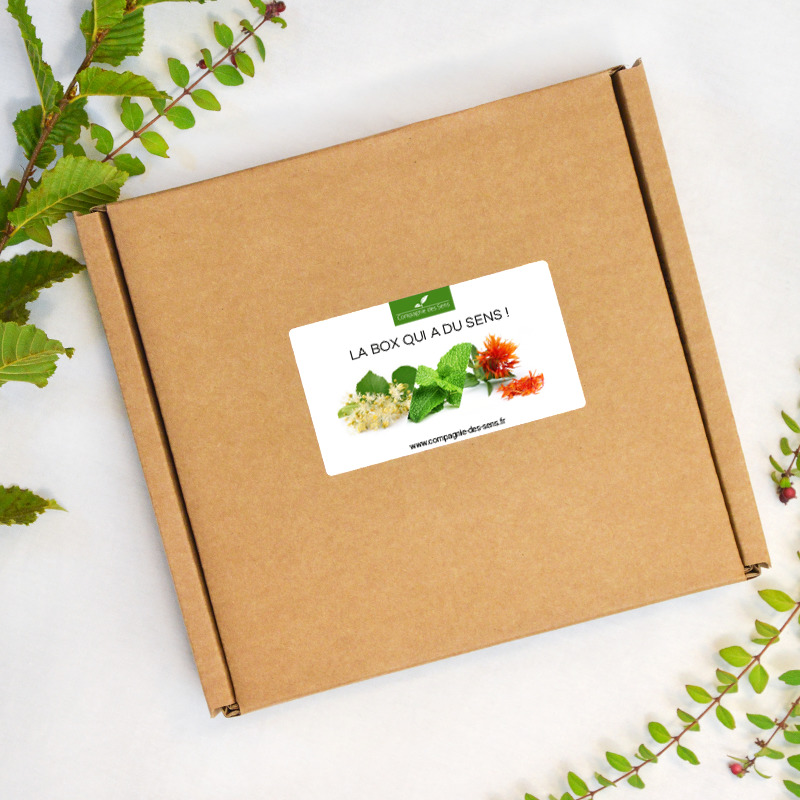
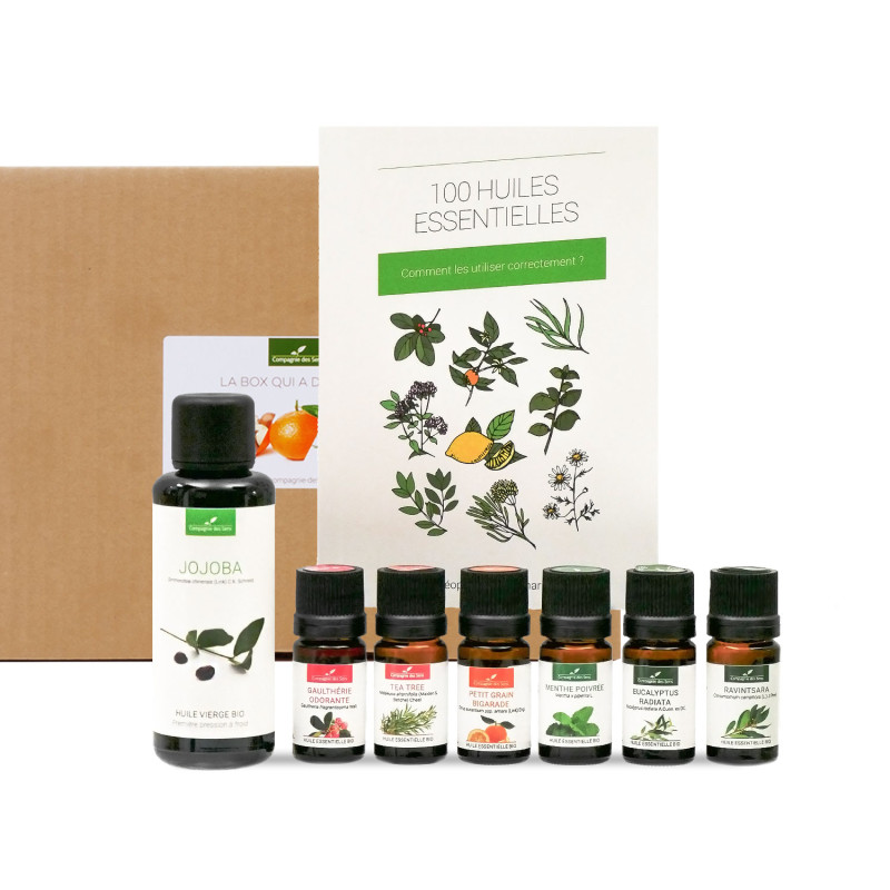
The packaging is a flat, rectangular box made from a single layer of paperboard. It features clean, precise edges and folds, indicative of a folding carton. The exterior is a kraft brown color, giving it a natural appearance. A prominent label is affixed to the top, displaying colorful images of flowers and text in a clear font. The box appears lightweight and is designed for retail display.
About the Brand
Compagnie des Sens delivers natural health and wellness solutions through a curated selection of herbal extracts, essential oils, and organic dietary supplements. The company’s packaging approach reflects its commitment to quality and sustainability, utilizing carton and corrugated boxes with botanical-themed branding.
Their packaging is characterized by the use of kraft paperboard and corrugated structures, offering both retail and shipping solutions tailored for sensitive products. Consistency in visual identity is seen across all formats, incorporating clean labeling, botanical illustrations, and environmentally conscious materials. The integration of educational materials within packaging further supports their consumer-centric model.
Key Differentiator: Compagnie des Sens stands out for its integration of 100% organic product sourcing with eco-conscious packaging and educational content, providing a cohesive and trustworthy consumer experience.
Design System
Visual Style
Typography employs clean, modern sans-serif fonts for clarity and accessibility. The color palette is anchored by natural browns, greens, and earthy tones, reinforcing the organic and botanical brand ethos. Overall, the aesthetic is minimal yet informative, with strong emphasis on product transparency.
Brand Identity
Brand logo and company name are consistently displayed on all packaging elements, supported by botanical iconography and plant illustrations. Visual consistency is maintained through uniform label structures, color schemes, and clear product hierarchies.
Packaging Design
Material choices focus on recyclable kraft paperboard and corrugated cardboard, with occasional use of glass for primary product containers. Structural design emphasizes folding cartons and robust shipping boxes, balancing product protection with environmental considerations.
User Experience
Packaging is designed to facilitate a positive unboxing experience, blending aesthetic appeal with practical protection. Informational inserts and clear labeling guide consumers through product use, supporting education and brand trust throughout the customer journey.
Company Metrics
Business insights for Compagnie des Sens based on available data
Market Positioning
Brand Values & Focus
Key Competitors
Target Market: Health-conscious consumers seeking natural, organic wellness products, with a significant emphasis on online retail and direct-to-consumer e-commerce in France and broader European markets.
Packaging Assessment
Overall Grade
Visual appeal and presentation quality
Packaging durability and protection
Eco-friendliness and recyclable materials
Cost efficiency and value for money
Packaging assessment for Compagnie des Sens based on industry standards and best practices
Frequently Asked Questions
What types of packaging materials does Compagnie des Sens use?
They primarily utilize paperboard folding cartons and kraft corrugated boxes, supplemented by glass and plastic bottles for essential oils and supplements. Packaging frequently incorporates recyclable and natural materials aligned with sustainability goals.
How does Compagnie des Sens ensure product safety during shipping?
The brand employs sturdy corrugated boxes with protective tissue linings and secure closures, effectively minimizing product movement and potential damage in transit.
Is the packaging recyclable or eco-friendly?
Most packaging is designed with recyclability and environmental impact in mind, leveraging kraft materials and minimizing plastic use, though some glass and plastic components remain for product protection.
Discover other Beauty & Fitness companies
Explore more companies in the beauty & fitness industry and their packaging strategies
Cultiv Cosmetique
Beauty & Fitness
Cultiv Cosmetique is a French skincare brand that provides organic and eco-friendly beauty products inspired by nature. They focus on effective skincare solutions for various skin concerns.
Pure Altitude
Beauty & Fitness
Pure Altitude specializes in high-quality beauty and skincare products that leverage the expertise of spa treatments to enhance daily routines. The brand offers a diverse range of products tailored for both facial and body care.
Institut Karité Paris
Beauty & Fitness
Institut Karité Paris specializes in luxury beauty products made with natural Shea Butter, offering a wide range of skincare and body care solutions. The brand combines Parisian heritage with a commitment to quality and creativity in its offerings.