Compagnie de Provence packaging
Compagnie de Provence specializes in Mediterranean-inspired skincare and body care, integrating natural ingredients and sustainability into its product lines. The company’s packaging strategy emphasizes eco-friendly carton solutions and clean, brand-consistent visual presentation across its retail and refill formats.
Packaging Portfolio
Compagnie de Provence leverages recyclable single-layer paperboard carton boxes across its product range, employing both standard and custom folding structures to accommodate liquids and solids. The packaging features matte finishes, earthy color schemes, and minimalist graphics for differentiation and shelf appeal. Structural design incorporates retail-ready cartons, spouted refill formats, and protective folding cartons, balancing aesthetics, product safety, and environmental impact. The consistent use of clear labeling and brand identifiers enhances user navigation and reinforces the company’s sustainable positioning within the beauty industry.

The packaging is a flat, rectangular carton with a smooth, single-layer construction. It features a foldable design with a top flap for easy opening. The exterior is a natural kraft color, giving it an eco-friendly appearance. The front displays a large blue label with white text, indicating the product name and details. There are also decorative green leaf graphics along the bottom, enhancing its aesthetic appeal.
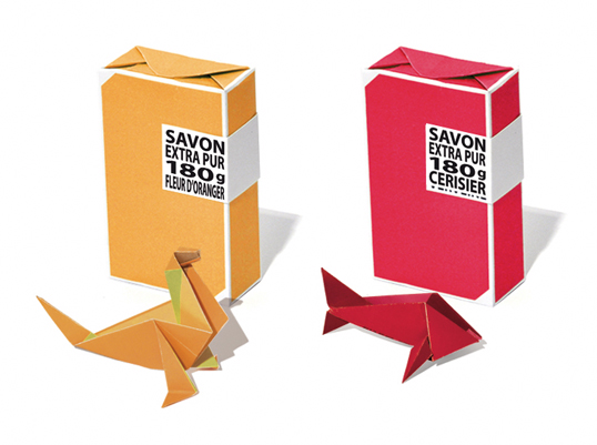
The packaging consists of two folding cartons, one in a vibrant orange color and the other in a bright red. Each carton features a smooth, flat construction without visible fluted layers, indicating they are made from single-layer paperboard. The edges are clean and precise, with a rectangular shape typical for retail packaging. The cartons are designed to resemble a traditional milk carton with a top closure that folds over. The surface appears to have a matte finish, giving it a modern look. The front of each carton displays product information in a contrasting black label, enhancing visibility.

The packaging is a folding carton box designed for retail use, featuring a smooth, flat construction without fluted layers. The box is predominantly brown with printed graphics. It has clean edges and folds, indicating a precise assembly. The front of the box displays a large graphic of a water droplet along with product information. The top has a spout for easy dispensing, and the overall shape is rectangular, designed to hold a liquid product securely.

The packaging is a square folding carton made of single-layer paperboard. It features a smooth, flat construction with clean edges and folds. The exterior is a light green color with a matte finish, giving it a natural and organic appearance. The front displays the product name 'SAVON MARSEILLE' prominently, along with the type 'Marseille Soap' and the ingredient information. The sides have icons and text indicating the product's natural ingredients and origin. There are no visible fluted layers, confirming it as a carton box.

The packaging consists of four rectangular cartons stacked vertically, each featuring a spout at the bottom for dispensing liquid soap. The cartons have a smooth, flat construction without fluted layers, characteristic of single-layer paperboard. Each carton is predominantly kraft brown with vibrant colored labels indicating the product type. The edges are clean and precise, with a matte finish that gives a natural look. The design includes botanical illustrations and clear product information.

The packaging is a rectangular box with a smooth, flat construction made of single-layer paperboard. It features a light brown kraft exterior with a matte finish. The box has a clean, precise folding pattern and is designed to hold multiple liquid soap containers. The front displays a large, clear label with product information and graphics, while the sides have additional design elements and branding.
About the Brand
Compagnie de Provence operates in the beauty and skincare sector, offering products rooted in Provencal heritage and utilizing plant-based formulations. The brand’s packaging approach prioritizes recyclable carton boxes with matte finishes, reinforcing a natural and eco-conscious identity. Consistency in visual elements and clear product information are hallmarks of their structural and graphic design choices.
With a focused direct-to-consumer model, Compagnie de Provence delivers a cohesive packaging system across diverse product types, from liquid soap refills to solid Marseille soaps. The company employs single-layer paperboard cartons for most SKUs, balancing product protection with environmental responsibility. Their packaging portfolio is characterized by minimalistic graphics, earthy color palettes, and the prominent use of brand identifiers, supporting both shelf impact and logistical efficiency. Strategic investments in refill packaging and clear labeling further highlight their sustainability commitments.
Key Differentiator: Distinctive integration of eco-friendly carton packaging with Mediterranean-inspired design, supporting both sustainability and premium brand positioning in the beauty sector.
Design System
Visual Style
Clean sans-serif typography, earthy and muted color palette (kraft browns, greens, blues, and natural tones), paired with matte surface finishes for a natural and understated aesthetic.
Brand Identity
Consistent application of the Compagnie de Provence logo and wordmark, frequent use of botanical iconography, and a strong emphasis on uncluttered, information-focused layouts for high brand recall and clarity.
Packaging Design
Preference for recyclable, FSC-certified paperboard; folding carton structures with precise edges; and modular formats for both retail and refill SKUs. Design choices prioritize sustainability, ease of transport, and visual consistency.
User Experience
Packaging design supports intuitive unboxing, clear product identification, and a premium tactile experience. The use of earthy visuals and structured labeling helps guide the customer journey, reinforcing brand values at every interaction point.
Company Metrics
Business insights for Compagnie de Provence based on available data
Market Positioning
Brand Values & Focus
Key Competitors
Target Market: Environmentally conscious beauty and skincare consumers seeking premium, natural ingredient-based products with strong brand heritage.
Packaging Assessment
Overall Grade
Visual appeal and presentation quality
Packaging durability and protection
Eco-friendliness and recyclable materials
Cost efficiency and value for money
Packaging assessment for Compagnie de Provence based on industry standards and best practices
Frequently Asked Questions
What types of packaging materials does Compagnie de Provence use?
Compagnie de Provence primarily utilizes single-layer paperboard carton boxes with matte finishes for both primary and secondary packaging, emphasizing recyclability and eco-friendly sourcing.
How does the packaging reinforce brand identity?
Packaging consistently features the Compagnie de Provence logo, product names, and natural imagery, using earthy colors and clean layouts to reflect the brand's Mediterranean heritage and sustainability ethos.
Is the company’s packaging strategy aligned with sustainability goals?
Yes, the use of recyclable carton materials, eco-refill formats, and minimalistic designs demonstrates a clear alignment with sustainability objectives in the beauty industry.
Discover other Beauty & Fitness companies
Explore more companies in the beauty & fitness industry and their packaging strategies
Orris Paris
Beauty & Fitness
Orris Paris specializes in creating artisanal skincare products that combine potent botanical ingredients with modern cleansing rituals. The company emphasizes natural, holistic practices in its formulations.
Pure Altitude
Beauty & Fitness
Pure Altitude specializes in high-quality beauty and skincare products that leverage the expertise of spa treatments to enhance daily routines. The brand offers a diverse range of products tailored for both facial and body care.
Owari
Beauty & Fitness
Owari specializes in 100% natural beauty and fitness products, designed to enhance health and wellness. The company proudly offers its products made in France, emphasizing quick delivery and customer support.