Climpson & Sons packaging
Climpson & Sons is a specialty coffee provider focused on quality coffee products, brewing equipment, and educational workshops. Their packaging strategy emphasizes brand visibility and product freshness through the use of modern, resealable flexible pouches and retail cartons.
Packaging Portfolio
Climpson & Sons employs a diverse packaging portfolio centered on flexible stand-up pouches with matte finishes and resealable zip closures, ideal for preserving coffee freshness and supporting repeated use. Their secondary packaging includes single-layer paperboard cartons for equipment and branded metal canisters for specialty products, optimizing both protection and shelf presentation. The use of laminated films in pouches offers barrier properties against moisture and oxygen, while carton and canister formats enhance visual differentiation for non-coffee items. Across all packaging, there is a consistent application of bold typography, color blocking, and brand-centric graphics to ensure clear product identification and alignment with their premium positioning.
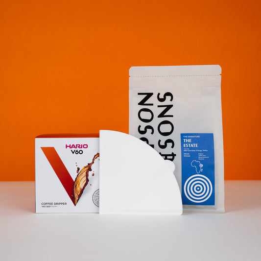
The image features two distinct packaging types: a retail carton and a stand-up pouch. The retail carton is square-shaped with a smooth, flat construction, made from single-layer paperboard, and displays a clean, precise design with a glossy finish. It features vibrant colors, including red and white, with graphics that include the brand name 'HARIO' and product details. The stand-up pouch is made from a flexible material, likely a laminated film, with a matte finish and a resealable top. It is designed to stand upright and features a simple design with a blue label containing product information and branding elements.
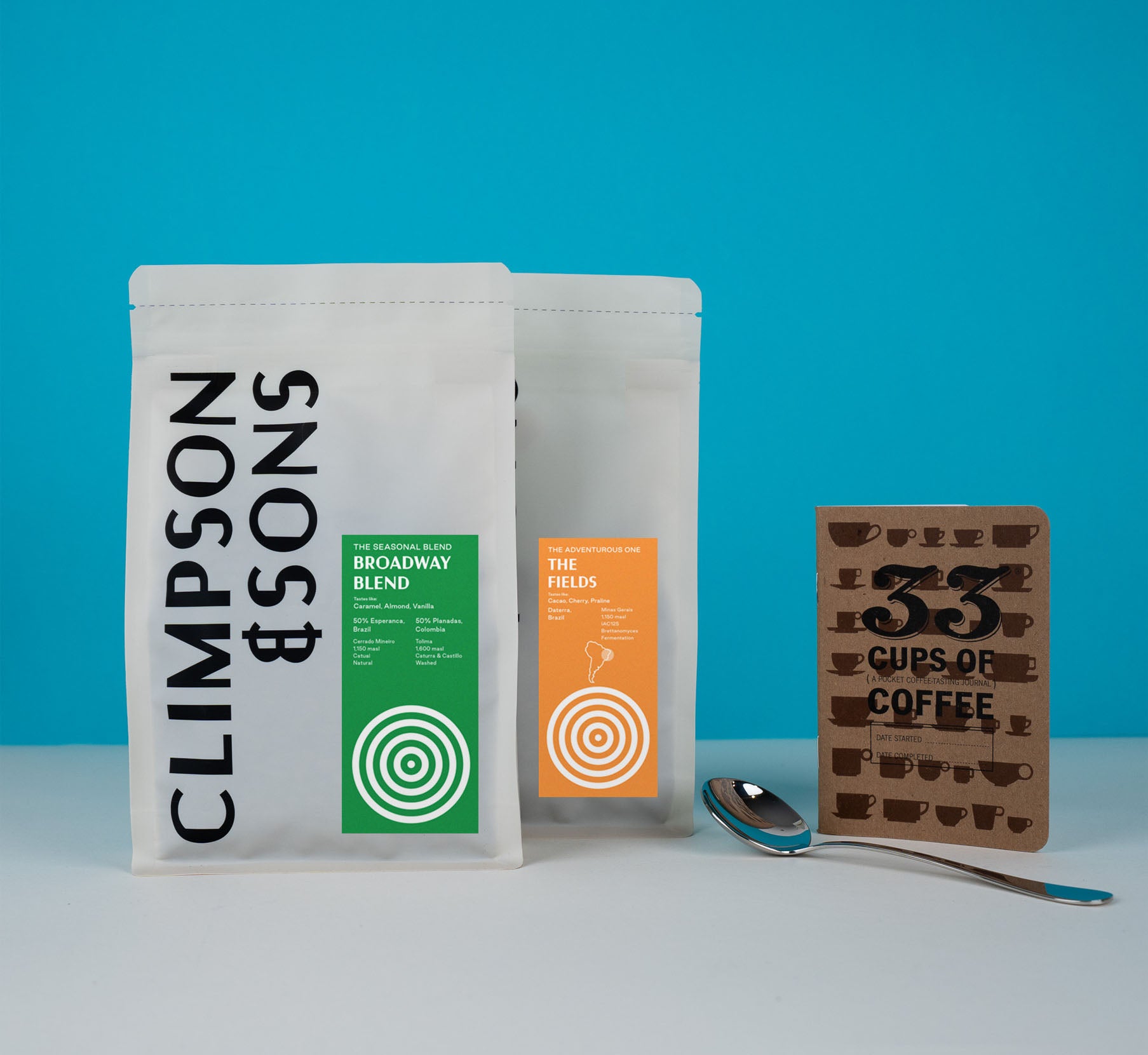
The packaging consists of two stand-up pouches made from a flexible material, likely a type of plastic or composite film. Each pouch features a smooth surface with a matte finish, and they are designed to stand upright. The pouches have a resealable top, allowing for easy access and storage. The front of each pouch displays vibrant colors and graphics, with one pouch being predominantly white and the other featuring a bright orange panel.
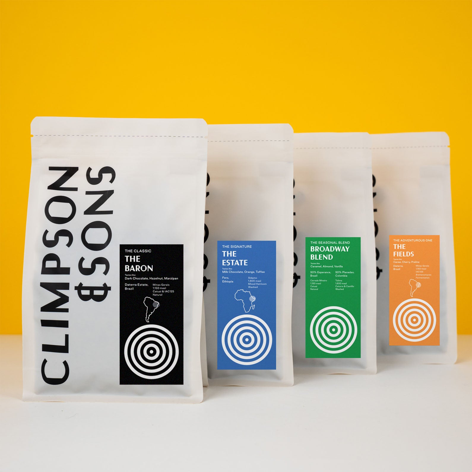
The packaging consists of stand-up pouches made from a flexible material. Each pouch features a clear front with a matte finish and a colored label at the bottom. The pouches have a resealable top with a zipper closure. The overall shape is rectangular, allowing them to stand upright. The pouches are designed for easy visibility of the contents inside.
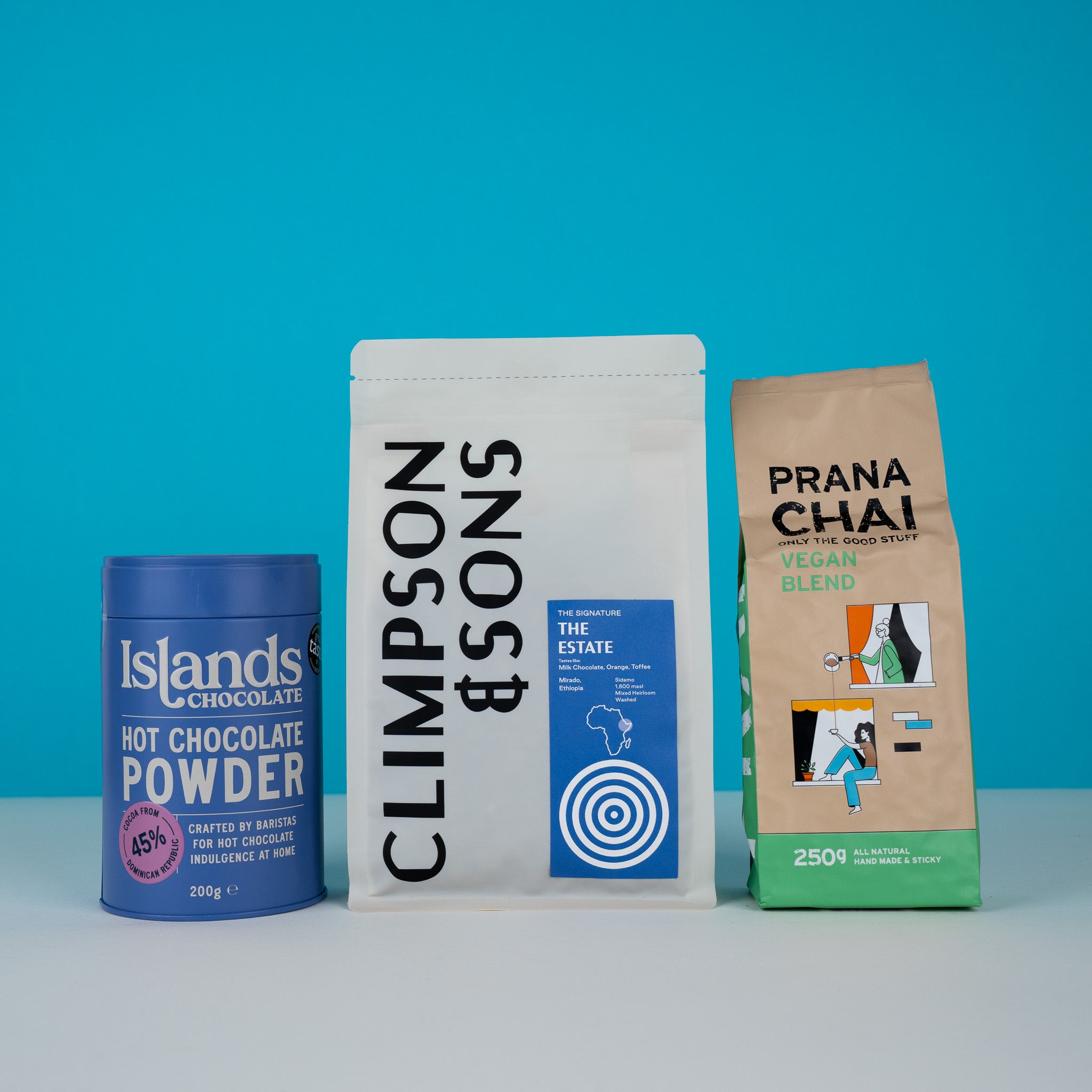
The image features three distinct types of packaging. The first is a cylindrical canister made of metal with a blue exterior, labeled 'Islands Chocolate Hot Chocolate Powder' in white text. The second is a flat, resealable pouch made of flexible material, labeled 'THE ESTATE' with a simple design and a white background. The third is a rectangular pouch with a colorful design, labeled 'PRANA CHAI Vegan Blend', showcasing a vibrant illustration and text. Each packaging type has a unique design and material.

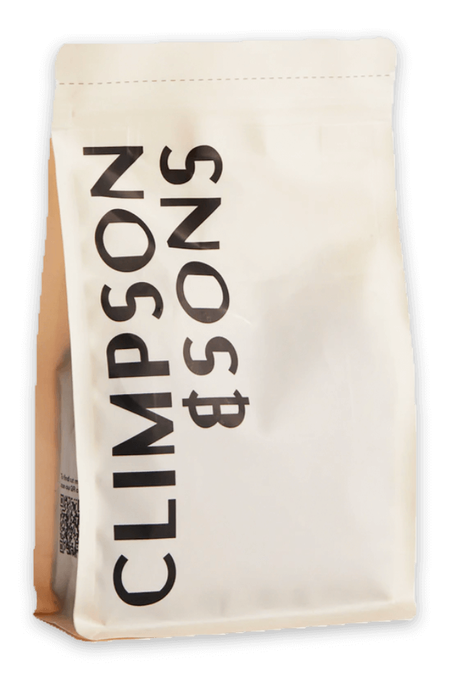
The packaging is a stand-up pouch made of a flexible material, likely a multi-layer film designed for coffee. It features a matte finish with a smooth surface. The front side prominently displays the brand name 'CLIMPSON & SONS' in bold, black typography, while the back includes product information and a colorful circular graphic, likely indicating freshness or flavor profile. The bag has a resealable top, which is a common feature for coffee packaging.
The packaging is a stand-up pouch made from a flexible material, likely a composite of plastic and possibly foil. The pouch has a flat bottom allowing it to stand upright. The surface is smooth with a matte finish, and it features a resealable top. The overall shape is rectangular with rounded edges, tapering slightly towards the top.
About the Brand
Climpson & Sons operates within the specialty coffee market, offering high-quality coffee blends, brewing equipment, and educational workshops to consumers and professionals. Their packaging approach leverages flexible pouches, retail cartons, and canisters, ensuring product freshness and consistent brand presentation. The brand’s operational focus supports both direct-to-consumer sales and partnerships with businesses seeking premium coffee experiences.
Their packaging is predominantly composed of stand-up pouches with matte finishes and resealable closures, providing functional and practical storage for coffee. Secondary packaging includes carton boxes for equipment and select products, as well as branded canisters for specialty items. Each packaging format is designed for durability in transit and shelf appeal, supporting both e-commerce and physical retail channels. Climpson & Sons prioritizes a cohesive visual identity, utilizing bold typography and color blocking to reinforce brand recognition.
Key Differentiator: Climpson & Sons stands out for integrating hands-on coffee education with premium coffee offerings, supported by packaging that balances modern aesthetics, product protection, and consistent brand messaging.
Design System
Visual Style
Utilizes modern sans-serif typography, bold black and white contrasts, and strategic color accents (such as orange, blue, and red) to create a clean and contemporary aesthetic. Matte finishes and minimalistic layouts dominate the visual approach.
Brand Identity
Prominent display of the 'CLIMPSON & SONS' logo, with consistent use of logotype across all packaging formats. Iconography is minimal and used sparingly, supporting a cohesive and instantly recognizable brand image. Visual consistency is achieved through uniform placement of brand elements and structured information hierarchy.
Packaging Design
Material selection prioritizes flexible, multi-layer pouches for coffee, offering excellent barrier protection and resealability. Carton boxes and metal canisters are used for specific products, emphasizing durability and premium feel. Structural design favors stand-up formats for shelf impact and user convenience.
User Experience
Design decisions focus on ease of use (resealable pouches), product freshness, and a premium unboxing experience. Clear labeling, bold product naming, and tactile finishes enhance user satisfaction and reinforce the brand's educational and quality-driven values throughout the customer journey.
Company Metrics
Business insights for Climpson & Sons based on available data
Market Positioning
Brand Values & Focus
Key Competitors
Target Market: Coffee enthusiasts, home brewers, professionals, and businesses seeking premium specialty coffee and educational experiences in the UK market.
Packaging Assessment
Overall Grade
Visual appeal and presentation quality
Packaging durability and protection
Eco-friendliness and recyclable materials
Cost efficiency and value for money
Packaging assessment for Climpson & Sons based on industry standards and best practices
Frequently Asked Questions
What types of packaging materials does Climpson & Sons use?
Climpson & Sons primarily utilizes flexible, multi-layer stand-up pouches with resealable features for coffee products, complemented by retail cartons and canisters for equipment and specialty items.
How does Climpson & Sons support sustainability in its packaging?
While the packaging features modern, resealable designs, the current approach focuses on durability and product protection; opportunities exist for increased use of recyclable or compostable materials to further reduce environmental impact.
How does their packaging contribute to the customer experience?
Packaging is designed to deliver a visually appealing unboxing experience, with clean layouts, bold branding, and practical resealable closures that maintain product freshness and enhance customer satisfaction.
Discover other Food & Drink companies
Explore more companies in the food & drink industry and their packaging strategies
Thés de la Pagode
Food & Drink
Thés de la Pagode is a French company specializing in organic teas and infusions, focusing on health and well-being. Established in 1987, they prioritize sustainable practices and high-quality ingredients sourced through fair trade.
Terres de Café
Food & Drink
Terres de Café is a specialty coffee retailer based in Paris, France, known for its commitment to sustainability and high-quality coffee sourcing.
Teegschwendner GmbH
Food & Drink
Teegschwendner GmbH is a specialty tea company based in Germany, offering a wide selection of high-quality teas and tea-related accessories. They focus on providing unique tea experiences through carefully sourced and curated products.