cioccolateria belga by charlotte dusart packaging
Cioccolateria Belga by Charlotte Dusart is a boutique Milan-based chocolatier specializing in handcrafted Belgian chocolates. Their packaging strategy leverages premium rigid boxes and vibrant retail cartons to enhance product presentation and reinforce a luxury brand image.
Packaging Portfolio
Cioccolateria Belga by Charlotte Dusart utilizes a diverse packaging portfolio comprised mainly of rigid paperboard boxes for premium chocolate assortments, folding carton boxes with geometric and festive designs for retail lines, and kraft paper containers for desserts. Rigid boxes feature compartmentalized interiors and matte or textured finishes to reinforce a luxury image, while carton boxes incorporate clear windows and vibrant patterns to enhance shelf visibility. Brand logos and names are consistently integrated, supporting both aesthetic appeal and traceability. The portfolio is tailored to deliver product protection, visual differentiation, and gifting suitability within the premium confectionery segment.
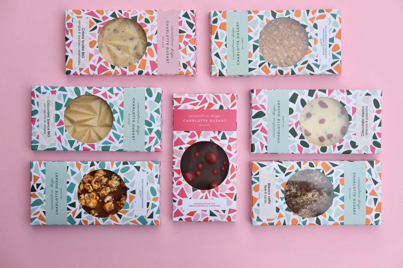
The packaging consists of flat, smooth, single-layer paperboard boxes featuring vibrant, colorful designs with geometric patterns. Each box has a clear window cutout that showcases the product inside. The edges are clean and well-defined, with precise folds. The overall appearance is lightweight and suitable for retail display.
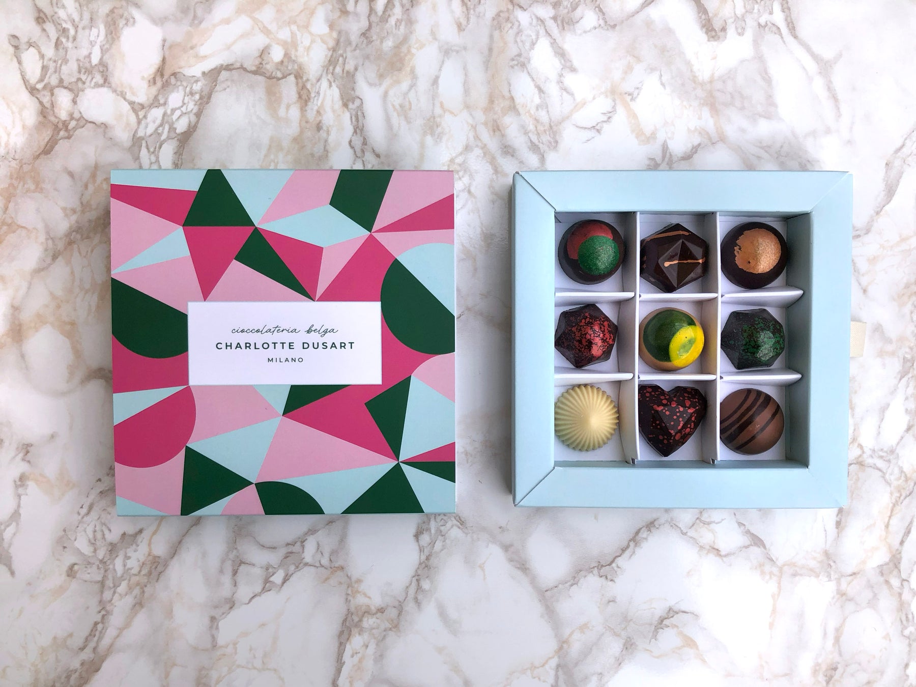
The packaging is a square-shaped box with a lid that features a colorful geometric design. The box is divided into sections, holding nine individual chocolates. The exterior has a matte finish with vibrant colors including pink, green, and blue, creating a modern aesthetic. The interior is light blue, contrasting with the exterior and enhancing the visual appeal of the chocolates.
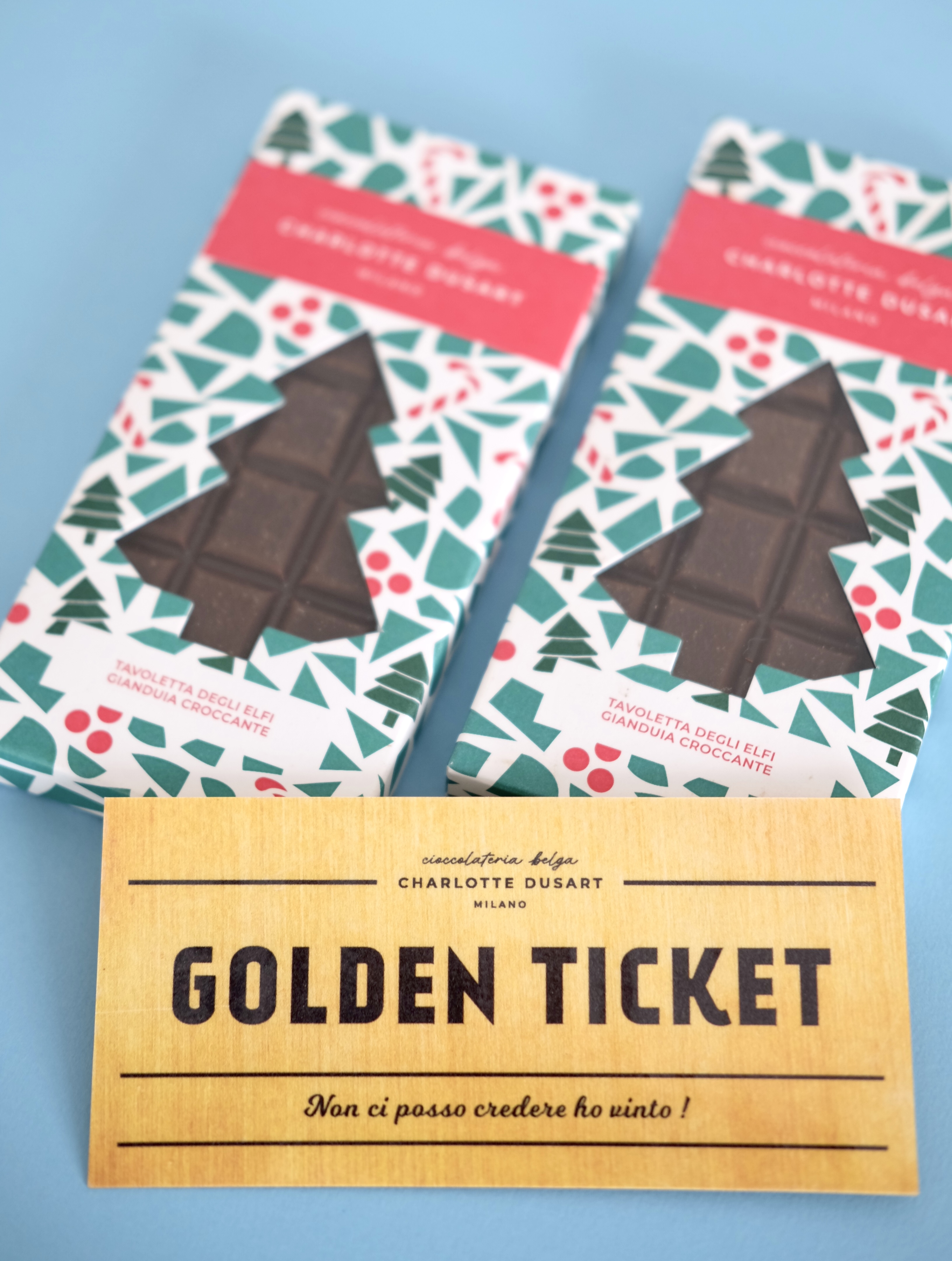
The packaging consists of a folding carton made of smooth, flat paperboard. It features a colorful design with a festive theme, showcasing a green and red pattern with holly leaves and berries. The carton is rectangular, with clean edges and precise folds, typical of retail packaging. The front displays a prominent logo and product information, while the back may contain additional details about the product.

The packaging is a high-quality rigid box with a sturdy construction, featuring a black exterior and a compartmentalized interior for assorted chocolates. The box has a smooth finish, likely covered in decorative paper, giving it a premium appearance. The interior compartments are lined with black paper or foil, enhancing the presentation of the chocolates. The box is rectangular in shape, with clean, precise edges and a lid that fits snugly over the base.

The image features six round containers arranged in a circular pattern, each filled with different colored desserts. The containers are made of a brown, kraft-like material, likely paperboard, with a smooth surface. Each container has a flat lid, and the base appears to be sturdy enough to hold the contents securely. The lids are decorated with various toppings and colors, indicating different flavors. The central container has a label with the brand name 'CHARLOTTE DUSART' prominently displayed.
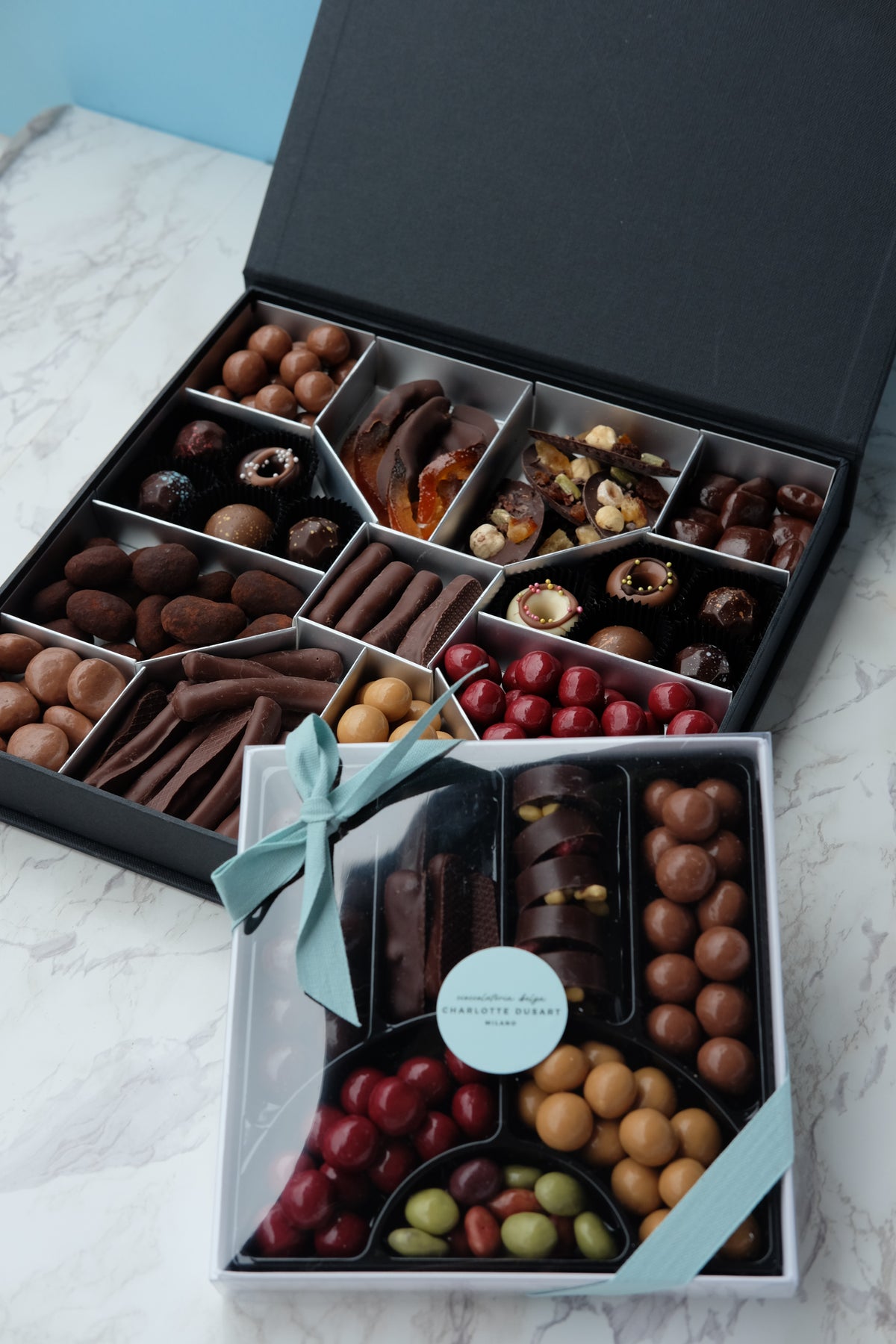
The packaging consists of a thick, sturdy box with a premium appearance. It features a dark exterior, likely covered in a textured or smooth finish, giving it a luxurious feel. The box has a hinged lid that opens to reveal several compartments filled with assorted chocolates. The interior is neatly organized with dividers separating different types of chocolates, showcasing a variety of colors and textures. The overall shape is rectangular, and the box appears to have a clean, elegant design.
About the Brand
Cioccolateria Belga by Charlotte Dusart operates in the gourmet chocolate sector, offering an array of pralines, chocolate bars, and custom confections. The company emphasizes high-quality ingredients and unique flavor profiles, supported by visually sophisticated packaging solutions suited for both retail and gifting contexts.
Founded in Milan, the brand's packaging approach reflects its commitment to craftsmanship and premium positioning in the market. The use of rigid luxury boxes with compartmentalized interiors, colorful geometric patterns, and clear branding elements underscores both the aesthetic and functional requirements for high-end confectionery packaging. Seasonal and custom packaging further support personalized customer experiences and holiday gift-giving, while attention to product safety and display standards is evident throughout their packaging formats.
Key Differentiator: The combination of bespoke rigid boxes, artistic visual design, and a strong focus on custom and seasonal packaging positions the brand as a leader in luxury chocolate presentation in the Milanese market.
Design System
Visual Style
The visual design employs elegant sans-serif typography, a modern and vibrant color palette (including matte blacks, pinks, greens, and blues), and geometric or festive motifs, creating a cohesive and contemporary luxury aesthetic.
Brand Identity
Logo usage is prominent on packaging fronts and labels, with the 'CHARLOTTE DUSART' name presented in a clear, refined font. Iconography is minimal, focusing on pattern and color for brand recognition. Visual consistency is maintained across seasonal and standard product lines.
Packaging Design
Material choices favor rigid paperboard for structural integrity and a premium feel, paired with high-quality carton and kraft boards for retail flexibility. The structural design philosophy emphasizes product protection, compartmentalization for assortments, and display-readiness for retail environments.
User Experience
Packaging is engineered to enhance the customer journey through tactile unboxing, clear product segmentation, and strong visual cues, supporting both emotional brand engagement and practical usability from purchase to gifting.
Company Metrics
Business insights for cioccolateria belga by charlotte dusart based on available data
Market Positioning
Brand Values & Focus
Key Competitors
Target Market: Affluent consumers, gift buyers, and chocolate enthusiasts in Milan and internationally who value premium quality, artisanal craftsmanship, and visually distinctive packaging.
Packaging Assessment
Overall Grade
Visual appeal and presentation quality
Packaging durability and protection
Eco-friendliness and recyclable materials
Cost efficiency and value for money
Packaging assessment for cioccolateria belga by charlotte dusart based on industry standards and best practices
Frequently Asked Questions
What types of packaging materials does Cioccolateria Belga by Charlotte Dusart use?
The company primarily utilizes rigid paperboard boxes for luxury gifting, folding carton boxes for retail display, and kraft paper-based containers for desserts and special confections. These materials are chosen for their durability, premium appearance, and adaptability to custom designs.
How does the packaging contribute to the customer experience?
The packaging is designed to deliver a high-impact unboxing experience, combining aesthetic elements like geometric patterns and brand-centric labeling with practical features such as product compartmentalization and protective interiors, thus enhancing both emotional engagement and product integrity.
Does the company prioritize sustainable packaging practices?
While the packaging demonstrates strong visual appeal and structural quality, the use of recyclable paperboard and kraft materials suggests some commitment to sustainability, though further transparency on sourcing and end-of-life recyclability would strengthen this position.
Discover other Food & Drink companies
Explore more companies in the food & drink industry and their packaging strategies
Terres de Café
Food & Drink
Terres de Café is a specialty coffee retailer based in Paris, France, known for its commitment to sustainability and high-quality coffee sourcing.
PrepMyMeal
Food & Drink
PrepMyMeal is a food production company specializing in high-protein meal delivery services. They offer a variety of natural, nutritious meals designed for fitness enthusiasts and those seeking convenience in meal preparation.
ruf lebensmittelwerk kg
Food & Drink
RUF Lebensmittelwerk KG is a German food production company specializing in a variety of baking mixes and drink products. Founded in 1920, the company is known for its high-quality ingredients and innovative food solutions.