Christian Breton packaging
Christian Breton specializes in targeted skincare for the eye area, leveraging premium formulations and a luxury brand aesthetic. Their packaging strategy emphasizes visually appealing, protective solutions with a focus on both brand consistency and unboxing experience.
Packaging Portfolio
Christian Breton’s packaging portfolio incorporates rigid boxes for creams, folding cartons for secondary packaging, and flexible pouches and sachets for single-use eye and facial treatments. Materials selection prioritizes product integrity and luxury shelf presence, utilizing glossy and metallic finishes to enhance visual impact. The structural design emphasizes protection for delicate formulations and delivers a consistent brand message across all touchpoints. The mix of rigid, folding, and flexible formats enables efficient distribution while supporting the brand’s high-end positioning.

The packaging is a flat, flexible pouch designed for a face mask product. It features a smooth, glossy surface with a pink background. The front displays the product name 'HYPER MOISTURIZING FACE MASK' in bold, white font, along with additional details about the product's benefits and usage. The edges are sealed, and the overall shape is rectangular with rounded corners, typical for single-use cosmetic products.

The packaging is a small, flat sachet made of a flexible material, likely a combination of plastic and aluminum, providing a barrier to moisture and light. The sachet is silver in color with a glossy finish, featuring a smooth surface without any visible fluted layers. It has clean, precise edges and a sealed top and bottom, indicating it is a single-use product. The overall shape is rectangular, designed to hold a small amount of liquid or gel.

The packaging is a flat, flexible pouch made of a single layer of plastic film. It has a smooth surface with a metallic finish, predominantly in shades of purple and silver. The front features a large logo and product name in white text, with additional product claims and details printed in smaller fonts. The edges are sealed, and there is no visible closure mechanism as it is likely a heat-sealed pouch.

The packaging is a square rigid box designed for cosmetic cream. It features thick chipboard construction, giving it a sturdy and premium feel. The box has a smooth surface with a glossy finish, enhancing its luxurious appearance. The edges are clean and precise, indicating high-quality manufacturing. The box is predominantly white with gold and black accents, showcasing a sophisticated design.
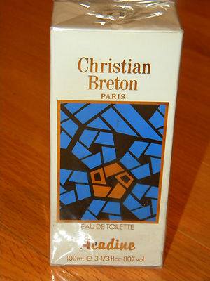
The packaging is a rectangular folding carton made of single-layer paperboard. The exterior features a smooth, flat surface with a predominantly white background. The front displays a colorful abstract design in blue and orange, which contrasts with the white base. The edges are clean and precise, indicating a well-constructed fold. The carton has a glossy finish that enhances the visual appeal. There are no visible fluted layers, confirming it is not corrugated. The top of the carton is sealed with a tuck flap.

The packaging is a flat, flexible pouch designed for a face mask. It features a smooth surface with a metallic finish, predominantly in a beige or light gold color. The front displays the product name and key benefits in bold, clear fonts. The edges are sealed, and the pouch has a top opening that is typically heat-sealed. The overall shape is rectangular, with rounded corners.
About the Brand
Christian Breton is a beauty brand recognized for its advanced eye care and skincare products, with a particular focus on sensitive and high-efficacy formulations. Their packaging approach combines luxury visual cues with practical, protective formats tailored to retail and e-commerce distribution.
The company operates primarily through a direct-to-consumer model, utilizing a streamlined e-commerce platform to reach a global clientele. Their packaging reflects premium positioning—employing glossy finishes, metallic effects, and rigid structures for creams and serums, alongside flexible pouches and sachets for single-use treatments. Consistent branding across all formats reinforces product recognition and customer trust.
Key Differentiator: Christian Breton differentiates itself by specializing in ophthalmologically tested eye care and employing cohesive, high-impact packaging that signals luxury while maintaining clarity and function.
Design System
Visual Style
The visual design is characterized by modern sans-serif typography, a palette dominated by white, gold, silver, and accent colors such as purple and pink. High-gloss and metallic finishes are prevalent, supporting a premium and clinical aesthetic.
Brand Identity
Logo placements are prominent and consistent, typically centered or placed at the top of each packaging unit. Iconography is minimal, focusing on clarity and legibility, while maintaining strong alignment with brand guidelines across SKUs.
Packaging Design
Material choices include rigid chipboard for structural strength, paperboard for folding cartons, and multilayer plastic/foil laminates for flexible packaging. The design philosophy balances durability, luxury cues, and efficient storage.
User Experience
Packaging is designed to create a strong first impression upon unboxing, with tactile finishes and clear labeling to guide user interaction. The system supports brand recall, reinforces luxury positioning, and facilitates a seamless transition from online purchase to product usage.
Company Metrics
Business insights for Christian Breton based on available data
Market Positioning
Brand Values & Focus
Key Competitors
Target Market: Affluent consumers seeking premium skincare solutions with an emphasis on eye-area treatments, primarily purchasing through online channels in Tier I markets such as Western Europe.
Packaging Assessment
Overall Grade
Visual appeal and presentation quality
Packaging durability and protection
Eco-friendliness and recyclable materials
Cost efficiency and value for money
Packaging assessment for Christian Breton based on industry standards and best practices
Frequently Asked Questions
What materials are used in Christian Breton's packaging?
Christian Breton utilizes a mix of materials including rigid chipboard for premium boxes, paperboard for folding cartons, and flexible plastic or foil laminates for single-use sachets and pouches, balancing shelf appeal with product protection.
How does Christian Breton ensure product safety during shipping?
Packaging formats such as rigid chipboard boxes and heat-sealed flexible pouches provide robust protection against physical damage and contamination, supporting safe delivery throughout e-commerce and retail channels.
Is Christian Breton's packaging recyclable or sustainable?
While some components like paperboard cartons are recyclable, the use of multi-material laminates in pouches may limit overall recyclability. The brand's packaging balances luxury cues with moderate sustainability performance typical of the beauty industry.
How does the packaging enhance the customer experience?
With a focus on glossy finishes, metallic accents, and premium tactile elements, Christian Breton’s packaging delivers a heightened sensory unboxing experience that aligns with the brand’s luxury positioning.
Discover other Beauty & Fitness companies
Explore more companies in the beauty & fitness industry and their packaging strategies
Cultiv Cosmetique
Beauty & Fitness
Cultiv Cosmetique is a French skincare brand that provides organic and eco-friendly beauty products inspired by nature. They focus on effective skincare solutions for various skin concerns.
Big Moustache
Beauty & Fitness
Big Moustache specializes in shaving and grooming products tailored for men, providing a hassle-free subscription service for razor blades and skincare essentials.
Orris Paris
Beauty & Fitness
Orris Paris specializes in creating artisanal skincare products that combine potent botanical ingredients with modern cleansing rituals. The company emphasizes natural, holistic practices in its formulations.