Childish Energy packaging
Childish Energy delivers nutritional supplements and energy powders with a strong emphasis on youthful, vibrant branding. Their packaging strategy leverages bold colors and custom formats to enhance product appeal and support their direct-to-consumer subscription model.
Packaging Portfolio
Childish Energy's packaging portfolio features a blend of rigid plastic tubs for powdered supplements, flexible sachets for single-serve convenience, and printed carton boxes for retail presentation. Materials are selected for structural integrity and visual appeal, with glossy finishes and high-impact colors enhancing shelf presence. Packaging designs integrate prominent brand elements and flavor cues, while the use of single-layer paperboard and rigid plastics reflects a focus on both protection and branding. The approach supports efficient D2C logistics, though sustainability optimization appears moderate.
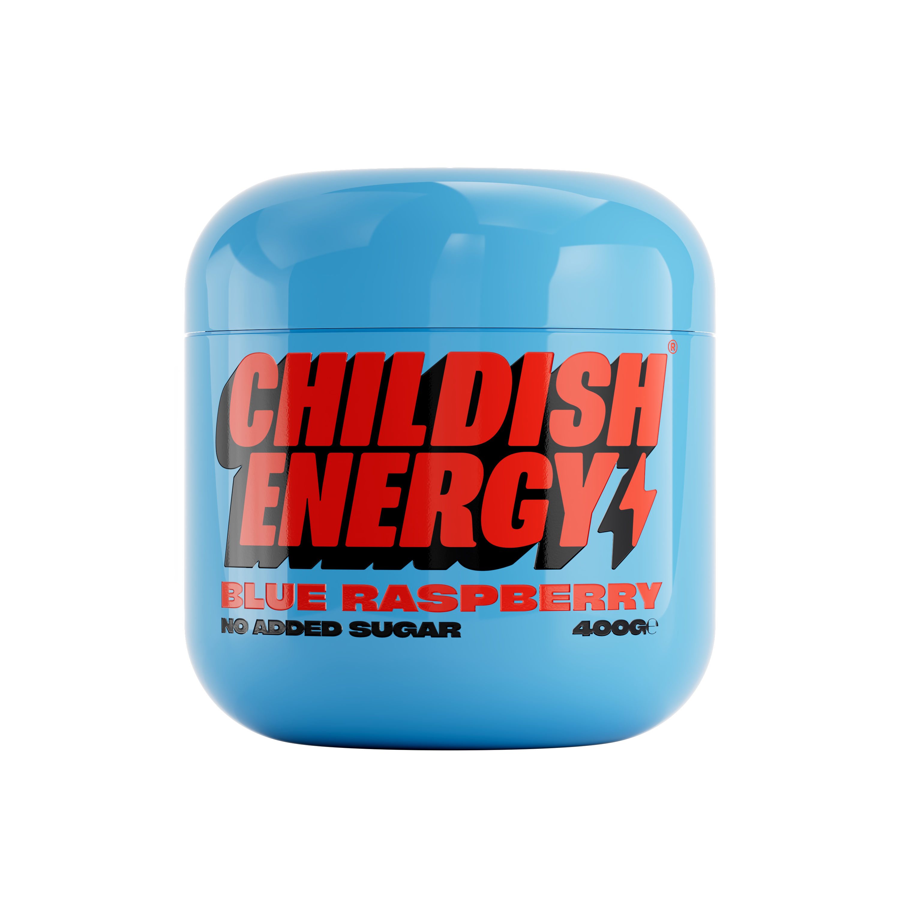
The packaging is a rounded, rigid container with a smooth, glossy surface. It has a bright blue exterior with a high-quality finish. The lid is securely fitted, providing a premium look and feel. The container is designed to hold a powdered product, likely a supplement or energy product, indicated by the product name and details printed on the surface.
The packaging consists of a smooth, flat construction made from single-layer paperboard. It features vibrant colors including pink, yellow, and green, with a glossy finish that enhances visual appeal. The edges are clean and precise, indicative of a well-constructed folding carton. The design includes bold typography and graphics that prominently display the brand name 'CHILDISH ENERGY' along with product flavors such as 'TROPIC STORM' and 'MELON BURST'. There are no visible fluted layers, confirming its classification as a carton box.

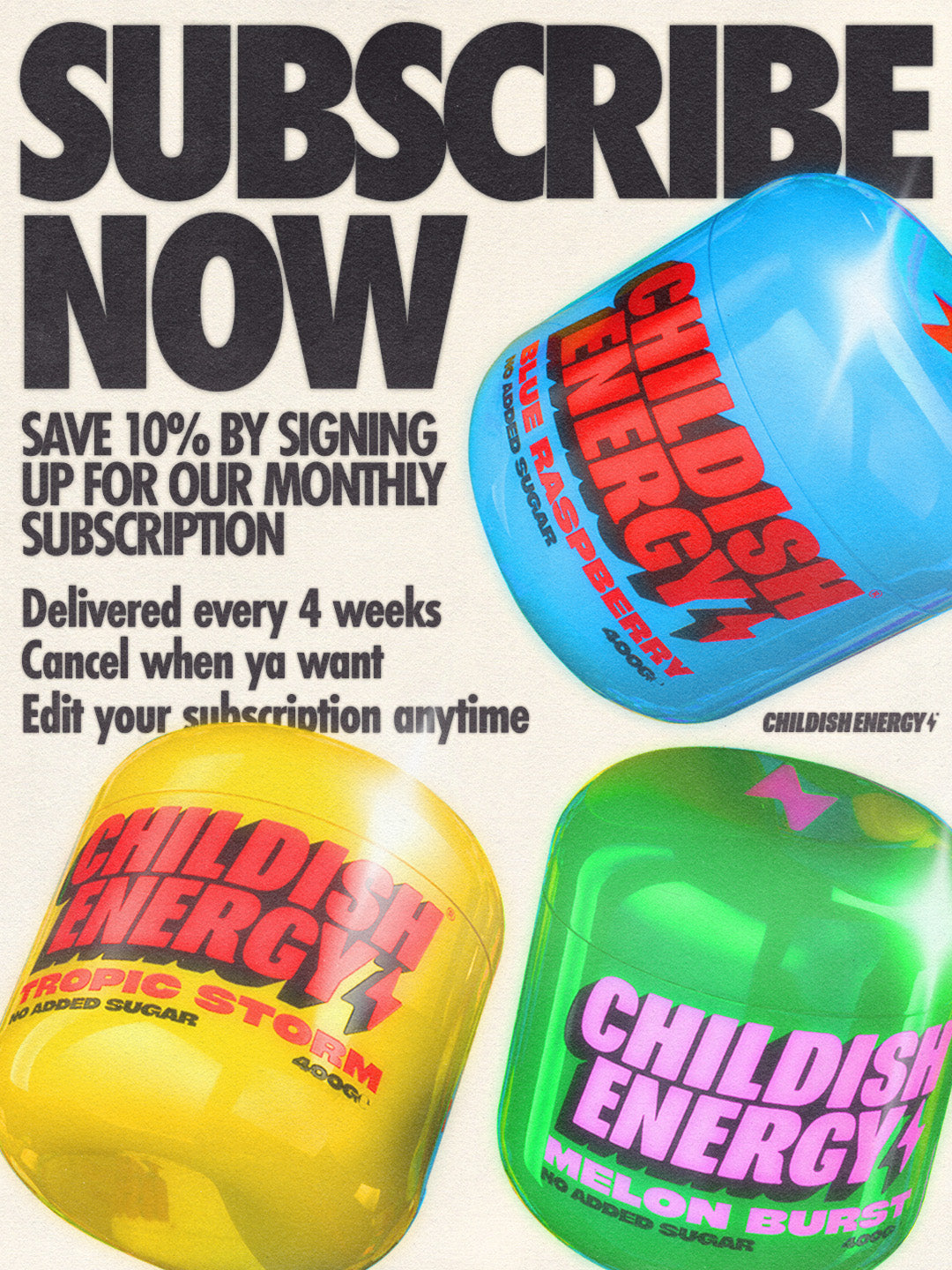
The packaging is a rounded, rigid container with a glossy, vibrant green exterior. The lid is smooth and fits snugly onto the base, creating a seamless appearance. The overall shape is cylindrical, resembling a jar. The surface is free of any visible seams or flaps, indicating a premium construction. The container features bold, contrasting text in pink and white, prominently displaying the brand name 'CHILDISH ENERGY' and the product flavor 'MELON BURST'.

The image features a black shaker bottle alongside several colorful sachets of energy drink mix. The shaker bottle has a smooth, cylindrical shape with a screw-on lid and a flip-top spout. The sachets are rectangular and flat, with vibrant colors and bold text. The overall presentation is designed for convenience and portability.

The packaging is a cylindrical rigid container with a glossy yellow finish. The surface is smooth with a high-quality appearance. The lid is seamless and fits snugly over the body, indicating a premium construction. The container has a vibrant design featuring bold red and black typography.
About the Brand
Childish Energy operates in the health supplement sector, focusing on energy-boosting products tailored for a youthful audience. The company's packaging approach centers on visually dynamic, brand-consistent designs that reinforce their fun and energetic market positioning.
The brand utilizes a combination of rigid containers, carton boxes, and branded accessories, optimizing for both visual impact and consumer convenience. Materials are chosen for durability and presentation, with a consistent use of glossy finishes and bold typography. Packaging formats are designed to appeal to active lifestyles, supporting ease of use for energy powders and supplements.
Key Differentiator: Childish Energy differentiates itself through highly distinctive, playful packaging that integrates brand identity into every touchpoint, enhancing both shelf presence and the direct-to-consumer unboxing experience.
Design System
Visual Style
The brand uses bold, sans-serif typography with oversized, high-contrast lettering. The color palette includes vibrant hues such as neon blue, yellow, pink, and green, paired with dark backgrounds for maximum visual contrast. The overall aesthetic is modern, playful, and energetic, appealing to a younger demographic.
Brand Identity
Logo placement is consistent across all packaging, with prominent use of the 'CHILDISH ENERGY' wordmark. Iconography is minimal, focusing instead on color and typography for differentiation. Visual consistency is maintained through repetitive use of signature colors and dynamic layouts.
Packaging Design
Material selection emphasizes durability and a tactile, premium feel—primarily rigid plastics for tubs and single-layer paperboard for cartons. Structural design favors cylindrical and rectangular formats with seamless lids and bold surface graphics. The philosophy prioritizes both visual impact and functional convenience for active users.
User Experience
Packaging is designed to create a memorable unboxing moment and facilitate product use, supporting the direct-to-consumer subscription model. Clear labeling, ergonomic formats, and vibrant visuals contribute to a seamless customer journey and reinforce overall brand engagement.
Company Metrics
Business insights for Childish Energy based on available data
Market Positioning
Brand Values & Focus
Key Competitors
Target Market: Youthful, health-conscious consumers seeking convenient, enjoyable supplement solutions with strong brand engagement.
Packaging Assessment
Overall Grade
Visual appeal and presentation quality
Packaging durability and protection
Eco-friendliness and recyclable materials
Cost efficiency and value for money
Packaging assessment for Childish Energy based on industry standards and best practices
Frequently Asked Questions
What types of packaging formats does Childish Energy use?
Childish Energy primarily utilizes rigid containers for powdered supplements, flat sachets for single servings, and custom-printed carton boxes for retail presentation. Each format is designed to maximize visual impact and functional convenience.
How does Childish Energy ensure packaging aligns with its brand strategy?
The company employs a cohesive visual system featuring consistent logo placement, a vibrant color palette, and bold, modern typography. These elements are integrated across all packaging types to reinforce the brand’s playful, energetic identity.
Is sustainability a focus in Childish Energy's packaging?
While the packaging emphasizes durability and visual appeal, there is limited publicly available information about the use of recycled or eco-friendly materials, indicating moderate sustainability efforts in the current packaging strategy.
Discover other Health companies
Explore more companies in the health industry and their packaging strategies
Lily & Loaf
Health
Lily & Loaf specializes in high-quality health and nutrition products, offering a range of supplements and vitamins aimed at supporting an active lifestyle. The company focuses on providing natural solutions for health and beauty.
Doctor Seaweed
Health
Doctor Seaweed specializes in natural, plant-based nutritional supplements derived from seaweed, aimed at promoting overall wellness.
EVO Nutrition
Health
EVO Nutrition specializes in premium health supplements, providing a wide range of vitamins and nutritional products to support well-being.