Charlotte Meentzen packaging
Charlotte Meentzen is a German natural cosmetics company specializing in high-quality facial, body care, and make-up products. Their packaging strategy emphasizes clean, premium folding cartons with a focus on brand consistency, professional presentation, and sustainability.
Packaging Portfolio
Charlotte Meentzen utilizes high-quality folding carton boxes as the primary packaging format, with a strong emphasis on clean, matte finishes and precise structural engineering. Most packaging features custom inserts for ampoule stability and plastic windows for product display, balancing protection with consumer appeal. The use of single-layer paperboard and minimalist graphics reduces material usage, while color accents distinguish product lines. Overall, their packaging portfolio prioritizes product safety, brand cohesion, and visual clarity in the competitive cosmetics sector.
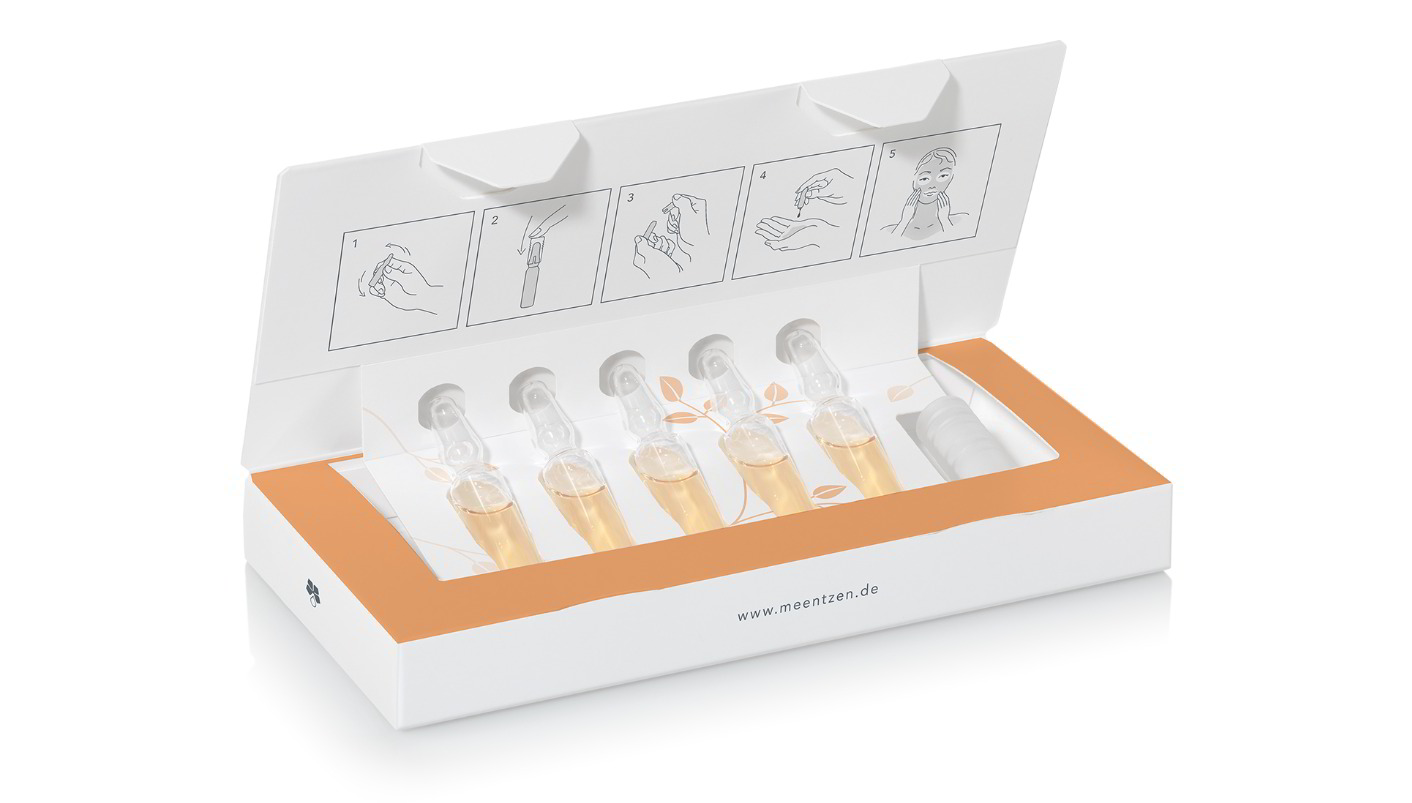
The packaging is a flat, folding carton designed to hold multiple glass ampoules. It features a smooth, white paperboard construction with a clean and precise folding pattern. The front has a clear plastic window allowing visibility of the ampoules inside. The top flaps are designed to tuck securely, ensuring the contents are held in place. The carton includes instructional graphics on the top panel, indicating how to use the product.

The packaging is a rectangular folding carton designed for retail display. It features a smooth, flat construction without any visible fluted layers, indicating that it is made from a single layer of paperboard. The exterior is predominantly a metallic silver color with a glossy finish, giving it a premium appearance. The front of the carton displays the product name 'M4M' prominently in a bold, stylized font, along with the words 'Eau de Toilette' and 'Pour Homme' in smaller text. The overall design is sleek and modern, appealing to a male demographic. The edges of the carton are clean and precise, with no signs of wear or damage.
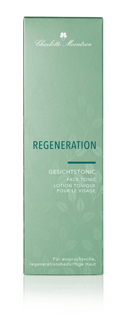
The packaging is a tall, rectangular box made of smooth, single-layer paperboard. It features clean, precise edges and folds, indicative of a folding carton design. The surface is predominantly a soft green color with a matte finish, giving it a premium appearance. The front displays the product name 'REGNERATION' prominently, along with the product type 'GESICHTSTONIC' in a smaller font. The text is printed in white, contrasting well against the green background. The box has a minimalist design, with a small logo at the top and additional text in multiple languages on the sides. There are no visible flaps or tabs, as it is a standard folding carton structure.
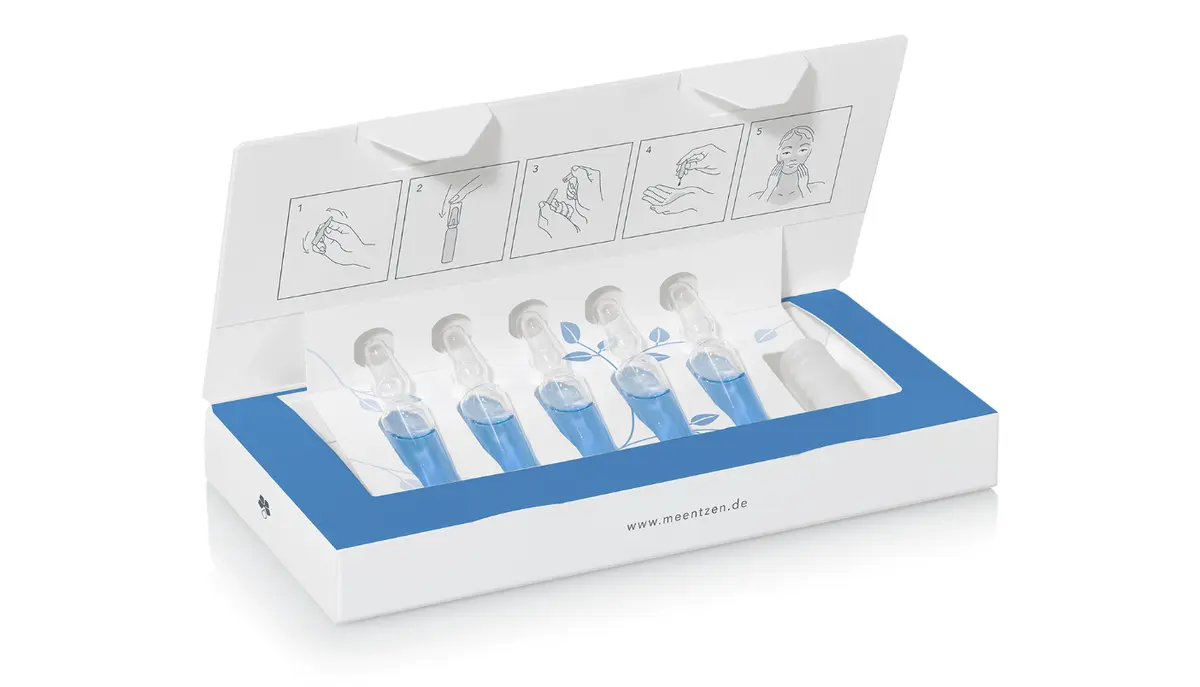
The packaging features a smooth, flat construction typical of folding cartons. It is predominantly white with a blue accent on the top flap. The box is designed to hold multiple ampoules securely, with clear illustrations on the top flap demonstrating usage instructions. The edges are clean and precise, indicating a high-quality folding process. The interior holds five transparent ampoules, suggesting a snug fit to prevent movement during shipping.
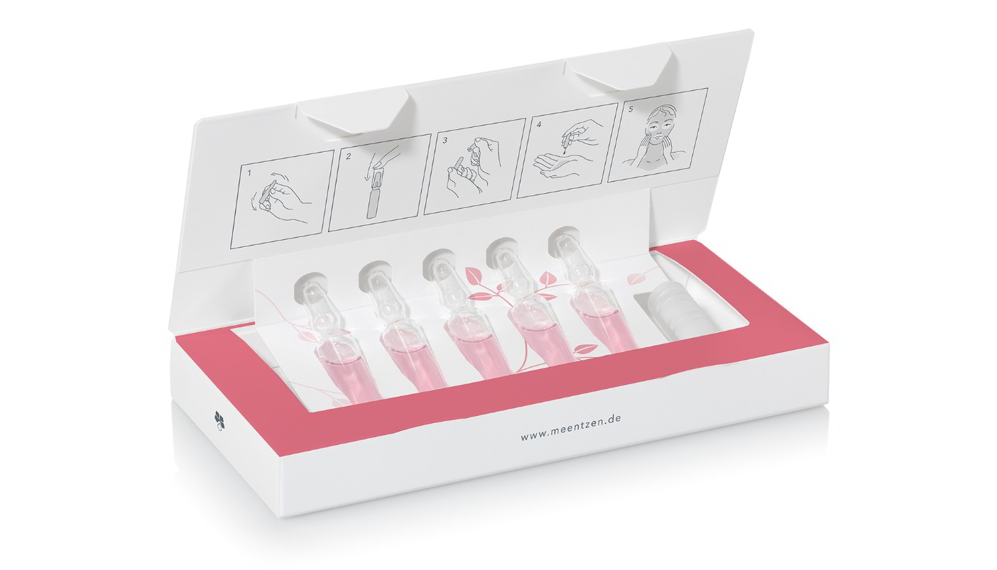
The packaging is a flat, smooth, and folded carton box designed to hold multiple cosmetic ampoules. It features a clean white exterior with a matte finish. The box has a rectangular shape with a hinged lid that opens from the top. The interior is designed to securely hold the ampoules in place, likely with cutouts or inserts. The front of the box includes instructional graphics and a window to showcase the product inside.
About the Brand
Charlotte Meentzen is a legacy natural cosmetics brand with a B2B business model, offering plant-based skincare and make-up solutions. The company leverages decades of expertise to deliver effective, professionally-oriented products rooted in sustainability and holistic beauty.
Founded in 1930, Charlotte Meentzen has established a reputation for innovative, plant-derived formulations and a steadfast commitment to environmental responsibility. Its product range addresses diverse skincare needs and is distributed primarily through professional channels and retail partners. Packaging plays a strategic role in reinforcing the brand's natural, premium positioning and ensuring safe product delivery.
Key Differentiator: The integration of traditional botanical knowledge with modern scientific practices, alongside a strong focus on sustainability and professional education, distinguishes Charlotte Meentzen in the competitive natural beauty market.
Design System
Visual Style
The visual design employs sans-serif typography, a restrained palette of whites, greens, and blues, and ample negative space for a clinical yet approachable aesthetic. Occasional metallics and gloss finishes are used for premium lines.
Brand Identity
Logos are consistently placed on front panels, accompanied by clean iconography and multilingual product descriptors. Visual consistency is maintained across categories, supporting instant brand recognition both on-shelf and in professional settings.
Packaging Design
Material selection favors recyclable paperboard with occasional plastic film for windows. Structural designs focus on efficient folding cartons with secure closure systems and internal fitments for fragile products, reflecting a balance between protection and sustainability.
User Experience
Packaging design enhances user experience by providing clear usage instructions, intuitive opening mechanisms, and visible product presentation. This approach supports both professional application and consumer confidence, reinforcing the brand’s premium, natural positioning.
Company Metrics
Business insights for Charlotte Meentzen based on available data
Market Positioning
Brand Values & Focus
Key Competitors
Target Market: Professional beauticians, skincare specialists, and retailers seeking premium, plant-based cosmetic products with a focus on sustainability and efficacy.
Packaging Assessment
Overall Grade
Visual appeal and presentation quality
Packaging durability and protection
Eco-friendliness and recyclable materials
Cost efficiency and value for money
Packaging assessment for Charlotte Meentzen based on industry standards and best practices
Frequently Asked Questions
What types of packaging formats does Charlotte Meentzen use?
The company primarily utilizes folding carton boxes for retail, with custom inserts for ampoule security and window panels for product visibility. These structures are designed for both professional and consumer-facing segments.
How sustainable are Charlotte Meentzen's packaging materials?
Charlotte Meentzen prioritizes recyclable paperboard materials and minimalist carton constructions, reflecting a moderate-to-high commitment to sustainable packaging. However, the occasional use of plastic windows represents a trade-off between product visibility and recyclability.
How does Charlotte Meentzen's packaging support its brand identity?
Packaging features a consistent visual system with clean typography, subdued color palettes, and prominent logo placement, reinforcing the brand's premium and natural positioning across all product lines.
Discover other Beauty & Fitness companies
Explore more companies in the beauty & fitness industry and their packaging strategies
Orris Paris
Beauty & Fitness
Orris Paris specializes in creating artisanal skincare products that combine potent botanical ingredients with modern cleansing rituals. The company emphasizes natural, holistic practices in its formulations.
Institut Karité Paris
Beauty & Fitness
Institut Karité Paris specializes in luxury beauty products made with natural Shea Butter, offering a wide range of skincare and body care solutions. The brand combines Parisian heritage with a commitment to quality and creativity in its offerings.
Pure Altitude
Beauty & Fitness
Pure Altitude specializes in high-quality beauty and skincare products that leverage the expertise of spa treatments to enhance daily routines. The brand offers a diverse range of products tailored for both facial and body care.