Change Please packaging
Change Please is a London-based social enterprise leveraging coffee sales to address homelessness, with a focus on premium products and transparent social impact. Their packaging strategy integrates vibrant visual branding and functional formats to enhance both shelf presence and consumer engagement.
Packaging Portfolio
Change Please deploys a diverse packaging portfolio comprising flexible stand-up pouches with resealable zippers, multi-layer barrier films to preserve freshness, and custom-printed retail cartons. Material selection emphasizes durability and shelf visibility, with most coffee bags using composite films for aroma and moisture protection. Visual elements are printed directly onto pouches and cartons, ensuring high-impact branding. The inclusion of branded reusable cups highlights a partial shift toward reusability, although most primary packaging remains single-use. Structural features such as flat-bottom bags and one-way valves further optimize both logistics and consumer convenience.
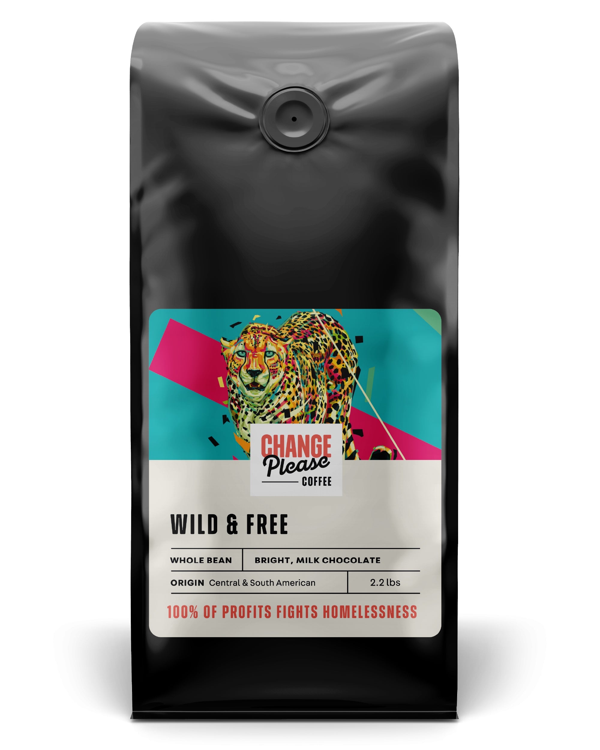
The packaging is a stand-up pouch made of a flexible material, likely a multi-layer film that includes a barrier layer to preserve freshness. The front features a vibrant design with a colorful leopard graphic and bold text. The top has a resealable valve for freshness, and the overall shape is rectangular with a flat bottom for stability.

The packaging is a stand-up pouch designed for retail display, featuring a vibrant, colorful design with a prominent bird illustration. The bag has a flat bottom, allowing it to stand upright on shelves. The front showcases the product name 'SWEET AS A NUT' in bold letters, along with additional product details and a strength indicator. The overall design is eye-catching, with a mix of red, yellow, and green colors, creating a lively appearance. The top of the bag has a resealable closure, which is common for coffee packaging.
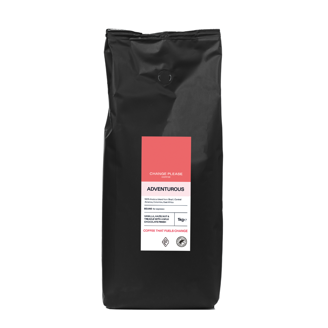
The packaging is a stand-up pouch made of a flexible material, likely a composite of plastic and aluminum. The bag has a matte black exterior with a prominent red label on the front. The label features the brand name 'CHANGE PLEASE' at the top, followed by the product name 'ADVENTUROUS' in a bold font. Below the product name, there is additional information about the coffee, including weight and a brief description. The bag has a resealable top, indicated by a tear notch and a zip closure, allowing for easy access and storage. The overall shape is rectangular with a flat bottom, enabling it to stand upright on shelves.

The packaging consists of a reusable coffee cup made from a sturdy material, likely plastic or silicone, with a smooth surface finish. It features a red exterior and a white paper sleeve that wraps around the cup, providing insulation and branding space. The sleeve has a scalloped edge, enhancing grip and aesthetic appeal. The cup has a lid with a small opening for sipping, indicating functionality for hot beverages.

The packaging is a rectangular, upright box with a smooth, flat construction. It features clean, precise edges and folds, indicating it is made from single-layer paperboard. The box is predominantly a bright coral color with the brand name 'CHANGE PLEASE' printed in bold, black typography on the sides. The front has a small white label with the same brand name, enhancing visibility. The box appears lightweight and is designed for retail display.
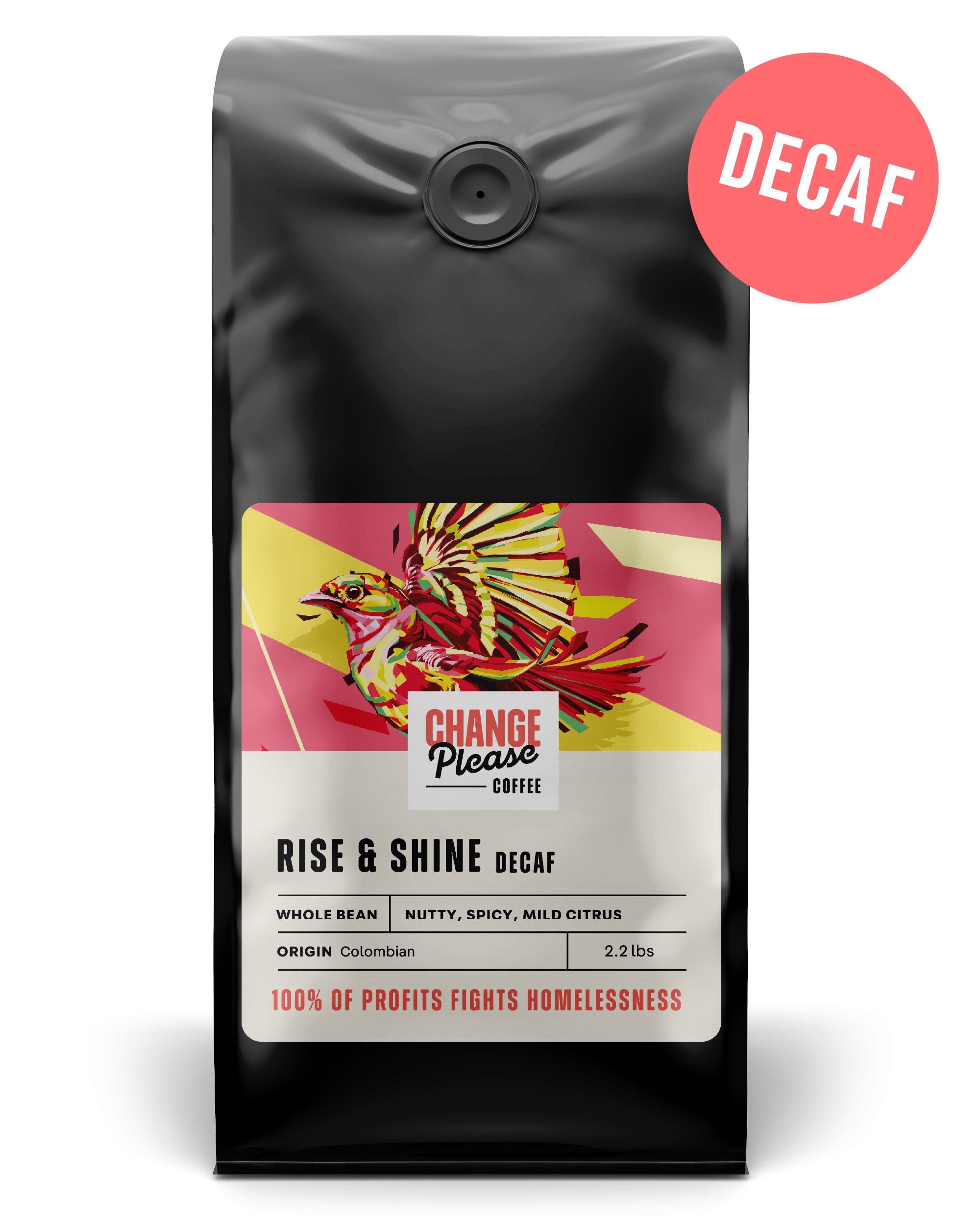
The packaging is a stand-up pouch designed for coffee, featuring a glossy black exterior with a vibrant graphic design. The front displays a colorful illustration of a bird, along with the brand name 'CHANGE PLEASE' prominently featured in white and red. Below the brand name, the product name 'RISE & SHINE DECAF' is printed in a bold font, accompanied by additional product details such as 'Whole Bean, Nutty, Spicy, Mild Citrus' and 'ORIGIN Colombian'. The bag has a resealable top with a one-way valve for freshness. The overall shape is rectangular with a flat bottom, allowing it to stand upright.
About the Brand
Change Please operates at the intersection of high-quality coffee and social impact, employing a business model that channels revenue into training and employing homeless individuals. Their branding is closely tied to their mission, and this ethos carries through to their packaging—designed to attract ethically-minded coffee consumers while maintaining product integrity.
With a mid-sized team and a growing retail and online presence, Change Please utilizes packaging as both a marketing and operational tool. Their solutions balance shelf appeal with technical functionality, utilizing resealable stand-up pouches, retail cartons, and branded reusable cups. The consistent use of bold colors and mission-driven messages on-pack signals their commitment to both product quality and social purpose.
Key Differentiator: Integration of social impact messaging directly into packaging design, setting them apart in the coffee market by aligning visual identity and material choice with their ethical mission.
Design System
Visual Style
Bright, saturated primary colors (notably reds, yellows, and greens), bold sans-serif typography, and illustrative graphic elements (e.g., birds, leopards) create a lively, approachable aesthetic. Typography is large, clear, and modern, emphasizing readability and shelf presence.
Brand Identity
Consistent placement of the 'CHANGE PLEASE' logo, integration of mission-driven messages, and use of organic certification/impact labels. Iconography and visual motifs reinforce the brand's social enterprise ethos and maintain visual unity across product lines.
Packaging Design
Prioritizes flexible packaging and lightweight carton boxes for efficient logistics and retail appeal. Material choices are practical, balancing cost with product protection, and feature resealable closures and freshness valves where relevant. The design philosophy favors high-contrast, high-visibility surfaces to maximize brand recall.
User Experience
Packaging is designed to guide the consumer from shelf discovery to at-home use, with clear labeling, resealable features for convenience, and storytelling elements that reinforce the brand's social mission. The unboxing sequence is visually engaging, aiming for both emotional resonance and functional satisfaction.
Company Metrics
Business insights for Change Please based on available data
Market Positioning
Brand Values & Focus
Key Competitors
Target Market: Ethically-minded coffee consumers in the UK, particularly urban dwellers seeking premium products with a social mission.
Packaging Assessment
Overall Grade
Visual appeal and presentation quality
Packaging durability and protection
Eco-friendliness and recyclable materials
Cost efficiency and value for money
Packaging assessment for Change Please based on industry standards and best practices
Frequently Asked Questions
What packaging formats does Change Please primarily use?
Change Please relies on stand-up pouches with resealable closures for coffee, carton boxes for retail display, and branded reusable coffee cups, each designed for visual impact and product protection.
How does Change Please address sustainability in their packaging?
Their packaging incorporates recyclable materials in both flexible pouches and cartons, and they reinforce reuse through branded coffee cups, though there is limited evidence of advanced eco-friendly certifications or compostable formats.
How does packaging contribute to Change Please's brand experience?
Packaging serves as a key communication tool, using bold graphics and clear messaging to reinforce their social mission and create an engaging unboxing experience for consumers.
Discover other Food & Drink companies
Explore more companies in the food & drink industry and their packaging strategies
ruf lebensmittelwerk kg
Food & Drink
RUF Lebensmittelwerk KG is a German food production company specializing in a variety of baking mixes and drink products. Founded in 1920, the company is known for its high-quality ingredients and innovative food solutions.
Thés de la Pagode
Food & Drink
Thés de la Pagode is a French company specializing in organic teas and infusions, focusing on health and well-being. Established in 1987, they prioritize sustainable practices and high-quality ingredients sourced through fair trade.
Teegschwendner GmbH
Food & Drink
Teegschwendner GmbH is a specialty tea company based in Germany, offering a wide selection of high-quality teas and tea-related accessories. They focus on providing unique tea experiences through carefully sourced and curated products.