Camondas Schokoladen GmbH packaging
Camondas Schokoladen GmbH specializes in premium chocolates and confections, utilizing a variety of packaging formats to enhance product presentation and support their brand image. Their packaging strategy emphasizes visual appeal, structural integrity, and alignment with premium retail and gifting experiences.
Packaging Portfolio
Camondas Schokoladen GmbH’s packaging portfolio is characterized by a balanced mix of rigid boxes, folding carton boxes, and flexible kraft paper pouches. Rigid boxes are employed for gift and premium assortments, using thick chipboard and decorative finishes such as ribbons and seasonal illustrations to enhance perceived value. Folding cartons and kraft pouches provide lighter-weight options for retail and everyday products, with transparent windows supporting product visibility. The use of recyclable paperboard and kraft materials reflects a partial commitment to sustainability, although premium rigid packaging increases material intensity and cost. Seasonal and personalized packaging designs are integrated for special occasions, demonstrating flexibility and branding alignment.

The packaging is a rigid box with a sturdy construction, featuring a thick chipboard material. The box is rectangular with a smooth, flat surface and a decorative design. The exterior is primarily white with a subtle pattern of illustrations, while the base is a solid kraft color. The box is closed with a satin ribbon tied in a bow, adding a premium touch. The edges are clean and precise, indicative of high-quality manufacturing.

The packaging consists of colorful folding cartons designed for retail display. Each carton features a smooth, flat construction without fluted layers, indicative of single-layer paperboard. The cartons are primarily in pastel colors, with a light green and orange hue, and adorned with floral graphics and Easter-themed imagery. The edges are clean and precise, suggesting a high-quality finish. The cartons are designed to hold chocolate eggs, with a clear branding presence.
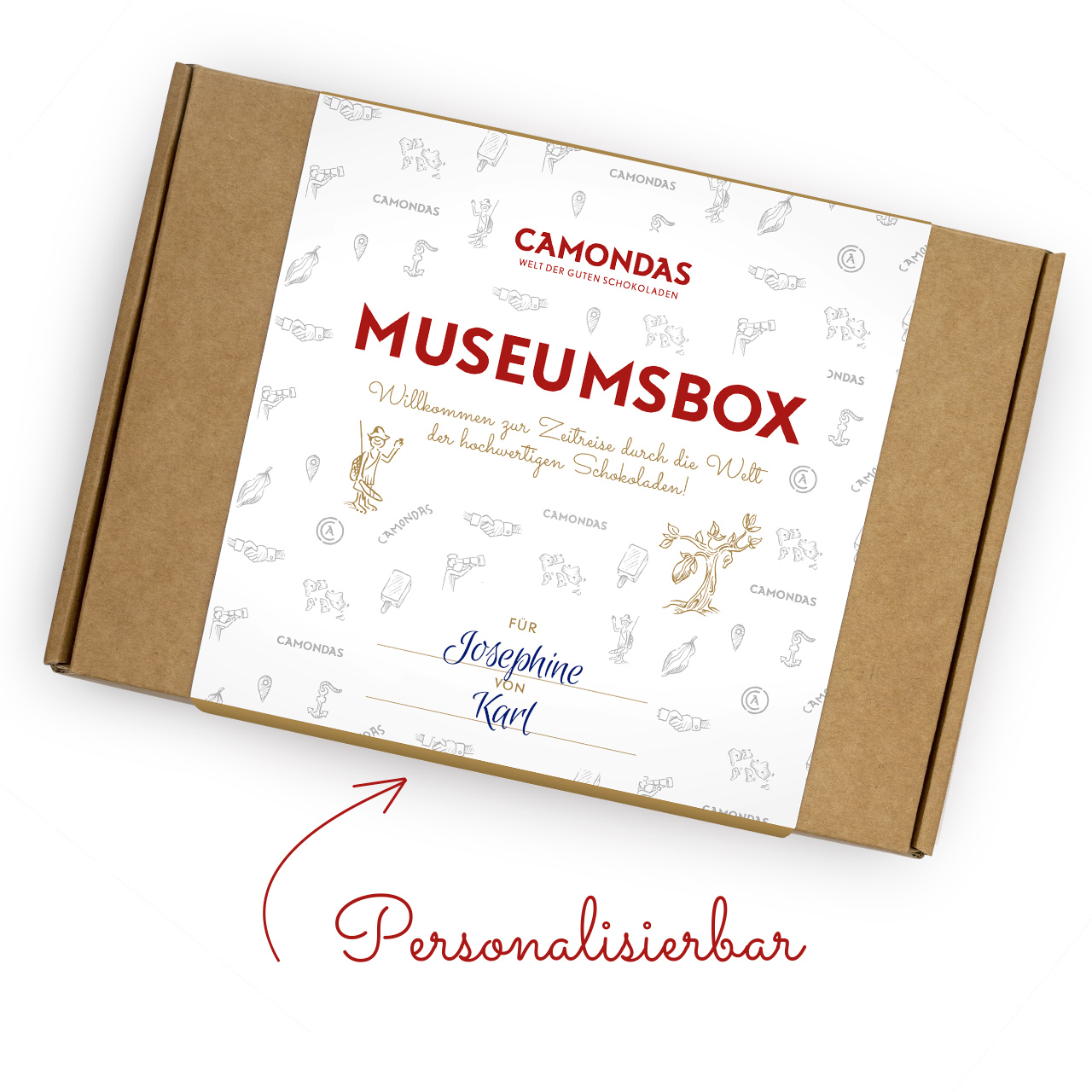
The packaging is a flat, rectangular box made from a single layer of paperboard. It features a smooth, flat construction with clean edges and folds. The exterior is predominantly kraft brown, with a white printed label on the top that includes decorative graphics and text. The box has a lightweight appearance and is designed for retail use, likely for a gift or subscription service.

The packaging consists of a sturdy, square-shaped box with a premium appearance. It features a decorative design with a white exterior and a festive theme, including a Christmas tree graphic. The box has a clean, flat construction with precise edges and folds, indicative of high-quality chipboard material. Inside, it contains three smaller confectionery items wrapped in colorful paper, each tied with a decorative twist tie.
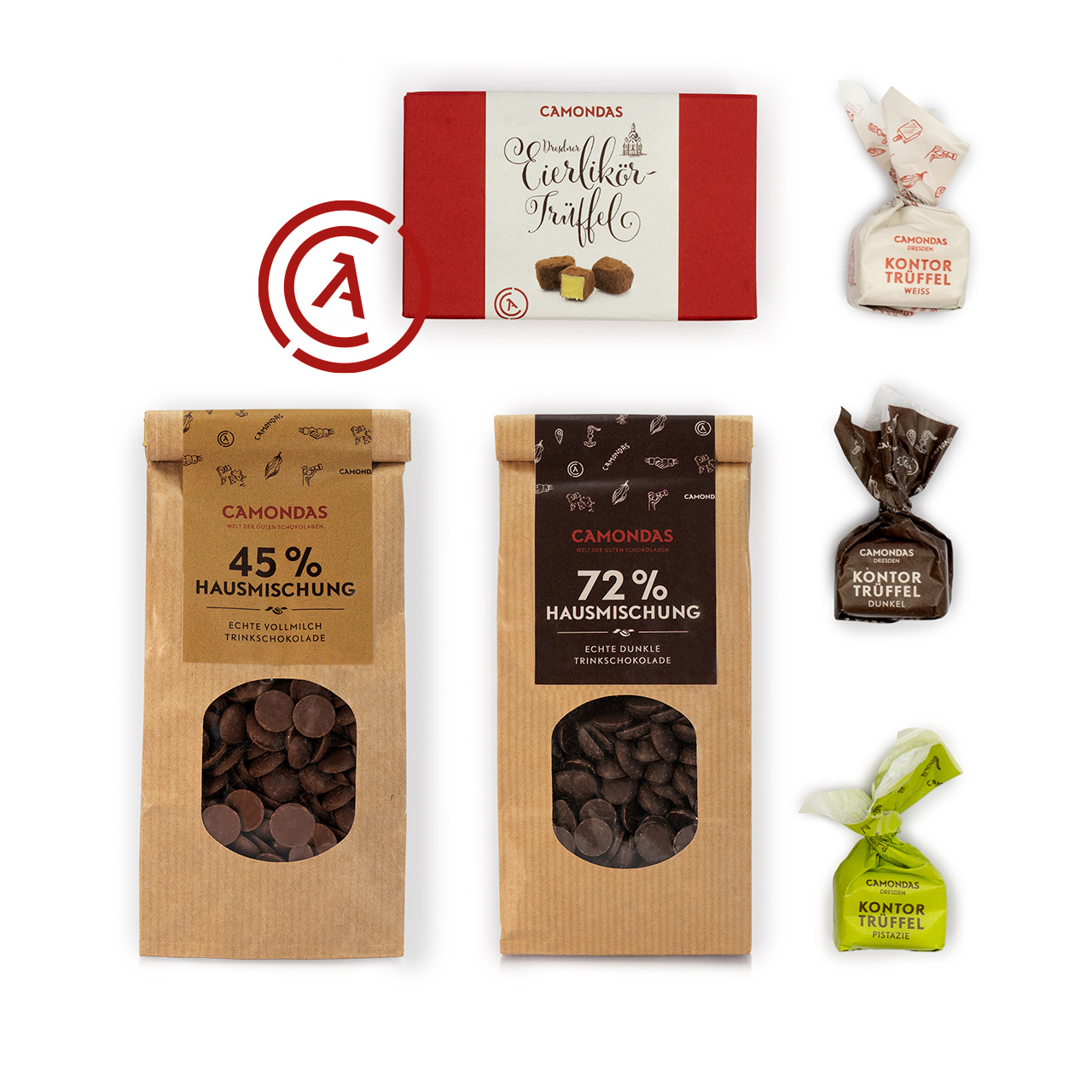
The image features various types of packaging for confectionery products. The red box is a folding carton with a smooth surface, likely made of paperboard, showcasing a clean design with a logo and product name. The two bags are flexible pouches made of kraft paper with a transparent window, displaying chocolate chips. The bags have a natural, rustic appearance with printed graphics and product information.
About the Brand
Camondas Schokoladen GmbH is a Dresden-based premium chocolate retailer known for its diverse range of over 400 confectionery products. The company combines a focus on product quality with curated packaging solutions that reinforce its luxury positioning in the chocolate market.
Operating both online and through multiple physical locations, Camondas integrates packaging as a core element of the customer journey, from unboxing to gifting. Their approach includes rigid and carton boxes, flexible pouches, and thematic seasonal packaging, each designed to support product freshness, visual impact, and the brand’s storytelling around quality and sustainability.
Key Differentiator: Camondas differentiates itself through consistent, high-quality packaging that supports premium product positioning, strong visual identity, and an emphasis on customer experience during unboxing and gifting.
Design System
Visual Style
Typography is clean and modern, often sans-serif, with a color palette that combines whites, kraft browns, reds, and pastels for seasonal editions. Decorative illustrations and subtle patterns contribute to a refined and festive look.
Brand Identity
Logo is consistently presented on all packaging, accompanied by clear product naming and thematic iconography. Visual consistency is maintained through uniform color usage, typographic hierarchy, and recurring decorative elements across formats.
Packaging Design
Material selection prioritizes chipboard for structural rigidity in gift boxes, single-layer paperboard for folding cartons, and kraft paper for flexible pouches. Structural design emphasizes clean edges, precise folding, and surface finishes that support both protection and shelf appeal.
User Experience
Packaging design is tailored to enhance the customer journey, offering tactile features (e.g., ribbons), clear product presentation, and seasonal motifs that reinforce gifting occasions. The unboxing process is curated to create an emotional connection and reinforce brand storytelling.
Company Metrics
Business insights for Camondas Schokoladen GmbH based on available data
Market Positioning
Brand Values & Focus
Key Competitors
Target Market: Affluent consumers, gift buyers, and chocolate enthusiasts in Germany and across Europe seeking premium confectionery products and gifting solutions.
Packaging Assessment
Overall Grade
Visual appeal and presentation quality
Packaging durability and protection
Eco-friendliness and recyclable materials
Cost efficiency and value for money
Packaging assessment for Camondas Schokoladen GmbH based on industry standards and best practices
Frequently Asked Questions
What types of packaging does Camondas Schokoladen GmbH primarily use?
Camondas utilizes a mix of rigid boxes, folding carton boxes, and flexible pouches, often incorporating branding and thematic design elements to align with seasonal or gifting occasions.
How does Camondas address packaging sustainability?
The company incorporates recyclable paperboard materials and kraft paper pouches in several products, though the overall portfolio balances between premium rigid formats and eco-friendly solutions.
What role does packaging play in Camondas' customer experience?
Packaging is central to the unboxing and gifting experience, with attention to details such as ribbon closures, decorative illustrations, and product visibility, enhancing both perceived value and emotional impact.
Discover other Food & Drink companies
Explore more companies in the food & drink industry and their packaging strategies
Teegschwendner GmbH
Food & Drink
Teegschwendner GmbH is a specialty tea company based in Germany, offering a wide selection of high-quality teas and tea-related accessories. They focus on providing unique tea experiences through carefully sourced and curated products.
ruf lebensmittelwerk kg
Food & Drink
RUF Lebensmittelwerk KG is a German food production company specializing in a variety of baking mixes and drink products. Founded in 1920, the company is known for its high-quality ingredients and innovative food solutions.
Thés de la Pagode
Food & Drink
Thés de la Pagode is a French company specializing in organic teas and infusions, focusing on health and well-being. Established in 1987, they prioritize sustainable practices and high-quality ingredients sourced through fair trade.